Are you looking for website welcome message examples to engage your visitors?
A website welcome message is a crucial component of any website, as it sets the tone for the user’s experience and can make or break their first impression of your brand.
In this article, we’ll explore the essential elements of a welcome message, provide examples, and offer tips for crafting a warm and engaging greeting to keep your users returning for more.
Top Website Welcome Message Examples:
What Is a Website Welcome Message?
A welcome message is a brief introductory text on your website’s homepage or landing page. It serves as a greeting to visitors and often includes a quick overview of your website’s purpose, mission, or products/services.
A well-crafted welcome message can make users feel valued, informed, and motivated to explore your site further. It can also tell visitors what to do next and encourage them to take action, such as:
- Join your email newsletter
- Log into your website
- Take advantage of a sale
- Claim a discount code or coupon
- Visit specific pages on your site
- And more.
But what should you include in a good welcome message? Let’s find out!
Essential Elements of a Website Welcome Message
A successful website welcome message should contain some or all of the following elements:
Personalization
The best welcome messages are tailored to the user, using their name or other relevant information to make them feel seen and appreciated. You can achieve personalization through cookies or by asking users to enter their names or preferences when they first arrive on your website.
Brand Identity
Your website welcome message should reflect your brand values, mission, and voice. You should write the message in a tone that aligns with your overall image, whether that’s playful, professional, or somewhere in between.
Clarity
Make your welcome message clear, and communicate your site’s purpose or main offerings. Avoid using jargon or overly technical language that might confuse or alienate visitors.
Call-to-Action
Include a clear call-to-action (CTA) in your welcome message to encourage users to take action, such as signing up for a newsletter or exploring a product page. This can guide users toward the next steps in their journey on your site.
To make sure your welcome message and other content are easy to understand and rank well in search results, use tools like SEOBoost. It gives you suggestions to improve how readable your content is and how well it uses keywords.
Effective Website Welcome Message Examples You Can Use
Now that you know what to include, here are some examples of effective website welcome messages that incorporate the essential elements listed above.
1. Website Pre Launch
If you’re launching a new website, a pre-launch welcome message is an excellent way to build excitement and anticipation with your audience. A compelling pre-launch message can also help you generate buzz, attract visitors, and encourage them to return when your site goes live.
Here’s an example of how a pre-launch welcome message may look:
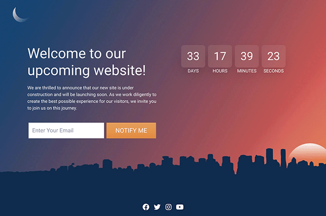
As you can see, it includes a clear headline, description, and a CTA encouraging visitors to subscribe to learn when the website launches. It also has a countdown timer which gives users a visual reminder and social links to explore the brand on social media.
Even better, we made this entire page without code using SeedProd, one of the best drag-and-drop page builders for WordPress.
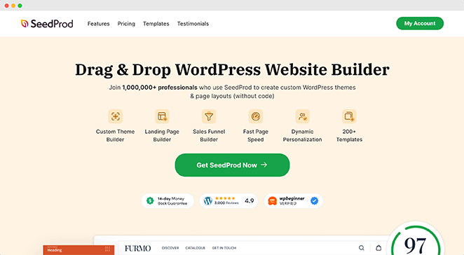
SeedProd comes with built-in Coming Soon Page functionality, making crafting a pre-launch page easy. You can also use its library of professional coming soon page templates to get a head start on building the perfect design.
From there, it’s simply a case of dragging and dropping design elements to build and customize your page. For instance, in the example above, we used the following SeedProd blocks:
- Headline
- Text
- Optin Form
- Countdown Timer
- Social Profiles
Check out this step-by-step guide to learn how to create a coming soon page for your new website launch.
2. Maintenance Alert
If your website requires routine maintenance, it’s essential to communicate with your visitors to minimize any confusion. An easy way to do this is with a maintenance alert, which tells website visitors about maintenance and when they can expect your site to be back up and running.
Here’s an example of a maintenance welcome message we made with SeedProd:
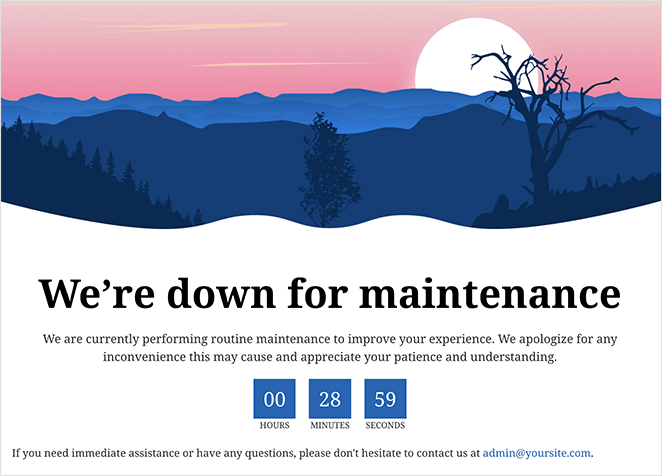
Besides coming soon pages, SeedProd also comes with Maintenance Mode built in, allowing you to create and customize an engaging WordPress maintenance page without writing code. Plus, you can switch your maintenance welcome message on and off with a single click.
You can make your maintenance message as simple or complex as you like. For example, you could add a contact form for users to get in touch and ask questions, direct users to your social media profiles, or even encourage them to join your email list.
3. Friendly Login
Login pages are like welcome screens that greet existing website users as they log into your website and are a great way to make them feel appreciated. It’s a simple but effective way to create a positive user experience and encourage repeat visits.
Here’s an example of how WPForms uses its login screen to improve its onboarding process:
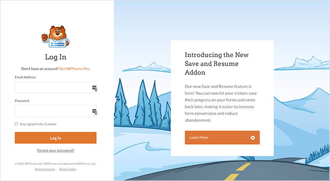
As you can see, it tells users about new product features they may not be familiar with. As a result, those users can get more value out of the product, while WPForms keeps its users engaged.
You can easily make a page like this with SeedProd’s Login Page mode and Login Form block. You’ll also find several pre-made login page templates to make the design process easier.
Once you find a template you like, follow this guide to customize your WordPress login page greeting message.
4. Grow Your Email List
Building a solid email list is crucial for the success of any small business, and email marketing is one of the most effective ways to generate revenue. However, the challenge remains: how do you attract more qualified leads to your email list?
A squeeze page is a great way to greet new subscribers. Here’s one we made with SeedProd’s landing page builder to serve as a warm greeting for new subscribers:
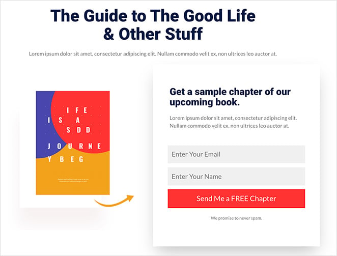
With a landing page like this, you can capture attention with an eye-catching message that invites new users to subscribe.
To make your offer more compelling, you can welcome potential subscribers with a lead magnet. This is a piece of content that you offer in exchange for an email address and which shows users how valuable your business is right away.
Need help getting started? Check out this guide on how to make a squeeze page in WordPress.
5. Promote a Sale
Another way to create a compelling website welcome message is with push notifications. Push notifications are short messages that appear on a user’s mobile device, desktop, or web browser, even if they’re not using the app or website.
Here’s an example of how Shein, a popular eCommerce website, uses push notifications to welcome potential customers with a discount:
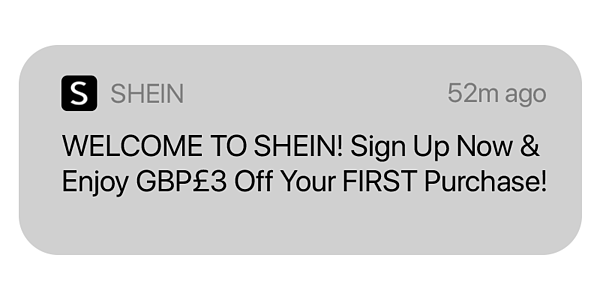
Shein encourages first-time customers to sign up with £3 off their first order. Offering new customers a discount for your online store, even if it’s small, can help your target audience feel wanted and appreciated.
We’d improve this type of welcome message by adding an emoji to capture the user’s attention. You can also use this welcome message to promote an online course or professional services.
One of the easiest ways to create push notifications is with PushEngage, the best push notification software.
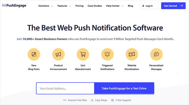
It’s super easy to use and even offers welcome message campaigns to help with customer onboarding.
6. Gather Feedback
Website welcome messages are also a fantastic way to collect user feedback. By welcoming visitors with a popup survey or form, you can learn more about their needs, preferences, and pain points.
In this example, we used a WordPress plugin called UserFeedback to display a welcome survey:
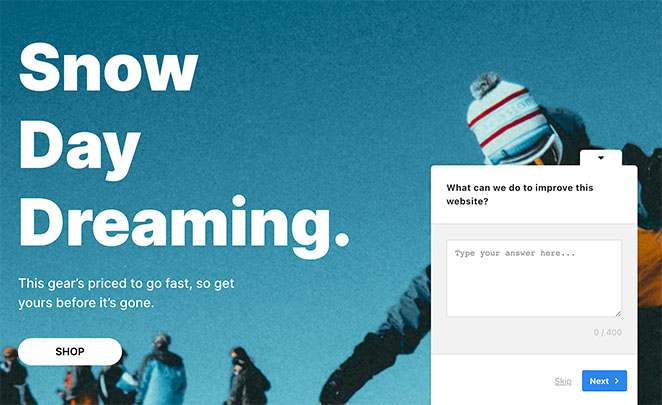
When visitors land on the page, they’ll see a popup asking for their opinion, which you can use to improve your website content, eCommerce sales, and conversions.
This particular plugin comes with several templates, from basic website experience surveys to more detailed buyer research. It’s also incredibly user-friendly, taking just a few minutes to set up.
7. Greet Returning Visitors
One of the most effective ways to increase user loyalty is to personalize the messaging on your web pages. A great way to do this is with a welcome-back message for returning users.
Here’s an example of how this type of welcome message would look with a slide-in popup:
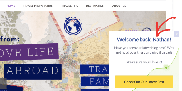
When returning users visit your website, you can address them by name and show them special offers or your latest content. This saves them from having to search through your website and allows you to put your best offers center stage.
You can create a marketing campaign like this with OptinMonster, the best lead-generation tool on the market.
With its premade campaign templates and smart tags, you can personalize how you communicate with your audience quickly and easily.
Check out this tutorial on how to personalize popups with your customer names for all the steps.
Alternatively, you can use a chatbot to display welcome messages to returning visitors. Here’s a list of the best live chat plugins to help you choose.
8. Verify a Visitor’s Age
If you run an online store selling adult products, you’ll need to ensure that only users above the legal age can access your site. This helps you stay within the law and keeps you safe from legal complications that can arise from underage users trying to buy your products.
One way to combat this is to add a welcome message requiring users to enter their birthdays to verify their age quickly. The Whisky Bar does this with a popup form in the example below:
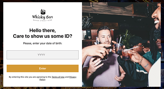
With measures like this in place, you can rest easy knowing your business is safe from potential legal issues. It’s also a great way to reassure visitors that you take their safety seriously.
If you’re unsure where to begin, you can see this guide on adding age verification to any website in just a few minutes.
9. Improve Webinar Registrations
Another excellent way to use a website welcome message is to promote an event or webinar. Since webinars help you build authority within your niche, they are essential for your sales funnel.
Here’s an example of how a welcome message for a webinar might look:
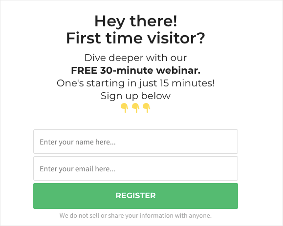
After users enter their email addresses, you can follow up with a welcome email and details about your webinar. Plus, you’ll also be able to send email campaigns in the future to nurture your relationship with those users based on their segmentation.
There are several ways you can make a welcome message like this. You can build a dedicated webinar registration landing page or use a popup plugin to display your welcome message in a lightbox popup.
10. Highlight Free Shipping
An additional strategy to use in a welcome message is to offer free shipping to your users because shipping costs are often a barrier to making a purchase. By offering free shipping in your welcome message, you can encourage users to take advantage of this offer and buy the products they desire.
When crafting your welcome message, highlight the free shipping offer prominently. In this example, we used SeedProd’s Alert box the make the message stand out:

This is an excellent welcome for people entering your site. Knowing that the price they see is the price they’ll pay is an extra incentive to add more items to the cart.
11. Boost Podcast Subscribers
Creating a website welcome message is also a great way to increase podcast subscribers and make listeners feel welcome. When someone discovers your podcast, you’ll want to make a good impression and give them a reason to keep listening.
One way to do this is to tailor a podcast landing page to new visitors. You can include a welcome message explaining why they should listen and support your show by subscribing.
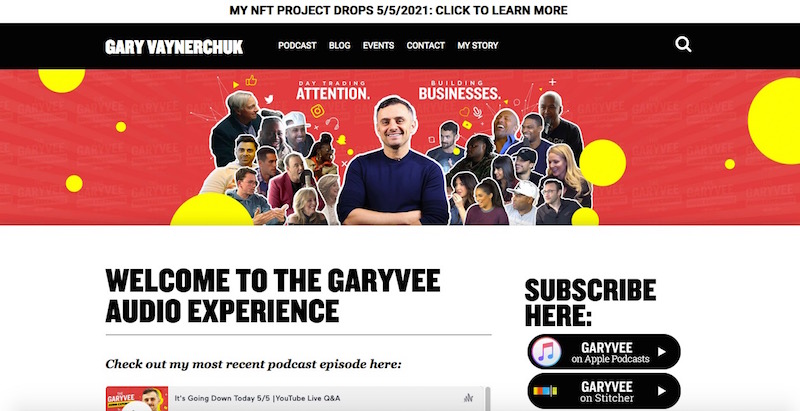
For example, you might mention that subscribers get early access to new episodes or exclusive bonus content. You can also let them know how to subscribe, whether through their favorite podcast app or by signing up for your email newsletter.
12. Redirect to Important Pages
Welcome messages can also help guide visitors to important pages on your website so they find the information they need.
When someone first lands on your site, they may need help figuring out where to go or what to do next. Therefore, a welcome message can help them get started and direct them to the most important pages on your site.
One way to do this is to include links to key pages in your welcome message. For example, you might link to your homepage, products or services page, about page, or contact page.

This can help visitors quickly find the information they need and get a sense of what your website has to offer. In this example, we made a welcome message using OptinMonster, but you an also create a message like this on your homepage with SeedProd’s page builder.
Bonus: Website Welcome Message Emails
Considering email open rates are 2-3 times higher than other messages, including a welcome email somewhere in your email automation pipeline is essential. When someone signs up for your email list, it’s a good idea to follow up with a welcome message thanking them for their interest and providing more information about your brand.
One way to use a welcome message email is with an intro about yourself and your business.
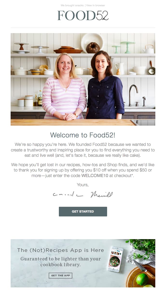
Let subscribers know who you are and why you’re passionate about what you do. This is a great chance to show your personality and help subscribers get to know you better.
Just as important is using a compelling subject line to grab attention and an eye-catching email template that shows your message in the best possible way.
There you have it!
We hope this article helped you find the best website welcome message examples for your business. By using them on your site, you can create a warm and engaging greeting that keeps your users coming back for more.
Before you leave, you might also like the following website guides:
- How to Write a Welcome Page for Your Website
- Stunning Website Layout Examples
- How to Use AI to Generate Images on Your Website
- Inspiring Website Header Examples You Need to Try
Thanks for reading! We’d love to hear your thoughts, so please feel free to leave a comment with any questions and feedback.
You can also follow us on YouTube, X (formerly Twitter), and Facebook for more helpful content to grow your business.


