Looking for website header examples for your WordPress site?
This tiny piece of real estate has the power to capture interest, convey your brand’s message, and help visitors navigate. Whether you’re designing a new website or refreshing an existing one, you need a user-friendly header design to make a strong first impression.
In this guide, we share some of our favorite website header examples and best practices for creating your own.
Table of Contents
What Is The Header of a Website?
Your website header is the first thing visitors see when they land on your site. Like a shop window, it needs to explain who you are, what you do, and encourage website visitors to explore your site further.
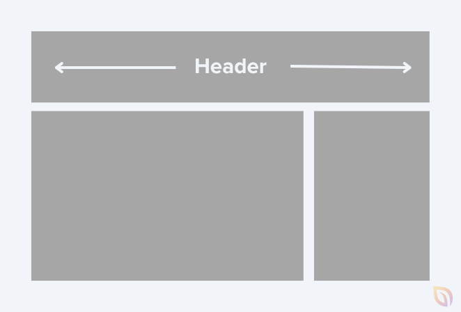
An eye-catching website header includes visual elements such as your brand’s company logo, site navigation, and, sometimes, a call to action (CTA). The colors, typography, and imagery you use should be consistent with your branding to create a recognizable look.
Beyond representing your brand identity, a good website header helps improve your site’s functionality and user experience. With clear navigation and relevant information, it helps visitors quickly find what they need, improving user engagement and retention.
Website Header Examples & Design Tips
As you approach your header design, it’s important to note that one size does not fit all. What works for one site might not work for yours. It all depends on your needs and the goals you’ve set for your website.
For inspiration and to see what might work best for you, let’s explore some successful and creative website header examples.
1. Single-Line Header with Left Aligned Logo
One of the most popular types of website header is one on a single line with a left-aligned logo. The reason for its popularity is its simplicity and easy navigation – two things any website should prioritize.
Here’s an example from one of our website template kits:
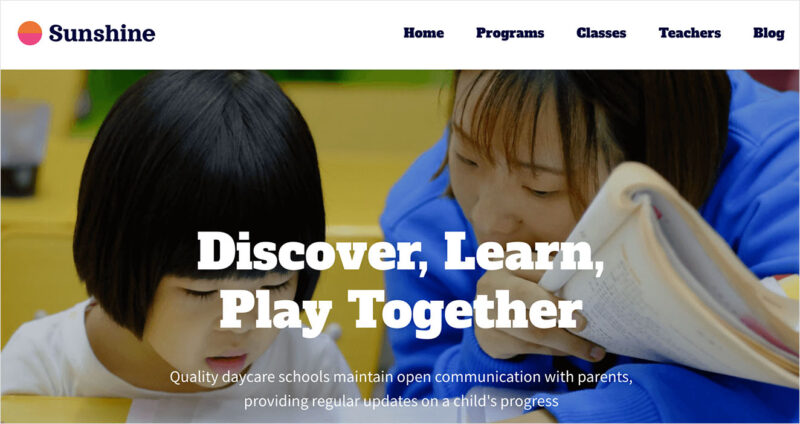
The left-aligned logo grabs the user’s attention immediately because it’s located right next to where most users start reading. It’s efficient, straightforward, and often the first thing a user sees.
Moreover, this header leaves room for links or calls to action on the same line, making it easier for visitors to navigate.
Key Features & Elements
- Left-aligned logo
- Navigation menu on the same line
- Clear fonts
- Consistent color scheme
- Ample white space
2. Two-Tier Header with Center-Aligned Logo
Another top choice for many website owners is a two-tier header with a center-aligned logo. This style gives your website a balanced and well-structured look while offering lots of information to visitors.
Here’s another site kit from our library with this style of header:
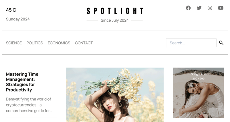
The two-tier design has space for two horizontal sections. While, the logo is in the center, drawing the eye to your branding.
This style of header allows you to spread out menu items for an uncluttered look.
For instance, the top tier could include contact information, social media links, and your tagline. Then you can dedicate the bottom to your main navigation menu.
Key Features & Elements
- Center-aligned logo
- 2 horizontal tiers
- Social media links
- Search box
- Category navigation
3. Header with a Sticky Menu
A sticky menu is a type of website header that stays fixed at the top of your site as visitors scroll. It ensures users can access your navigation wherever they are on the page.
This approach is an effective way to improve user experience. The research underscores this: according to Smashing Magazine, sticky navigation can cut browsing time by 22%.
This website header example from Dr Gillian Jack aligns beautifully with the minimalist design.

Users can scroll down to view qualifications and still quickly navigate to other pages.
Key Features & Elements
- Left, center, or right-aligned navigation
- Header sticks as users scroll
- Consistent branding
- Responsive design
4. Header with a Mega Menu
If you’re looking for a menu with plenty of options, mega menus are an ideal choice. They have a drop-down option that appears when users hover or click an element showing links grouped by category.
Here’s an example from WPBeginner, which has a clean, user-friendly mega menu.
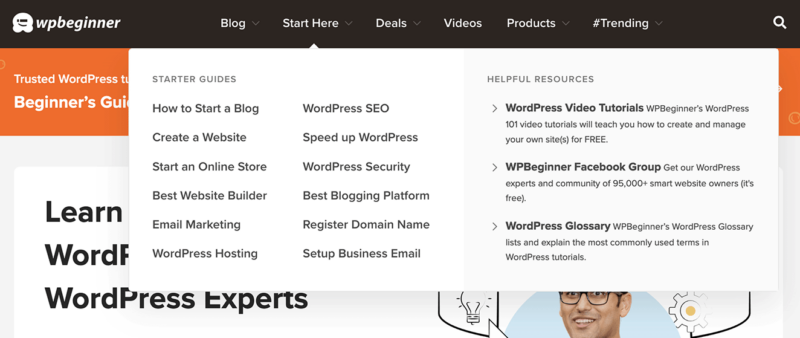
As you can see, they organize their most important content into clear sections based on what their visitors will find most helpful.
What sets a mega menu apart is it supports advanced features like images, icons, and widgets. This makes it ideal for large-scale websites with a lot of content, such as eCommerce websites or online portfolios.
Key Features & Elements
- Large drop-down menu
- Multi-column layout
- Rich media support
- Subcategories and sub-menus
- Hover and click functionality
- Search integration
5. Header with a Sticky Notification Bar
Many websites display a message above the main navigation that sticks to the top as you scroll. This is a sticky notification bar, and it’s great for showing short, actionable information.
In this website header example from Smash Balloon, you’ll see that their primary navigation bar disappears while the sticky message stays in place as you scroll.
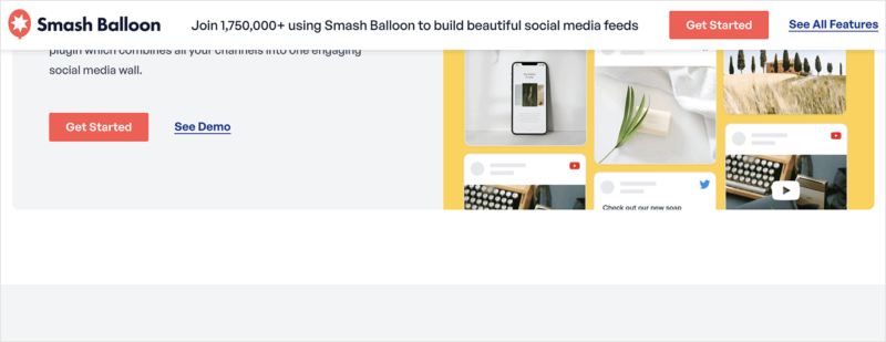
The design increases the visibility of certain messages or links, making sure they catch visitors’ attention.
In Smash Balloon’s example, they highlight a call to action button to get started with their products. However, you can use this space to announce new features, promote a sale, celebrate a milestone, and more.
Key Features & Elements
- Single column
- Sticky functionality
- Short, clear message
- Call to Action
- Countdown timer (for sales)
- Dismiss option
6. Left-Aligned Header with Vertical Navigation
If you’re aiming for a minimalist and modern look, a left-aligned header is a creative choice. It’s a design where the main header elements, such as the logo, navigation links, and call-to-actions, are lined up on the left side of the page, putting the focus on that area.
As you can see in this example from Believer Magazine, this approach guides the eye and allows for an intuitive, simple user experience.
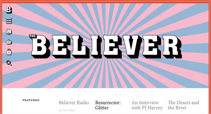
This style is quite popular among websites and blogs as it aligns well with the natural left-to-right reading flow. It also helps streamline your header design, prevents clutter, and promotes a clean, orderly look.
Key Features & Elements
- Left-aligned logo
- Vertical navigation menu
- Mobile-friendly design
- Social media icons
- Search box
7. Header with Hamburger Menu
Named after its resemblance to a hamburger – three stacked horizontal lines – this type of website header design stores navigation links in a collapsible menu. Whether you have a handful of links or dozens, this design saves precious space on your site.
Upon clicking the hamburger icon, navigation options appear either as a drop-down or slide-out menu.
The New York Times uses its hamburger menu to display a drop-down of article categories. It makes it easier for users on mobile devices to browse.
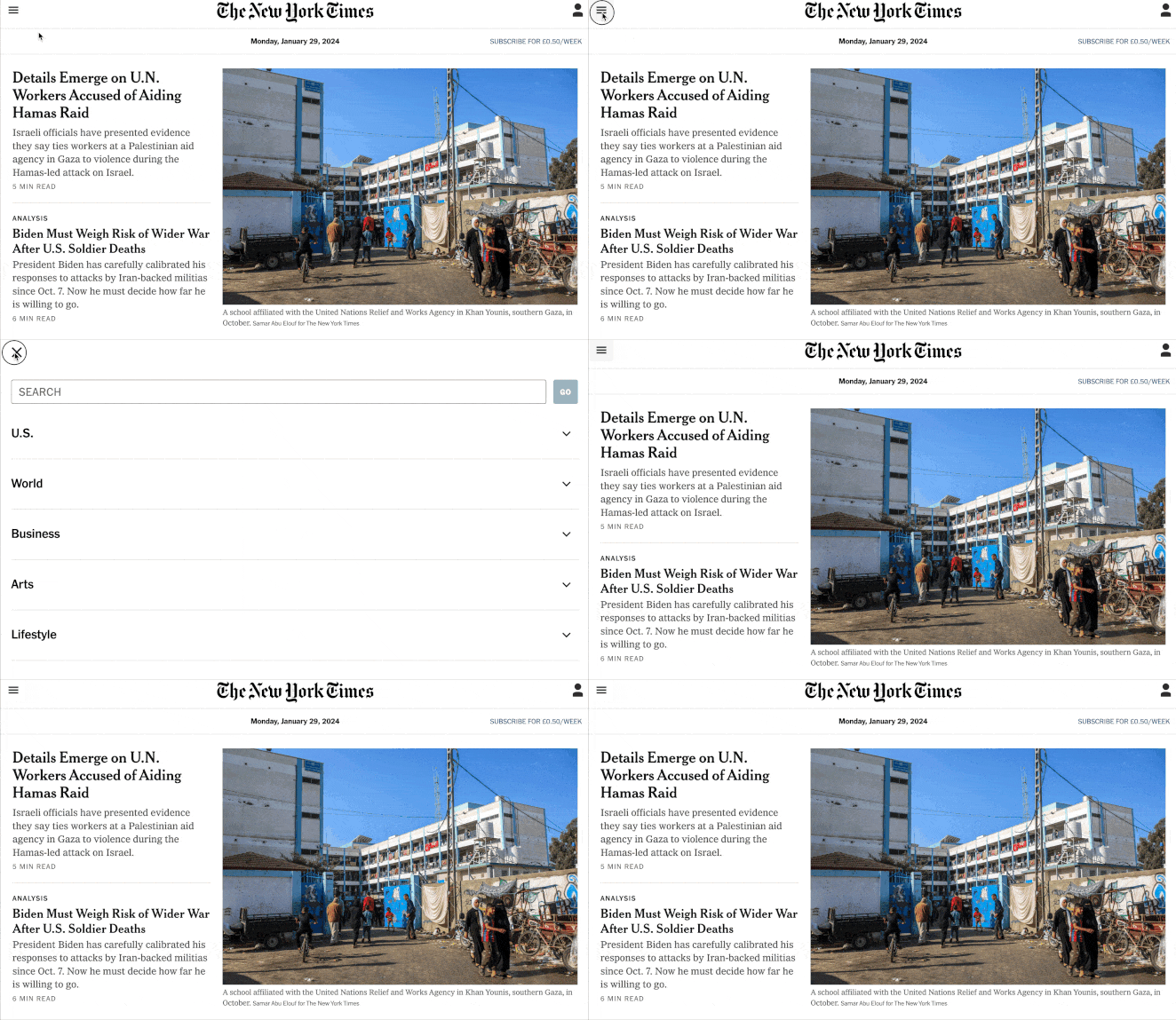
This style of header is popular with websites that have numerous navigation links or want a clean, minimalist layout with fewer distractions upfront.
Key Features & Elements
- Hamburger menu icon
- Mobile-friendly layout
- Expandable and collapsible
- Close button (optional)
- Keyboard navigation (for accessibility)
8. Header with Slide-In
Similar to the previous example, a header with a slide-in has a hidden menu that ‘slides in’ – typically from the left or right – when a user clicks or hovers over a button or element.
The Verge demonstrates this perfectly:
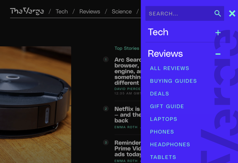
After clicking a plus icon, the menu slides in from the right with links to various categories and social icons. You can even expand the links to see subcategories.
This web design provides a clean, uncluttered look with easy access to various web pages or sections.
You’ll often see this type of header on mobile website versions for a touch-friendly user experience. However, it’s equally effective for desktop sites to maximize space.
Key Features & Elements
- Icon to expand slide-in menu
- Left or right slide-in effect
- Vertical navigation links
- Social media icons
- Categories and subcategories
9. Header with Multi-site Navigation
A header with multi-site navigation is a versatile option for those managing multiple websites or subsections of a single website. It offers an elegant solution that allows users to switch seamlessly between websites.
Here’s an example of how Old Navy uses a multi-site navigation header:
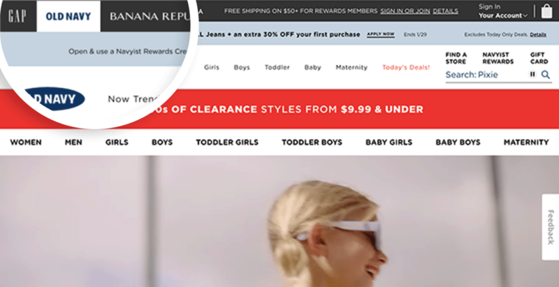
Users can quickly switch between their sister brands, GAP, Banana Republic, and Athleta.
The purpose is to provide unified branding across all sites while placing the navigation control in the user’s hands. The result is more visitor engagement, better user experience, and a boost to overall traffic.
Key Features & Elements
- Multi-tier header
- Links to multiple brand websites
- Main website navigation
- Login link (optional)
- Shopping cart (for eCommerce sites)
10. Mobile Optimized Header
We couldn’t wrap up this guide without mentioning mobile optimization. As its name implies, a mobile-optimized header has a design tailored for mobile devices to make mobile viewing effortless.
Here’s an example of a mobile header from RingCentral, one of the best VoIP services.
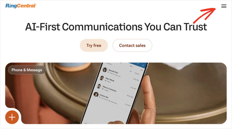
The header makes for easy reading and navigation without resizing, panning, and scrolling. The focal point is the same: the brand’s logo and website navigation, but it’s much easier to see and tap on a smaller screen.
Moreover, the hamburger icon tucks the navigation away, ensuring the links don’t crowd the mobile screen.
Key Features & Elements
- Mobile-responsive design
- Hamburger icon
- Compact layout
- Simple navigational elements
- Fast load times
Best Practices for Designing a Website Header
Now that you’ve seen some excellent website header examples, let’s look at the best practices for designing one.
- Ensure your header is responsive and adapts to different screen sizes. This is important for better user experience and SEO.
- Always feature your logo in the header. It’s an essential part of your brand and helps users quickly identify your business.
- Keep your design simple. The header shouldn’t have too many design elements. Keep it clean, ensuring the information is easily accessible and doesn’t distract or confuse your users.
- Include clear navigation. Aim to have primary and major site navigation easily reachable.
- Stay consistent. Your header design should fit with the rest of your website’s design.
- Emphasize important calls to action. If there’s a particular action you want users to take, consider featuring it in your header.
- Include a search bar in your header if your site has a lot of content that users may want to search for.
How to Make a Cool Website Header
There are several ways to design and build a header for your own website. One of the easiest approaches for WordPress websites is to use a website builder like SeedProd.
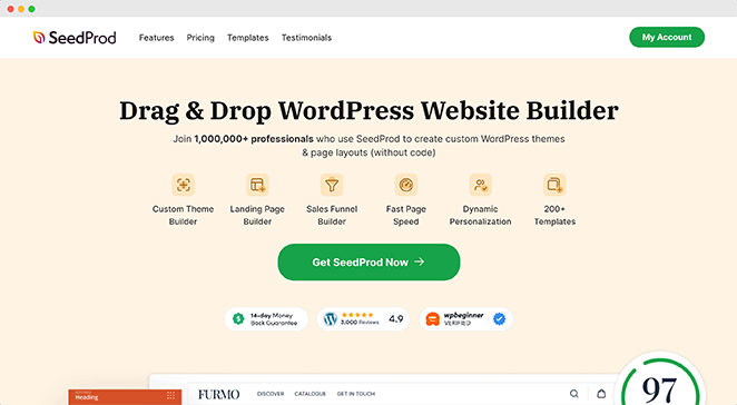
SeedProd is our favorite choice because it’s easy to use and doesn’t require coding. In fact, you can build your entire website with its drag-and-drop theme builder.
With its pre-built sections, you can design a professional header in minutes. You can even customize your homepage, footer, sidebar, blog, and other pages.
For all the steps, please see our guide on how to customize headers in WordPress.
Website Header FAQs
How do I make my header stand out?
To make your header stand out, focus on a bold logo, a catchy tagline, and varying header sizes. You can also consider having a transparent header, using a contrasting background color, adding links to landing pages and case studies, and displaying an eye-catching hero area below with bold header text.
Should my header be on every page?
Your header should appear on every page of your website to ensure easy navigation. This enables visitors to identify and access important sections of your site swiftly, regardless of the page they’re on.
What size should a website header be?
The size of a website header depends on its content. Generally, it should be between 100-200 pixels high, with a resolution of 72 dpi for optimal visibility and usability.
Get Started with a Responsive Website Header
We hope this guide gave you the website header examples you need to get started.
If you need more inspiration, you may enjoy the following tips and guides:
- How to Easily Add a Button to Your WordPress Header
- How to Create a Sticky Header
- How To Create A Header Template
- How to Create a Vertical Navigation Bar in WordPress
Thanks for reading! We’d love to hear your thoughts, so please feel free to leave a comment with any questions and feedback.
You can also follow us on YouTube, X (formerly Twitter), and Facebook for more helpful content to grow your business.


