

First impressions matter – a lot. Visitors can decide in seconds whether your website design is worth their time.
The secret to capturing their attention? It’s all in the website typography.
The right font styles can evoke emotions, build trust, and tell your brand’s story before visitors even read a single word.
In this guide, I’ll show you how to use typography in web design to transform your WordPress site into a visually stunning and engaging experience.
Table of Contents
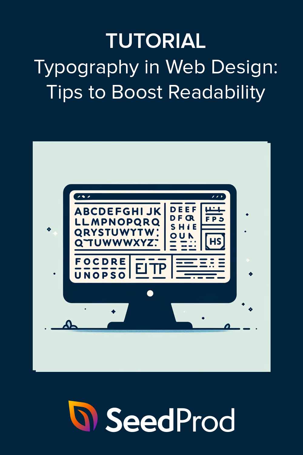
What Is Typography in Web Design?
Typography in web design is the art of arranging text elements on your website. It’s about choosing the right fonts, sizes, styles, and spacing to make your words look amazing and deliver your message with impact.
Think of it as giving your website’s text a makeover.
Why is Typography in Web Design Important?
Typography is the unsung hero of web design. It might not always be in the spotlight, but it plays a crucial role in how your audience perceives your website and brand.
Here’s why good typography is essential:
- Appeal and Professionalism: Well-chosen fonts and thoughtful text layouts instantly make your site look polished and professional. In fact, 38% of people will leave a website if they find the layout or content unattractive.
- Brand Expression: Typography subtly conveys your brand’s personality and values. A sleek, modern font might suggest innovation, while a classic serif font evokes tradition and reliability.
- Cohesive User Interface Experience: Consistent typography throughout your website creates a seamless experience for visitors, reinforcing your identity. Research shows that consistent branding can increase revenue by up to 33%.
- Readability: Effective typography makes web content easier to read, ensuring your audience stays engaged and explores your site further.
Best Practices for Typography in Web Design
Let’s dive into the fundamentals of web typography and discover how to optimize your WordPress website for maximum readability and visual appeal.
1. Choose the Right Typefaces
Fonts come in two main styles: serif (with little “feet” on the ends, like Times New Roman or Georgia) and sans serif (clean and modern, like Arial or Helvetica).

There are also monospaced fonts, where each character occupies the same width. These are often used for code snippets or technical documentation for better readability and alignment.
The best font for your website depends on your brand identity and target audience. A fashion blog might choose a sleek, sans-serif font, while a law firm might prefer a classic serif.

The key is to find fonts that complement each other, creating contrast and visual interest without overwhelming your readers. You can find a wide variety of different fonts from providers like Google Fonts or Adobe Fonts.
2. Pick Fonts That Load Quickly
When choosing a font for your website, you’re not just embedding a file like you would in a word processor. Web fonts are formatted to ensure compatibility across different browsers and devices.
Here are the most common formats you’ll encounter:
- WOFF (Web Open Font Format): A widely supported format known for its compression capabilities, making font files smaller and faster to load.
- WOFF2 (WOFF 2.0): An even more efficient version of WOFF, offering better compression and performance.
- TTF (TrueType Font): A standard font format, often used as a fallback option for older browsers that don’t support WOFF or WOFF2.
- EOT (Embedded OpenType): A legacy format primarily used for Internet Explorer, less common today due to its limited browser support.

Choosing the correct web font formats can significantly impact your website’s loading speed. Larger font files take longer to download, potentially frustrating visitors and harming your SEO rankings.
Here’s why it’s crucial to optimize your font choices:
- Faster Loading Times: Smaller font files translate to faster page loads, improving the user experience and reducing bounce rates. Research indicates that 47% of consumers expect a web page to load in 2 seconds or less.
- Better SEO: Search engines prioritize websites that load quickly, so optimizing your fonts can boost your visibility in search results. Google has confirmed that page speed is a ranking factor for desktop and mobile searches.
- Mobile Friendliness: Mobile users are especially sensitive to slow-loading websites. Optimizing font sizes and formats is essential for a seamless mobile experience. 53% of mobile site visits are abandoned if pages take longer than 3 seconds to load.
3. Optimize Font Size and Line Height
Font size and line height are all about creating a comfortable reading experience. A good starting point for body text is 16-18 pixels, but the ideal size can vary depending on your chosen font.
Line length, or the space between lines of text, is crucial for readability. Too little space makes your text look cramped, while too much space disrupts the flow. A general rule of thumb is to set your line height to 1.5 times your font size.

In addition to font size and line height, consider using different font weights to create contrast and visual interest. For example, using a bolder font weight for headings can help them stand out from the body text.
4. Mind Your Letter and Word Spacing
Letter and word spacing are the fine-tuning knobs of typography. Tracking (adjusting the overall space between letters) and kerning (fine-tuning the space between specific letter pairs) can improve readability, especially on digital screens.
Word spacing also plays a role. Too little space makes words feel crammed together, while too much space creates a choppy reading experience.

Generally, slightly increasing letter spacing for headings and titles can make them more impactful and easier to scan. For body text, aim for a comfortable balance where words are distinct but not isolated.
5. Prioritize Color Contrast and Background
Colors aren’t just about aesthetics; they also impact readability. Aim for a contrast ratio of at least 4.5:1 for regular text and 3:1 for larger headings. This ensures that people with disabilities like visual impairments can easily read your content.

Did you know? 1 in 12 men and 1 in 200 women have some form of color vision deficiency. In fact, a study by Monotype found that optimizing the font color contrast can improve reading speed by up to 25%.
6. Establish Hierarchy with Visual Cues
Imagine your website as a journey and your content as the roadmap guiding your visitors.
Heading styles (H1, H2, H3) act like signposts, showing the way through different sections and topics. A clear visual hierarchy, achieved through font size, color, and lists, ensures that no one gets lost – including those with visual impairments.
Visually, your H1 should stand out as the largest and most prominent element, like a bold headline announcing a major story. H2s and H3s should decrease in size, guiding readers through your content.

Strategically use color to highlight key points or calls to action, adding visual interest and emphasis.

Consider using lists and bullet points for complex information or lengthy paragraphs. These visual breaks make your content scannable and easy to digest, allowing readers to grasp key takeaways quickly.
Accessibility Tips:
- Structure your content using semantic HTML (H1, H2, H3) to make it easier for screen readers to navigate.
- Choose fonts that are easy to read for people with dyslexia, such as sans-serif typefaces with simple letterforms and consistent spacing (e.g., Open Dyslexic, Arial, Verdana).
- Optimize line spacing (aim for 1.5 times the font size) to improve readability.
- Avoid justified text, as reading it can be more challenging for people with visual impairments.
7. Leverage the Emotional Impact of Typography
Fonts aren’t just about how easy they are to read. They can also subtly influence how we feel and think. The fonts you choose can trigger certain emotions and ideas, which can really affect how people experience your message.
For example, fonts with tails on the letters (serif fonts) make people think of tradition, importance, and reliability. They’re like the font version of a fancy suit! That’s why newspapers like The New York Times and universities often use them – they want to seem serious and trustworthy.

Fonts without the tails (sans serif fonts) are all about clean lines and a modern look. They feel friendly, easy to talk to, and like they’re up-to-date with the latest trends. That’s why tech companies and startups love them – they project an image of being fresh and innovative.

Fancy fonts that look like handwriting (script fonts) feel creative, classy, and maybe even a little romantic. That’s why you see them on wedding invitations, fancy perfume ads, and websites that want to feel artsy.

Big, bold fonts are all about grabbing eyeballs. They can be fun and playful, whimsical and quirky, or even loud and dramatic.
Think of them as the attention-seekers of the font world. That’s why they’re great for posters, flyers, or anything that needs to stand out.
A study by Dasol Han using Kansei Engineering revealed how specific text features impact emotions:
- Vibrancy: Noteworthy font with italics perceived as most vibrant.
- Comfort: Normal spacing is considered more comfortable.
- Harmony: Times New Roman in bold is perceived as harmonious.
- Happiness: Times New Roman, in sentence case, evokes happiness.
- Modernness: Arial and sentence cases are seen as modern.
- Confidence: Arial with normal spacing induces confidence.
- Preference: Normal spacing and Times New Roman in sentence case preferred.
8. Embrace Mobile-First Design
Fonts also need to work well on tiny phone screens. Here’s how to adjust your fonts for mobile:
- Bigger is Better: Make those fonts a little bigger on mobile so people don’t have to squint to read.
- Space Things Out: Give your lines of text some breathing room by increasing the line height on mobile.
- Keep it Simple: Fancy fonts might be fun on desktop, but they can be a mess on mobile. Stick to clean, easy-to-read fonts for phones.
- Readability First: No matter what, make sure your text is crystal clear on mobile, even in different lighting or on older phones.
By following these tips, your website will be easy and enjoyable to use for everyone, no matter what device they’re on.
9. Remember Additional Readability Factors
There’s more to good website text than just fonts. Here are some extra readability tips:
- Short & Sweet Paragraphs: Break up your text into smaller chunks of 2-3 sentences. This makes it easier to digest and less intimidating for readers.
- White Space is Your Friend: Don’t cram everything together! Leave space between your lines and paragraphs to give your readers’ eyes a break.
- Left is Best: Stick to left-aligned text for most of your website. Fancy alignments can be tricky to read, especially on mobile.
- Go Easy on Effects: A little text-shadow or animation can be fun, but don’t overdo it. Clear text is always better than fancy effects.
- Mobile Matters: Test how your website looks on phones. Fonts that look good on desktop might be tiny and unreadable on mobile screens.
What Are the Latest Web Typography Trends?
Web typography is a dynamic field, constantly evolving with new trends and innovations. Here’s a glimpse into the future:
Bold & Experimental Typefaces

Break free from the traditional and embrace unconventional fonts that make a statement. Use them strategically to add personality and visual interest.
3D Typography

Create immersive experiences with text that pops off the screen and adds depth to your website.
Minimalist Typography

Embrace clean, simple typefaces that prioritize clarity and elegance. This timeless approach lets your content shine.
Animated & Interactive Typography

Bring your website to life with moving text, interactive elements, and playful animations.
Variable Fonts

Enjoy unprecedented flexibility with fonts that adapt to different styles and weights without compromising loading speed.
Hand-Lettered & Hand-Drawn

Infuse warmth and personality into your design with hand-crafted typography that feels authentic and unique.
Outline & Layered Fonts

Add depth and visual interest with fonts that feature outlines, shadows, or multiple layers.
Retro & Vintage Fonts

Tap into the power of nostalgia with retro-inspired fonts that evoke specific eras or styles.
Use SeedPod to Improve Your Site’s Typography

With SeedProd, the best WordPress website builder, you can easily implement these typography best practices.
Its user-friendly drag-and-drop interface can help you:

- Choose curated font themes: These pre-selected font pairings look great together, taking the guesswork out of font selection.
- Access hundreds of Google Fonts: Explore high-quality web fonts to find the perfect match for your brand.
- Upload your own fonts: Have a unique font you love? Easily upload and use it on your website.
- Customize every detail: Simple controls allow you to easily change fonts and adjust spacing, line height, and other typographic elements.
- Preview on mobile: Use the mobile preview feature to see how your typography looks on different screen sizes and adjust as needed.

Over to You
Typography is the secret weapon in web design. It can help you craft a website that looks stunning and delivers an exceptional user experience.
By choosing the right fonts, optimizing spacing, prioritizing readability, and experimenting with the latest trends, you can take your WordPress website to new heights.
With SeedProd, you have all the tools you need to create a visually appealing and user-friendly website.
You can also see our guides for even more helpful WordPress web design tips:
- How to Change Fonts in WordPress Themes
- How to Easily Add Font Awesome to Your WordPress Theme
- How to Change Margins in WordPress
- How to Redesign a Website Without Losing SEO
Thanks for reading! We’d love to hear your thoughts, so please feel free to leave a comment with any questions and feedback.
You can also follow us on YouTube, X (formerly Twitter), and Facebook for more helpful content to grow your business.