Want more customers? Of course you do!
Businesses with 30+ landing pages get 7x more leads than those with only 1-5. Source: HubSpot. That’s a lot more potential customers.
But, having any landing pages is not enough. You need sales funnel landing pages, which are built to turn visitors into buyers.
In this guide, I’ll show you exactly how to make a sales funnel landing page, even if you’ve never done it before.
How to Build a Sales Funnel Landing Page:
What is a Sales Funnel Landing Page?
A sales funnel landing page is a special page on your website with one job: to get people to buy something. It’s different from other types of landing pages because it’s laser-focused on making sales.
Think of it this way: a regular landing page on your website might have many different things going on. It might have information about your company, your products, your blog, and more, which can be confusing for visitors.
But a sales funnel landing page is different. It has one clear goal, and everything on the page is designed to help visitors reach it.

Why Sales Funnel Landing Pages are Important
- More Sales: Because sales funnel landing pages are so focused, they’re good at getting people to buy.
- Better Leads: You’ll attract the right kind of customers—people who are actually interested in what you’re selling.
- More Money: More sales mean more money for your business.
Stages of a Sales Funnel Landing Page
Now that you understand what a sales funnel landing page is, let’s explore how it works.
A typical sales funnel has three main stages, each needing a specific type of landing page. Think of these stages as steps on a ladder, leading your customer to their goal (and your sale).
Stage 1: Top-of-Funnel (TOFU)
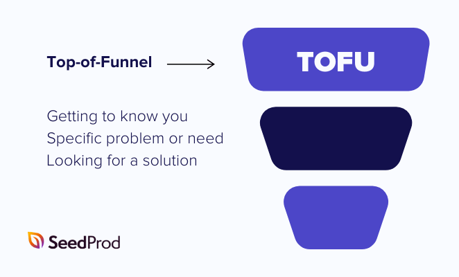
At the top of the funnel, potential customers are just getting to know you. They might have a problem or need, but they’re not quite sure what the solution is or who to trust.
The goal of a TOFU landing page is to:
- Grab Attention: Use eye-catching headlines and images to make visitors stop scrolling.
- Spark Interest: Highlight the problem your product or service solves in a way that resonates with your target audience.
- Build Trust: Establish credibility with testimonials, case studies, or data points.
Some examples of TOFU landing pages include coming soon pages, blog posts, and educational resources.

Stage 2: Middle-of-Funnel (MOFU)
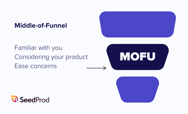
Okay, now your potential customer is familiar with your brand and what you offer. They’ve moved from the “awareness” stage to the “consideration” stage. This is where MOFU landing pages come in.
The goal of a MOFU landing page is to:
- Deepen Engagement: Provide more detailed information about your product or service and how it addresses their needs.
- Overcome Objections: Address any doubts or concerns they may have about making a purchase.
- Nurture the Relationship: Offer valuable resources that keep them engaged and move them closer to a decision.
Some good examples of MOFU landing pages include product demo pages, comparison pages, and case study landing pages.
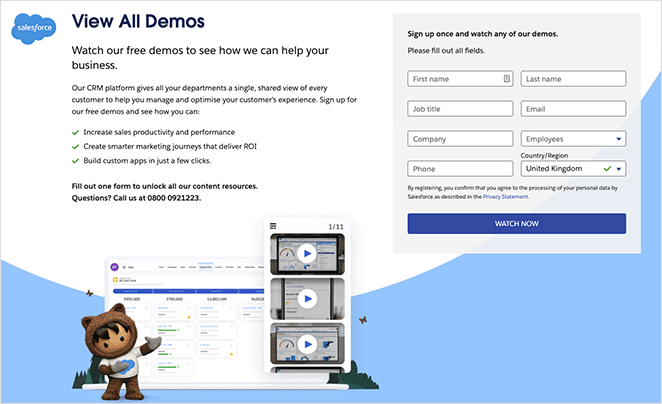
Stage 3: Bottom-of-Funnel (BOFU)
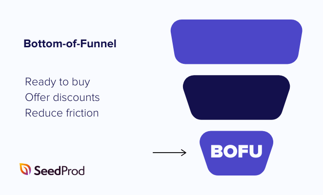
Your potential customer is close to making a purchase. They’ve researched and compared options and are almost ready to commit. This is where BOFU landing pages seal the deal.
The goal of a BOFU landing page is to:
- Drive Conversions: Make it as easy as possible for leads to take the final step and purchase.
- Create Urgency: Use limited-time offers and discounts or highlight scarcity to encourage immediate action. Studies have shown that using scarcity tactics on your landing page can boost conversions by up to 332%. Source: CXL
- Reduce Friction: Simplify the checkout process and provide clear instructions to minimize roadblocks.
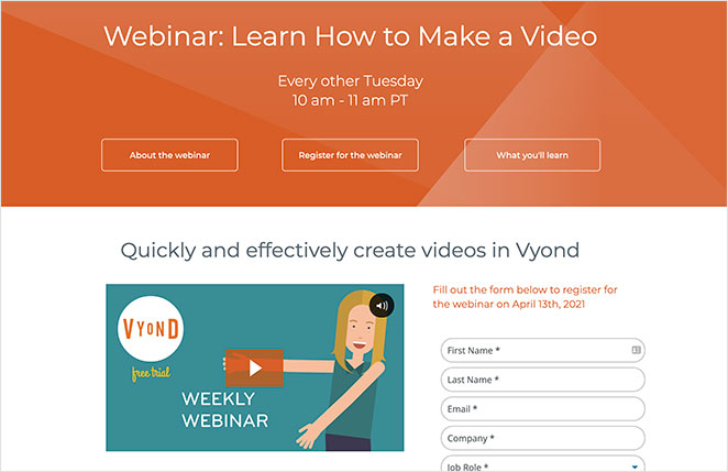
Some examples of BOFU landing pages include sales pages, free consultation pages, and even product-specific webinar registration pages.
Sales Funnel Landing Page Best Practices
To create a successful sales funnel landing page, you need to do more than just make it look good. You also need to consider how to best convert visitors into customers.
Here are some best practices to help you get started:
Make It Easy to Understand
Keep your landing page simple and easy to read, with clear headlines and high-quality images.

Remember, over 58% of people visit websites on their phones, so make sure yours looks good on any device. Source: Statista
Tell People What to Do
Your call to action, which is the button they click, should be obvious. Use action words like “Download Now” or “Get Started Today.”

A clear call to action gets more people clicking, which means more sales.
Make It Personal
If possible, change your landing page based on who is visiting. This shows them you understand their needs. For example, you might offer different things to different types of customers.
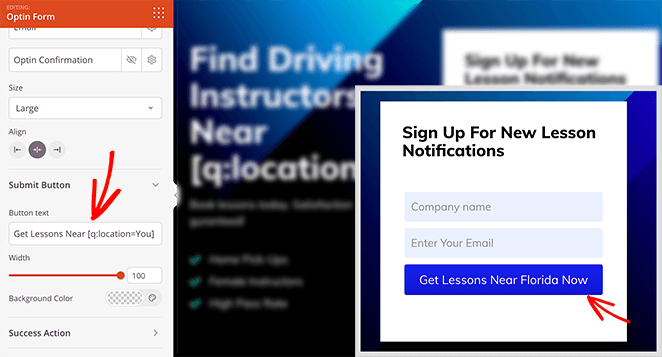
I’ve even written a guide on how to create a personalized landing page with all the steps.
Keep Testing and Improving
Don’t be afraid to try different things. See what happens when you use different headlines, images, or button placements.
Run A/B split testing on your pages and analyze the data to see what works best. With minor changes, you can make your landing page even better over time.
How to Create a Sales Funnel Landing Page in WordPress
As you’ve learned, building a successful sales funnel helps guide website visitors toward making a purchase. And while SeedProd might not have built-in sales funnel features, you can still use it to build the pages you need for each stage of your funnel.
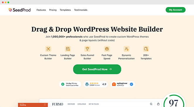
SeedProd is a drag-and-drop WordPress landing page builder that makes creating professional-looking landing pages easy without coding. You can also use it to create custom WordPress themes from scratch and customize them any way you like.
Here’s how to use SeedProd to make a sales funnel landing page.
1. Install and Set Up SeedProd
First, visit the SeedProd website, then download, install, and activate the plugin. If you need help with this step, please see our documentation on how to install SeedProd.
While there’s a free version of SeedProd, I’m using SeedProd Pro for the extra Pro templates and blocks.
2. Choose a Landing Page Template
Upon installation, go to SeedProd » Landing Pages from your WordPress dashboard and click the “Add New Landing Page” button.
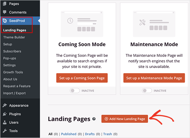
This allows you to browse hundreds of premade landing page templates to use as the foundation for your design.
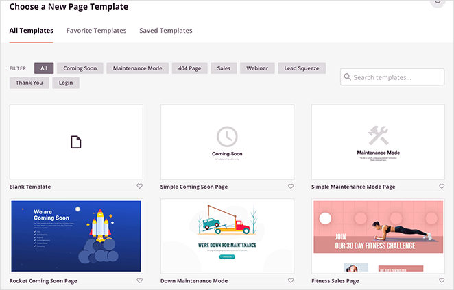
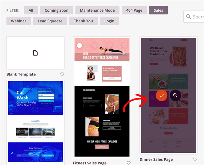
Use the filters at the top to find a template that works for the type of funnel page you’re building.
For example, if yours is a TOFU page, you could use “Lead Squeeze,” “Webinar,” or “Coming Soon” to grab people’s attention and collect their contact info.
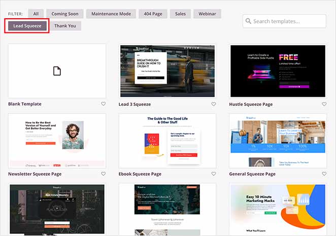
Or, for BOFU pages, the Sales filter has plenty of templates for creating high-converting sales pages.
I’ll use the “Dinner Sales Page” template for this guide. To choose it, simply hover over the thumbnail and click the checkmark icon.
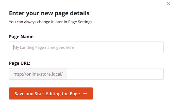
Next, give your page a name and URL, then click the “Save and Start Editing the Page” button.
3. Customize Your Sales Funnel Landing Page
On the next screen, you’ll see the drag-and-drop page editor. On the left are blocks and sections you can add to your page. Then, on the right is a live preview of any changes you make.
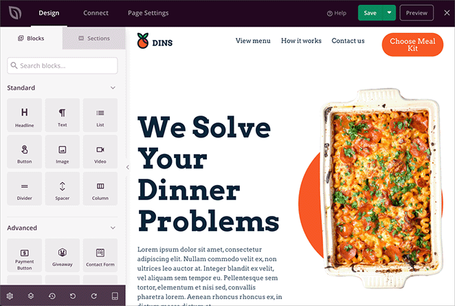
You can easily change the content, fonts, colors, images, and much more by pointing and clicking.
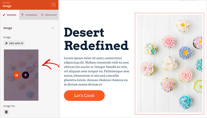
For example, you can change the images by clicking any image block, deleting the placeholder, and choosing a new photo from your computer or WordPress Media library.
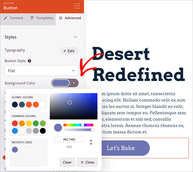
Changing button colors is also easy. Click the button block, then select the “Advanced” tab in the left-hand panel.
From there, find the “Background Color” option and use the color picker to select a new one for your call-to-action button.
Earlier in this guide, I explained how trust signals and social proof can help you build credibility with hesitant visitors. OptinMonster’s social proof statistics show that the average consumer reads about 10 online reviews before purchasing.
Adding testimonials to your landing pages is a great way to build trust. With SeedProd, adding testimonials is super easy. Simply drag and drop the Testimonials block onto your page, then customize the content and appearance to fit your brand.
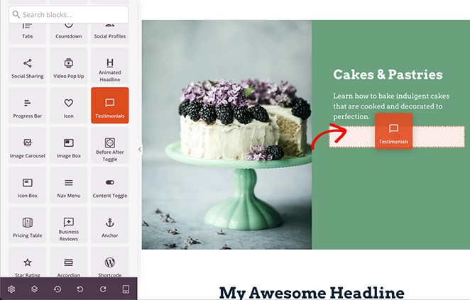
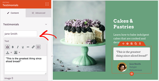
You can even add the reviewer’s headshot and title and customize the text bubble with a few clicks.
And remember those high-converting CTAs we talked about? SeedProd’s Opt-In Form block makes creating attention-grabbing forms that capture leads simple.
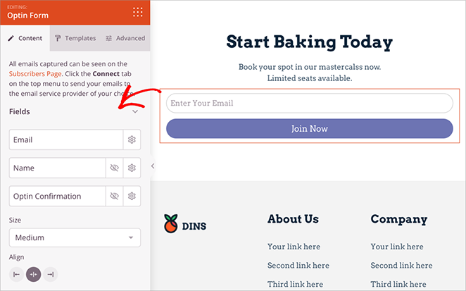
You can customize the form fields and button text and even connect it directly to your email marketing service to streamline your lead generation process.
As you work on your design, click the Save button in the top right corner to save your changes.
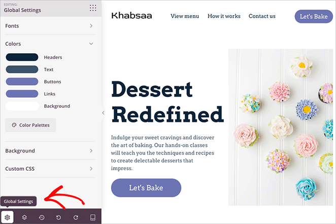
Pro Tip: Want to save time while designing? Use SeedProd’s Global Settings to apply color and font changes to your entire landing page with a single click, ensuring a consistent look and feel.
4. Connect to Your Email Service
When someone gives you their email address, you want to add them to your email list so you can stay in touch. SeedProd makes connecting your landing pages to your email list easy, whether you use Constant Contact, ConvertKit, or another service.
To do this, find the “Connect” tab at the top of the builder and choose your email marketing service from the list.
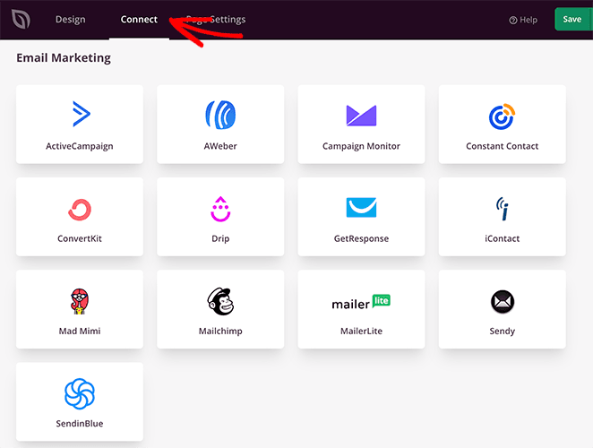
Each email service has a slightly different way of connecting, but SeedProd will show you exactly what to do.
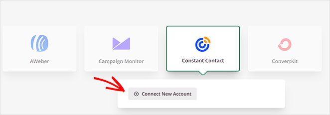
Now, when someone fills out your form on your landing page, they’ll automatically be added to your email list. You can even set up automatic emails to welcome them and share helpful information.
5. Preview and Publish Your Landing Page
Before you launch your sales funnel landing page, it’s always a good idea to double-check that everything looks exactly how you want it to.
You can do this using SeedProd’s built-in preview options, which look like a mobile icon in the bottom toolbar.
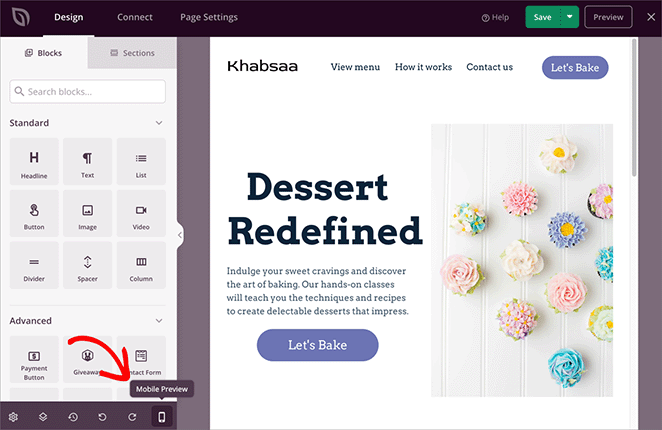
This will let you see your landing page as it will appear to your visitors on mobile, desktop, or tablet devices.
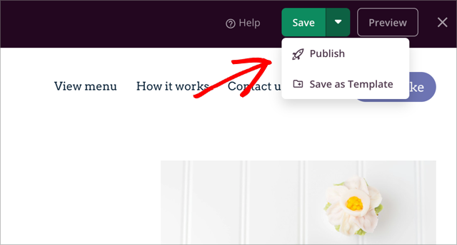
Once you’re happy with your design, save your changes by clicking the “Save” button. Then, when you’re ready to go live, click the down arrow on the Save button and select “Publish.”
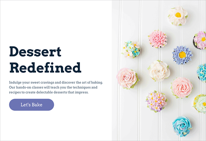
Now, you have a shiny new sales funnel page ready to bring in those leads and conversions.
Build Your Sales Funnel Today
See? Building sales funnel landing pages that get results is easier than you thought.
Just remember these key takeaways:
- Think like your customer: Use your landing pages to guide people toward a purchase, step by step.
- SeedProd is your secret weapon: Easily create beautiful, high-converting landing pages without any tech headaches.
- Don’t be afraid to experiment: Try different things to see what works best for your audience.
Ready to start growing your business? Get started with SeedProd today to create sales funnel pages that convert.
You may also find these landing page guides super helpful:
- Anatomy of a Landing Page: 9 Essential Elements
- Landing Page Best Practices for Incredible Conversion Rates
- Landing Page URL Examples and Best Practices
- How to Create a Landing Page with Countdown Timer
- What Is a Good Landing Page Conversion Rate
Thanks for reading! We’d love to hear your thoughts, so please feel free to leave a comment with any questions and feedback.
You can also follow us on YouTube, X (formerly Twitter), and Facebook for more helpful content to grow your business.

