Are you looking for some inspiring one product store examples?
One product stores focus on a single, standout product, streamlining their inventory and marketing efforts. But don’t be fooled by their simplicity – creating a successful one-product store takes a thoughtful blend of smart design and effective strategy.
That’s where we come in. In this guide, I’ll share 20 outstanding one product store examples, all to inspire your own eCommerce journey.
Table of Contents
What is a One Product Store?
A one-product store is an online shop that sells one main product or a closely related product line. The store’s entire brand and marketing strategy revolves around that single item.
Why choose this model? Focusing on one product lets you:
- Streamline your business: Simplify inventory management, marketing, and customer support.
- Build a strong brand identity: Craft a laser-focused message around your unique product.
- Maximize marketing efforts: Concentrate your resources on promoting a single, compelling item.
Key Elements of a Successful One-Product Store
A successful one-product store nails the essentials. Here’s what to focus on:
- Smooth Navigation: Make sure your website is easy to navigate. Customers should find what they need quickly, without any confusion.
- Show Off Your Product: High-quality photos and videos are a must. Showcase your product from every angle, highlighting its best features.
- Build Trust: Display customer reviews, testimonials, or awards to show potential buyers that your product is legit.
- Tell a Story: Your product description should include more than just features. It should tell a compelling story about how your product solves problems or improves lives.
- Guide the Buyer: Include clear, eye-catching calls-to-action (CTAs) that encourage visitors to “Buy Now” or “Learn More.”
Examples of Successful One-Product Stores
Now that you know what elements to look for, let’s see them in action. I’ve hand-picked 20 one-product stores that are crushing it online and turning curious visitors into loyal customers.
1. Daylight
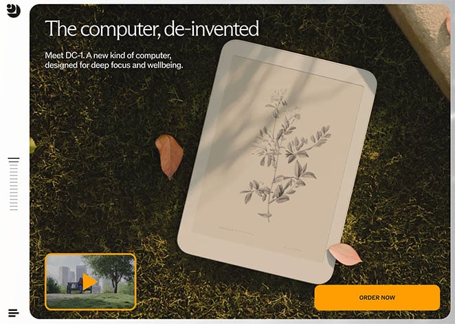
Daylight isn’t just a tablet; it’s a calm oasis for your eyes. Its 60hz e-paper display, free of blue light and eye strain, is a game-changer. And its website? It’s a minimalist’s dream, making it easy to find everything you need.
What Sets It Apart:
- The website focuses on eye health and user comfort, its top selling points.
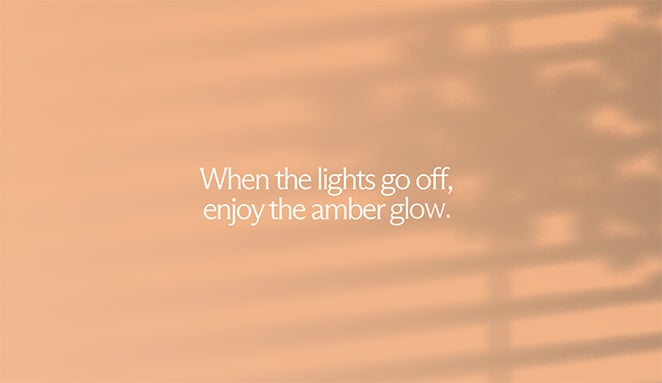
- The clever design taps into customer’s paint points like reading at night.
Why I’m a Fan:
I’m smitten with Daylight’s thoughtful website design. Its focus on user experience helps you imagine using the product before you’ve even ordered.
2. OneWheel
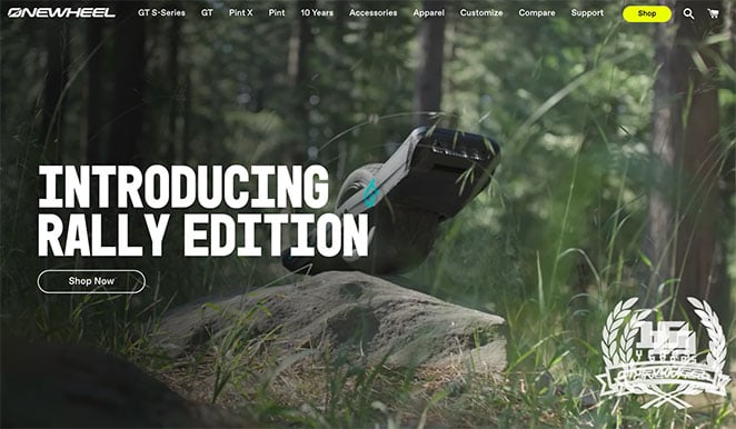
OneWheel is redefining personal transportation with its self-balancing electric skateboard. Whether carving up city streets or exploring off-road trails, this thing is a blast. Their website is a visual feast packed with high-def videos and images that capture the thrill of the ride.
What Sets It Apart:
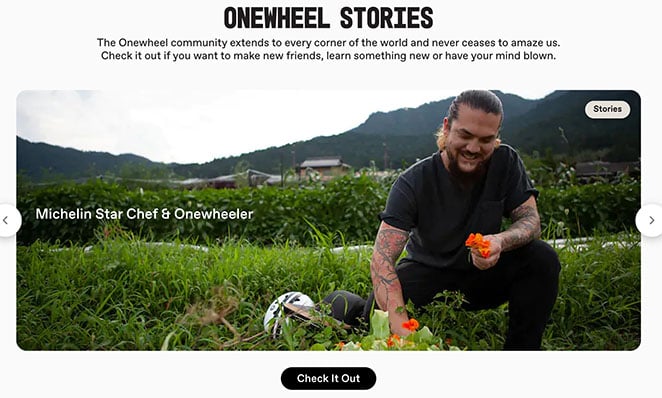
- The community focus is strong, with a dedicated section for user stories and engagement.
- High-quality multimedia content brings the product to life.
Why I’m a Fan:
OneWheel captures the spirit of adventure and freedom perfectly. Their videos and user stories make you want to hop on and experience the thrill for yourself.
3. Palmpress
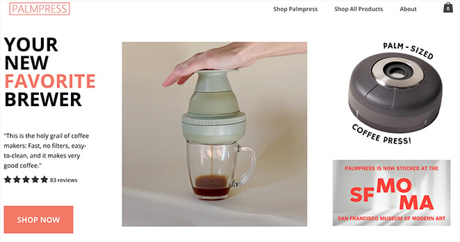
Palmpress has a simple yet brilliant idea: a compact coffee press for single servings. Fresh, delicious coffee without the fuss. Their one product store is as clean and inviting as their product, with bright colors and mouthwatering images.
What Sets It Apart:
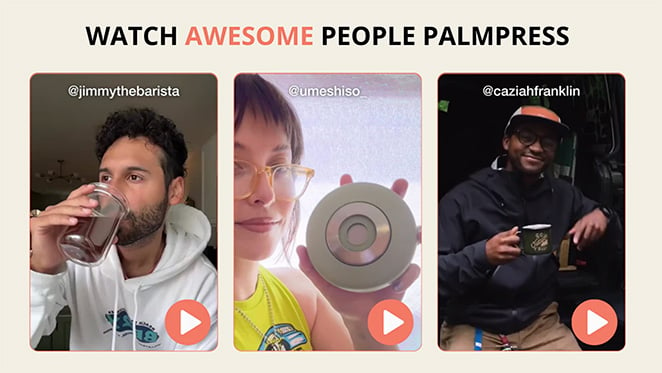
- They don’t just sell a product; they offer user-generated content (UGC) that teaches you how to make the perfect cup of coffee.
- The minimalist design is user-friendly and focused on the essentials.
Why I’m a Fan:
Palmpress gets it right by combining sleek design with educational content. It’s a perfect example of how to enhance the user experience beyond the product itself.
4. Loom
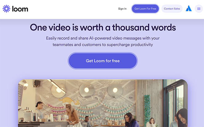
Loom is all about simplifying communication. Their video messaging tool makes it easy to record and share messages instantly, perfect for remote teams or anyone who hates typing out long emails.
What Sets It Apart:
- The website is all about the user, with clear messaging and helpful resources.
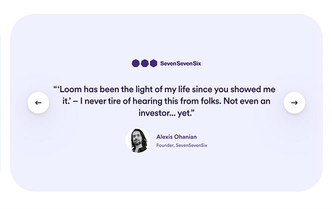
- Interactive elements like demo videos and testimonials make seeing the product in action easy.
Why I’m a Fan:
Loom shows how a tech product can be both functional and fun. The website’s design and content make it a breeze to understand and use.
5. Neck Hammock
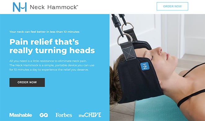
Neck Hammock offers a simple yet effective solution for neck pain and tension: a portable, easy-to-use hammock for your neck. Their website gets straight to the point, focusing on the product’s benefits and the positive experiences of real users.
What Sets It Apart:
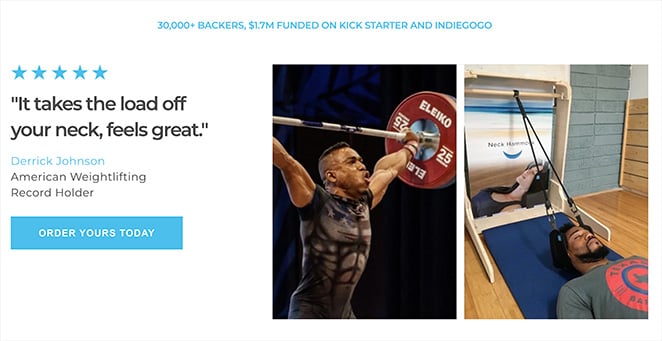
- The emphasis on user testimonials builds trust and credibility.
- The website provides comprehensive information on how to use the product effectively.
Why I’m a Fan:
Neck Hammock is an excellent example of simplicity done right. The website is straightforward, informative, and focuses on what matters most: helping people find relief.
6. Shipt
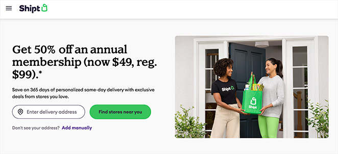
Shipt is your go-to for same-day grocery delivery from local stores. Their website is a breeze to use, making it a lifesaver for busy folks who just don’t have time to hit the aisles.
What Sets It Apart:
- The user-friendly design and clear benefits make it a no-brainer for anyone who hates grocery shopping.
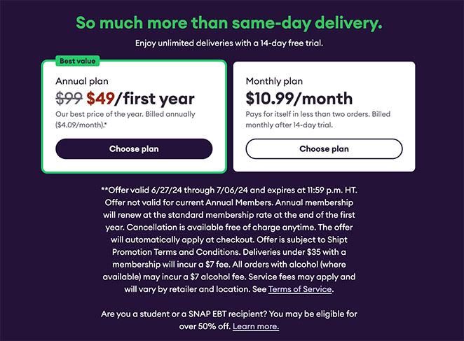
- The seamless sign-up process and detailed delivery information make it super convenient.
Why I’m a Fan:
Shipt’s one-product store takes the hassle out of grocery shopping, giving me more time to do the things I actually enjoy.
7. Fybelle
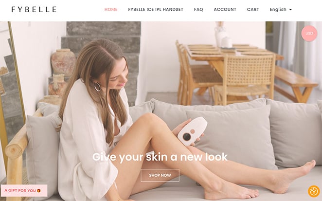
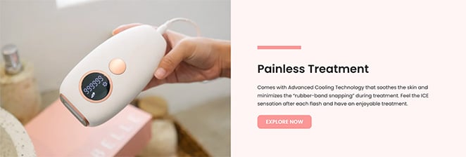
Fybelle offers a revolutionary hair removal handset that puts you in control of your smooth skin journey. Their website feels like a modern beauty haven, with a sleek design and empowering messaging. They guide you through the process of finding the perfect hair removal solution for your needs.
What Sets It Apart:
- Focuses on empowering individuals to achieve smooth, hair-free skin on their own terms.
- The website provides comprehensive information about the technology and its benefits.
Why I’m a Fan:
Fybelle makes hair removal feel effortless and accessible. Their website is a testament to their commitment to helping people feel confident in their own skin.
8. Bokksu
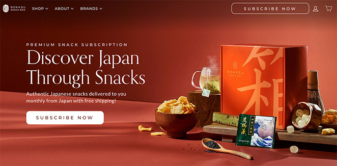
Bokksu is a snack lover’s dream come true. Each box is filled with authentic Japanese treats, complete with a booklet that explains the regions and flavors. Their website is a vibrant celebration of Japanese culture and cuisine.
What Sets It Apart:
- Bokksu isn’t just about snacks, it’s a cultural experience.
- The website design is as fun and engaging as the snacks themselves.
Why I’m a Fan:
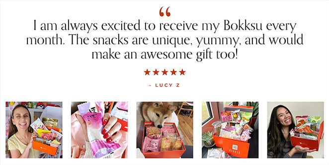
Bokksu is my monthly dose of joy, and their website makes me feel like I’m traveling through Japan without leaving my couch.
9. Madsen Cycles
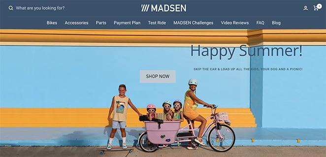
Madsen Cycles has nailed the family-friendly bike game. Their cargo bikes are stylish, durable, and perfect for hauling kids and cargo. Their website is filled with photos of happy families enjoying their bikes, making you want to join the fun.
What Sets It Apart:
- The website seamlessly blends style and practicality.
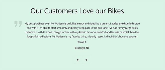
- Customer testimonials and family stories make the brand feel authentic and relatable.
Why I’m a Fan:
Madsen Cycles understands that family biking is about more than just transportation; it’s about making memories. Their website perfectly captures that spirit.
10. ReMarkable
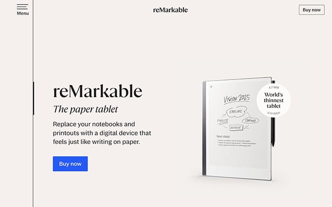
ReMarkable is a digital notepad that feels like writing on paper. It’s a game-changer for note-takers, students, and anyone who loves the feel of pen on paper but wants the convenience of digital. Their website is sleek and professional, just like their product.
What Sets It Apart:
- The clear and focused messaging makes it easy to understand the product’s value.
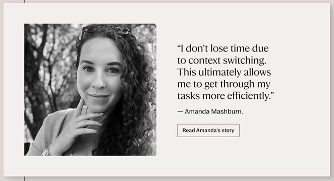
- Product demos and reviews give you a real feel for how it works.
Why I’m a Fan:
ReMarkable is the best of both worlds: the joy of writing by hand with the organization and convenience of digital notes. Its one-product store captures this perfectly with its design.
11. Death Wish Coffee
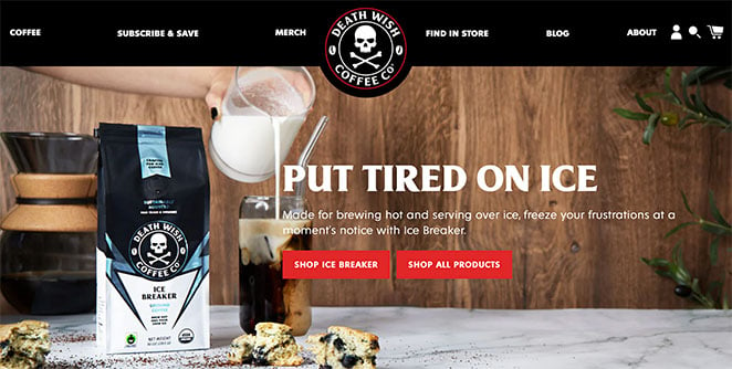
Death Wish Coffee isn’t for the faint of heart. It’s the world’s strongest coffee, and their website screams it. Dark colors, striking visuals, and edgy branding perfectly capture the essence of their product.
What Sets It Apart:
- The distinctive branding and strong visual identity make it unforgettable.
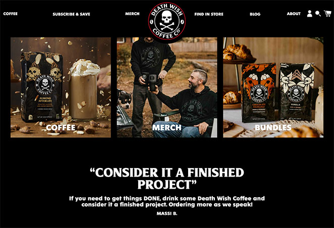
- Engaging content like videos and testimonials make you feel part of the Death Wish community.
Why I’m a Fan:
Death Wish Coffee knows its audience and caters to it perfectly. Its website is as bold and daring as its coffee.
12. Snooz
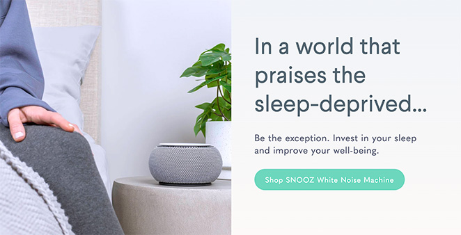
Snooz is all about helping you get a good night’s sleep. Their white noise machine creates a peaceful sound environment that blocks out distractions. The website is calming and informative, focusing on the science of sleep and the benefits of white noise.
What Sets It Apart:
- The website goes beyond selling a product, offering valuable sleep tips and resources.
- The calming design and soothing colors create a relaxing experience.
Why I’m a Fan:
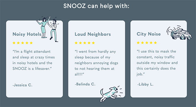
Snooz understands that sleep is essential for well-being. Their website is a testament to their commitment to helping people sleep better.
13. Gravity Blankets
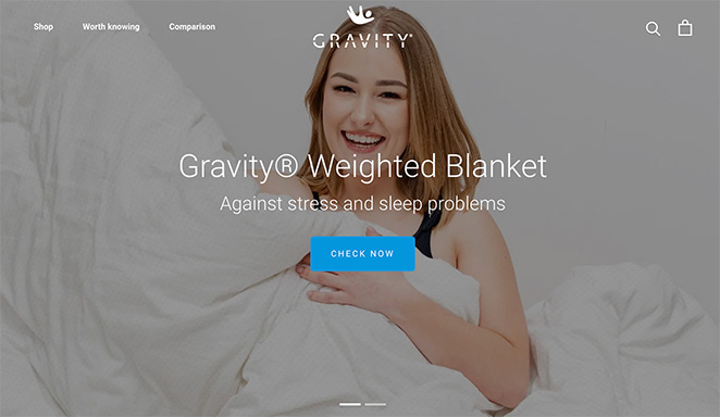
Gravity Blankets has created a weighted blanket that feels like a warm hug. Their website is a haven of tranquility, with soothing colors and images that make you want to curl up and relax.
What Sets It Apart:
- They back up their product’s benefits with scientific research and expert opinions.
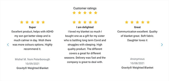
- User testimonials show how Gravity Blankets have helped people sleep better and feel more relaxed.
Why I’m a Fan:
Gravity Blankets offers more than just a product; it’s a path to better sleep and reduced anxiety. Their testimonials make it hard to resist ordering one myself.
14. Baby’s Brew
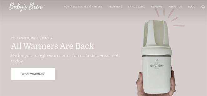
Baby’s Brew has come to the rescue of parents everywhere with their portable bottle warmer. It’s battery-powered and super easy to use, making it perfect for on-the-go feedings.
What Sets It Apart:
- The website focuses on convenience and innovation, addressing a real need for parents.
- The design is user-friendly, with clear product information and helpful guides.
Why I’m a Fan:
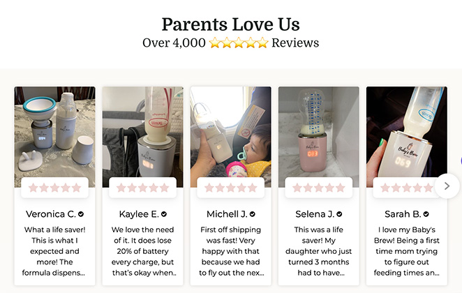
Baby’s Brew makes life easier for parents, and its website reflects that with its practical approach and focus on solving a common problem.
15. CatGenie
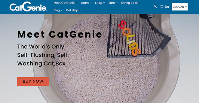
Say goodbye to scooping litter with CatGenie, the self-cleaning litter box. Their website is modern and functional, showcasing the product’s innovative features and how it works.
What Sets It Apart:
- The website emphasizes the product’s convenience and hygienic benefits.
- How-to guides and customer reviews make it easy to understand and trust the product.

Why I’m a Fan:
CatGenie solves a real problem for cat owners, and their website highlights the product’s unique value proposition.
16. Truff
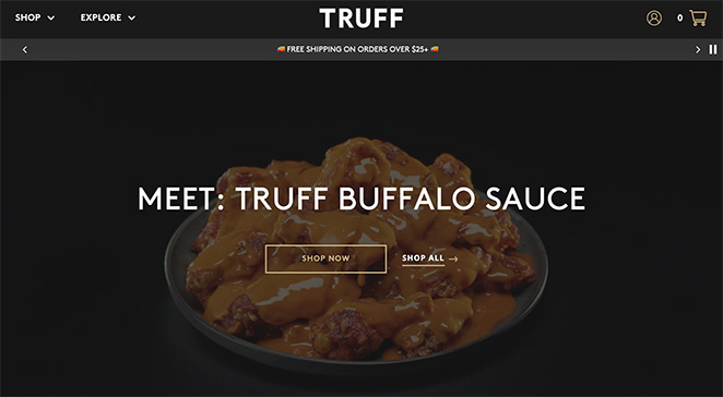
Truff isn’t your average hot sauce. It’s a luxurious blend of heat and truffle flavor. Their website is as elegant and sophisticated as their product, with rich colors and stunning images.
What Sets It Apart:
- The distinctive branding and emphasis on luxury make it stand out from the crowd.
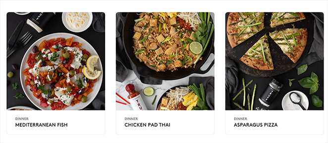
- The website offers recipe ideas to inspire your culinary creations.
Why I’m a Fan:
Truff elevates hot sauce to a whole new level, and its website is a feast for the eyes and the taste buds. If I could handle spice, I’d try these recipes myself.
17. Tushy Bidet
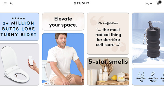
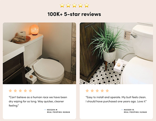
Tushy Bidet is on a mission to bring bidets to the masses. Their affordable, easy-to-install attachments are a game-changer for hygiene and sustainability. The website is playful and informative, making a potentially awkward topic fun and approachable.
What Sets It Apart:
- The humorous branding and straightforward information make it easy to understand the benefits of a bidet.
- Installation guides and customer reviews make it easy to make the switch.
Why I’m a Fan:
Tushy Bidet makes bidets accessible and enjoyable, and their website is a testament to their commitment to making a difference.
18. Nori
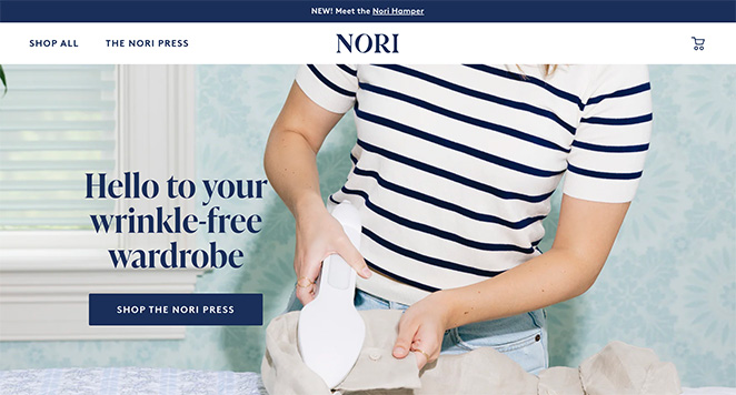
Nori’s wrinkle-removal device is a lifesaver for anyone who hates ironing. It combines the convenience of a steamer with the effectiveness of an iron, making garment care a breeze.
What Sets It Apart:
- The website is all about showcasing the product’s innovation and convenience.
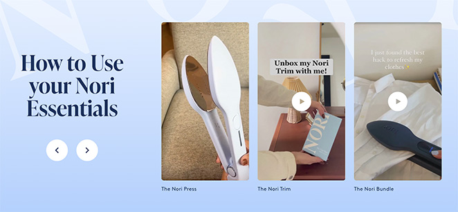
- High-quality images and videos demonstrate how easy it is to use.
Why I’m a Fan:
Nori solves a common problem with a simple, effective solution. Their website makes it easy to see why this product is a must-have.
19. Glossybox
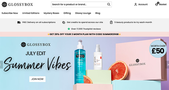
Glossybox is the ultimate beauty subscription box, delivering a curated selection of goodies to your doorstep every month. Their website is a beauty lover’s paradise, with soft colors, elegant typography, and gorgeous product images.
What Sets It Apart:
- The focus on luxury and discovery makes it feel like a special treat.
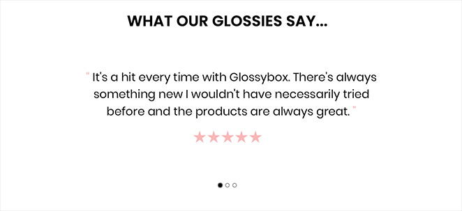
- Detailed product descriptions and user reviews build excitement and anticipation.
Why I’m a Fan:
Glossybox is a fun and convenient way to discover new beauty products, and their website makes the experience even more enjoyable.
Pro Tip: Glossybox also encourages feedback with its points system. After receiving each box, you’re invited to complete a quick survey about the products in the box. As a reward, you earn points that you can redeem as money-off vouchers.
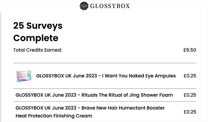
So far, I’ve earned £6.50! It’s a fantastic way to gather user feedback and encourage brand loyalty.
20. Thinkx
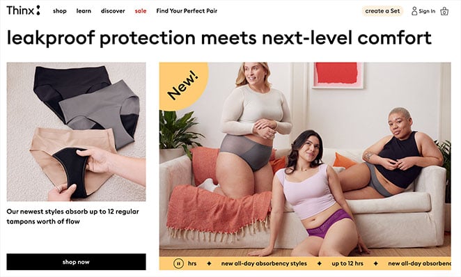
Thinx is revolutionizing period care with its absorbent underwear. Their website is a breath of fresh air, with a clean, modern design and a focus on education and empowerment.
What Sets It Apart:
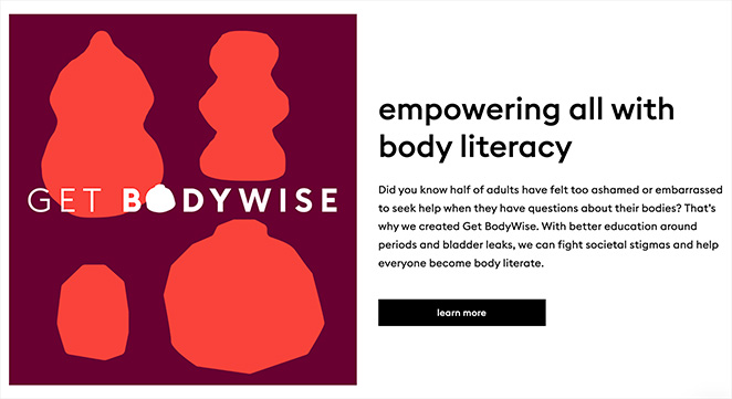
- The website doesn’t shy away from talking about periods, offering clear and informative content.
- The focus on sustainability and social impact makes it more than just a product; it’s a movement.
Why I’m a Fan:
Thinx is breaking taboos and offering a comfortable, eco-friendly alternative to traditional period products. Their website is a testament to their mission to empower women and change the conversation around menstruation.
Your Turn to Build a One-Product Store
One-product stores are a powerful way to make your mark in eCommerce. They let you focus your energy on a single, amazing product, simplifying everything from inventory management to marketing.
As you’ve seen with these one-product store examples, they share some common traits:
- Clear focus: They have a unique product that solves a specific problem.
- Compelling design: Their websites are visually appealing and easy to navigate.
- Strong branding: They craft a clear message that resonates with their target audience.
- Social proof: They build trust through customer testimonials and reviews.
Ready to build yours? SeedProd’s drag-and-drop WordPress website builder makes it a breeze.
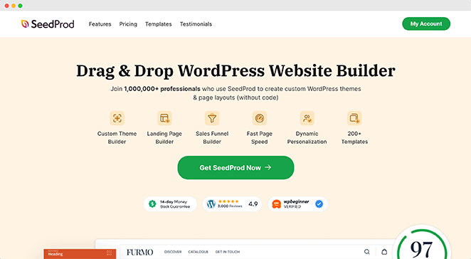
You don’t need any coding skills – just your awesome product idea and a little creativity.
SeedProd has everything you need to create a stunning, high-converting website. You’ll get customizable templates, an easy-to-use page builder, and even built-in coming soon pages and maintenance modes to keep your audience engaged while you build.
Check out our in-depth tutorial on how to make a one-product website with SeedProd.
Thanks for reading! We’d love to hear your thoughts, so please feel free to leave a comment with any questions and feedback.
You can also follow us on YouTube, X (formerly Twitter), and Facebook for more helpful content to grow your business.

