Are you building a website, and are you looking for one-page website examples?
Single-page websites are an excellent way for small businesses to promote their products and services without creating multiple pages.
This article shares some of the best one-page website examples you can use to inspire your next web design.
What Is a One Page Website?
A one-page website is a single-page design that shows more information as the user scrolls. And instead of showing a navigation menu, single-page layouts have sections for the different content on display.
For example, there may be a hero area at the top of the page, then an about section, your services, and finally, a contact form or CTA button to get in touch.
The great thing about this website design is that it fits everything people need to know about your business on a single landing page. That way, users won’t need to click away to other web pages, creating a better user experience.
And since all of your traffic is going to one page, your single-page site should see much higher conversion rates.
Typically, large businesses may find it hard to fit all their information into a one-page WordPress design. But if you’re running a small business site, a marketing agency or a single product company, this type of business website is an excellent choice.
What Should Be On a One Page Website?
Given that a one-page website has only a single page, it’s crucial to plan the information you’ll include. You’ll need all the vital details about your business, product, or service, and leave out extras that don’t add to the user experience.
Most one-page websites include the following information:
- Recognizable branding elements like your logo and tagline
- A section about who you are and what you do
- The products or services your company offers
- Trust-building social proof like reviews or testimonials
- A compelling call-to-action to buy now or learn more
- Social media icons to find your brand on social networks
- Contact details for potential customers to get in touch
Yet what you include on your page depends largely on your type of business.
A good rule of thumb is to include your most crucial information higher up on the page. That way, you can engage users before they lose interest.
10 Beautiful One Page Website Examples
By now, you know what a one-page website is and the type of information to include. So let’s dive in and check out some stunning one-page website examples from real small businesses.
1. Elon’s Toilet
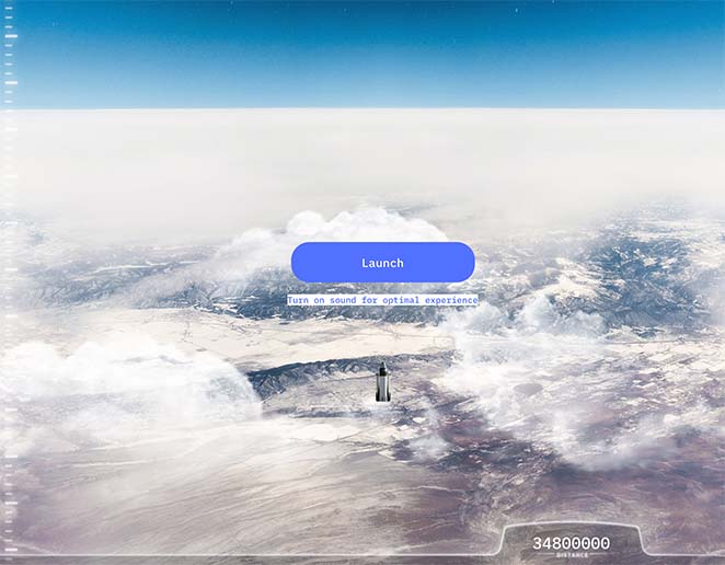
Elon’s Toilet is a creative one-page website example that does 2 things:
- Celebrates Elon Musk’s 50th birthday
- Raise awareness of colon cancer
When you first land on the website, it asks you to turn on your sound and click the Launch button. Next is a countdown of a rocket launch that prompts you to scroll up the page as it blasts off into space.
What follows is a visual journey into space, with graphics explaining how Elon Musk needs a toilet for his journey to Mars. As you scroll up, it continues to explain that at 50, he should start testing for colon cancer and that there’s a high survival rate by testing early.
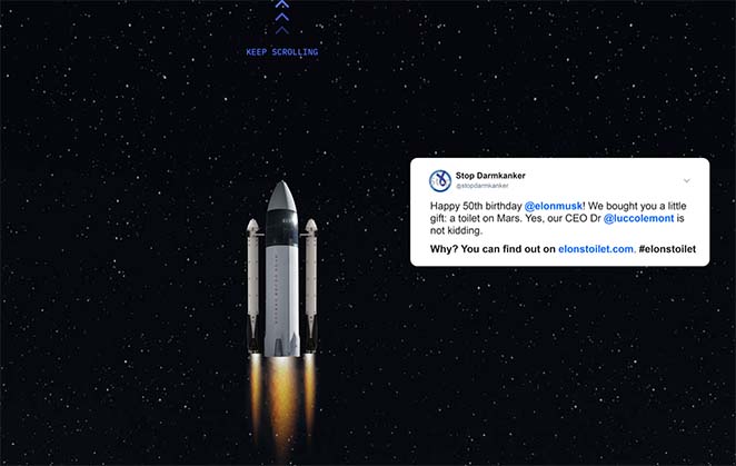
Thus, with his toilet on both Mars and Earth, he can continue testing and raising awareness about this terrible disease. And with a final push towards Mars, you land at the top of the page with the Stop Colon Cancer logo.
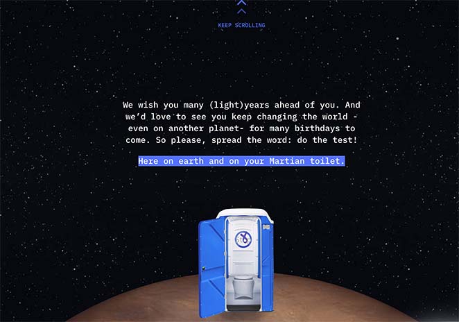
Given the level of creativity used in this design and the vital message it drives home, we think this one-page website example is hard to beat.
2. Bugatti Smartwatches

If you’ve heard of Bugatti, you’ll know that it’s a luxury car manufacturer with a reputation for high performance. But this one-page website example isn’t promoting a car but the first Bugatti smartwatch.
Scrolling through the page, the brand capitalizes on its reputation with high-quality photos of its cars and watches. They also use the space to showcase their French heritage with a red, white, and blue color palette.
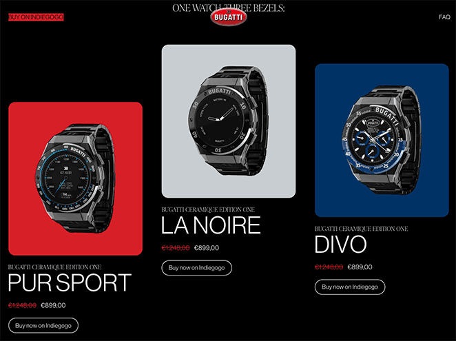
The brand cleverly uses video backgrounds and gifs to demonstrate the watch’s features.
And towards the end of the page, it shows a full-width CTA button to buy the watch on Indiegogo. Plus, with the FAQ section, they can answer any questions before potential customers decide to buy.

We think Bugatti has done a fantastic job of merging its branding and reputation with the launch of its new product.
For even more inspiration, check out these other business website examples.
3. Mama Joyce Peppa Sauce
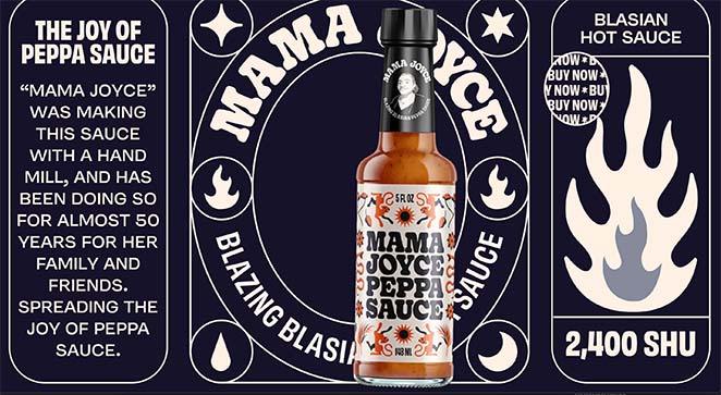
Next is a bold one-page website example promoting Mama Joyce Peppa Sauce. The primary features of this design are the bold, eye-catching typography and simple color palette.
As you scroll down the page, the sauce bottle moves from left to right, allowing you to access the content easier. From there, you can learn what the sauce is, where it comes from, and even which dishes it goes with best.
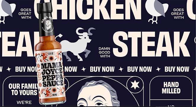
At the end of the page, you see an honest message explaining that it’s impossible to make a website taste like the sauce, so you should just give it a try. And if that wasn’t enough, the mouse cursor features an animated GIF prompting you to buy now.
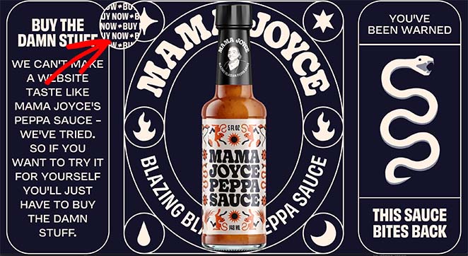
Overall, this single-page website example ticks all the boxes while still maintaining the brand’s quirky personality.
4. Daniel Schuh Originals
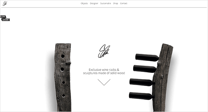
This one-page website example is a little different from the others on this list. It takes a more minimalist approach with its’ neutral color palette and seamless scrolling.
Daniel Schuh Originals promotes sustainable wine racks and wooden sculptures. And each section of the website moves seamlessly to the next, offering all the details shoppers may need.
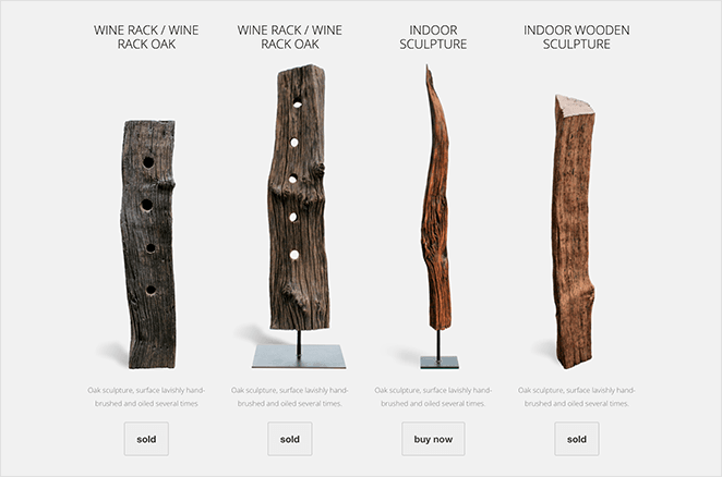
The sections on the page include:
- Hero area
- Product listings
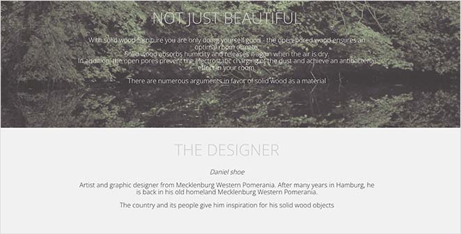
- About section
- Image gallery
- Sustainability information
- Contact details
In the end, potential customers have a distinct overview of what they’ll get by buying from this brand.
5. Sawdust Art Festival

Sawdust Art Festival has done an excellent job with its one-page event website design. As soon as you open the page, you see an eye-catching image, details about when and where the event takes place, and a CTA to buy tickets.
Further through the page, you’ll learn what the festival is about, the featured artists, and even an Instagram feed showing their latest photos.
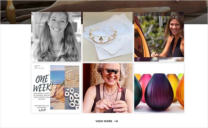
But more importantly, at multiple points throughout the page is a call to action button inviting users to book their tickets.

The benefit of adding multiple CTA buttons is it catches people at different stages in their decision-making process. That way, when they decide to buy, the button is right there with no obstacles preventing them from buying.
6. Ljubicic Tennis Academy
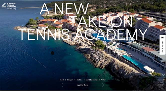
The Ljubicic Tennis Academy offers another stunning one-page website example that’s hard to ignore. Upon landing on the site, you see a full-width background video showcasing all the academy’s best facilities.
Each page section has a clear transition with labels explaining what that part of the page is about, including:
- About
- Team
- Academy Program
- Facilities
- Partners
- Arrival
- Contact information
- Subscription Form

And as a unique touch, the cursor features a tennis ball icon that expands on clickable page elements, drawing attention successfully.
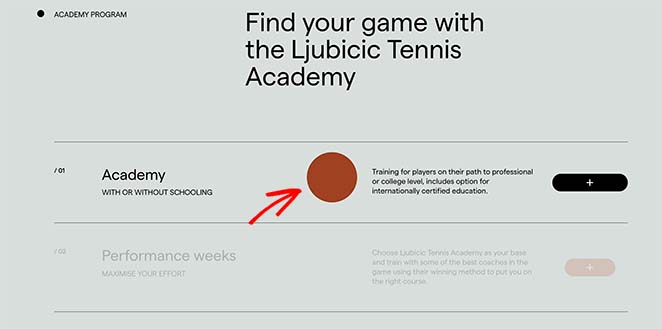
With the modern design, high-quality photos, and essential information, this website is a gorgeous example of a one-page website done well.
7. Hareesh Live
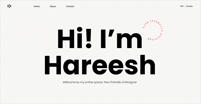
One-page website designs aren’t just limited to small businesses. As this example shows, they’re an excellent way to promote your skills and experience.
This one-page website example from Hareesh is a simple showcase of their talents as a UI UX designer. It features a portfolio, an about section, and an easy way to get in touch.
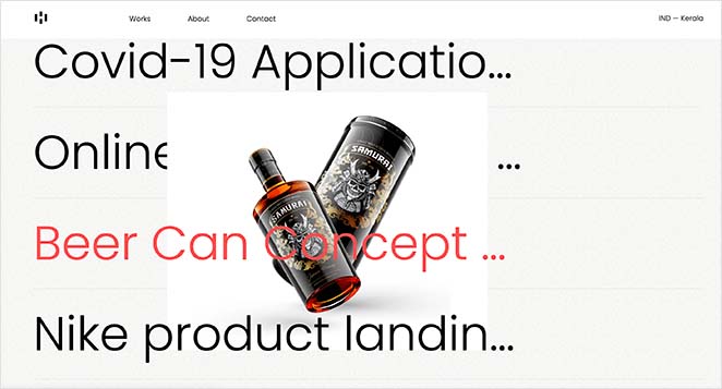
Even though the design isn’t as long as other examples on this list, it has everything potential employers need to find out more about the designer.

8. Lucibelle Paris

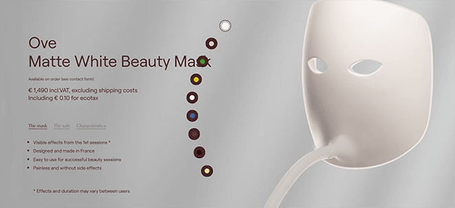
Lucibelle Paris is a one-page website example promoting a single product: the Ove beauty mask. Immediately after landing on the page is a full-width animation showcasing how the product looks.
That video follows you as you scroll, illustrating the product’s features and benefits. It then transitions to a solid color, making it easier to see the mask’s after-effects.

We especially like the section with testimonials from previous customers. A section like that helps convince people that your product does what it claims, easing any fears.
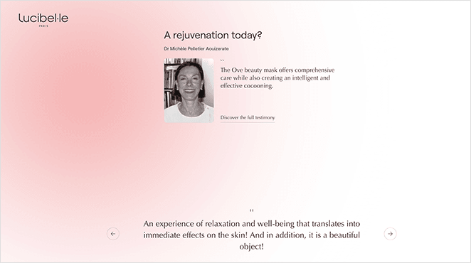
Finally, as you reach the bottom of the page, you’re met with pricing details and a CTA to buy the mask or ask for more information.
9. No-Code Conf 2021
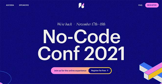
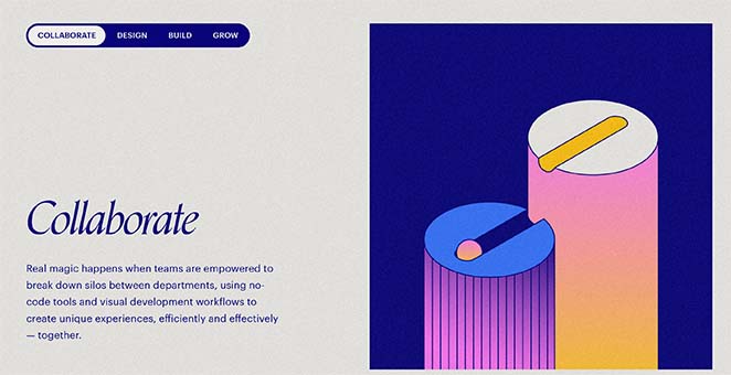
We love this bright one-page website example from No-Code Conf 2021. It features a bold, modern design that’s easy to read and navigate.
You’ll see everything you expect from a stunning single-page website, including:
- Information about the conference
- Speaker information
- Why you should attend
- CTA to register
What we love most about this page is the “Why Attend” section. Clicking each navigation item pulls up the next section of information. That means users don’t even need to scroll to learn more.
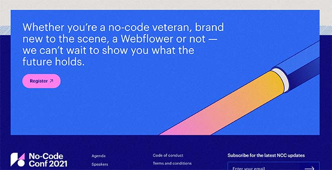
Then, at the end of the page is a bright graphic featuring a CTA to register for the conference.
10. The Beyond

Next is a beautiful one-page website example from The Beyond, a festival that includes live music, artists, and more. The hero area of the site gives you a stunning snapshot of what you can expect from the festival, and as you scroll, you learn what the festival is about and its location.
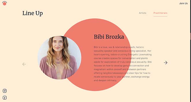
After a series of high-quality photos, visitors can learn about the festival lineup, the schedule, and the cost of buying tickets.
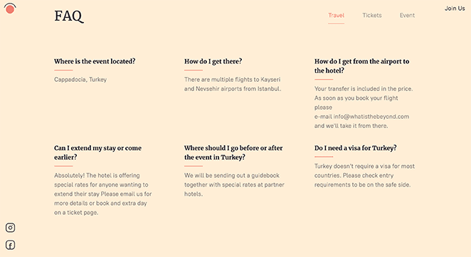
Further down is a FAQ section addressing the most frequently asked questions, such as travel, ticket, and event information.
Towards the end of the website is a contact form you can fill out to register your interest.
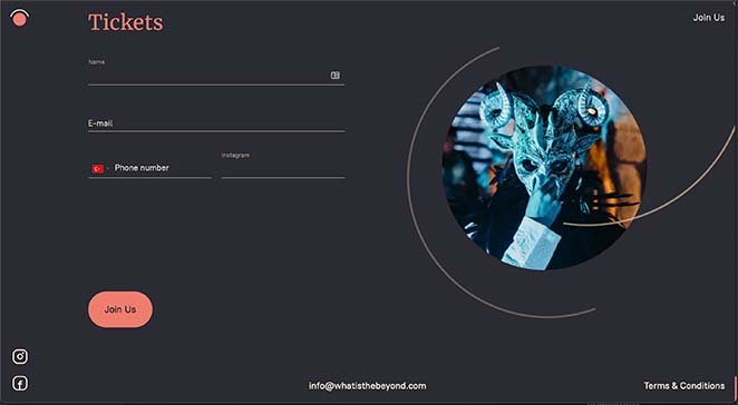
Overall, this website is simple and functional and does a great job of inspiring visitors to book their tickets.
How to Create a One Page Website
After looking at the inspiring one-page website examples above, you may be wondering how to make one for your business. The truth is, you don’t even need to hire a developer to build a single-page website.
With website builders like SeedProd, you can create a one-page website easily in WordPress. And the good news is, we have several handy guides to help you get started.
So follow this guide to learn how to make a WordPress website. And when your site is up and running, follow these steps to create a one-page website in WordPress.
There you have it!
We hope this article helped you find some great one-page website examples. While you’re here, you might also like these best push notification services to keep people coming back to your site.
Thanks for reading. If you liked this article, please follow us on YouTube, Twitter, and Facebook for more helpful content to grow your business.

