Are you still using landing page navigation?
It might make sense to include navigation links when designing landing pages on your website. However, doing so can hurt your marketing efforts, reducing leads and potential customers.
In this article, we’ll explain why you should remove landing page navigation links to increase conversions.
Here is an example of navigation on a page header:
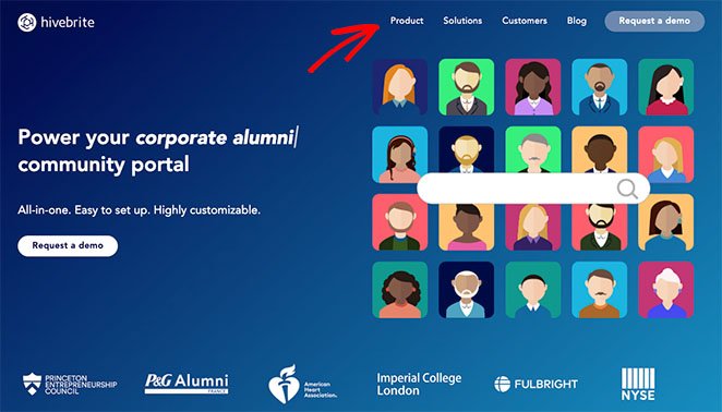
And here is the same example of navigation links in the footer:

These links send visitors to different pages on your site, making it easier for them to browse and find the information they need.
There are 3 types of navigation you can use:
- Main Navigation: divides your website content into a menu with links to each site section.
- Local Navigation: sub-sections that classify content, often included in dropdown-menus on the main navigation.
- Contextual Navigation: links within your content, such as “read more” links, back buttons, and hyperlinks related to another page on your site.
What these links have in common is they help users find information on your website.
Including website navigation on your homepage, for example, is an excellent way to educate visitors about your business, products, or services, improving user experience. However, this type of navigation can have the opposite effect on landing pages, as we’ll explain below.
What Is the Difference Between a Homepage and a Landing Page?
Homepages should educate and inform visitors about your business, but landing pages have a completely different purpose. Instead of informing visitors, landing pages are designed for users to convert into leads and new customers.
For example, after visiting your homepage, users might read your About page, browse your products, read a blog post, and then fill in a form to join your email list. Yet after visiting a landing page, users have a single choice: read the information, join your list, or click away.
Bottom line: Home pages are designed to educate and inform, but landing pages aim to convince and convert.
Navigation Bars Distract Landing Page Visitors
When you put navigation links on a standalone landing page, you connect it to other pages on your website. That means it’s no longer “standalone.” As a result, it can distract visitors from the offer your landing page includes.
Here’s an example of this concept.
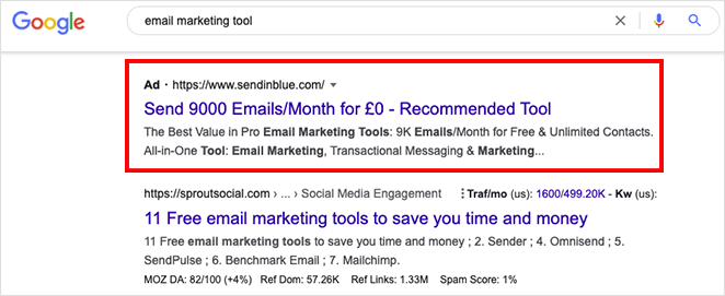
Let’s say we’re searching Google for an email marketing tool and see this Google Ad:
You click the ad and see this landing page from Brevo, formerly Sendinblue:
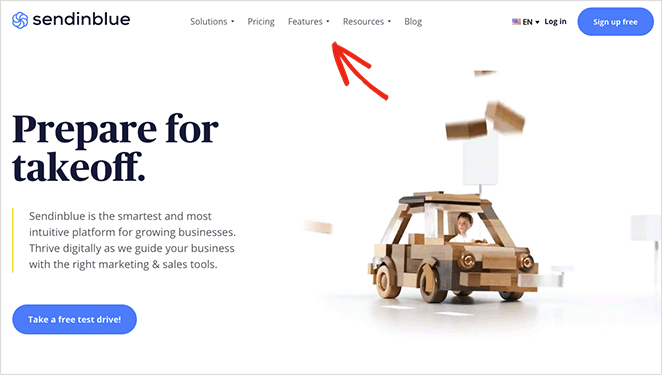
It’s an attractive page with an eye-catching headline and a tempting offer to test drive the platform. Yet you can’t help but notice the bar at the top of the page.
The menu bar includes clickable links that let you check out their pricing page, features, resources, and even read their blog. Each link gives you an excuse to leave the page, taking your eyes away from the main offer: the free plan.
This isn’t what a landing page should do.
Another search result takes you to the Salesforce landing page.
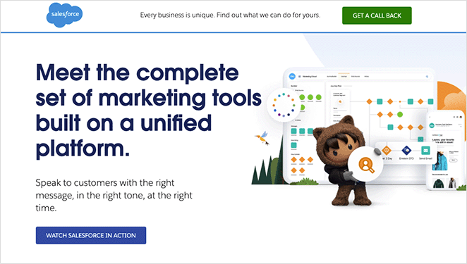
This page also has excellent headlines and copy to convince you to convert. However, it only includes links to tour the product or start a free trial. Both links help visitors decide to convert, leading to higher conversion rates.
Navigation Links Increase Costs
As demonstrated above, many businesses use landing pages for Pay-Per-Click (PPC) Google Ad campaigns, and when users click your ad, it costs you money. This is known as Cost-Per-Click (CPC) and relates to how much you pay for each click.
When you include navigation links on a landing page connected to your ad, you give visitors a reason not to convert. As a consequence, you’re costing yourself money for no reason.
Even though that visitor clicks your ad, the chances of them converting are slim because there are too many distractions. For example, the visitor may click a link to your homepage, blog post, or even your social media profiles.
By leaving your landing page, they’re ignoring your landing page call-to-action or leaving your website entirely, making the cost of their initial ad click a waste.
In comparison, removing navigation from your landing page keeps users on the page with a greater chance of converting, making the cost worthwhile.
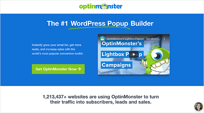
In fact, if you take a similar approach to OptinMonster in this example and remove your navigation, you can reduce cost per acquisition, giving you a greater return on investment.
Navigation Menus Lower Landing Page Conversion Rates
The bottom line of this post is that landing page navigation can reduce your conversion rates. Look at the following example from HubSpot if you’re still unconvinced.
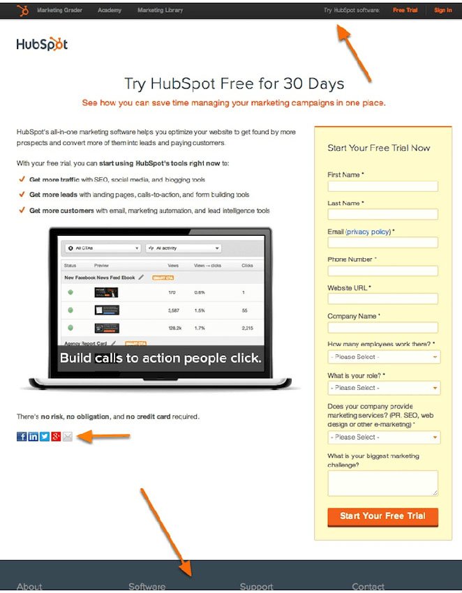
They A/B tested 2 different versions of their landing page; one with navigation exit links in the header and footer and one without.
When the test was over, they found that the landing page variation without exit links increased landing page conversion rates.
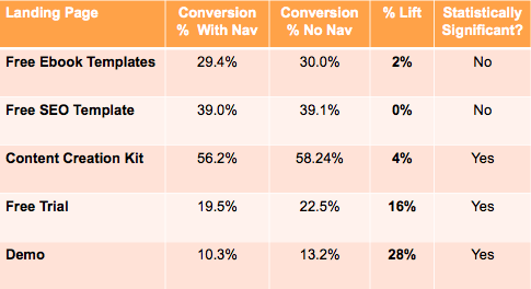
Considering only 16% of landing pages have no navigation, removing it from your page is one of the top ways to increase your conversions.
How to Create a Landing Page Without Navigation
Creating a landing page without navigation is easy with a landing page builder. WordPress website owners can use a drag-and-drop landing page plugin to make one visually without hiring a developer.
We recommend SeedProd, the best WordPress website builder with over 1 million users. You can use it to create standalone landing pages, WordPress themes, and any website layout without code.
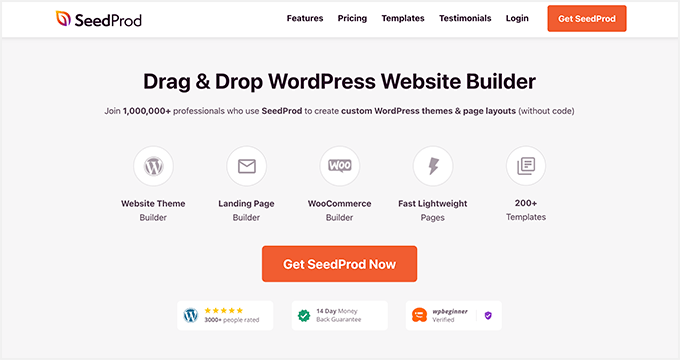
SeedProd has everything you need to create high-converting landing pages, including customizable content elements, landing page templates, popular email integrations, and more. It’s also lightweight and bloat-free, ensuring it won’t impact your page speed.
Follow this step-by-step guide to create a landing page without navigation with SeedProd in WordPress.
Or, if you’re ready to dive in, you can get started with SeedProd here.
There you have it!
We hope you liked this article and it helped you learn the benefits of removing landing page navigation. You might also enjoy this guide on how to create a landing page without a website. And these website layout examples that drive conversions.
Thanks for reading! We’d love to hear your thoughts, so please feel free to leave a comment with any questions and feedback.
You can also follow us on YouTube, X (formerly Twitter), and Facebook for more helpful content to grow your business.

