

Want to learn how to make a mobile landing page for your WordPress website?
It’s frustrating to visit a website on your phone only to find tiny links, slow loading times, and content that’s impossible to read. If your landing pages aren’t optimized for mobile, you’re missing out on leads and sales.
In this guide, you’ll learn how to create a high-converting mobile landing page in WordPress that looks great and converts visitors into customers. We’ll use a simple, code-free approach, even if you’re a complete beginner.
How to Make a Mobile Landing Page in WordPress:
Why Make Your Landing Page Mobile-Friendly?
Today, more people access the internet on their mobile devices than on desktops. This means if your landing page isn’t mobile-friendly, you’re missing out on a huge chunk of potential customers.
Think about it: if a website takes too long to load on your phone or is difficult to navigate, wouldn’t you leave and find a better option? Studies show that 40% of users will abandon a website that takes more than 3 seconds to load.

Google knows that mobile users are important, which is why it prioritizes mobile-first design in search results. So, a mobile-responsive design isn’t just good for user experience—it’s crucial for SEO.
Now, you might be wondering, “What’s the best process for designing mobile landing pages in WordPrerss?” There are two main ways:
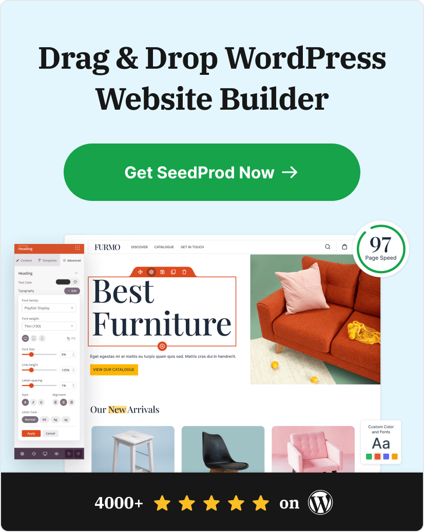
- Use a WordPress landing page plugin: This is the easiest option, as it requires no coding. A plugin like SeedProd, the best WordPress plugin for effective mobile landing pages, provides mobile-responsive templates and a drag-and-drop builder to simplify the process.
- Code a custom responsive design: This option gives you more flexibility but requires coding knowledge and can be time-consuming.
This guide focuses on the simplest method – using a WordPress landing page plugin. This way, you can create a high-converting mobile landing page quickly and easily.
How to Make a Mobile Landing Page
Step 1. Install SeedProd Landing Page Builder Plugin
Ready to create a mobile landing page? The first step is installing the SeedProd landing page plugin.

SeedProd is a powerful WordPress mobile landing page builder that makes creating beautiful, high-converting pages a breeze.
Don’t worry; there’s no coding required. SeedProd has a drag-and-drop interface and pre-built templates, making it easy for anyone to create great mobile landing pages.
While SeedProd has a free version, this guide uses SeedProd Pro. The pro version offers more advanced features and customization options to optimize landing pages for conversions.
And in the elite plan, you can use its WooCommerce blocks to build eCommerce landing pages that drive sales.
Here’s how to install SeedProd Pro:
- Purchase SeedProd Pro from the pricing page.
- Download the plugin file from your SeedProd account.
- Go to your WordPress dashboard and navigate to Plugins » Add New.
- Click Upload Plugin and select the SeedProd Pro zip file.
- Click Install Now, and once installed, click Activate Plugin.

Once activated, you’ll be prompted to enter your license key. You can find this key in your SeedProd account dashboard. After entering it, you’re ready to start building.

Step 2. Choose a Mobile-Responsive Template
Now that you have SeedProd installed, let’s create your mobile-friendly landing page.
SeedProd offers a variety of responsive landing page templates, so you don’t have to start from scratch. These mobile landing page templates are already optimized for mobile responsiveness, ensuring your page looks great on any screen size.
To choose a template:
- Go to your WordPress dashboard and click on SeedProd » Landing Pages.
- Click the Add New Landing Page button.

- You’ll see a library of templates. Browse through the options or use the filters to narrow your search. For example, if you want a mobile page for your webinar, select the webinar landing page filter.

Tips for choosing a mobile-friendly template:
- Look for a clean and simple layout: Avoid templates with too many columns or cluttered designs, as these can be overwhelming on smaller screens.
- Prioritize readability: Make sure the text is large enough to read comfortably on a mobile device.
- Choose large, touch-friendly buttons: Buttons should be easy to tap with a finger.
Remember, you can customize any template to fit your brand and message, so don’t be afraid to experiment.
Once you’ve found a template you like, hover over it and click the checkmark to select it.

You’ll be asked to give your page a name and URL. You can always change these later. Once you’re ready, click Save and Start Editing the Page to open the drag-and-drop builder.

Step 3. Customize Your Landing Page For Mobile
Now comes the fun part—customizing your mobile landing page.

SeedProd’s drag-and-drop builder makes this process easy and intuitive. You’ll see a library of pre-built blocks on the left side of your screen, such as images, text, buttons, forms, and more.
Just drag and drop the elements you need onto the page preview. As you make changes, you’ll see them reflected in real-time, making it simple to visualize your design.

Mobile-Specific Design Principles
When designing for mobile, keep these additional principles in mind:
Thumb-Friendly Navigation Zones
Consider the “thumb zone” – the area of the screen easily reachable with a thumb when holding a smartphone. Place important buttons and interactive elements in this zone for easier navigation.

Appropriate Font Sizes
Use larger font sizes to ensure readability on small screens. A good rule of thumb is:
- Body text: 16-18px
- Headings: 22px or larger
- Call-to-action buttons: 14px or larger
SeedProd allows you to adjust font sizes easily. Simply select any text or heading block and adjust the font size slider to suit your needs.

Handling Complex Content
For complex content or large tables, consider:
- Using accordions or collapsible sections to save space
- Simplifying tables for mobile view or allowing horizontal scrolling
- Using bullet points instead of paragraphs where possible
Here’s how to add an accordion in SeedProd:

Streamlined Navigation
Use a hamburger menu to save space and keep navigation clean. SeedProd’s navigation block allows you to easily create a mobile-friendly menu:

Continue adding content to your page until you’re happy with its appearance. Then, click the green Save button at the top-right corner to store your settings.
Step 4. Configure Your Settings
Now that your landing page looks amazing on mobile, let’s configure some important settings to help you track performance and capture leads.
Connect Your Email Marketing Service
SeedProd integrates seamlessly with popular email marketing services like Constant Contact, MailChimp, and more. This integration lets you easily grow your email list by capturing leads directly from your mobile landing page.
To connect your email marketing service:
- In the SeedProd builder, click the Connect tab.

- Choose your email provider from the list and follow the on-screen instructions to connect your account.

Configure Page Settings
Now, click the Page Settings tab to view your landing page settings. You can edit your landing page’s name and URL and choose whether to enable Isolation Mode.

What is Isolation Mode?
Isolation Mode makes your landing page load faster by preventing conflicts with your WordPress theme and plugins. If you experience any display issues, enabling this option can help.
SeedProd also lets you optimize your landing page for search engines and track key metrics with Google Analytics. You can customize your page’s title and meta description and add tracking codes.

Then, the Scripts tab lets you paste custom header, body, and footer scripts. This is useful for retargeting page visitors with your Facebook Tracking pixel, etc.
Step 5. Preview & Publish Your Mobile Landing Page
Before you launch your new landing page, it’s crucial to see how it looks on different devices. Luckily, SeedProd makes this easy with its built-in mobile preview feature.
Here’s how to preview your landing page:
- In the SeedProd builder, look for the mobile phone icon at the bottom of the screen.

- Click the icon to toggle between desktop, tablet, and mobile views.

This preview lets you double-check that your layout, text size, and buttons are optimized for smaller screens. If anything looks off, you can easily make adjustments directly within the mobile preview mode.
Ready to publish?
- Click the green Save button to save your changes.
- Next to the save button, click the arrow to either save your landing page as a template for later use or click Publish to make it live on your website.

Congratulations! You’ve successfully created a mobile-friendly landing page in WordPress. Now you’re ready to start driving more leads and conversions from your mobile visitors.
Here’s the final version of a page I created on my test website:

Mobile Landing Page Examples & Inspiration
Check out these best mobile landing page examples I’ve found if you need some inspiration before designing your page.
1. Bugaboo

First is a mobile page example from Bugaboo, an online retailer of products for babies and children. I like how their landing page design has a single-column layout and is clean, modern, and easy to navigate from any device.
2. Etsy
As you can see, Etsy hides the page’s navigation menu from the main page with a mobile menu. The images are crystal clear, and the buttons are large enough for shoppers to tap.

In addition, the search box spans the entire width of the mobile page, making it much easier to tap on smaller screens.
3. Slack

I particularly love Slack’s mobile landing page because they have tailored it to the user’s device. Since I used an iPhone, they personalized the page for the Apple store.
That approach is an excellent way to target specific audiences. And since the page suits that audience’s needs, they’re more likely to convert.
4. Maped Helix

Maped Helix’s crisp mobile landing page design leaves nothing to chance. It features a sticky bar at the top of the page to encourage users to subscribe and clearly labeled CTA buttons directing users to popular sections of the site.
Even better, the CTA button colors vary by importance, with the bolder color indicating which button users should click first.
5. Evernote

Evernote keeps things simple with this example. The call to action is clear, actionable and the page loads lightning fast. Given that the page has virtually no imagery, it’s surprisingly eye-catching.
A text-only mobile landing page may not be the best solution for everyone, but they’re effective for the right brands.
6. Headspace

The Headspace mobile landing page utilizes large, legible text combined with ample whitespace for a clean, focused experience that draws your attention to the company’s primary call to action.
Mobile Landing Page Frequently Asked Questions
There are several types of mobile landing pages, each serving a unique purpose:
Squeeze Pages: Collect email addresses or other contact information in exchange for a lead magnet, such as an ebook or discount code.
Click-Through Pages: Warm up potential customers by providing them with additional information about a product or service before directing them to a sales page.
Lead Capture Pages: Collect leads through forms, often in conjunction with a content upgrade or webinar registration.
Sales Pages: Sell a product or service directly, with a strong focus on the benefits and features.
Here’s why you need to prioritize mobile landing pages:
Improved User Experience: Mobile-optimized design ensures that visitors can easily navigate and interact with your content, leading to a positive user experience.
Higher Conversion Rates: By focusing on a single goal and minimizing distractions, mobile landing pages can significantly increase conversion rates compared to standard web pages.
Better Mobile SEO: Search engines favor mobile-friendly landing pages, improving your visibility in mobile search results.
Increased Brand Credibility: Providing a seamless mobile experience demonstrates that your business is modern and attentive to customer needs.
By investing in mobile landing pages, you can tap into the 6.93 billion smartphone users worldwide and drive significant growth for your business.
Next, More Mobile-Friendly Tips
I hope this guide has equipped you with the knowledge and best practices needed to create high-converting, mobile-friendly landing pages for your WordPress website.
By adopting a mobile-first mindset, optimizing for performance, and leveraging responsive design techniques, you can ensure your landing pages provide a seamless user experience that drives more leads and sales from the ever-growing mobile audience.
If you liked this article, you may find these additional mobile-friendly design tips helpful:
- How to Edit Mobile Menus in WordPress (Beginner’s Guide)
- Landing Page Best Practices for Incredible Conversion Rates
- How to Hide Images in Mobile View on WordPress
- 9 Mobile Friendly Website Examples for Responsive Design Inspiration
- How to Make a Desktop Only Website Mobile-Friendly (Easy Steps)
- 11 Best WordPress Mobile Plugins for Mobile Friendly Websites
Thanks for reading! We’d love to hear your thoughts, so please feel free to leave a comment with any questions and feedback.
You can also follow us on YouTube, X (formerly Twitter), and Facebook for more helpful content to grow your business.