Want to learn how to design a sign up page on your WordPress website?
A sign up page allows your readers to easily opt-in for your mailing list so you can communicate with them on how your services or products can help them out.
In this tutorial, we’ll show you how to design a sign up page in WordPress with examples for inspiration.
What Is a Sign Up Page?
A sign up page is a standalone web page that allows you to collect email addresses from users interested in your products or services. Sometimes they’re called “registration pages,” and they aren’t all the same.
Some are linked to online advertisements, while others are linked to your website’s navigation menu. Yet, despite these differences, they’re all designed to generate sign ups for your business.
Often your sign up page is the final step in your conversion funnel after users have decided your brand is what they’re looking for. Instead of focusing on persuading users to convert, the emphasis is on user experience and streamlining the registration process.
To get the most conversions from your sign up page design, you need to limit the number of steps needed to register. That said, you should make the most of the few elements you use.
7 High-Converting Sign Up Page Examples
Here are some excellent signup page examples you can use as inspiration.
1. Coming Soon Sign Up Page
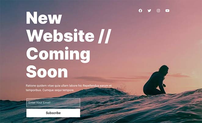
Coming soon pages are designed to tell people about a new website launch. But they’re also the ideal place to collect emails from visitors before launch day.
In this example, users are encouraged to subscribe to learn when the website launches. They can also follow the brand on social media by clicking the social media profile icons at the top of the page.
2. New Website Sign Up Page
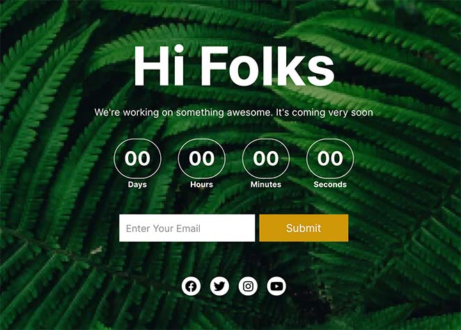
Here is a similar signup page example with a simple sign up form for users to subscribe for updates. The difference on this page is it has a countdown timer as well as social media buttons.
Countdown timers are a great way to create a sense of urgency. They encourage people to act before the timer runs out, leading to better conversion rates.
3. Maintenance Mode Sign Up Page
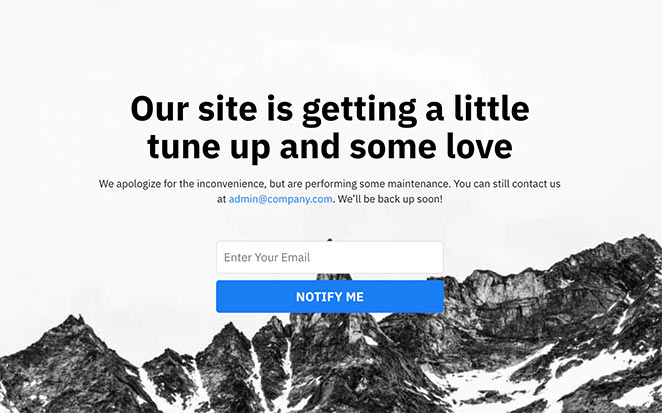
On this sign up page example, users see a message telling them the site is down for maintenance. It includes a simple message apologizing for the inconvenience and an email address to get in touch.
This page also includes a signup form where users can register to get notifications when the site is back up. It only includes 1 form field, making it super-easy for people to finish the sign up process.
4. Coupon Sign Up Page

This sign up page offers users a discount coupon in exchange for subscribing with their email address. Offering a coupon or discount is an excellent way to give users an incentive to sign up.
The entire design is minimal, with no distractions, ensuring users focus on converting.
5. Course Sign Up Page

The next example asks visitors to sign up for a course. Showing the logos of sponsors and clients, it increases trust and credibility.
Again, the sign up form only has a single input field to collect emails. Long forms are often too distracting and ask for too much personal information, so keep yours short and to the point.
6. Webinar Registration Page

If you’re promoting a webinar, you need a registration page to collect signups. In this webinar sign up page template from SeedProd, the registration form is one of the first things visitors see, making it easier to register.
7. Newsletter Sign Up Page
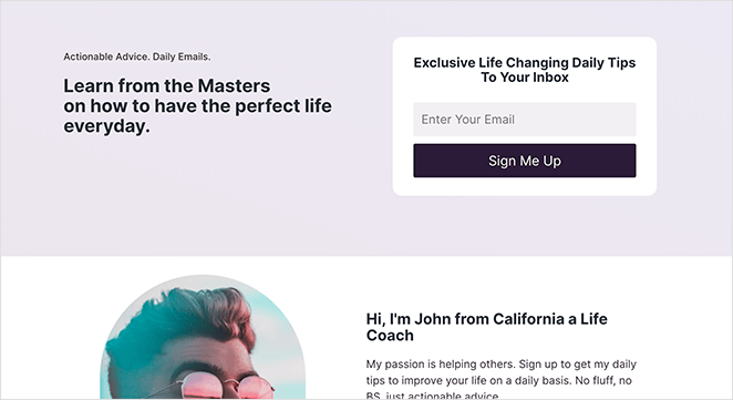
Our final sign up page design asks users to enter their email to get daily tips in their inbox. The focus here is on compelling headlines that encourage users to enter their email and click the call-to-action button.
Users instantly know what they can expect from registering. And it only requires a single piece of information for them to get what they want.
After looking at the above sign up and registration page examples, you’re probably wondering how to make one for your website. Follow the steps below to learn how to design a sign up page in WordPress easily.
How to Design a Sign Up Page in WordPress
Using the default WordPress editor to create your signup page isn’t always the best choice. Even with the versatile block editor, getting your page looking the way you want can be hard without help from a professional.
That’s why we suggest using a page builder plugin like SeedProd to design your sign up page.
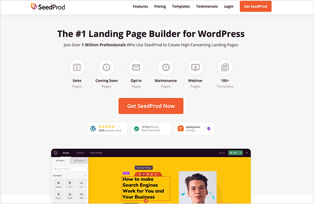
SeedProd is the best WordPress landing page builder on the market. It comes with a library of multipurpose landing page templates and a drop and drop builder, allowing you to create a landing page without hiring a developer.
With tons of customization options, you can design your page without writing a single line of code. You can also put your site in maintenance mode, launch a coming soon page, and more with its 1-click landing page modes.
Despite being packed with all the features needed to create high-converting landing pages, SeedProd is lightning-fast and bloat-free. This means it won’t slow down your website, which can impact your SEO and conversion rates.
Did you know you can get an unlimited free trial of SeedProd? Click the link to find out how.
Let’s look at how to design a sign up page in WordPress with SeedProd.
1. Install and Activate SeedProd
First, click here to get started with SeedProd and download the plugin to your computer. You then need to install and activate the plugin on your WordPress website.
If you need help with this, follow these step-by-step instructions for installing a WordPress plugin.
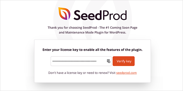
After installing SeedProd, you’ll see a welcome screen asking you to enter your SeedProd license key.
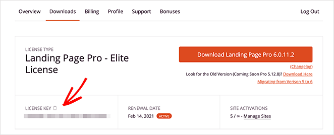
You can find your key in the Downloads section of your SeedProd account. Copy the key, paste it into the field provided, and click Verify Key.
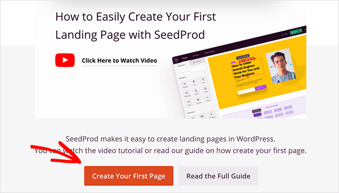
Once you’ve entered your SeedProd license key, scroll down the page and click the Create Your First Page button.
This takes you to SeedProd’s landing page overview.
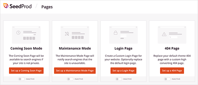
At the top of the page are the different landing page modes you can activate, including:
- Coming Soon Mode – Create a coming soon page and hide the rest of your site from the public.
- Maintenance Mode – Show a user-friendly message telling users your page is temporarily down for maintenance while hiding the update process.
- Login Page – Create a custom WordPress login page for your website users.
- 404 Page – Show a custom 404 error page on broken page links.
2. Create a New Landing Page
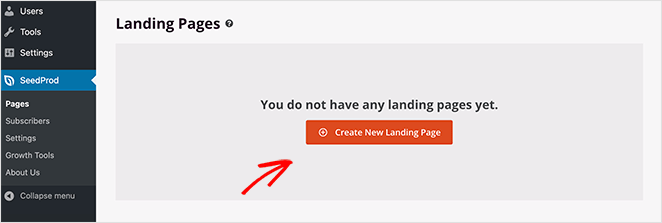
Under the landing page modes section is where you’ll see all the pages you create with SeedProd.
To create your first page, click the Create New Landing Page button.
3. Choose a Sign Up Page Template
On the next screen, you can choose a template for your sign up page.
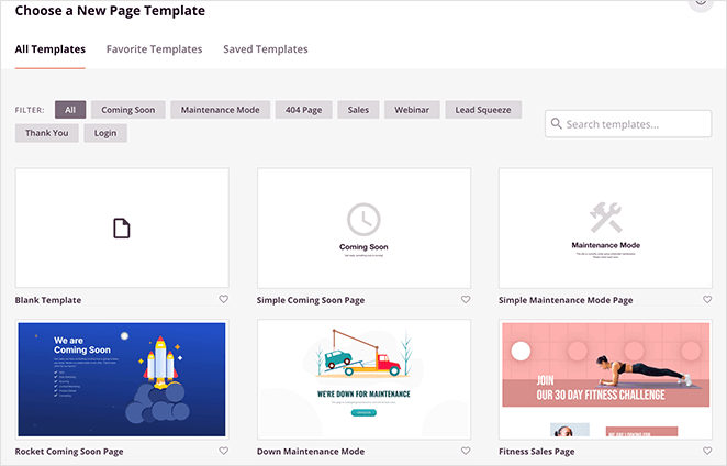
SeedProd comes with a variety of customizable landing page templates, including:
- Coming Soon page templates
- Maintenance Mode templates
- 404 page templates
- Sales page templates
- Squeeze page templates
- Webinar page templates
- Thank you page templates
- Login page templates
And because you can customize them in the visual editor, each template is multipurpose. This means you can customize any template to suit your specific landing page needs.
So go ahead and pick a template that resembles how you want your sign up page to look. For this guide, we’ll use the Hustle Squeeze Page template.

Just hover your mouse over the template thumbnail and click the tick icon to select your design.

A popup then appears, asking you to enter your page name and URL. You can change these settings later if needed.
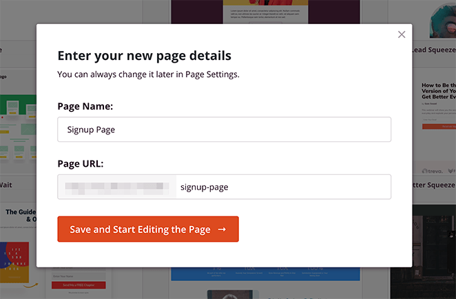
Now click the Save and Start Editing the Page button to launch your template in the drag and drop page builder.
4. Customize Your Sign Up Landing Page
SeedProd’s drag and drop visual editor is super-easy to navigate.
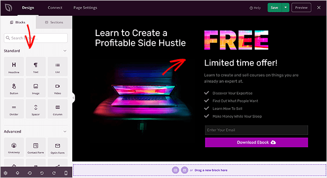
On the left-hand side is a panel with the different blocks and sections you can add to your design. And on the right-hand side is a live preview of how your page looks.
Customizing with Blocks
Adding new content to your page is as simple as dragging a block from the left panel and dropping it anywhere on your page on the right.
For instance, if you want to put a countdown timer on your sign up page, just drag it from the Advanced blocks section and drop it into place.
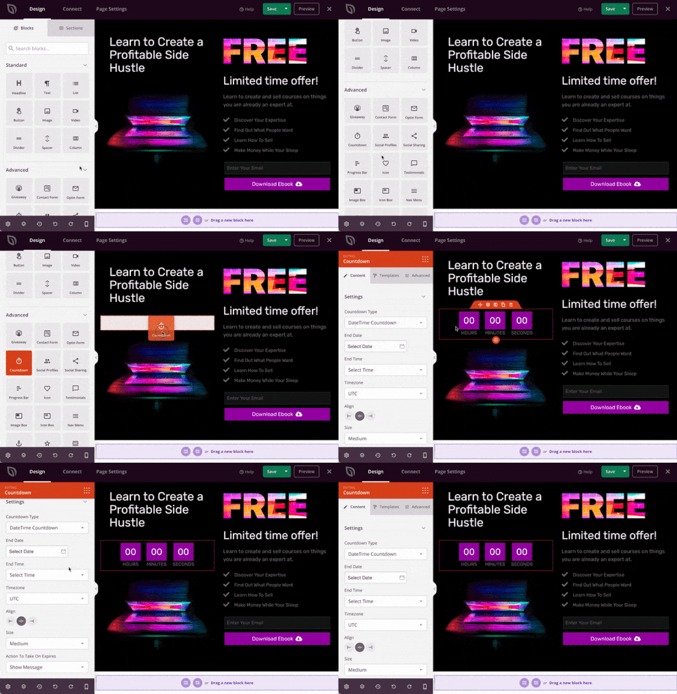
Clicking any block on your preview opens the content settings panel on the left. This allows you to edit the content of any block to suit your business needs.
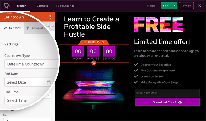
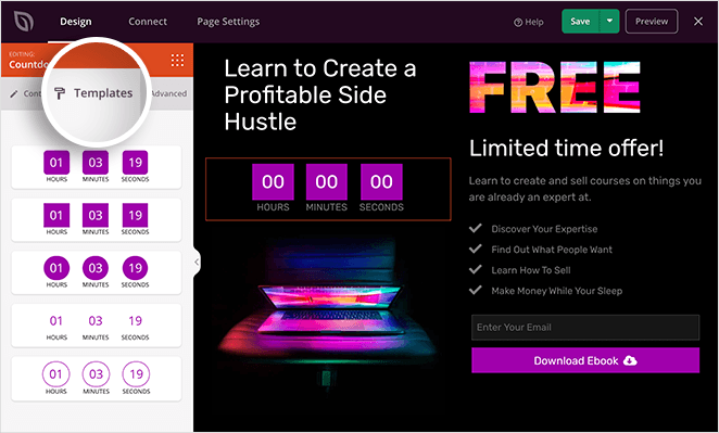
Many blocks also include custom templates, which allow you to tweak the block design without adding special code.
For example, clicking the countdown timer and selecting Templates tab in the left panel shows many different designs you can use. Just click the one you like best to add it to your sign up page design.
In the Advanced tab of your block settings, you can change individual settings like colors, borders, spacing, and more.
SeedProd’s Advanced blocks are the best way to collect leads on your registration page. Every block is designed with lead generation in mind, helping you create the most successful page possible.
Here are just some of the lead-generating blocks you can embed on your sign up page:
- Giveaway
- Contact form
- Optin form (signup form)
- Countdown timer
- Social profiles
- Social sharing buttons
- Progress bar
- Testimonials
- Accordion
- Login form
- And more.
Customizing with Sections
Besides blocks, you can add other content to your sign up page by clicking the Sections tab.
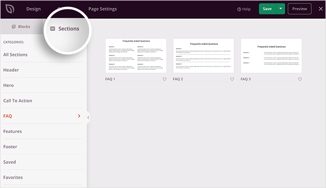
On this screen, you’ll see ready-made sections with all the blocks you need to make it look fantastic. This allows you to create whole page areas without building them manually, block by block.
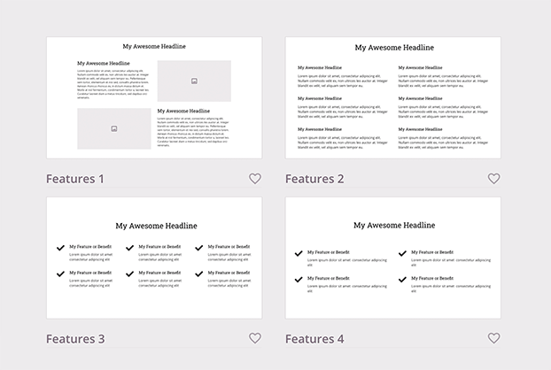
You can choose from:
- Headers
- Footers
- Hero
- Call-to-Action
- Features
And all it takes is a single click to insert it onto your page. From there, customizing the section is the same as any other block.
Customizing with Global Settings
If you want to change up your sign up page’s fonts, colors, and background, it’s easy with the Global Settings panel. You can find it by clicking the gear icon in the bottom-left corner of your screen.
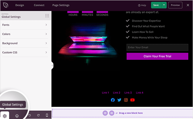
Then click any of the tabs to customize those areas of your page and apply the changes globally.
Under the Fonts heading, you can change your entire page’s typography. Use the drop-down menus to browse near-unlimited Google web fonts.
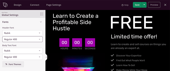
If you need help deciding which fonts go well together, click the Font Themes button. This shows you previews of font pairings curated by SeedProd’s designers.
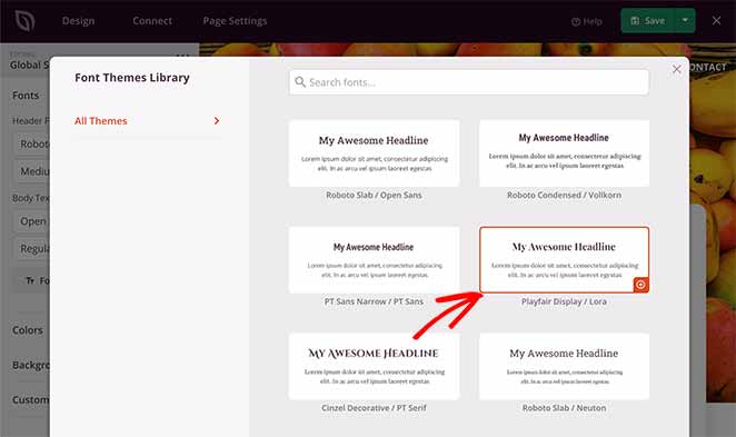
You can then click the one you like to apply it to your page.
Clicking the Colors heading reveals the different color options you can customize on your page. This includes headers, buttons, body text, and more.
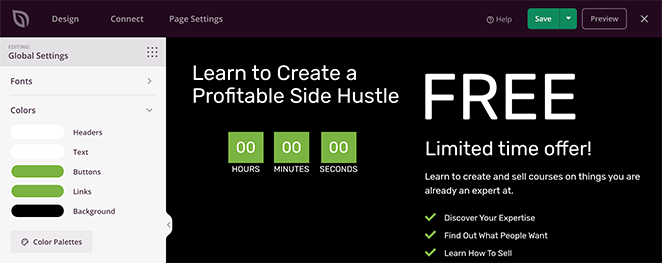
You can choose your own custom color scheme or click the Color Palettes button to browse 20+ ready-made color combinations.
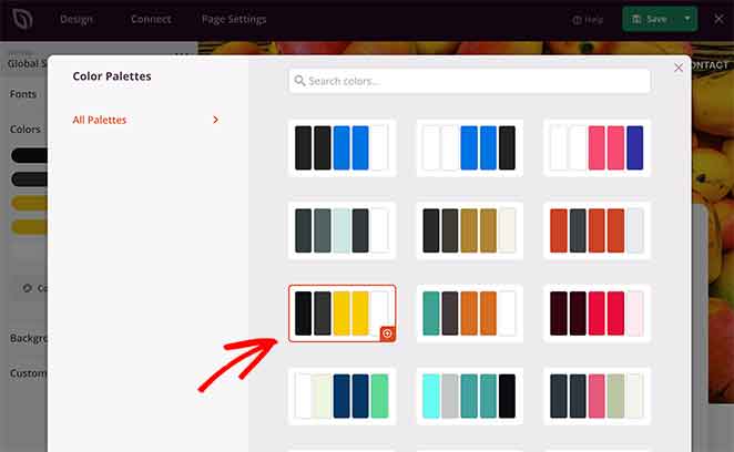
And as with the fonts, you just need to click one you like to add it to your page.
Under the Background heading is where you can control your sign up page’s background. You can choose from a solid color or gradient or upload a custom background image.
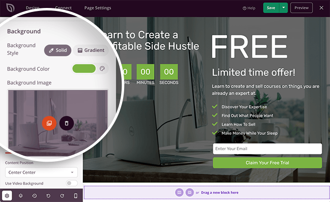
It’s also possible to add a background slideshow or video background by turning the toggle for each option to the “on” position.
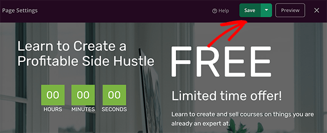
When you’re happy with your changes, click the green Save button in the top-right corner of your screen.
5. Connect Your Email Marketing Service
The next step in learning how to design a sign up page is to configure your email collection settings. This means connecting SeedProd to your email marketing provider.
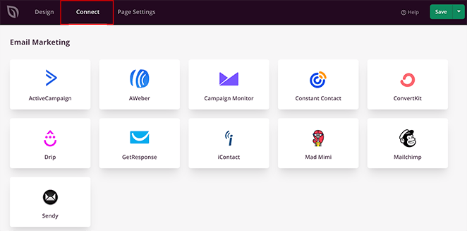
Click the Connect tab at the top of the screen to see the popular email marketing services that integrate with SeedProd, including:
- Drip
- Constant Contact
- AWeber
- GetResponse
- ConvertKit
- Campaign Monitor
- Mailchimp
- And more
You can even connect to tons of other services by using the Zapier integration.
To connect your email list, just choose your preferred email service, click Connect, and follow the instructions.
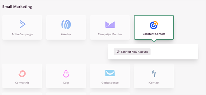
For specific instructions on integrating each email marketing service, see our email integration documentation.
It’s also possible to see who subscribes to your email list by navigating to SeedProd » Subscribers from your WordPress admin area.
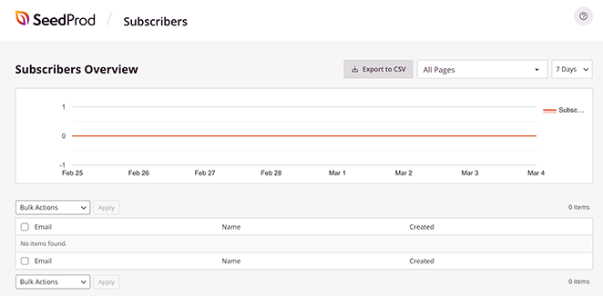
This takes you to SeedProd’s subscriber overview, where you’ll see the details of your new subscribers.
6. Configure Your Sign Up Page Settings
After connecting your email list to your registration page, you can configure a few more settings. To see them, click the Page Settings tab at the top of your screen.
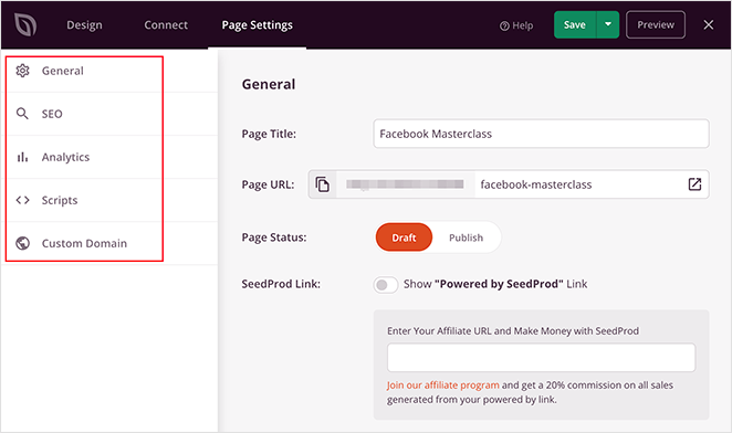
On this page, you can edit your General settings by giving your page a new name, URL, or even set it to draft or publish.
In the Analytics section, you can view your signup page performance settings in Google Analytics plugins like MonsterInsights. You can do the same in the SEO section and set your page’s SEO metadata using WordPress SEO plugins like All in One SEO.
The Scripts area allows you to add custom scripts and code snippets, such as cookies and tracking pixels.
And lastly, the Custom Domain section lets you connect your landing page to any domain name you like without installing WordPress on it.
You can learn all about domain mapping for landing pages in our step-by-step guide: How to Point a WordPress Landing Page to a Different Domain.
When you’ve customized your sign up page settings, remember to click the Save button.
7. Publish Your Sign Up Page in WordPress
Before publishing your registration page, it’s good practice to see if it shows up correctly on mobile devices. If it doesn’t, you could lose leads and miss out on tons of potential customers.
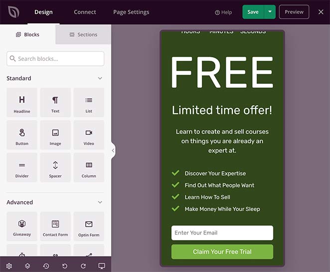
Luckily, you can preview your page on mobile with SeedProd. Just click the Design tab and select the mobile icon at the bottom of your screen.
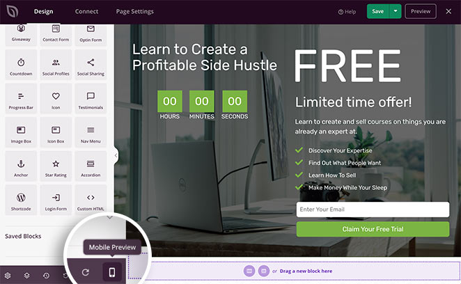
This shows a mobile preview of your landing page. If anything doesn’t look right, click anywhere on the page to adjust your design.
Any changes you make are automatically applied to BOTH the desktop and mobile layout of your page.
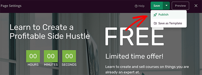
With all your customizations in place, it’s time to publish your sign up page. To do that, click the down arrow next to the Save button and select Publish.
A window appears saying that your page is now live.
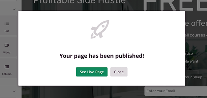
Go ahead and click the See Live Page button to see how it looks.

Congratulations!
We hope this guide has helped you learn how to design a sign up page in WordPress and build it without a developer’s help.
Now all that’s left is for you to create one and start generating leads and conversions for your business. And with SeedProd, it’s super easy!
So what are you waiting for?
If you liked this article, then please follow us on YouTube, Twitter, and Facebook for more useful content to help grow your business.

