Looking for eCommerce landing page examples for your online store?
eCommerce pages grab your target audience’s attention, keeping them on your site to start their shopping experience. The most effective landing pages convert potential customers into leads, boosting conversion rates.
This article will share some of the best examples of eCommerce pages to drive sales.
Video Guide
What Is an eCommerce Landing Page?
A landing page is a single web page for marketing your online store. It’s a page that visitors “land on” after clicking a link from an email marketing campaign, social media post, or Google advertisement.
eCommerce pages encourage shoppers to complete a specific goal, such as making a purchase. The landing page matches the shopper’s intent and includes engaging headlines, compelling copy, special offers, customer testimonials, and call to action buttons (CTA buttons).
Here’s an example scenario to clarify:
A shopper may be looking for pet food for their new kitten, so they search on Google for “best food for kittens.” In the search results, they click a link titled “The Perfect Food for Kittens.”
When our hypothetical shopper lands on the page, they see:
- A headline matching the ad
- Images of kittens
- A CTA button offering a 25% discount
- A money-back guarantee
- Testimonials from existing customers
In this scenario, the shopper found what they were looking for in seconds. The content fits the buyer persona, includes essential product features and trust signals, and makes it easy to purchase. As a result, the site converts a visitor into a potential buyer.
That is what landing pages are for: to convert visitors into customers.
eCommerce Landing Pages vs. Product Pages
When website visitors land on your site, they often see a homepage or product page. This is an excellent way to introduce visitors to your brand and provide product information; however, they’re not best for encouraging shoppers to act.
Product pages center on educating and informing visitors, but landing pages focus on conversion goals to increase sales. Both page types use different web design elements to support their intent.
Here’s a breakdown of the differences between landing pages and product pages:
Landing Pages
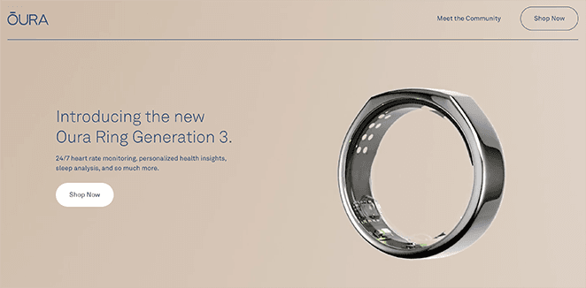
- Include 1 clear CTA
- Remove exit pathways like navigation
- Includes content focusing on a specific audience
- Optimized for marketing rather than search engines (SEO)
Product Pages
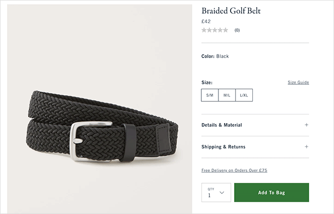
- Can include multiple CTAs
- Includes exit pathways like navigation, product categories, etc
- Offers general content for a broader audience
- Includes product descriptions and recommendations
- Optimized for SEO to attract organic traffic
Best eCommerce Landing Page Examples
It’s best to try different landing page versions to see what works for you and your audience, but getting started is typically the most challenging. Here are some eCommerce product landing page examples you can use as inspiration.
1. Prime X

This eCommerce landing page example for the Prime X backpack offers a streamlined experience with the ideal balance between simplicity and style. The product information, value proposition, and CTAs are clear, with high-quality images and videos.
Why it works:
- Clean design with concise information
- High-quality product images and video
- Social proof with customer logos
- CTA is clear with only 1 form field
2. Premium Granola eCommerce Landing Page
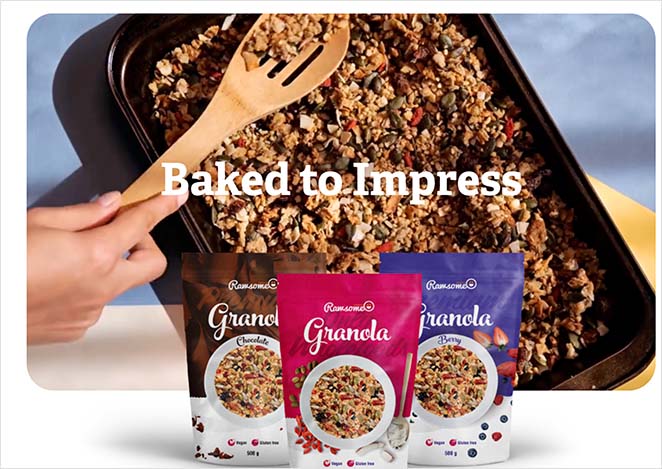
Premium Granola’s landing page is a bright and bold page that uses white space to focus on the product information. Users can scroll through vibrant product images and hear directly from the owner at the bottom of the page.
Why it works:
- Clear value proposition
- Engaging product GIFs captures attention
- No navigation menu
- High-quality product images
- A photo of the owner adds a “human face”
3. Gazelle No1
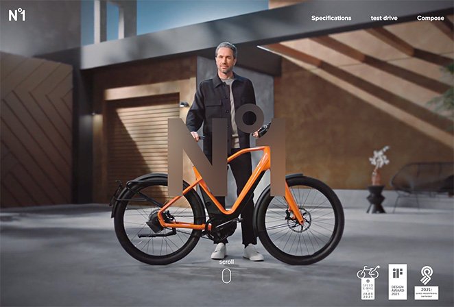
Gazelle No1 offers a complete visual experience with its eCommerce landing page design. It includes interactive elements, smooth scrolling, images, and video that help shoppers visualize owning and using the bicycle.
Why it works:
- Award badges increase trust
- High-quality product images and video
- Interactive product feature buttons
- Multiple CTA buttons
- Anchor links for easier navigation
4. Samina Sleepsystem
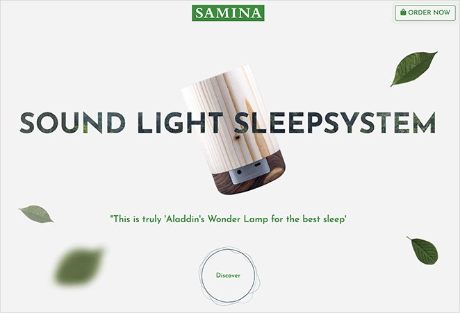
Samina has a stunning eCommerce landing page for its sound, light sleep system. It offsets a neutral background design with high-quality images and clever animations to draw the eye to product details and specifications.
Why it works:
- Social proof above the fold
- Authority-building founder statement
- Navigation CTA is always visible
- High-quality product images
- Exit links only in the footer
5. Genki Instruments

This eCommerce landing page example from Genki Instruments has a minimalist design with clever pops of color to create an easy-to-browse shopping experience. It uses images, videos, and customer reviews to highlight the product benefits, build trust, and encourage shoppers to buy.
Why it works:
- Customer reviews above and below the fold
- CTA buttons for different use intents
- High-quality product images
- Free shipping offer
- “Low stock” scarcity message to boost sales
6. Ion X1
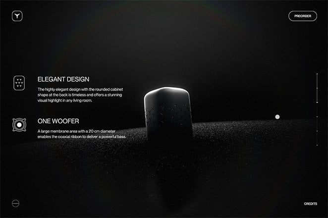
This page promoting the Ion X1 smart speaker has a gorgeous design that exudes class and sophistication. The value proposition is immediately visible, and the clever scrolling feature keeps all information above the page fold.
Why it works:
- Value proposition at the top of the page
- Scrolling transitions seamlessly between information, keeping it above the fold
- Straight-to-the-point copy
- Clear CTA button
7. Naboso eCommerce Landing Page
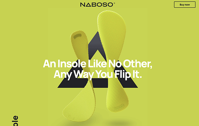
The vibrant design of Naboso’s landing page combines simplicity with the key product color for a stunning visual effect. The insole follows you through the page, helping to illustrate its features in a fun and engaging way.
Why it works:
- Clever animation keeps your eye on the product
- Strong value proposition “An insole like no other, any way you flip it.”
- Excellent use of color
- High-quality images
- Clear CTA button
8. Kookslams Hard Seltzer
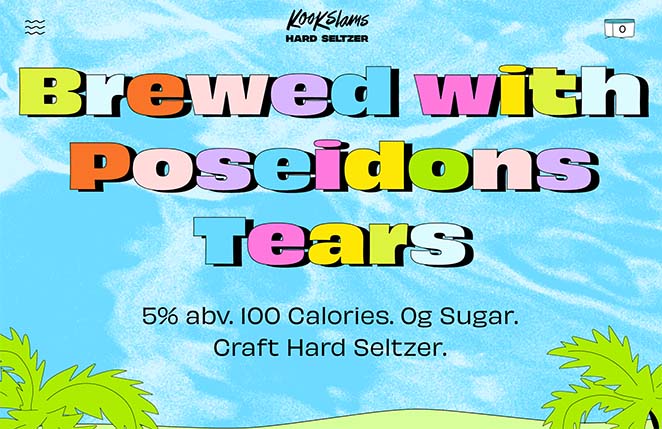
Another vibrant eCommerce landing page is this example from Kookslams. It uses fun illustrations and compelling copywriting to effectively portray the brand’s personality while promoting its products.
Why it works:
- Product information above the fold
- Convincing copywriting
- High-quality images and GIFs
- Multiple bold CTA buttons
9. De Havilland Gin
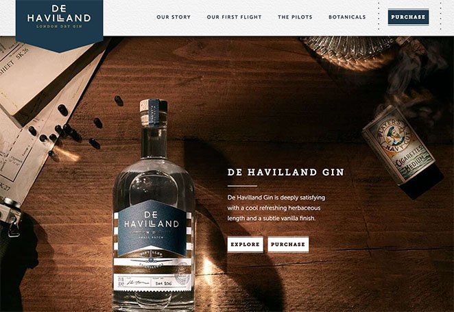
This eCommerce landing page example from De Havilland Gin has a more conventional design but still includes essential information for potential customers. It features high-quality product images, anchor links for easy navigation, and a visible CTA button.
Why it works:
- Eye-catching hero area with CTA buttons
- Product history and overview
- High-quality images
- Multiple CTA buttons
How to Create an eCommerce Landing Page
Now that you have some inspiration, you’re probably wondering how to make an eCommerce landing page. As we mentioned earlier, creating a landing page for your eCommerce site is super easy with landing page builders.
WordPress website owners can choose from various WordPress landing page plugins, but the following solution is the best, in our opinion.
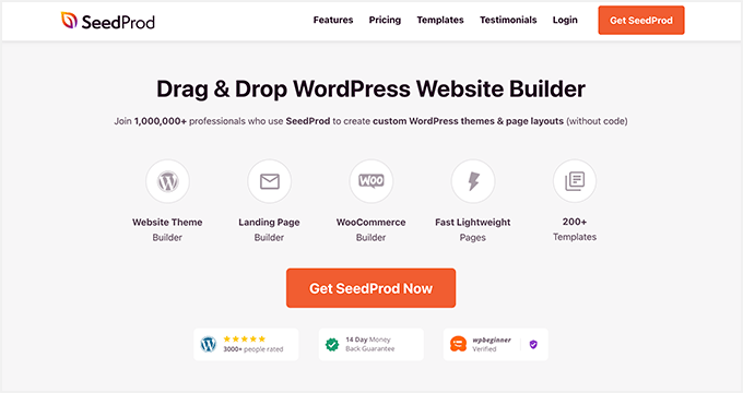
SeedProd is one of the best website builders for WordPress. It lets you create, customize, and launch high-converting landing pages without code.
You can also use SeedProd to create:
- Custom WordPress themes
- Coming soon and maintenance pages
- WooCommerce websites
- Login pages
- Custom 404 pages
- And more
You can start with a professionally designed landing page template, then customize your page visually with the drag-and-drop page builder. SeedProd also includes various blocks and sections, including CTA buttons, reviews and testimonials, countdown timers, and add-to-cart buttons to increase conversions.
Follow this step-by-step guide to learn how to create a landing page in WordPress. Or you can jump right in:
eCommerce Landing Page FAQs
A well-designed eCommerce landing page typically includes a compelling headline, clear product or service description, attractive visuals, prominent call-to-action buttons, customer testimonials, trust indicators (such as security badges), and any relevant offers or incentives.
To create an effective headline, focus on capturing the attention of your visitors and clearly conveying the value proposition of your product or service. Make it concise, specific, and compelling to generate interest and encourage further exploration.
Absolutely! Product images are crucial for eCommerce landing pages as they provide visual representations of your offerings. Use high-quality images that showcase your products from different angles, highlighting their key features and benefits.
There are several strategies to improve the conversion rate of your landing page. Optimize the page’s design and layout for easy navigation, simplify the checkout process, use persuasive copywriting techniques, test different variations of your landing page elements, and leverage user data to make data-driven decisions.
You can track the performance of your eCommerce landing page using web analytics tools like Google Analytics. These tools provide valuable insights into visitor behavior, conversion rates, bounce rates, and other key metrics. Analyzing this data helps you understand what’s working and identify areas for improvement.
There you have it!
We hope this post helped you find some excellent eCommerce landing page examples and the information you need to make your eCommerce page successful.
You might also like to learn the difference between a landing page vs. a splash page.
Thanks for reading! We’d love to hear your thoughts, so please feel free to leave a comment with any questions and feedback.
You can also follow us on YouTube, X (formerly Twitter), and Facebook for more helpful content to grow your business.

