I’ve been in digital marketing for over 10 years, and I’ve seen how ebook landing pages are game-changing for lead generation. HubSpot reports that 43.6% of marketers say generating leads is their main goal. And ebook landing pages? They’re perfect for just that.
An ebook landing page is a simple web page with one job: to offer a free ebook in exchange for someone’s contact info. It’s a smart way to grow your email list while giving your audience something valuable.
In this guide, I’ll share some of my favorite ebook landing page examples. We’ll look at why they work so well and how you can use the same ideas to create your own high-converting pages.
Ebook Landing Page Examples:
Why Create a Landing Page for Your Ebook?
You’ve put a ton of work into creating your ebook. But here’s the thing – even the best ebook won’t do much good if nobody knows about it.
That’s where ebook landing pages come in. They do one thing really well: promote your ebook and get more people to download it. And I’ve seen how they can turn a good marketing campaign into a great one.
For example, Qintil, a company that makes learning software, needed more leads and clients. Their solution? They created an ebook about their software and promoted it through a special landing page.
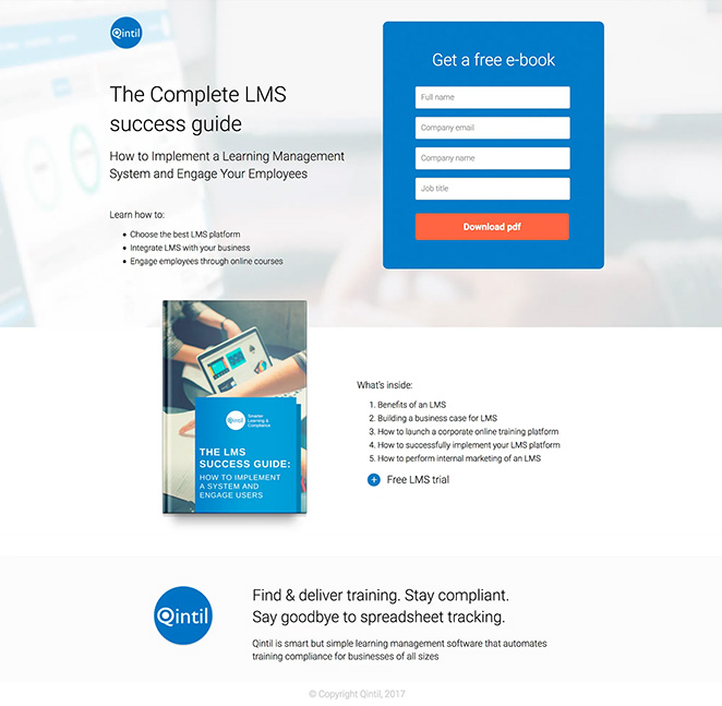
This page did three key things:
- Clearly showed the value of the ebook
- Made it easy for people to sign up
- Used visuals to make the ebook look appealing
The result? A high-performing page that turned visitors into qualified leads, helping Qintil grow their business. You can see the full case study here.
Here’s why ebook landing pages are so effective:
- Laser Focus: Unlike your homepage or blog, which juggle multiple messages, your ebook landing page has one job – to showcase your ebook.
- Lead Generation: A good ebook landing page is like a powerful magnet for potential customers. It makes it easy for them to trade their contact info for valuable content.
- Measurable Results: With a dedicated page, you can easily track views and downloads. This data helps you improve your marketing.
- SEO Boost: A well-optimized landing page can help your ebook show up in search results, bringing more organic traffic your way.
What’s the Conversion Rate for Ebook Landing Pages?
According to Leadpages, the average landing page converts at 11%. But ebook landing pages convert at 24%. That’s more than double. It means for every 100 visitors, you could get 24 new leads.
Ready to see what makes a great ebook landing page tick? Let’s dive into some standout examples.
Ebook Landing Page Examples That Convert
1. Flywheel
When you first see Flywheel’s ebook landing page, you’re greeted with a clear title saying exactly what the ebook is about. Next to it, is the ebook cover, giving you a visual idea of what you’re getting.
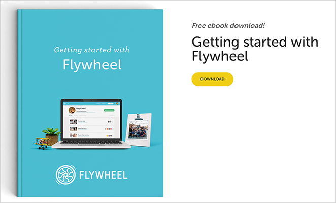
The call-to-action is straightforward – a simple button that takes you directly to the PDF download. To convince you it’s worth downloading, they’ve included a few bullet points explaining what you’ll learn from the ebook.

Overall, the page design is clean and focused, making it easy for visitors to understand the offer and take action.
| What Flywheel Does | How to Use This Idea |
|---|---|
| Clear, descriptive headline | Write a clear title that says what your ebook is about |
| One-click “Download PDF” button | Consider letting people download without signing up |
| Bullet points of ebook topics | Use bullet points to show why your ebook is useful |
| Professional ebook cover image | Make a nice cover for your ebook |
| Page works well on all devices | Make sure your page looks good on phones |
| Simple, focused design | Keep your page simple and focused on the ebook |
Key Takeaway: Flywheel’s page is simple but effective. It gives visitors the info they need and makes getting the ebook easy. By offering the ebook freely, they build trust with potential customers.
2. BlogTyrant
BlogTyrant smartly places their free ebook offer at the bottom of their homepage, where it’s likely to catch visitors’ eyes. They’ve given it an appealing title: “Ultimate Blogging Toolkit + Bonuses,” which immediately tells you it’s free and full of useful stuff.
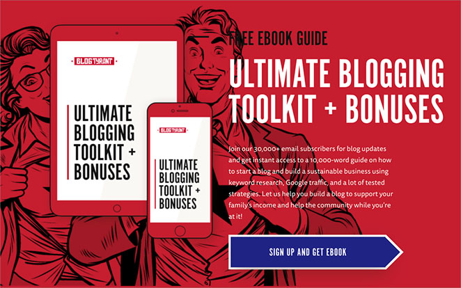
There’s a clear “Sign up and get ebook” button below, so you know exactly what to do next. Click it, and a small window pops up asking for your email address. It’s that simple.
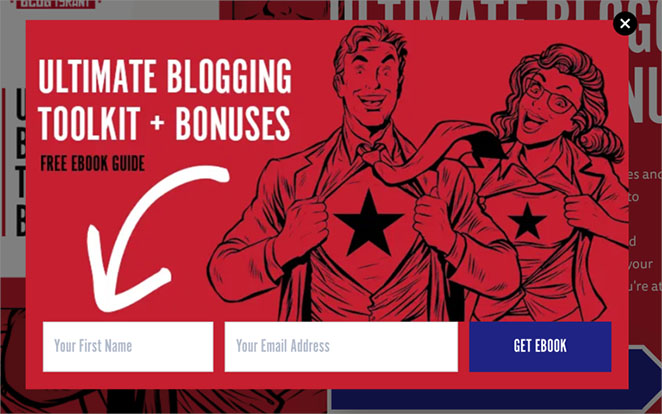
Now, using a pop-up is a bit of a gamble. Some folks find them helpful, while others might be annoyed. But BlogTyrant is confident their ebook is valuable enough to make it worthwhile.
| What BlogTyrant Does | How to Use This Idea |
|---|---|
| Puts ebook offer at bottom of homepage | Think about where to put your ebook offer on your site |
| Says “Free Ebook Guide” | Tell people your ebook is free to get more interest |
| Shows ebook title clearly | Make your ebook title easy to understand and interesting |
| Shows ebook cover picture | Make a nice cover for your ebook |
| Uses “sign up and get ebook” button | Tell people clearly what to do to get the ebook |
| Uses popup for email signup | Think about using popups to get emails if you want to grow your list |
Key Takeaway: BlogTyrant’s homepage does a good job showing off their free ebook. They make it look appealing and explain its value clearly. Try this approach to grow your email list while offering something useful to your visitors.
3. Microsoft
Microsoft’s ebook landing page for Windows 365 is straightforward and packed with information. At the top, there’s a big image and a catchy title: “Windows 365 E-Book: The Only Constant is Change”. This title is clever because it hints at how Windows 365 can help with changing work environments.
On the left side, Microsoft explains why their ebook is useful. They list four main benefits you’ll learn about in the ebook, like making hybrid work easier and keeping things secure.
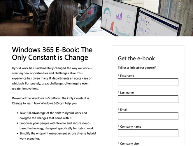
On the right side, there’s a form to fill out. It has quite a few fields to complete before you can get the ebook. At the bottom of the form, there’s a button that says, “Get the e-book”.
Interestingly, Microsoft asks for a lot of information. This is tricky because people usually don’t like filling out long forms.
Dan Zarrella, a marketing expert, found that as the number of form fields increases, fewer people tend to complete the form. But the drop isn’t as big as you might think.
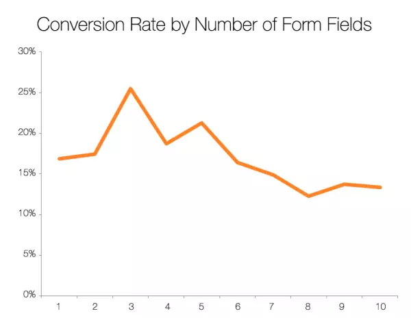
Microsoft must believe that the quality of leads they get from more detailed forms is worth losing some potential downloads.
| What Microsoft Does | How to Use This Idea |
|---|---|
| Uses a big, eye-catching image | Add an attractive image to your landing page |
| Has a clever, relevant title | Create a title that relates to your readers’ needs |
| Lists clear benefits of the ebook | Tell people exactly what they’ll learn |
| Uses a longer form for lead quality | Consider what information you really need from leads |
| Offers additional resources | Give people a way to learn more if they’re not ready to download |
Key Takeaway: Microsoft’s approach is about quality over quantity. They provide lots of information upfront and ask for detailed lead information in return. This can work if your ebook is highly valuable and you’re targeting a specific audience.
4. HubSpot
HubSpot’s ebook landing page is a masterclass in persuasion. Right from the top, they grab your attention with a clear, bold title and a promise of free, valuable content.
The page is smartly divided. On one side, you see the ebook’s title and a brief description, topped with a “Download Now” button. On the other, there’s an image of the ebook cover, giving you a visual taste of what you’re getting.
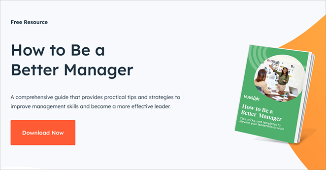
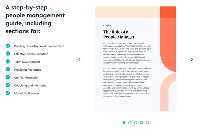
As you scroll down, HubSpot builds your interest. They list out the topics covered in the ebook, touching on key management skills like building a positive work environment and resolving conflicts.
To seal the deal, they even include a slideshow of the ebook’s contents, letting you peek inside before you commit.
For those who need more convincing, HubSpot goes the extra mile. They dive deeper into the ebook’s content, explain who it’s for, and answer common questions with a handy FAQ section.
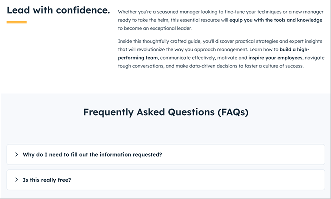
And just in case you missed it the first time, there’s another download button at the bottom of the page.
| What HubSpot Does | How to Use This Idea |
|---|---|
| Emphasizes that it’s free | Make it clear your ebook doesn’t cost anything |
| Shows ebook cover image | Create an attractive cover and display it prominently |
| Lists topics covered | Tell people exactly what they’ll learn |
| Uses a slideshow of contents | Give a sneak peek of what’s inside your ebook |
| Includes FAQs | Answer common questions to remove doubts |
| Has two download buttons | Give multiple chances to download throughout the page |
Key Takeaway: HubSpot gives you plenty of reasons to download the ebook and makes it easy to do so at any point. This approach could work well if your ebook is packed with valuable information, and you want to show off its contents.
5. Pixelgrade
Pixelgrade’s ebook landing page feels like a friendly chat with a WordPress expert. As soon as you land on the page, you see a professional ebook cover and an inviting message.
The title immediately tells you what you’re in for. But what really stands out is the personal touch. Vlad, the author, introduces himself and gives you a sneak peek of what’s inside.
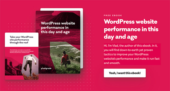
As you scroll down, the page unfolds like a story. You’ll see the main takeaways from the ebook, almost like a movie trailer showing the best parts.
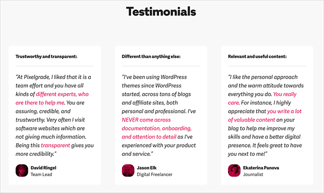
Then come the testimonials – real words from real people who’ve found the ebook helpful. It’s like your friends recommending a good book.
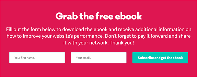
Finally, you get to know Vlad a bit better. This isn’t just any ebook; it’s advice from someone who knows their stuff and wants to help. At the bottom, there’s a simple form to sign up.
| What Pixelgrade Does | How to Use This Idea |
|---|---|
| Shows a big ebook cover image | Make your ebook cover look good and show it off |
| Uses a personal message from the author | Add a personal touch to make readers feel connected |
| Lists key takeaways | Tell people exactly what they’ll learn |
| Includes testimonials | Show comments from happy readers to build trust |
| Introduces the author | Help readers get to know who wrote the ebook |
| Uses casual, friendly language | Write in a way that feels approachable and easy to understand |
Key Takeaway: Pixelgrade’s landing page feels like a friendly invitation rather than a sales pitch. They make the ebook seem valuable and the author approachable. This personal touch could work wonders if you’re looking to build a connection with your readers and present your ebook as helpful advice from a trusted friend.
6. Salesforce
Salesforce keeps things simple with their ebook landing page. The first thing you notice is an image of the ebook cover, giving you a clear picture of what you’re about to download.
Next to it, there’s a form with the heading: “Sign up once and unlock all our resources.” This is clever because it suggests you’re not just getting one ebook, but access to a whole library of valuable content.
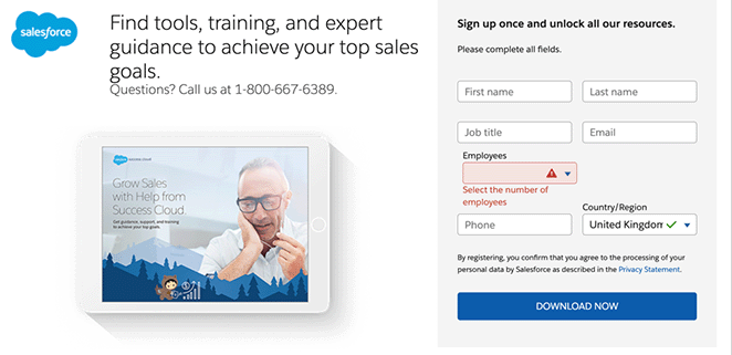
The form itself is pretty standard, but it does ask for quite a bit of information. This might make some people think twice before signing up. At the bottom of the form, there’s a clear “Download Now” button, making it obvious what to do next.
One thing that stands out is what’s missing – there’s not much explanation about what’s in the ebook or why you should want it. Salesforce seems to be betting that if you’re on this page, you already know you want the ebook.
| What Salesforce Does | How to Use This Idea |
|---|---|
| Shows an ebook cover image | Make your ebook cover eye-catching and display it prominently |
| Promises access to more resources | Consider offering additional value beyond just the ebook |
| Uses a clear, action-oriented CTA | Make your download button obvious and descriptive |
| Keeps the page simple | Don’t clutter your page with unnecessary information |
| Asks for detailed information | Think about what user data is most valuable to your business |
Key Takeaway: Salesforce focuses on getting you to sign up instead of talking a lot about what’s in the ebook. This can work well if people already know and trust your brand, or if they came to the page planning to download anyway.
7. Optimizely
Optimizely’s landing page is a colorful blend of information and eye-catching design. It’s clear they’re not just offering an ebook – they’re promising a comprehensive guide to Digital Experience Platforms (DXP).
The page is split into two main sections. On the left, you’re greeted with the bold title “The Big Book of DXP”. Below it, there’s a concise description that explains what a DXP is and why it matters.
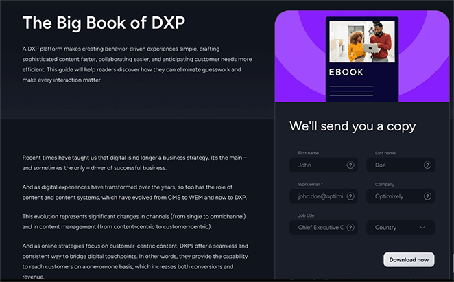
As you read on, Optimizely dives deeper. They even list out exactly what you’ll learn in the ebook, from defining DXPs to sharing real-world success stories.
On the right side, there’s a colorful graphic that draws your eye. Next to it sits a simple form with the friendly heading “We’ll send you a copy”. The “Download Now” button makes it clear what to do next.
| What Optimizely Does | How to Use This Idea |
|---|---|
| Uses a bold, clear title | Make your ebook title stand out and be easily understood |
| Provides a detailed description | Explain why your ebook is valuable and what it covers |
| Includes educational content | Give readers a taste of what they’ll learn |
| Uses eye-catching graphics | Make your page visually appealing to grab attention |
| Keeps the form simple | Don’t ask for too much information upfront |
| Uses a friendly form heading | Make your form feel inviting and personal |
Key Takeaway: Optimizely uses the landing page not just to promote their ebook, but to start teaching visitors right away. This strategy could work well if your ebook covers a complex topic or if you want to establish yourself as an authority in your field.
8. Marigold
Marigold’s landing page keeps things simple. The page is split in two: information on one side, signup form on the other.
On the left, you see the title “Relationship Marketing”, which is short and to the point. Marigold then explains why this topic matters right now and promises stories from big companies like American Airlines and Magnolia Bakery.
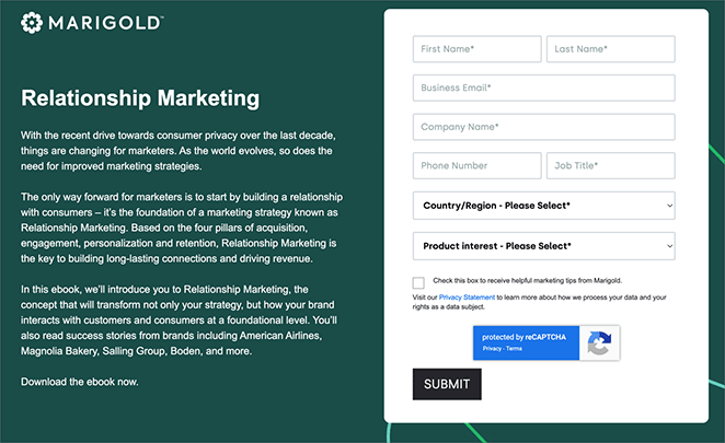
The right side has a form to fill out. It’s pretty long, which might make some people think twice before signing up.
At the bottom of the form is a plain “Submit” button. They could make this more exciting, like “Get Your Free Ebook” or “Download Now”.
What’s missing? Pictures. There’s no image of the ebook or any other visuals to catch your eye. The page also doesn’t have things like customer reviews or the number of downloads, which could help convince people to sign up.
| What Marigold Does | How to Use This Idea |
|---|---|
| Uses a clear, concise title | Keep your ebook title simple and relevant |
| Explains why the topic matters now | Show readers why your ebook is timely and important |
| Previews ebook content | Give a sneak peek of what readers will learn |
| Mentions case studies | Highlight any real-world examples or success stories in your ebook |
| Includes a clear CTA | Tell readers exactly what to do to get the ebook |
Key Takeaway: Marigold focuses on explaining their ebook without any fancy design. This might work well for people already interested in the topic. But for most folks, adding some pictures, making the form shorter, and using a more exciting CTA could make the page work better.
6 Easy to Use Ebook Landing Page Templates
Creating a great ebook landing page doesn’t have to be hard. With SeedProd, you can build one quickly and easily without coding.
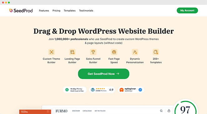
SeedProd is a popular WordPress page builder plugin used on over 1 million websites. It allows you to create beautiful landing pages by simply dragging and dropping.
One of SeedProd’s best features is its library of responsive landing page templates. They use industry best practices, so you can be confident they’ll help you get more downloads or sales for your ebook.
Let’s look at some ebook landing page templates SeedProd offers:
- Ebook Landing Page: This template uses a split-screen design. On one side, there’s a large image. On the other, you’ll find big headings, clear copy, and a simple sign-up form. It also includes social follow buttons at the bottom.
- Ebook Download Page: Similar to the first template, but the split-screen is flipped. Everything important is above the fold, meaning visitors don’t need to scroll. It uses social share buttons instead of follow buttons.
- Free Ebook Landing Page: This is a longer page with more details. The top part has a heading and form. As you scroll, you’ll find more copy, testimonials, and multiple buttons to download. It also uses more images throughout the page.
- Ebook Squeeze Page: This is a short, simple page with a black background. It’s designed to quickly capture attention and get sign-ups without distractions.
- Ebook Sales Page: This template has a minimal design. It includes a unique feature: a sneak peek of an ebook chapter. This can help convince visitors to buy or download.
- Ebook Opt-In Page: Another longer page, similar to template 3. It’s colorful and includes sections for FAQs. This can be great if you want to provide more information and answer common questions.
All of these templates are fully customizable. You can change colors, add your own images, adjust layouts, and more. This means you can make your landing page match your brand perfectly.
SeedProd also integrates with popular email marketing services, making it easy to collect and manage leads from your ebook landing page. Plus, it’s optimized for speed and mobile devices, ensuring your page looks great and works well for all visitors.
Remember, the best template for you depends on your goals. Are you giving away a free ebook to get email signups? Or are you selling an ebook? Choose the template that best fits what you’re trying to achieve.
Ready to create your own? See our step-by-step guide on how to create an ebook landing page in WordPress.
Next, Learn More About Landing Pages
As we’ve seen from the ebook landing page examples in this article, there are many effective strategies you can use to design a page that engages your audience and encourages them to download your ebook.
Remember, the key elements of a successful ebook landing page include a clear value proposition, compelling visuals, concise copy, and a simple sign-up process. Whether you’re using a template or creating a page from scratch, keep these principles in mind to maximize your conversions.
Want to learn more about creating effective landing pages? See these helpful resources:
- How to Create a Landing Page with a Form
- A/B Testing for Landing Pages: What You Need to Know
- Powerful Landing Page Headline Formulas That Convert
- The Anatomy of a Perfect Landing Page
Thanks for reading! We’d love to hear your thoughts, so please feel free to leave a comment with any questions and feedback.
You can also follow us on YouTube, X (formerly Twitter), and Facebook for more helpful content to grow your business.

