Are you looking for login page examples for your website design?
Login pages are like welcome screens that greet visitors as they log into your website. A creative and attractive login page can catch visitors’ attention quickly, drive more traffic to your website, and convert potential customers.
In this post, we’ll share some stunning login page examples to help you design a login screen that converts.
Table of Contents
What Is a Login Page?
A login page design is a page on your website where visitors can sign in. You can also use login form pages to get new visitors to sign up for an account, browse your products, and more.
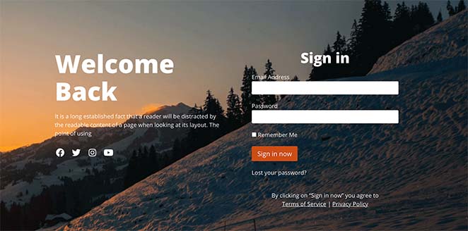
Many website owners put little effort into their login page design. For example, you could add a sign-in form, or a forgotten password link and leave it at that.
But if you want to make users feel welcome on your website and attract more registrations, you’ll need to go a step further.
So what should a login page include? Let’s find out.
What Should a Login Page Have?
First, your login page should include essential elements, like a login form, a login button, and a forgotten password link. But to make your login page more inviting, it’s a good idea to include some of the following things:
- Business logo for familiarity
- Social login buttons for more choice
- Headlines and content to explain the page’s purpose
- Sign-up form for unregistered users
Besides the elements mentioned above, a login page is a great place to promote products and services your users may like. After all, if they’ve taken the time to sign up, they’re already interested in what your brand has to offer.
14 Stunning Login Page Examples
Now that you know what a login page is, here are some excellent login page design examples you can use for inspiration.
1. SeedProd
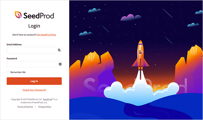
At SeedProd, our login page has 2 purposes:
- To help users log in
- To help users without an account sign up
As you can see, the design has 2 sections, with the login form on the left and an eye-catching image on the right. The “busy” image directs people’s attention to the distraction-free form design, helping users focus on what we want them to do.
And with the link to “Get SeedProd Now,” anyone without an account can learn more about SeedProd and sign up.
2. OptinMonster
This login page example from OptinMonster has a similar layout. But instead of an image, they use carefully crafted copywriting to tell returning users about new OptinMonster features.
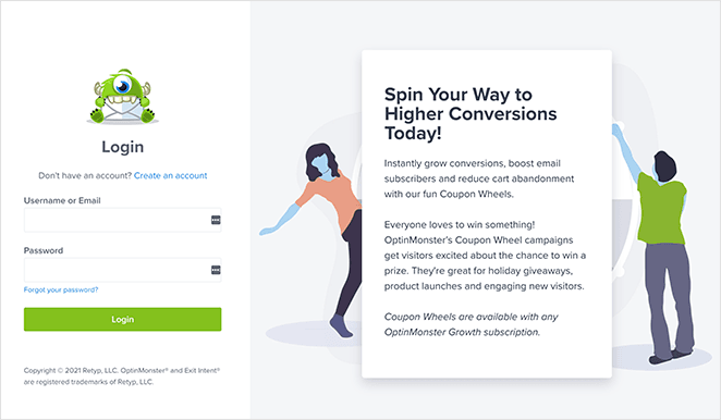
We love this approach because it adds value to the user experience.
Instead of distracting the user, OptinMonster helps them by highlighting features they may have missed while they were away. So after logging in to their account area, users are more likely to check that feature out.
In addition, the feature showcase gives hesitant visitors another reason to sign up.
3. WPForms
Like OptinMonster, WPForms uses its user-friendly login page to tell users about new plugin features.
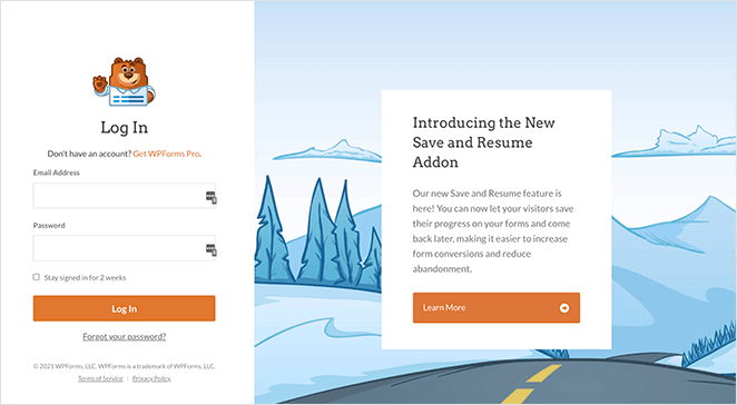
But where WPForms goes a step further is by adding a call to action button inviting users to learn more. Clicking the button takes users to the new feature’s announcement post to get more information.
Again, this approach is an excellent way to educate returning users. But it’s also a great way to give first-time visitors the information needed to convert them into customers.
4. MonsterInsights
Besides telling users about your latest features, you can also promote related products and services using your login page. And that’s what MonsterInsights does with this login page example.
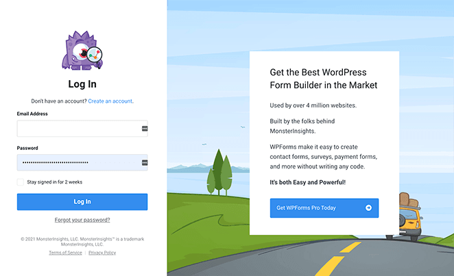
Besides inviting users to create an account and log in, MonsterInsights uses the space to promote its sister product, WPForms. Since MonsterInsights users are interested in WordPress plugins, the chances are that they’ll find WPForms helpful too, which again provides people added value.
You can do the same by promoting products from your partners or affiliates on your login page.
5. Medium
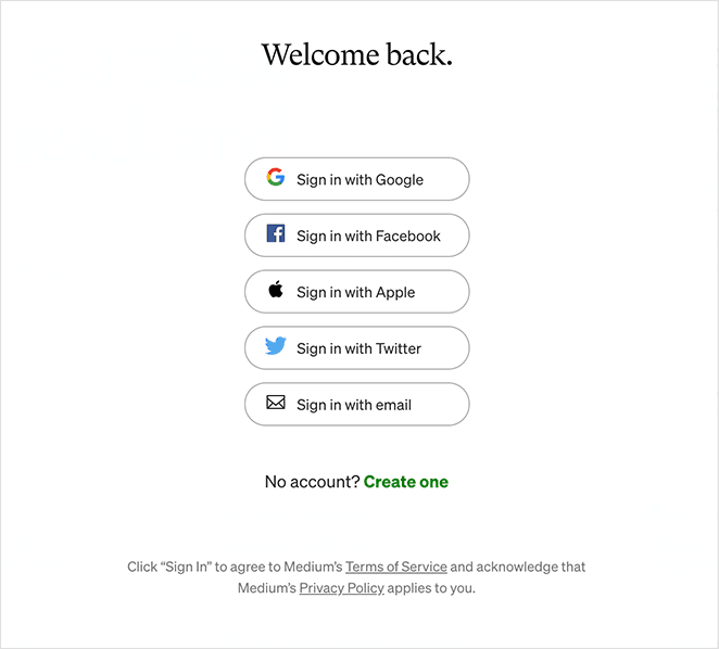
This login page example from Medium is different because it doesn’t offer any input fields for users to log in. Instead, users can choose from the following social login methods:
- Apple
This quick and easy login format with its white background gives users a minimalist experience. True to its brand, Medium keeps the design free of background images and distracting graphics.
6. Spotify
Spotify offers another distraction-free design for its login page. It has a minimalist white background, no excess design elements, and the recognizable Spotify logo.
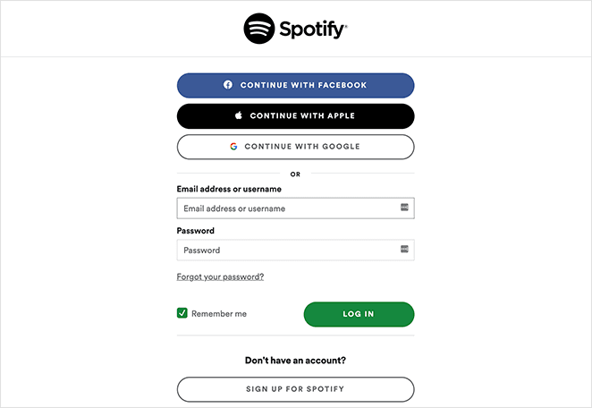
Like Medium, Spotify users can log in with Google, Facebook, Apple, or their email address and password. It also includes easily readable error messages if you enter the wrong login credentials.
And if you don’t have a Spotify account, you can click the button to fill in a form and create one instantly.
7. Ted
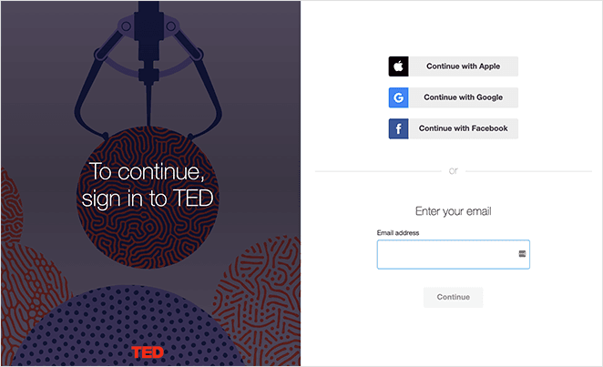
This login page example from Ted has 2 halves. A colorful image and headline inviting users to log in are on the left. On the right is a simple login form and other login methods.
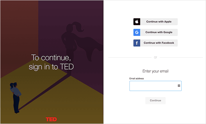
The form side of the page sits on a clean, white background with only a single form field to log in via email. Additionally, users can log in with Apple, Facebook, and Google.
We also noticed that Ted’s login screen cycles between different images. This is an excellent way to keep the login process interesting for repeat users.
8. Dribbble
Dribbble’s login page example has a similar design with an illustration on the left and its form on the right. Given that Dribbble is a community of designers and creatives, we love that they use their login page to promote work from their users, as it shows how much they value them.
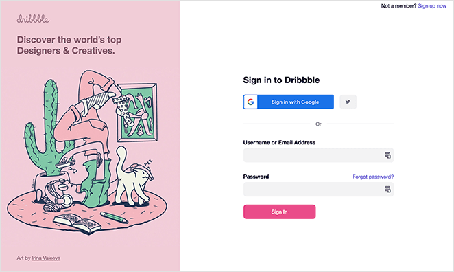
Users can sign in to Dribbble with the usual email and password method. In addition, there are options to log in via Google and Twitter.
And if you aren’t a Dribbble user, you can click the link in the top-right corner to create an account.
9. Awwwards
This login screen example from Awwwards isn’t a page but a lightbox popup. That means users can log into the website without leaving the page they’re currently browsing.
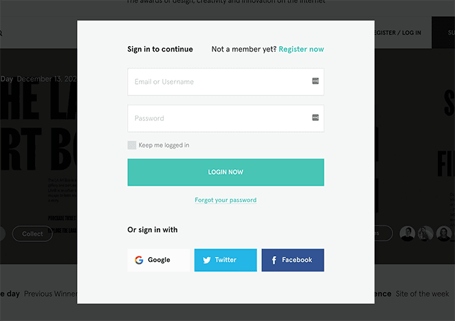
We love how this approach gives users a seamless experience of the website. It also makes visitors more likely to keep reading instead of leaving.
When it comes to the login popup, the form is simple, has minimal form fields, and gives users the option to stay signed in. You can also log in with Google, Twitter, and Facebook.
10. Headspace
Given that Headspace is a meditation and mindfulness service, it’s no surprise that its login page exudes zen. The muted colors and minimalistic design create a peaceful impression, and its choice of imagery is entirely on-brand.
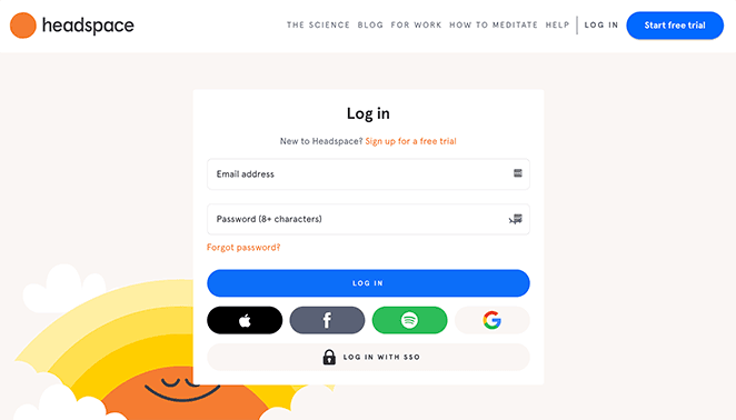
To log in, users can enter their email address and password. Or, they can sign in with Apple, Facebook, Google, and Spotify.
Since Headspace added its material to Spotify, it makes sense that they allow users to log in with that service. Plus, doing so shows that Spotify cares about making things more convenient for its users.
11. Pocket
Pocket is a web and mobile app that allows you to save content to read later offline. It has a split-screen design with various options for logging in.
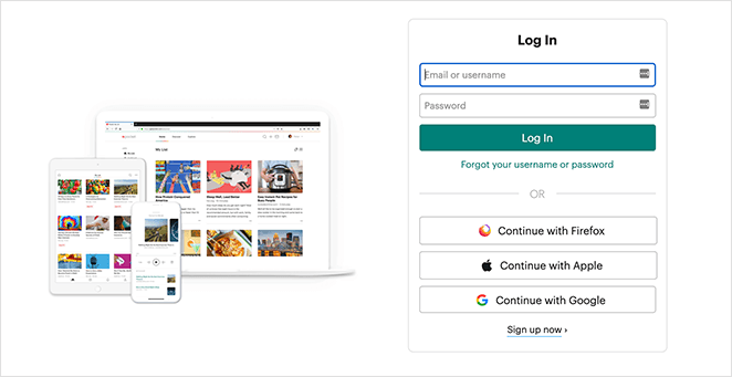
The imagery that Pocket uses is a screenshot of how the app looks on different devices. That is a great way to showcase its many uses to users without that knowledge.
Like many of the login page examples on this list, you can log in to Pocket with your email address and password. You can also sign in with Apple, Google, and Firefox.
12. Dropbox
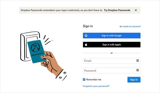
Dropbox is another brand that takes a minimalist approach to its login page design. It has the usual login page elements, including:
- Email address and password field
- Google sign in
- Apple sign
- Custom graphics
- Option to create an account
But what we particularly love about this page is how Dropbox includes a notification promoting Dropbox Passwords. The product is highly relevant to users looking for a safe way to store passwords, so promoting it on a login page is intelligent.
13. Epic Games
This login page example from Epic Games shows how easily you can tailor your login screen to your target audience. Epic’s login page is simple, with only a single-column layout and the brand’s logo.
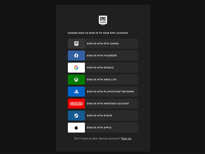
But they don’t just offer 1 way to log in but 8 ways, including:
- Epic Games account
- Xbox Live
- PlayStation Network
- Nintendo
- Steam
- Apple
Since users can log in with their favorite gaming platform, it shows that this brand cares about user experience.
14. BBC
This festive design from the BBC is an example of how you can use your login page to celebrate the changing seasons with your users. It features a fun and engaging design with a simple login form and a full-width background image from one of its popular TV shows.
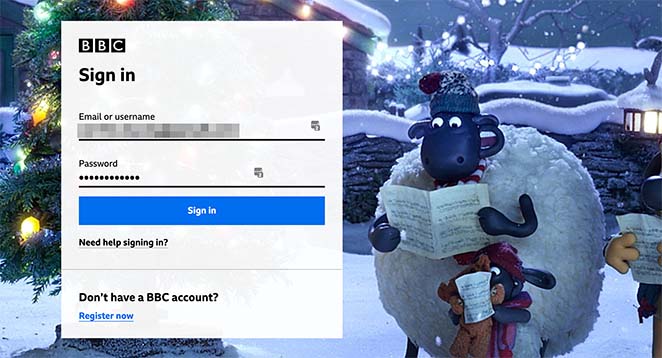
Fans of the BBC will recognize the image immediately, reassuring them that they’re in the right place. In fact, this website regularly changes the login page image to coincide with different seasons and events.
And the result is an ever-evolving login screen that never fails to delight its audience.
How to Create a Login Page in WordPress
After feasting your eyes on the excellent login design examples in this post, what’s the next step? That would be to create a shiny new login page for your website, and if you’re a WordPress website owner, you can create one fast and easily with the SeedProd plugin.
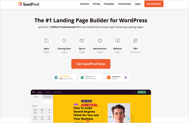
SeedProd is the best WordPress page builder with login page functionality. You can use it to create a stunning login page for your WordPress site with no code required.
Its drag-and-drop visual editor is easy to use and includes everything you need to get started fast, including:
- Premade login page templates
- Customizable login forms
- Easy signup forms
- Email marketing integration
- Social media buttons and embeds
- Social proof elements
- And much more
You can also change your WordPress login URL to hide it from spammers and malicious attacks. With bloat-free code, this plugin will always load super fast.
We hope this article gives you all the login page examples you need to create the perfect design. While you’re here, you might also like this guide on how to create a client login page in WordPress.
Thanks for reading! We’d love to hear your thoughts, so please feel free to leave a comment with any questions and feedback.
You can also follow us on YouTube, X (formerly Twitter), and Facebook for more helpful content to grow your business.

