Do you want to create a lead generation landing page for your website?
High converting landing pages are the most effective way to get website visitors to give you their email addresses. From there, they become qualified leads and potential customers.
This article will share some of the best lead generation landing page examples you can use as inspiration for your next design.
What Is a Lead Generation Landing Page?
A lead gen landing page is a standalone web page for turning your target audience into leads and sales. They typically work by offering a valuable incentive in exchange for a visitor’s email address or contact information.

As a result, your target audience gets something they’ll find helpful, and you get a new lead or customer. It’s a win-win situation.
There are several incentives you can offer on lead capture pages, including:
- Free trial
- Checklist
- Cheatsheet
- Discount or coupon
- Giveaway
However, the key is to ensure you offer something highly valuable. Otherwise, your page won’t hold visitors’ interest long enough for them to convert.
Why Do You Need Lead a Generation Landing Page?
By now, you’re probably wondering why you need a lead generation page. Isn’t a simple lead capture form just as good?
Imagine adding a signup form to your website’s homepage. What do you think would happen?
You might get a few leads, but many website visitors will click away to other pages on your site because there are too many distractions.
However, a lead generation landing page focuses on a single goal: generating leads. It will have no unnecessary distractions and use proven digital marketing tactics to convince users to convert.
For instance, you can talk about users’ pain points and offer solutions that overcome them. Research shows that addressing buyer fears on landing pages can increase conversion rates by 80%.
In the end, your business needs a lead gen landing page because it can help build trust, remove distractions and increase conversions.
How Do You Create a Lead Generation Landing Page?
There are many ways to create a lead generation page for your business website. If your website is on WordPress, you can use landing page plugins like SeedProd to build pages quickly and easily.
SeedProd is the best website builder for WordPress, with over 1 million users. It lets you create custom WordPress themes, high-converting landing pages, and flexible WordPress layouts without writing code.
You can choose from 150+ premade WordPress themes and landing page templates to get started. From there, you can customize every part of your design with SeedProd’s drag-and-drop page builder.
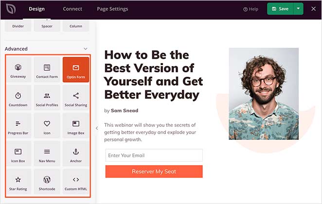
SeedProd also has built-in coming soon, maintenance, 404, and login page modes. You can enable each page mode with a single click, hiding your site’s construction behind a beautiful landing page.
Follow this step-by-step guide to learn how to create a landing page in WordPress.
7 Effective Lead Generation Landing Page Examples
So far, you know what a lead generation page is, why you need one, and how to create one in WordPress. If you’re unsure where to start, you’re in the right place.
Below we share several compelling lead generation landing page examples you can use for inspiration. We’ll also show you how to replicate them with SeedProd.
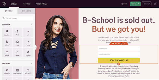
1. Marie Forleo B-School Waitlist Landing Page

Marie Forleo runs a popular online course empowering users to start their own business. But even when B-School enrollment is sold out, she uses a waitlist landing page to continue generating leads.
The page is friendly, eye-catching, and gives users all the information they need to take action, including:
- Visual content provides the brand with a human face
- Bold headlines to grab attention
- Lead capture form to collect email addresses
- Case studies for valuable social proof
- Call to action (CTA) button that stands out

Replicate It with SeedProd
To recreate this type of landing page in SeedProd, you’ll need a 2-column layout and the following landing page blocks:
- Image
- Headline
- Text
- Optin Form
- Testimonials
- Call To Action
You can customize the Optin Form block by hiding and showing form fields, changing the submit button, and adjusting the spacing and margins.
2. Integrify Free Demo Landing Page

Integrify is workflow management software that helps companies work more efficiently. They also use a landing page to generate leads, but they do that by offering visitors a free demo.
They use video at the top of the page to grab attention and engage readers. After, they explain how users can benefit from giving their software a go.
In this example, Integrify uses a contact form with more form fields, such as the company name. They also use plenty of white space to draw attention to the page’s most important features.
Replicate It with SeedProd
To recreate this page with SeedProd, you’ll need two 2-column sections and the following landing page blocks:
- Image
- Headline
- Video
- Optin Form

If you need extra form fields for your form, you can use WPForms, the best WordPress contact form plugin. It works seamlessly with SeedProd, allowing you to customize your form completely.
3. Mixpanel Demo Page

Mixpanel is another company that uses a demo landing page to generate leads. They differ by using a call to action button that leads users to a separate signup page.
However, both buttons result in users signing up with their email address, so the goal is the same.
Mixpanel uses engaging visuals throughout the page and social proof to build credibility and trust. They also repeat their CTA at the end of the page for users who are still deciding.
Replicate It with SeedProd
To recreate this lead generation landing page example with SeedProd, you’ll need several 2-column sections and the following content blocks:
- Image
- Headline
- Nav Menu
- Text
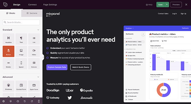
You can then create separate pages for your signup forms and link them to your CTAs. What’s more, SeedProd’s Optin Form block integrates with popular email marketing services to help grow your email list.
4. BigCommerce Product Tour Landing Page

BigCommerce is a popular eCommerce platform for online stores. Their product tour landing page is an excellent way to educate their audience while generating leads simultaneously.
The page is relatively simple, with minimal elements, including:
- Bullet list of covered topics
- Simple graphics
- CTA
- Signup form
You’ll also notice that the signup form is a lot longer than previous examples. That allows BigCommerce to collect more information, such as a phone number, revenue, etc.
Replicate It with SeedProd
To recreate this landing page with SeedProd’s drag-and-drop builder, you’ll need two 2-column sections and the following landing page blocks:
- Image
- Headline
- Text
- Contact Form
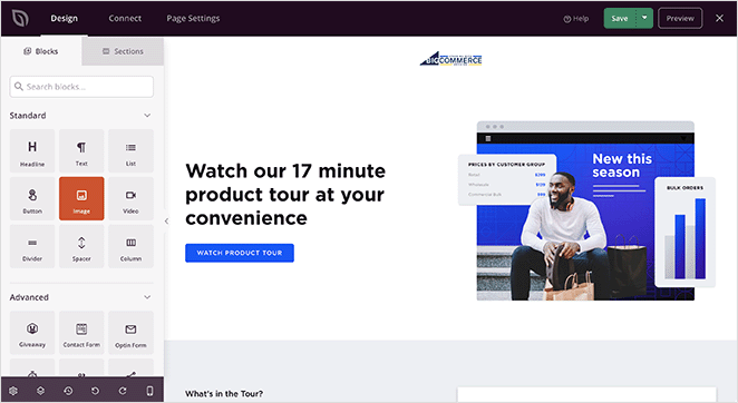
If you want your form to be as long as the example above, you can use WPForms and SeedProd’s built-in Contact Form block to embed it.
5. Freelance to Business Owner Sales Page

Freelance to Business Owner is a downloadable ebook that promises to show you how to secure your ideal clients. Unlike the other lead capture page examples on this list, it’s a long-form landing page with lots of creative copywriting.
The benefits of a long-form page are it gives you lots of space to address user pain points and convince them to take action. It also allows you to include customer testimonials and feedback from people who use your product.
We also like the animation on the primary CTA button because it draws the eye.
Replicate It with SeedProd
To recreate this landing page example with SeedProd, you’ll need multiple sections and the following landing page blocks:
- Headline
- Animated Headline
- Text
- Image
- List
- Anchor
- Testimonials
- Checkout
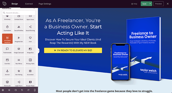
SeedProd’s Checkout block works seamlessly with WooCommerce, allowing users to purchase products right from your landing page. Because it includes a form field for the user’s email address, you can add them right to your email list.
6. Local iQ Webinar Registration Page

Local iQ is a marketing platform for small businesses, and one tactic they use to generate leads is to host regular webinars.
Webinars are an excellent way to offer value to users and educate them about your products or services. More importantly, you can generate leads easily when users register to attend your webinar.
Local iQ has a relatively simple webinar landing page. It includes crucial information about the webinar and a registration form to reserve your seat.
Replicate It with SeedProd
To recreate this landing page with SeedProd, you’ll need a 1 column and a 2 column section, and the following landing page blocks:
- Headline
- Image
- Text
- Button
- Anchor
- List
- Contact Form
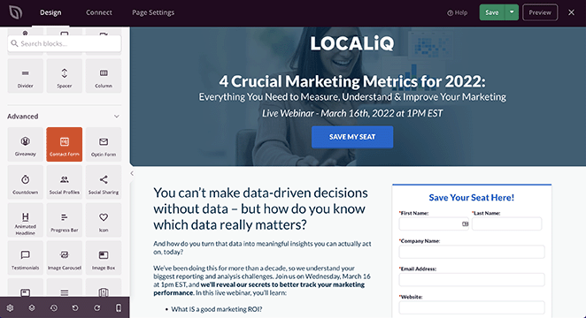
To create the full-width background image at the top, click the sections settings icon and upload an image from your computer.
7. WordStream Free Tool Landing Page

The last lead generation landing page example is from WordStream.
WordStream made a handy tool for marketers that grades their Facebook Ads performance for free. However, users have to enter an email address to unlock the tool.
There’s plenty on this landing page to convince visitors to hand over their email. For instance, it includes a demo of how a report would look, a checklist of what the report covers, and frequently asked questions to ease user fears.
The page also includes a simple signup form that only asks for minimal information. Research shows that limiting form fields to 3 or less can slash form abandonment rates, so the fewer you use, the better.
Replicate It with SeedProd
To recreate this lead generation page with SeedProd, you’ll need several multi-column sections and the following content blocks:
- Headline
- Image
- Optin Form
- Text
- List
- Accordion
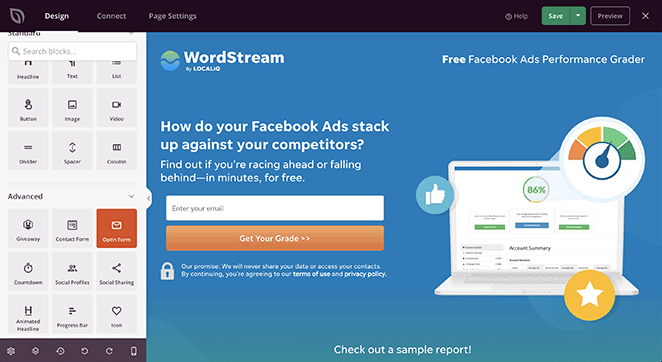
The Accordion block is an excellent way to add frequently asked questions (FAQs) to your landing page. The accordion heading will expand when users click it, revealing answers to their most pressing questions.
Landing Page Optimization Best Practices
Let’s recap this post so far: you know what a lead generation page is, why you need one, and how to create one. We’ve also shared landing page examples to give you some inspiration.
The question remains, what should you do next?
After launching your lead generation page, your work isn’t over. The best way to ensure your page converts well is to optimize it effectively.
Here are a few best practices for optimizing any landing page design:
- Make what you’re offering clear
- Keep your design simple
- Use contrasting colors
- Put crucial info above the fold
- Use urgency to drive action
- Remove your navigation menu
You can find more ideas in our landing page optimization guide.
That’s it!
We hope this article has helped you discover some ideas for your lead generation landing page. You might also like these lead magnet ideas to help grow your email list.
Thanks for reading! We’d love to hear your thoughts, so please feel free to leave a comment with any questions and feedback.
You can also follow us on YouTube, X (formerly Twitter), and Facebook for more helpful content to grow your business.


