Is your landing page not converting as well as you expect?
You could have the best advertising campaign in the world, but if the page you send traffic to isn’t converting, it likely needs some work. You need to step back at times like this and see what is and isn’t working.
The truth is, only 22% of businesses are satisfied with their conversion rates, meaning 78% are facing the same problems as you. That’s why we’re sharing the reasons behind why your landing page is not converting and how you can fix it fast.
9 Reasons Why Your Landing Page Is Not Converting
There are several reasons why your landing page is failing to convert. It could be because your call to action lacks urgency, your user experience is lacking, or your offer isn’t good enough.
But that doesn’t mean you’re domed with poor conversion rates forever. So keep reading to learn why your landing page isn’t converting and how to fix each issue.
- 1. You’re Targeting the Wrong Audience
- 2. Your Visitors Don’t Trust You
- 3. Your Landing Page Has Too Many Distractions
- 4. There’s Too Much Written Content
- 5. Your Message Doesn’t Match Your Ad
- 6. You Ask for Too Much Personal Information
- 7. There Isn’t Any Urgency
- 8. Your Call to Action Is Uninspiring
- 9. The Landing Page Doesn’t Load Fast Enough
1. You’re Targeting the Wrong Audience
The first thing you should look at is if your landing page appeals to the right target audience. If the people that see your ad aren’t interested in your offer, they won’t click through to your page and most certainly won’t convert.
How To Fix It: Build Buyer Personas
Ask yourself the following questions:
- Who will read this page?
- What do I want them to read?
- How do I want them to feel?
- What do I want them to do?
You can also dive deeper into those questions by creating a buyer persona.
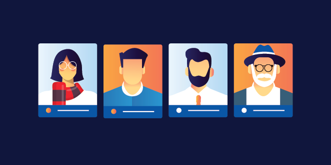
Buyer personas are fictional characters who represent your ideal customer. And the purpose of creating personas is to get a crystal clear idea of the people you’re marketing to.
Check out this guide to create a concrete buyer persona. Once you have your ideal customer in mind, you can adjust your landing page until you’re confident it meets your target audience’s needs.
2. Your Visitors Don’t Trust You
Would you give your email address to a total stranger? Chances are you’d run a mile! Yet when you ask your landing page visitors to fill in a form, that’s precisely what you’re doing.
Most users visiting your landing page probably haven’t heard of you before, making you a stranger. So you need to build a connection and trust before you ask visitors to convert.
How To Fix It: Use Social Proof
Customer testimonials and reviews are an excellent way to build trust. Studies show that users are more likely to respond positively to recommendations from their peers, so use that to your advantage.
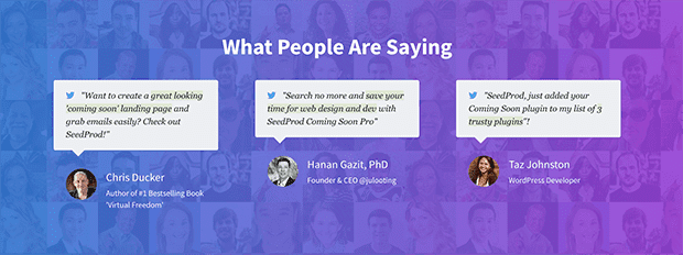
The different types of social proof you can use includes:
- Star ratings
- Client logos
- Written reviews
- Awards badges
- Video testimonials
- Official payment processor badges
- Photos of customers using your product or service
Most importantly, ensure the social proof you use is credible. Would you believe it if you saw it on a competitor’s page? Would it make you want to sign up?
3. Your Landing Page Has Too Many Distractions
Look at your landing page and note how many of the following features it includes:
- Navigation menu
- External links
- Blog posts
- Lots of animations
If you ticked those things off, they’re probably harming your landing page conversion rates rather than helping.
All of those elements are offering users too much choice. And the more choices you offer visitors, the longer they’ll take to make a decision. Chances are they could leave your page without clicking a single link.
How To Fix It: Simplify Your Landing Page
The fix for this issue is quite simple. Get rid of the distractions and make your landing page as straightforward as possible.
You can start by removing the navigation bar, which gave Yuppiechef a 100% conversion increase. Having links other than your call to action gives users a reason to leave your page before you want them to.
Just as important is how well your landing page design flows. You want users to have a frictionless experience that naturally leads them to your call to action.
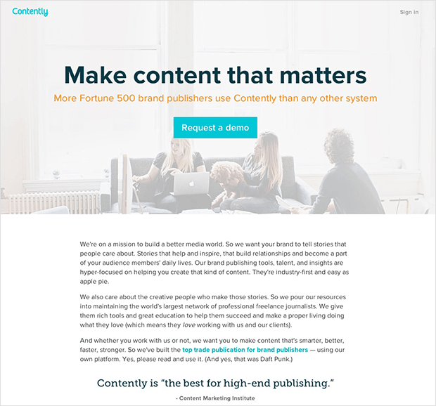
So use clear fonts, bold headlines, plenty of white space, and make your call to action stand out.
4. There’s Too Much Written Content
Too much written content is hard to read and makes your landing page boring. And if you use lots of technical jargon, you’ll turn your visitors off.
Let’s face it; you’re promoting a product or service, not writing the next bestseller. With that in mind, make your copy easy to read and show users why they should convert.
How To Fix It: Make Your Copy Easy to Read
Most people scan web pages instead of reading each word, so only say what you need to say and filter out the fluff. Use plain language and write in a way your target audience understands.
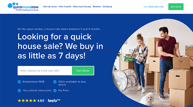
Additionally, make your pages easier to scan by including:
- Shorter sentences
- Bulleted lists
- Headers and subheaders
You can even use videos and images to explain complex information in a way that’s easier to digest. And since videos are more engaging, they’ll keep users on your landing page for longer.
5. Your Message Doesn’t Match Your Ad
Another reason your landing page is not converting could be because it doesn’t match the original ad. If your landing page’s tone, design, and language don’t match your ad, it will feel unfamiliar to users who will bounce off your page.
How To Fix It: Keep Your Design Consistent
To combat message miss-matching, carry the same theme, design, and call-to-action from your ad through to your landing page. That includes using similar imagery, color schemes, headlines, and language.
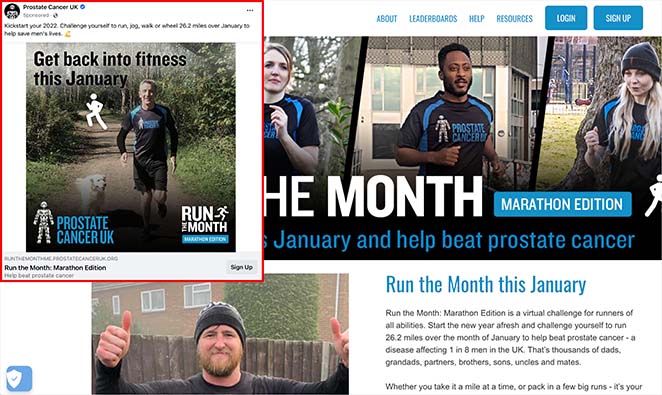
You can also customize your landing pages to suit your traffic source. For example, you can create a landing page tailored to your Facebook audience for Facebook ads or a Google Ads landing page for your PPC campaign.
6. You Ask for Too Much Personal Information
Think back to our 2nd reason for your landing page not converting. If you remember, new visitors to your page don’t know you yet, so the chances of them handing over lots of personal information are slim.
Moreover, first-time visitors are almost certain to bounce if your sign up form has a ton of form fields asking for the users’:
- Email address
- First and last name
- Home address
- Phone number
- Credit card information
Many pages ask for way too much information without explaining why they need it. But the truth is, you don’t need a user’s favorite pet name, mother’s maiden name, and other details for a simple free trial or ebook download.
How To Fix It: Only Ask for What You Need
When creating any type of landing page, be mindful of how much information you request. Your visitors should never have to wonder why you need the details you ask them for.
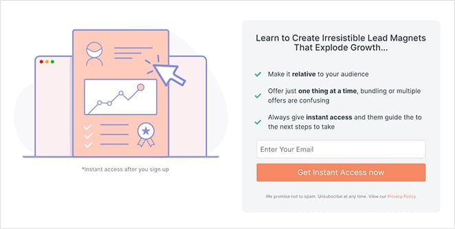
You can get more information from users after you nurture the relationship and ease any concerns about your product or service.
Moreover, the value of what you ask for should match what you offer. For example, if you offer a free ebook, you should ask for less information than a high-value offer such as a face-to-face consultation.
7. There Isn’t Any Urgency
Did you know that most people who visit your landing page and leave won’t ever return? In essence, their first visit to your landing page will also be their last.
And the reason why many people don’t return is that they don’t feel the need to. Your landing page has no urgency – there’s nothing to make them want to come back, so they probably won’t.
How To Fix It: Give Visitors The Fear of Missing Out
If you want to motivate your target audience, give them a deadline to create urgency. For this persuasion tactic to work, you need to give visitors a reason to act now instead of waiting.
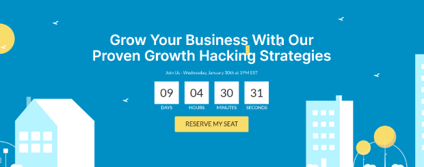
You can use the following methods to create urgency on your landing pages:
- Limited-time offers: Use countdown timers to show how long is left before your offer ends.
- Recent sales notifications: Display how many people have just made a purchase with sales notifications.
- Time-sensitive reminders: Ask visitors to act within a certain time to secure your offer.
- Limited stock: Tell users only a limited number of items are left.
8. Your Call to Action Is Uninspiring
If you’re struggling with your lead generation efforts, it could be that your call-to-action (CTA) or CTA button isn’t strong enough. Most CTAs are vague and don’t inspire visitors to act, such as:
- Subscribe Now
- Buy Now
- Submit
The problem with the CTA examples above is they don’t offer any information on what users can expect after clicking. Would you hand over your information if you don’t know what you’re getting?
How To Fix It: Make Your CTA Irresistible
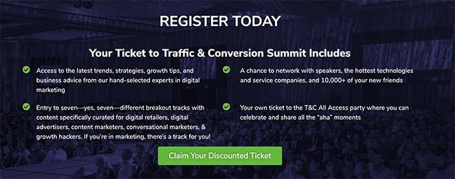
To ensure your CTA is hard to ignore, follow these CTA best practices:
- Only use one offer per page. If you have CTAs for multiple offers on one page, it will confuse your visitors and they may decide not to click at all.
- Use contrasting colors to make your CTA stand out.
- Make your CTA specific to your offer’s benefits. For instance if you’re offering an ebook, don’t just write “Download Now”. Instead, use powerful language to show users what they’ll get, like “Discover Marketing Best Practices”, or “Increase Your eCommerce Conversion Rates”.
9. The Landing Page Doesn’t Load Fast Enough
The speed of your landing page can also have a crucial effect on conversion rates. Not only does your landing page speed impact your search engine rankings, but it also affects user experience.
When your target audience is browsing the internet, they typically have an attention span of no longer than a few seconds. So if your landing page takes longer than 2-3 seconds to load, most people won’t wait around.
Additionally, search engines like Google won’t deliver search results that are slow to load or put people off. They want to present the most relevant and appropriate websites, and slow pages don’t fall into that category.
How To Fix It: Optimize Your Landing Page for Speed
One of the best things you can do for your landing page is optimize it for the fastest page speeds.
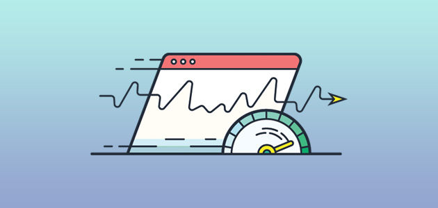
Here are several ways to improve page speeds:
- Reduce the size of your CSS, HTML, and JavaScript
- Leverage browser caching
- Use a content distribution network (CDN)
- Compress and optimize your images
- Host your videos on a video hosting service
Another way to boost your landing page speed is to switch up how you create landing pages in the first place.
Many landing page tools are bloated with features you’ll never use and code that isn’t optimized for performance. And as a result, they’ll add precious seconds to your landing page loading speed.
Think about switching to a tool that keeps page speed best practices in mind. If you create landing pages in WordPress, SeedProd is the best WordPress page builder for the job.
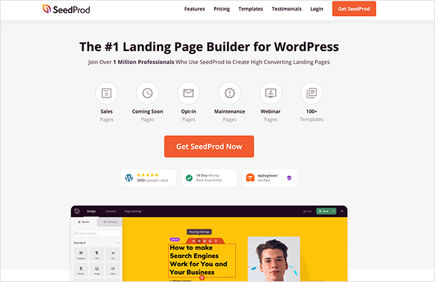
This plugin is made for speed, with minimal code and only the features needed to generate leads.
With SeedProd, you can:
- Create lighting fast landing pages with the drag-and-drop builder
- Build trust with built-in testimonial and star ratings blocks
- Make distraction-free designs with optimized landing page templates
- Simplify your content with bullet lists, accordions, and FAQ blocks
- Message match with video and image blocks, built-in color schemes, and custom fonts
- Keep forms minimal with customizable contact, login, and optin forms
- Increase urgency with built-in countdown timers
- Inspire action with fully customizable CTA buttons
- Boost page speeds with minimal and bloat-free code
Best of all, you can do all that without writing code or hiring a developer.
Essentially, SeedProd can solve all the reasons for your landing page not converting.
So what are you waiting for?
Frequently Asked Questions
The length of your landing page can depend on the goal of your campaign and the complexity of your offer. Generally, shorter pages are better for simple offers, while longer pages may be necessary for more complex or high-priced products or services.
It’s important to focus on the key benefits of your offer and make sure your copy is clear and easy to understand, no matter the length.
Your headline should be attention-grabbing and clearly communicate the main benefit of your offer. Avoid using vague or generic language and instead focus on specific benefits that your target audience cares about.
Use action-oriented language and make it clear what action you want visitors to take, such as “Sign up now for our free trial” or “Get your exclusive discount today.”
A/B testing is a great way to determine the effectiveness of your landing page. Test different elements such as headlines, CTAs, images, and colors to see which combinations drive the most conversions.
Use tools such as Google Analytics or other tools that offer A/B testing features to track and measure your results.
We hope this article helped you learn why your landing page is not converting. While you’re here, follow this guide on using Google Optimize to A/B Test landing pages and get even better results.
Thanks for reading! We’d love to hear your thoughts, so please feel free to leave a comment with any questions and feedback.
You can also follow us on YouTube, X (formerly Twitter), and Facebook for more helpful content to grow your business.

