If you’re launching a new business, your startup landing page is often the first thing potential customers will see. It’s where you prove your idea has legs, collect early signups, and start building momentum before you even have a full website.
In this post, I’ll show you 9 startup landing page examples that do this well, plus how you can create one yourself in WordPress using SeedProd.
Jump to the startup landing page examples:
What Is a Startup Landing Page?
A startup landing page is the first place you send people to validate your idea, collect leads, and drive early conversions. It’s a single, focused page that explains your product or service and often doubles as the homepage when you don’t have a full website yet.
Most startup landing pages fall into two categories:
- Lead capture page: Designed to collect emails or signups with a form so you can follow up later. See how to make a lead capture page here.
- Click-through page: Warms up visitors and pushes them to a next step like checkout or account creation so they can convert immediately.
What Are The Benefits of Startup Landing Pages?
The main benefit of a startup landing page is speed: you can validate your idea, capture leads, and test messaging without paying for a full website. It’s a low-risk way to see if people care about your product before you invest heavily.
Slack is a perfect example. In the early days, it launched with just a single landing page.
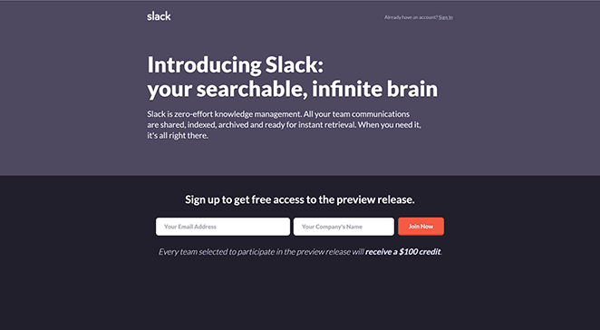
That page let Slack test its message, measure demand, and collect leads for its beta launch. Only after proving the concept did they invest in a full website.
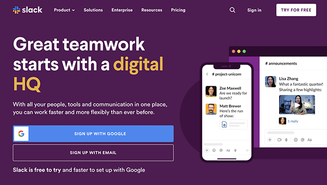
That’s the power of startup landing pages: you can test offers, run split tests, and build buzz—all before you have a complete site.
How to Build a Startup Landing Page
Most startups have limited budgets, making it crucial you find a budget-friendly way to build your landing page. The most cost-effective solution is to use a landing page builder.
Landing page builders focus specifically on creating high-converting pages. They’re also easy to use and often don’t require coding or technical expertise.
One of the best landing page builders is SeedProd, especially if you plan on using WordPress to build your future website.
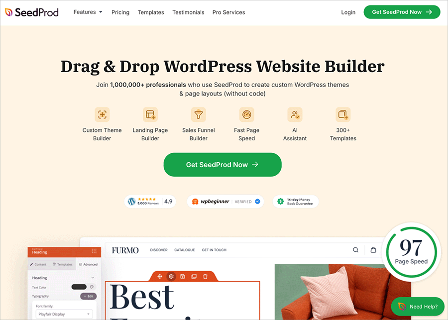
SeedProd is a landing page and WordPress website builder, allowing you to create visually appealing web pages without code. It comes with hundreds of high-quality landing page templates, and you can customize each design with its drag-and-drop editor.
The visual editor has all the building blocks needed to increase conversion rates, including:
- Lead capture forms
- Call to action (CTA) buttons
- Image galleries
- Pricing tables
- Social media
- Reviews and testimonials
- Accordions
- And more
You can also use its page modes to create a coming soon page for your startup, put your website in maintenance mode, or create a login and 404 page.
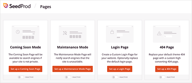
Here’s a step-by-step guide on creating a landing page with SeedProd for your startup. It’s also a good idea to check out this guide on the anatomy of a landing page to ensure you include the essential elements.
9 Startup Landing Page Examples
Do you need some inspiration before making your landing page design? Here are some stunning startup landing page examples that will give you some ideas.
1. SurveyAuto Startup Landing Page

SurveyAuto’s startup landing page is clean, engaging, and shows visitors crucial information about the business. The page has individual sections to separate content and uses imagery to hold your attention.
What I love:
- Images demonstrate the product, giving users a good idea of how it looks
- The scrolling carousel of clients adds valuable social proof for building credibility
- They use video to explain how the product works, making it easy to understand
- Multiple CTA buttons all lead to a method of generating leads
- Users can try it for free, removing the need to pay right away
2. Streem Startup Landing Page
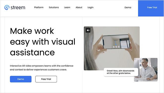
Streem has a minimalist startup landing page that uses white space and color contrast to direct attention. The top of the page features a video to demonstrate the product, while the rest of the page goes into more detail.
What I love:
- Multiple CTA buttons encourage users to get a demo or free trial
- The contrasting color stands out against the clean design
- The navigation menu expands, helping users find the correct information
- Client logos and testimonials build trust and authority
- Features are benefits-based and address user pain points
3. Wheels Startup Page
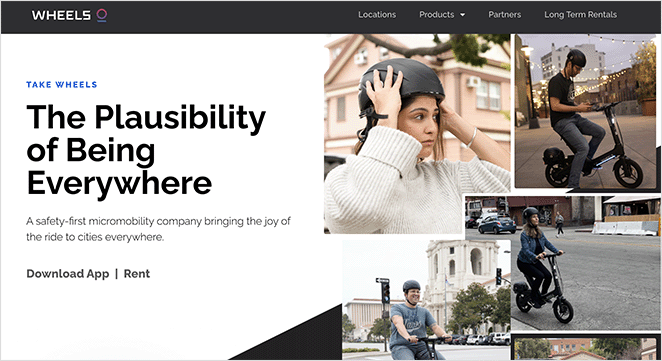
This startup landing page example from Wheels is another design that uses visual content to help users imagine using the product. A combination of highly-quality images and animations brings the page to life, prompting visitors to learn more.
What I love:
- Compelling copywriting helps users visualize the product benefits
- By using official statistics, the startup backs up and adds weight to its claims
- The “trusted by” carousel includes logos from reputable companies
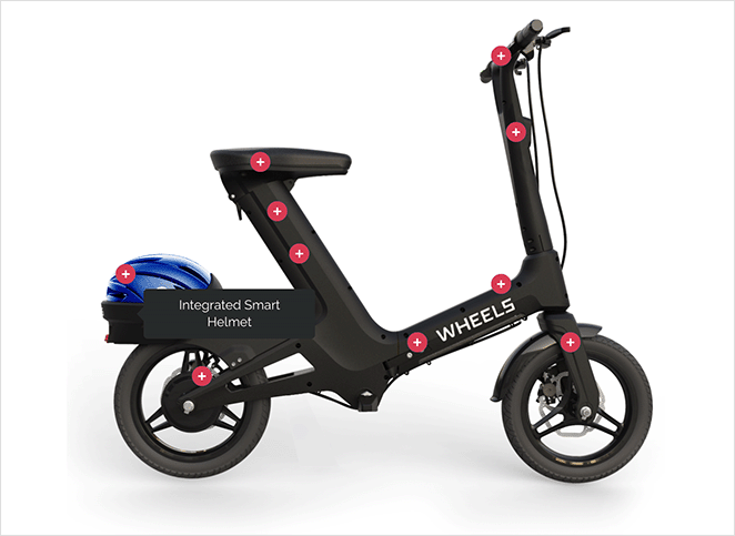
- Users can interact with the product to learn more about each feature
- The bottom of the page includes links to download the app
4. NutSpace Startup Landing Page
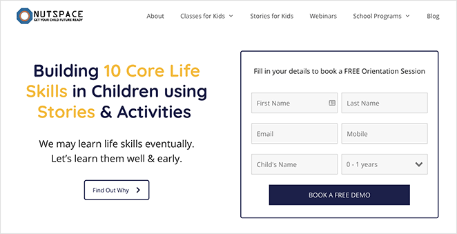
NutSpace has a colorful landing page for its startup, which makes sense, given that its products focus on children. The page uses popular digital marketing strategies to capture attention and guide users. It also allows visitors to book a free session right away.
What I love:
- The lead capture form only asks for the email address and minimal extra details
- Users can buy products directly from the landing page
- The newsletter form at the bottom of the page helps to capture more leads
- Bright colors draw attention and focus on crucial details
- Social icons help users stay in touch
5. CoachHub Startup Landing Page
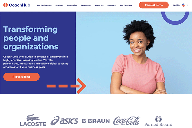
CoachHub offers another example of a stunning startup landing page design. Like the other pages in this post, it has clear page sections and uses visual content to explain the details of its product.
What I love:
- The eye-catching hero section prompts users to act immediately
- Client logos from popular brands build trust with hesitant users
- The focus on safety helps ease concerns about data protection
- Users can quickly learn more with the handy resources section
- The simple animations help draw attention down the page
6. Pleo Startup Page Example
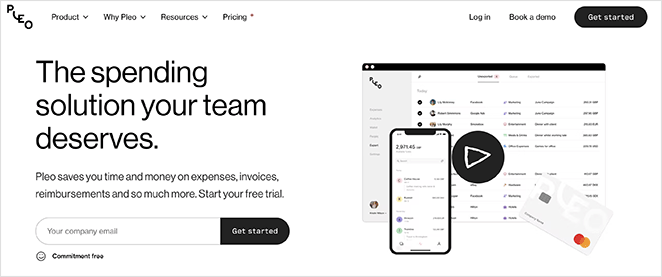
Pleo’s startup landing page has a monochrome design and a modern layout. Visitors get a solid overview of the software as they scroll down the page with high-quality graphics, animations, and videos.
What I love:
- The explainer video explains the product features at-a-glance
- The signup form only asks for the user’s email address
- Video testimonials make the company more trustworthy
- They use more than 1 signup form to capture emails at different decision-making stages
- The animations are simple, lightweight, but also effective at demonstrating the product features
7. Meatable Startup Landing Page

Meatable offers sustainable meat production, and this startup landing page demonstrates its values perfectly. The page takes you on a visual journey and uses emotional copywriting to help visitors imagine a more sustainable future.
What I love:
- Bold, compelling headlines cut straight to the heart of the company’s values and purpose
- High-quality imagery helps to illustrate those values clearly
- The co-founders section gives them a human face which makes them more relatable
- Users can get in touch quickly by using the links at the end of the page
8. NeuroFlow Startup Page Example
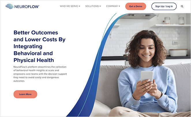
NeuroFlow’s startup landing page design is simple, effective, and easy to navigate. The landing page layout is minimal, with clear sections highlighting product features in a way that’s benefit-driven.
What I love:
- The clever use of image dividers evokes a sense of “flow,” directly relating to the brand
- The feature sections include benefit-driven copy and supporting screenshots
- Statistics and testimonials give the company credibility and trust
- The lead capture form has minimal form fields, making it quick and easy to fill
- Multiple CTAs offer more chances to generate leads
9. Mythical Games Startup Landing Page
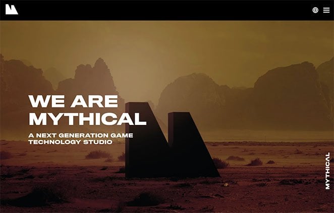
The final startup landing page example comes from Mythical Games, a next-generation game technology company. It’s a simple landing page design, but successful startup pages don’t need fancy bells and whistles to make an impact. You can get your message across effectively with even the simplest landing page elements.
What I love:
- The imagery evokes a “mythical” impression, helping to set the company’s tone
- Bold headlines grab attention instantly, communicating the startup’s core message
- Endorsements from popular media outlets give the company credibility
- Social media icons help users find the brand on different social media platforms
FAQs About Startup Landing Pages
Next Steps
I hope this article helped you learn the benefits of creating a startup landing page. Use the examples in this post as inspiration for your startup.
Remember: the easiest way to create a startup landing page is with a drag-and-drop landing page builder, and SeedProd is the most cost-effective and easy-to-use solution for WordPress.
You might also like this post on creating a landing page with a countdown timer to add urgency to your page.
Thanks for reading! We’d love to hear your thoughts, so please feel free to join the conversation on YouTube, X and Facebook for more helpful advice and content to grow your business.

