Getting people to notice your online business can be tough. You might get visitors to your website, but then they disappear. A squeeze page can help you turn those visitors into subscribers. And as someone who’s built their fair share of landing pages, I can assure you they’re a must-have.
A squeeze page is a simple webpage that asks for visitor’s email addresses. In exchange, you can offer them something valuable like a free download or a discount. This helps you build an email list. You can then use your email list to share updates, promote products, and build relationships with potential customers.
In this guide, I’ll show you some great squeeze page examples and give you tips on how to create your own.
High-Converting Squeeze Page Examples:
- 1. Free Marketing Hacks eBook
- 2. Free Marketing Plan Template
- 3. Guide to Bridging Finance
- 4. How to Meditate Guide
- 5. Free Instant Guide
- 6. Best UK Spas Guide
- 7. Marketer's Guide to SKAdNetwork
- 8. Free Gut Health Guide
- 9. Best-in-Class Share Scheme Guide
- 10. Your Office in a Backpack
- 11. Signup Squeeze Page Template
- 12. Free Trial Streaming Service
- 13. Business Squeeze Page Template
- 14. Real Estate Squeeze Page
- 15. Webinar Registration Squeeze Page
- 16. Sneak Peak Squeeze Page
- 17. Urgency Squeeze Page Example
- 18. Engaging Video Squeeze Page
- 19. Coaching Squeeze Page
- 20. Podcast Squeeze Page
- 21. Black Friday Squeeze Page
What Is a Squeeze Page?
A squeeze page is a simple web page meant to collect visitor information, usually an email address, in return for something like a freebie or discount. The goal is to grow a contact list by keeping the text short, making the call to action clear, and providing an easy form to fill out.
The benefits of using squeeze pages are:
- Helps filter and identify potential customers interested in your offerings.
- Gathers valuable contact information directly from users.
- Building your own email list without relying on social media for communication and marketing.
What Should Be On a High-Converting Squeeze Page?
A good squeeze page has a few key elements that help turn visitors into subscribers. Let’s look at what your squeeze page needs to work well:
- A Compelling Headline: Your headline needs to grab attention right away and tell visitors what they’ll get. Keep it clear and focused on the benefit to your reader.
- Strong Call-to-Action (CTA): Make your signup button stand out and use action words that encourage clicks, like “Get My Free Guide” or “Send Me the Tips.” The CTA should be easy to spot and clearly tell people what to do next.
- Simple Lead Capture Form: Only ask for information you really need – usually just an email address. The more fields you add, the fewer people will sign up.
- Clear Value Proposition: Explain why people should sign up. What’s in it for them? This could be a free guide, exclusive tips, or special discounts. Make the benefit crystal clear.
- Social Proof: Add testimonials, subscriber counts, or trust badges to show visitors that others trust you. This helps new visitors feel confident about signing up.
- Minimal Distractions: Remove navigation menus, sidebars, and other links that might lead visitors away. Keep their focus on your signup form.
- Mobile-Friendly Design: Make sure your squeeze page looks good and works well on phones and tablets, not just desktop computers.
Remember, a squeeze page has one job: to collect email addresses. Everything on your page should help achieve that goal. Keep it simple, focused, and easy to use.
The Best Squeeze Page Examples
Now, let’s dive into some of the best squeeze page examples I’ve found that you can use on your own website.
1. Free Marketing Hacks eBook
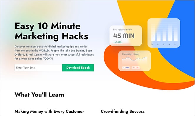
In this design, squeeze page visitors can enter their email address to download an ebook. Ebooks are a popular lead magnet choice for content marketers because they offer significant value through the information they contain.
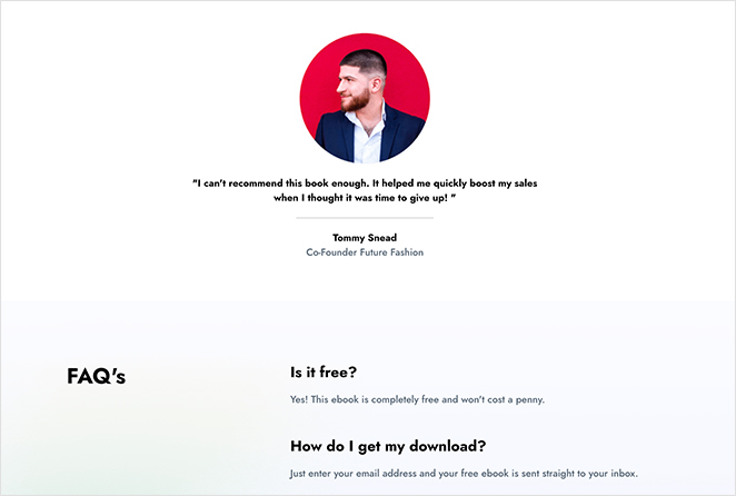
Where this squeeze page example differs from the previous design is in the extra details it offers. It’s a little longer than traditional squeeze designs but not so long that it’s distracting for users.
Why This Squeeze Page works:
- Headline: The benefits for visitors are clear by using the words “easy” and “hacks. “
- Description: The names of leading experts are included in the description, which gives the page more credibility. If authority figures back your content, people are more likely to sign up.
- Social proof: Using testimonials effectively assures users that your offering is legit and endorsed by other users.
- FAQ: A FAQ section allows you to answer popular questions before people subscribe. This removes objections that prevent users from taking action.
- Optin form: Like the previous example, the form doesn’t ask for phone numbers or names. It only asks for an email address, making it easy to subscribe.
- CTA: The CTA is in a contrasting color, helping it stand out from the page. It also uses direct copy, which is more effective in persuading people to act.
How I’d Improve This Squeeze Page
A more specific, benefit-driven headline would be stronger. Visuals in the description would boost engagement. More whitespace would improve readability.
2. Free Marketing Plan Template
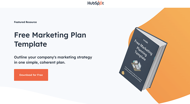
In this example, HubSpot offers a free marketing plan template in exchange for an email address. The squeeze page features a clean design with a prominent form.
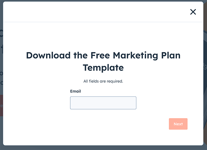
Why This Squeeze Page Design Works:
- Headline: The headline clearly states what the visitor will receive, emphasizing the words “free” and “template.”
- Benefit-Oriented Copy: The description quickly conveys the value of downloading the marketing plan template.
- Form Fields: The form is short, asking only for essential details to minimize friction.
- CTA: The CTA button stands out and uses action-oriented language like “Get Your Free Template.”
How I’d Improve This Squeeze Page
Instead of the plain graphic, a picture or video showing the template would be more interesting. Adding a customer quote would also help build trust. Maybe add a newsletter signup checkbox to the form.
3. Guide to Bridging Finance
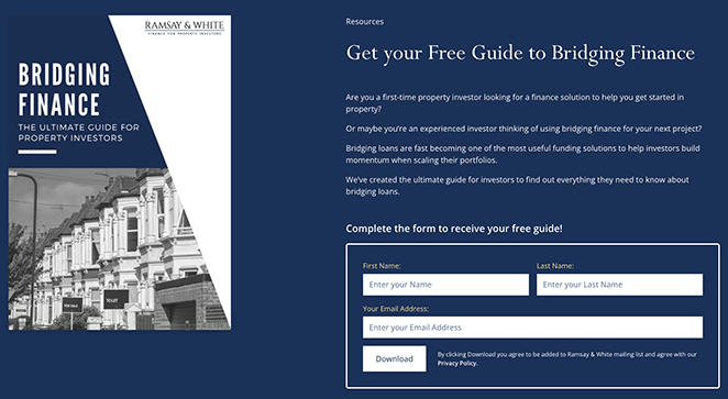
This squeeze page from Ramsay & White provides a comprehensive guide to bridging finance in exchange for contact details.
Why This Squeeze Page Design Works:
- Headline: The headline clearly articulates the main benefit of downloading the guide.
- Visual Appeal: High-quality visuals make the offer more enticing.
- Form Fields: The form is simple, asking for minimal information.
- Trust Elements: Including industry credibility and expertise helps build trust with potential subscribers.
How I’d Improve This Squeeze Page
A visual showing something about bridging finance would be better. Adding a customer quote or a trust badge would also help. The form could also be smarter, asking for just an email first, then more details later.
4. How to Meditate Guide
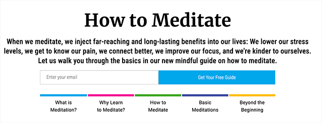
Mindful offers a free guide on how to meditate. Users must submit their email to access the resource. The design is calming and focused, aligning with the meditation theme.
Why This Squeeze Page Design works:
- Headline: The headline is clear, promising a beneficial guide to meditation.
- Imagery: Soothing, related imagery helps keep potential subscribers engaged.
- Form Fields: The minimalistic form lowers the barrier to entry.
- Trust Elements: Endorsements and testimonials add credibility to the offer.
How I’d Improve This Squeeze Page
I’d also add a testimonial or two from users who have benefited from the guide. A subtle animation or hover effect on the CTA button could also draw more attention to it.
5. Free Instant Guide
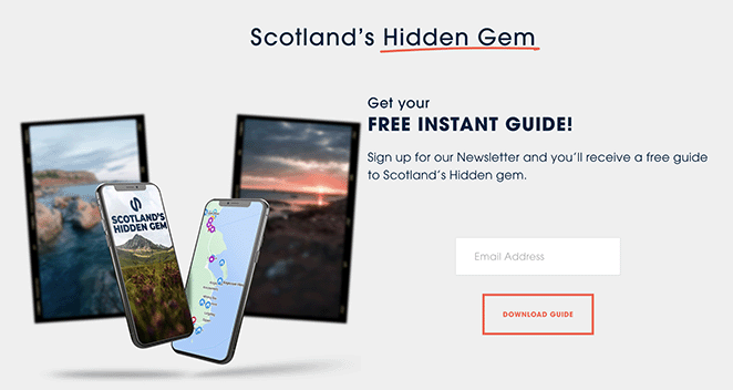
This squeeze page from Sloane’s Media offers a free instant guide on Scotland’s hidden gem. It is well-structured to highlight the guide’s value.
Why This Squeeze Page Design Works:
- Headline: The headline effectively promises an instant and free resource.
- Benefit-Oriented Copy: The description emphasizes what users will gain immediately.
- Form Fields: The form is short and sweet, asking for only an email address.
- CTA: The CTA stands out, ensuring users are clear on how to get the guide.
How I’d Improve This Squeeze Page
The image could be more evocative of Scotland’s hidden gems. A more scenic photo would better capture attention and entice clicks. The description could also benefit from painting a picture of what the guide offers.
6. Best UK Spas Guide
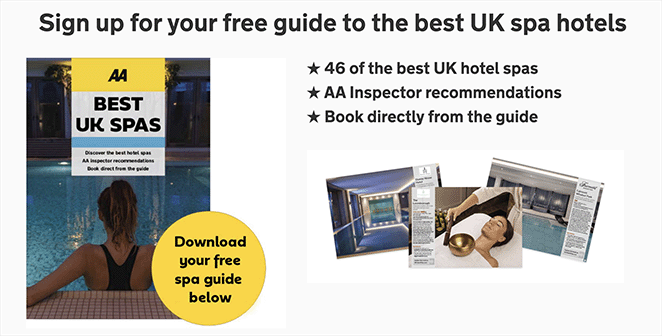
Rated Trips offers a guide to the best UK spas, collecting subscriber emails through an inviting and engaging squeeze page.
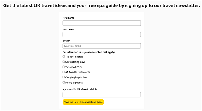
Why This Squeeze Page Design Works:
- Headline: The headline makes a clear, attractive offer.
- Imagery: High-quality images of spas enhance the visual appeal.
- Form Fields: Minimal fields reduce friction for users.
- Social Proof: Logos and testimonials from well-known establishments add credibility.
How I’d Improve This Squeeze Page
The form’s placement could be improved. Positioning it above the fold, where users see it immediately without scrolling, might increase conversions.
7. Marketer’s Guide to SKAdNetwork
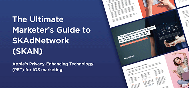
Kochava’s squeeze page provides a comprehensive guide to SKAdNetwork for marketers, accessible after providing email information.
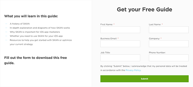
Why This Squeeze Page Design Works:
- Headline: The headline is direct and value-centric.
- Professional Visuals: Visual elements add authority and professionalism.
- Form Fields: The form remains uncomplicated, asking for minimal user input.
- CTA: The CTA button uses contrasting colors and direct action language.
How I’d Improve This Squeeze Page
The headline could be more compelling by highlighting the benefits of understanding SKAdNetwork. The page could also include a brief preview of the guide’s contents, like a table of contents or a short excerpt, to further pique interest.
8. Free Gut Health Guide
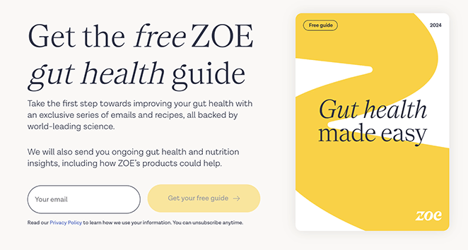
ZOE offers a free guide to gut health with a simple and informative squeeze page that captures user interest effectively.
Why This Squeeze Page Design Works:
- Headline: Clear and precise headline informing users what they’ll receive.
- Visual Relevance: Imagery related to gut health draws user interest.
- Form Fields: Requests minimal information, making it user-friendly.
- Trust Elements: Includes scientific credibility and endorsements, building trust.
How I’d Improve This Squeeze Page
Adding a video of a health expert discussing gut health or a recipe from the guide would make it more engaging. Including a testimonial or a statistic related to gut health could also increase credibility and conversions.
9. Best-in-Class Share Scheme Guide
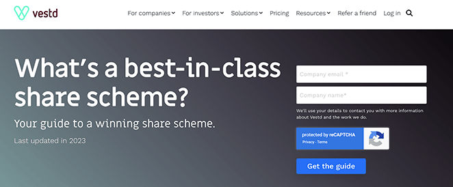
Vestd provides a guide on “Best-in-Class Share Scheme,” targeting business owners and executives interested in share schemes.
Why This Squeeze Page Design Works:
- Headline: The headline promises valuable, actionable advice.
- Design Elements: Professional visuals and layout build credibility.
- Form Fields: Simplified form ensures higher conversion rates.
- Social Proof: Testimonials and trust badges enhance perceived value.
How I’d Improve This Squeeze Page
Adding testimonials from satisfied clients or logos of companies that have used their services, could strengthen trust and encourage conversions. A short, explainer video outlining the key benefits of a well-structured share scheme would further enhance the page.
10. Your Office in a Backpack
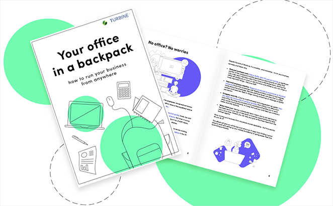
Turbine offers a guide called “Your Office in a Backpack,” which is designed to help users streamline their work setup. The squeeze page is focused and to the point.
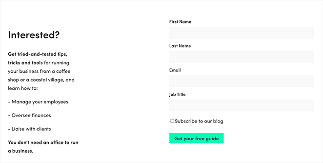
Why This Squeeze Page Design Works:
- Headline: The headline clearly communicates the value proposition.
- Imagery: Visuals of the guide make the offer tangible.
- Form Fields: The form asks only for the essentials, making it easy to fill out.
- CTA: The CTA button uses contrasting colors to draw attention and prompt action.
How I’d Improve This Squeeze Page
The page could benefit from a stronger call to action. Instead of just “Download,” try “Get My Free Guide Now” or “Optimize My Mobile Office Today.”
11. Signup Squeeze Page Template
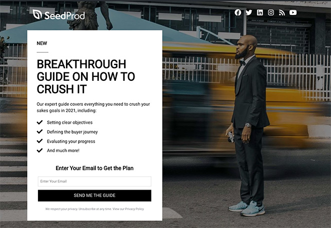
In this squeeze page example, visitors can sign up for a free guide on achieving their sales goals for the year ahead.
Offering a free guide is an excellent way to generate potential leads. But remember, for it to be successful, your free resource must align with your audience’s interests.
Why This Squeeze Page Design Works:
- Headline: The headline is bold and eye-catching and explains the benefits of opting in.
- Description: Users get a good idea of what’s included in the guide.
- Optin Form: The subscription form only asks for an email address, removing friction from signing up.
- CTA: The CTA stands out from the rest of the page, encouraging users to click.
How I’d Improve This Squeeze Page
The background image is generic and could be more relevant to the offer. A visual related to sales goals or business growth would be more effective.
The description, while concise, could be more persuasive by highlighting specific benefits of the guide. Adding a testimonial or social proof element would further build trust and encourage sign-ups.
12. Free Trial Streaming Service
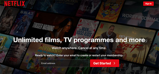
Netflix’s squeeze page invites users to sign up for a free trial of its streaming service. The minimalistic design focuses solely on getting users to create an account.
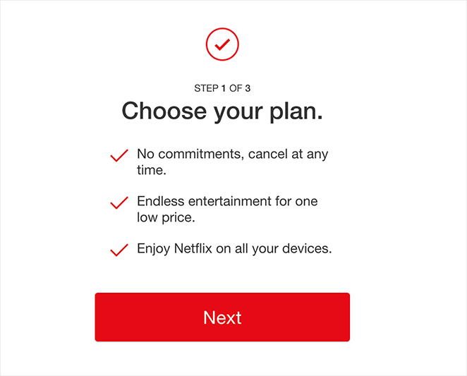
Why This Squeeze Page Design Works:
- Headline: The headline is straightforward, highlighting the free trial.
- Visual Simplicity: A clean, distraction-free design keeps the user’s focus on the form.
- Form Fields: Only essential information is requested, making sign-up quick and easy.
- Brand Authority: The well-recognized Netflix brand adds a layer of trust and credibility to the offer.
How I’d Improve This Squeeze Page
Highlighting specific benefits of the free trial, such as access to exclusive content or ad-free streaming, could increase conversions. Adding a countdown timer, creating a sense of urgency, might also encourage action.
13. Business Squeeze Page Template
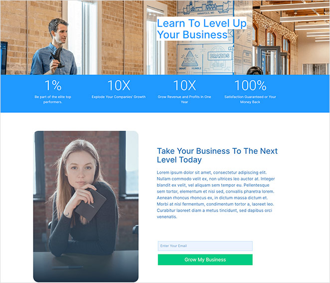
In this example, users are encouraged to subscribe to learn how to level up their business. Although the design is straightforward, several powerful elements transform it into a high-converting landing page.
Why This Squeeze Page Design Works:
- Imagery: In marketing, your audience is more likely to relate to other people. When used properly, the use of people and faces on your landing page can help you establish trust and encourage strong connections between customers and your brand.
- Number promise: This page uses eye-catching numbers that promise you’re part of the top 1% and to 10x your revenue. As a result of those promises, people are more likely to subscribe.
- Optin form: With so much text on the page, keeping the form short and simple is essential for ensuring users can optin quickly.
- CTA: The CTA button copy is benefit-driven, indicating that users should click to grow their business.
How I’d Improve This Squeeze Page
While the numbers are attention-grabbing, clarifying what they represent would add context and strengthen the message. The CTA, while benefit-driven, could be more specific, such as “Get My Growth Plan Now.”
14. Real Estate Squeeze Page
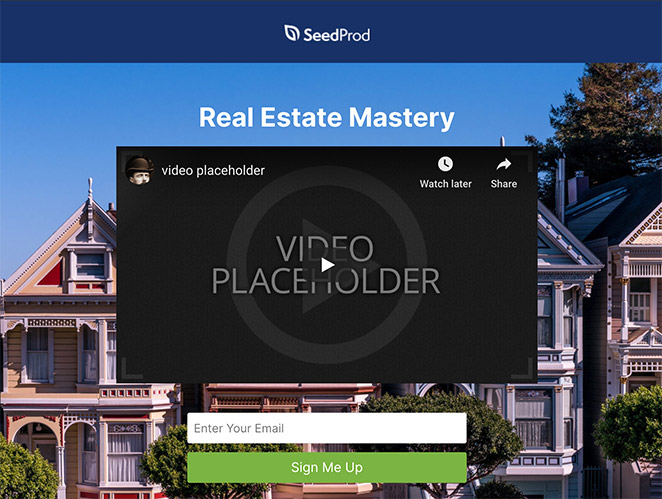
Offering an email course to visitors is a great way to boost your email marketing efforts. Regular emails packed full of useful information will keep your leads engaged with your business.
This real estate squeeze page example from a popular real estate website also uses engagement to get their message across via video. Since videos are easier to remember than simple text, including them on your squeeze page could be just what you need to persuade people to take action.
Why This Squeeze Page Design Works:
- No navigation: By removing the navigation bar from the top of the page, people are unable to click away. This keeps them around long enough to hear your message and take action.
- Video content: As mentioned above, video is more effective at driving your message home than the copy. It’s more memorable and explains complex information easily.
- Optin Form: The subscription form is short and asks for only the information you need.
- CTA: A CTA that explains what you want users to do works better than generic button text like “join” or “subscribe.”
How I’d Improve This Squeeze Page
The headline could also be more benefit-driven, focusing on what users will gain from the email course. Adding testimonials or success stories from past participants would further build credibility and encourage sign-ups.
To make a page like this, see our roundup of the best real estate landing page examples.
15. Webinar Registration Squeeze Page
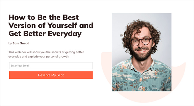
This squeeze page example encourages users to reserve their seats for an upcoming webinar. Not only is a webinar landing page a great way to collect emails, but it’s also one of the best ways to increase registrations for your event.
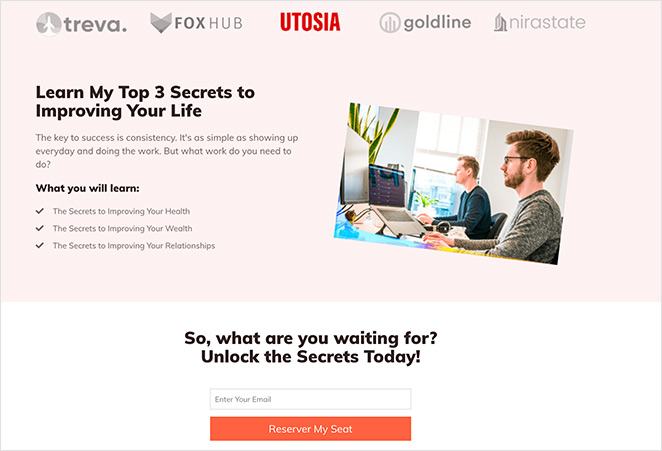
With no other distractions, visitors are completely focused on what you want them to do: register. This example can also be used as a waitlist landing page.
Why This Squeeze Page Works:
- Headline: There’s no doubt about what people will learn from attending this webinar, increasing their registration chances.
- No navigation: Again, this design has no navigation to prevent people from leaving before signing up.
- Trust: Using logos from existing clients sends trust signals to your users, increasing your brand’s credibility. You could also use case studies and testimonials.
- Description: The body copy on this page uses short, straightforward bullet points to clearly explain the benefits. They’re also super-easy for readers to scan in a hurry.
- Multiple CTAs: This page has 2 optin forms instead of 1. This serves as an extra reminder for people to subscribe after reading about the benefits of doing so.
How I’d Improve This Squeeze Page
Adding a short video introducing the speaker and highlighting their expertise would personalize the page and build excitement. While having two opt-in forms is good, ensuring they are visually distinct and placed strategically on the page would maximize their effectiveness.
16. Sneak Peak Squeeze Page
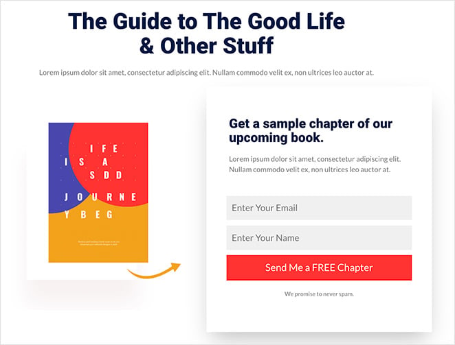
We love the simplicity of this squeeze page design example. It’s clutter-free and offers something valuable for free that readers will love.
Instead of offering an ebook or guide, users can get an entire free chapter of an upcoming book. This works much like a free trial, where if they enjoy what they read, people are more likely to buy the book when it launches.
Why This Squeeze Page Example Works:
- Headline: The headline gets straight to the point about what the page offers.
- Product image: Showing an image of what users can receive makes the offer much more desirable.
- Optin form: Even though this sign-up form has 2 fields, it’s still short enough for users to complete quickly and easily.
- CTA: The CTA stands out yet follows the same color scheme as the rest of the page, creating a consistent and branded look.
How I’d Improve This Squeeze Page
Adding a brief author bio and headshot would personalize the page and build credibility. The CTA button could be made more prominent through contrasting colors or a larger size.
17. Urgency Squeeze Page Example
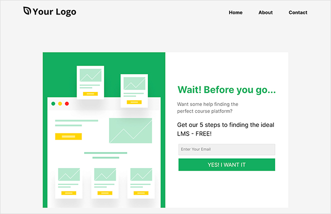
In this landing page design, users are asked to stop and wait before leaving. By opting in, they can get a free guide on finding the perfect platform for online courses.
The only thing we’d change on this page would be to remove the navigation. This would prevent people from leaving before they opt in.
Why This Squeeze Page Example Works:
- Headline: Words like “wait” instill a sense of urgency in readers, naturally leading them to wonder why they should wait.
- Description: The description is simple and short and explains why readers should wait and sign up.
- Optin form: This signup form only requires an email to subscribe, allowing users to sign up quickly.
- CTA: Instead of generic terms, the CTA uses emotive language to connect with the reader and persuade them to act.
How I’d Improve This Squeeze Page
The page could benefit from a stronger visual, perhaps an image related to online courses or educational platforms. Adding testimonials from users who have found the perfect platform using the guide would further build trust.
18. Engaging Video Squeeze Page
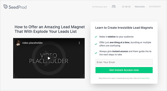
Earlier, we mentioned the power of video in persuading people to take action. This squeeze page design uses it in combination with creative body copy to access an instant online course.
For pages like this, you could use a video of the course instructor or even offer a sneak peek at the course content to whet people’s appetites.
Why This Squeeze Page Example Works:
- Trust: Instead of using a navigation menu, this page shows logos to reassure users of the course’s credibility.
- Headline: “How to” headlines are among the most popular ways to increase conversions. They promise to show you how to do something, which is a powerful motivator for signing up.
- Video: With engaging video content, you can back up your headline by showing examples of what users will learn.
- Optin form: Not only does the optin form include minimal fields, but it also breaks down the benefits of subscribing in easy-to-read bullet points.
- CTA: The CTA copy promises instant access. This reassures visitors that they won’t need to wait.
How I’d Improve This Squeeze Page
Using captions, animations, or screen recordings of the course platform would make it more visually appealing. Adding a countdown timer to the offer would create a sense of urgency and encourage immediate sign-ups.
19. Coaching Squeeze Page
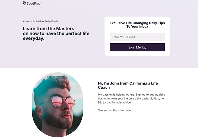
It’s easy to think that squeeze pages are reserved for big businesses and eCommerce websites. Yet even personal brands and coaches can achieve success with a well-designed squeeze page.
The example above, although simple, is a great way to encourage potential clients to subscribe to your list without sounding too pushy.
Why This Squeeze Page Design Works:
- Headline: This headline claims to offer advice from the “masters,” which is both a powerful and convincing use of words.
- Description: The description clearly states that you’ll receive actionable advice daily, revealing exactly what users can expect.
- Personal touch: By introducing yourself to your audience, you can create a more personal connection to readers.
- Optin Form: The form is short, doesn’t take up too much space, and includes a clear CTA button.
How I’d Improve This Squeeze Page
Including testimonials from satisfied clients would also build social proof and encourage sign-ups. The CTA could be strengthened by adding a sense of urgency or scarcity, such as “Join Now – Limited Spots Available”.
20. Podcast Squeeze Page
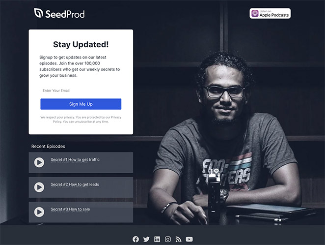
Next up is this stunning squeeze page example for podcasts. By subscribing, users can access thousands of weekly podcast episodes with secrets to growing their business.
Not only is this an excellent way to grow your email list, but it also expands your podcasting audience.
Why This Squeeze Page Design Works:
- Badges: By including platform badges for your podcast landing page, you can reassure users that you cover their app of choice.
- Recent episodes: Allowing users to listen to recent episodes right on your squeeze page gives them the chance to see if they enjoy your broadcasts before signing up.
- Social buttons: Showing buttons for your social profiles helps grow your following on those channels.
- No navigation: Since there are no other navigation options, users have no choice but to subscribe, listen, or follow you.
How I’d Improve This Squeeze Page
Adding a short trailer or highlight reel showing the podcast’s best moments would entice visitors to subscribe. Including testimonials or reviews from listeners would further build credibility.
21. Black Friday Squeeze Page
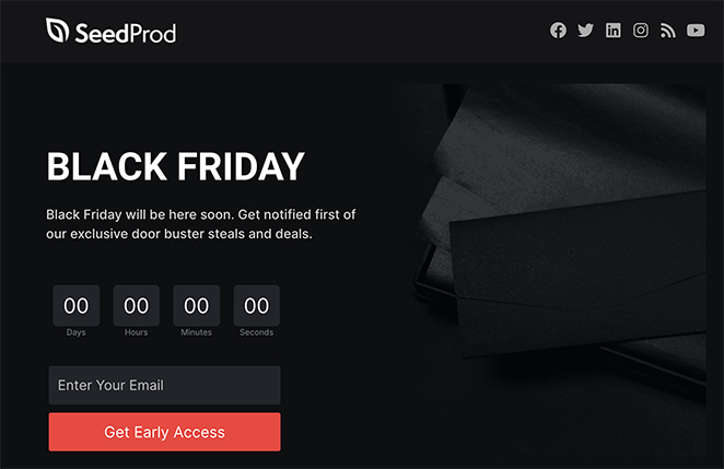
Our final squeeze page example is an excellent way to kick-start your Black Friday and Cyber Monday marketing efforts. To be among the first users to get the deals and discounts, you need to subscribe with your email address for early access.
Why This Squeeze Page Design Works:
- No navigation: With no way to exit the page other than closing the browser, users are forced to decide if they want to get access.
- Headline: Sometimes, the simplest headlines are the most effective, and this one certainly encourages you to take notice.
- Description: The language used in the description is witty, urgent, and engaging. It works to persuade you to take action now.
- Countdown timer: For another layer of urgency, the countdown timer evokes the fear of missing out. It makes you want to subscribe now before your chance is gone.
- Optin form: To keep things simple, the subscription form is short, with only 1 field. You won’t want to fill in lengthy forms if you’re in a hurry.
- CTA: Red is a powerful color and makes you want to stop and take notice. Using it for your CTA button is a great way to get users to pause, think, and act.
How I’d Improve This Squeeze Page
Highlighting a few of the top deals or discounts available would further incentivize sign-ups. Adding a progress bar to the email signup form could also create a sense of gamification and encourage completion.

“A squeeze page is a clickbait designed to capture leads by asking for visitors’ information:
On the other hand, a landing page is a more versatile tool that allows creators to track how many people have viewed it and update the content.
Asking people to register on the website or log in with their Facebook information.”
— Jackie Durbin – KvCORE Coaching
How to Create a Squeeze Page
Over the years, I’ve built a lot of squeeze pages using different tools. Some methods are more advanced and take time to learn. But if you’re just getting started, I think the easiest way is to use a WordPress page builder plugin.
The one I use and recommend is SeedProd.
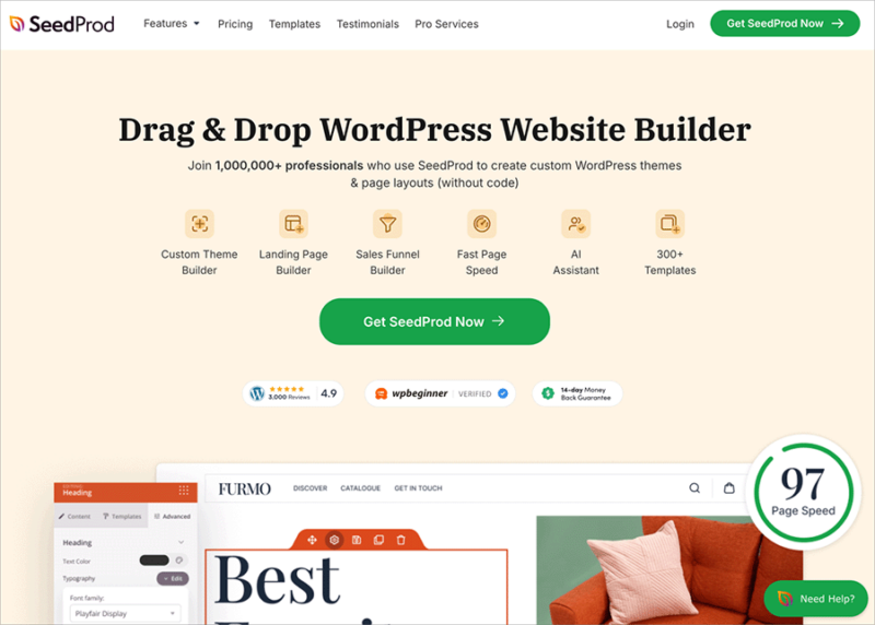
It’s a beginner-friendly page builder made for WordPress. You don’t need to know how to code, and you can design your entire squeeze page using a simple drag-and-drop editor.
SeedProd comes with squeeze page templates you can start with, so you’re not building from scratch. You can add your headline, form, call-to-action, and images with just a few clicks. If you’re offering a freebie like a guide or discount, you can connect your page to your email service right inside the builder.
This is the method I use when I need to build a squeeze page quickly that still looks professional. Everything stays on your WordPress site, and you stay in control of your content and your email list.
If you want to follow a step-by-step tutorial, I wrote a full guide that walks you through everything. You can read it here: How to Create a Squeeze Page in WordPress.
More Questions About Squeeze Pages
Next, More Landing Page Inspiration
We hope this article gave you enough squeeze page examples to inspire your next design.
Ready to create a high-converting squeeze page without writing code?
If you need more inspiration, see the following landing page examples:
- Blog Landing Page Examples + How to Make One
- Best Email Subscription Popup Plugins
- Social Media Landing Page Examples to Grow Your Company
- Request a Demo Landing Page Examples Proven to Boost Leads
- Effective Email Unsubscribe Page Examples + Easy Tutorial
- Top eCommerce Landing Page Examples to Drive Sales
Thanks for reading! We’d love to hear your thoughts, so please feel free to leave a comment with any questions and feedback.
You can also follow us on YouTube, X (formerly Twitter), and Facebook for more helpful content to grow your business.

