Are you looking for sign up page design examples for your website?
Sign-up pages are an excellent way to convince visitors to fill in your sign-up form and register for your product, service, or newsletter. Since no 2 businesses are the same, choosing the right sign-up page design for your site can be confusing.
In this article, we share several different sign-up page designs so you can choose the right approach to increase leads for your brand.
What Is a Sign Up Page?
A sign-up page is a single landing page with the goal of driving registrations. They do that by prompting users to fill in a registration form on the page or by encouraging them to click a call to action button leading to an account creation page.
You might be thinking, “Do I really need separate sign-up or registration pages?” Since you’re already driving traffic to your website’s homepage, what’s the point?
Well, here’s the difference.
Most people who land on your homepage are in the curiosity stage and may not even know what your brand does. They probably come from various sources, like search engines and social media, and are just checking you out, so the chances that they’ll fill in a sign-up form are pretty low.
But if you run an ad with the main goal of getting people to convert, it makes more sense to send that traffic to a landing page designed to get them to sign up. That’s because landing pages have fewer distractions that move users away from your main goal and clever design elements that can increase sign-ups.
We’ll look at what you should include on your sign-up page design next.
What Does a Sign Up Page Have?
A successful sign-up page has several essential elements, including:
- Benefit-driven Headline – Your heading should grab attention instantly and entice users to keep reading.
- Compelling Copy – Include a subheading or supporting copy packed full of powerful words that lead users to the following sentence and the next step.
- Relevant Media – Use eye-catching images to illustrate the value of your product or service and why people should hand over their personal information.
- Sign-up Form – Keep your sign-up form simple with minimal form fields. You can always collect more pieces of information later. Alternatively, you can use a multi-step form with a progress bar.
- Irresistible Call to Action – If your form is behind a CTA button, it needs to stand out. Use a contrasting color and ensure your button is large enough to see against the rest of your content.
Above all, your sign-up page design should have as little friction as possible. So, keep your design clean, to the point, and easy to navigate.
12+ Excellent Sign Up Page Design Examples
Often, the best way to learn about the essential principles of a successful landing page is to see them in action. With that in mind, here are some excellent sign-up page design examples to fuel your inspiration.
- 1. WPBeginner: Popup Sign Up Page Design
- 2. Workplace: Minimal Sign Up Page
- 3. Creddy: Bold Sign Up Page Design
- 4. Brevo (Sendinblue): Reassuring Sign Up Design
- 5. LiveChat: Trustworthy Sign Up Page
- 6. Seven Thirty: Simple Sign Up Page Design
- 7. Read Me: Friendly Sign Up Page Design
- 8. Bamboo HR: Successful Sign Up Page Design
- 9. Postman: Eyecatching Sign Up Page
- 10. Geckoboard: Hassle Free Sign Up Page
- 11. Drift: Sign Up Page with Recaptcha
- 12. Toggl: Multi-Sign Up Options
- 13. Wise: Minimalist Sign Up Page Design
- FAQs About Sign Up Page Designs
1. WPBeginner: Popup Sign Up Page Design
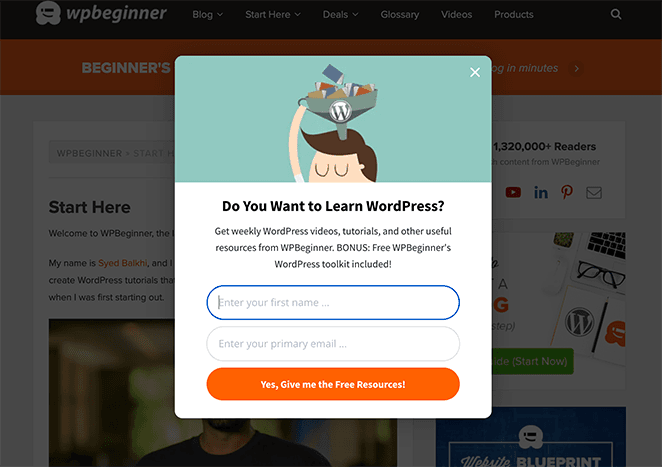
WPBeginner is one of the top resources for people learning about WordPress. So it makes sense that they make it super easy for users to find their sign-up page.
With a single click of the email icon, curious website visitors will see an eye-catching lightbox popup with the following elements:
- Image – Eye-catching and relevant to the target audience.
- Headline – Curiosity-driven and addresses the audience’s pain points
- Sub-heading – Includes action words and a free bonus.
- Sign-up Form – Only has 2 form fields.
- Call to Action Button – Compelling and easy to see.
The simplicity of WPBeginner’s sign-up form makes it easy for users to know what to do next. And the bonus of a free toolkit adds extra value to seal the deal.
2. Workplace: Minimal Sign Up Page
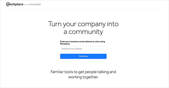
Workplace from Facebook offers a sign-up page design that couldn’t be any simpler if it tried. The entire page is free from distractions, putting the focus squarely on what it wants to achieve.
At the top of the page is the brand’s logo, which helps users recognize the page. After that is a bold benefit-driven headline enticing visitors to keep going.
Then, it’s straight into a single form field with a placeholder text to enter your business email address. It’s less than a 1 min read from start to finish but has everything it needs to convert visitors into leads.
3. Creddy: Bold Sign Up Page Design
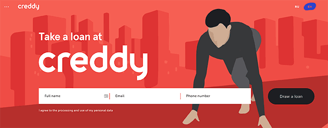
Creddy is a peer-to-peer loan service with a unique sign-up page design. When you land on the page, you see a bold image of someone ready to start running and a simple sign-up form to get started.
We love this combination of elements because it gives the impression of ‘getting ready,’ which evokes a sense of urgency in readers. From there, users can enter their name, email, and phone number and ‘Draw a loan’ right away.
But where this design differs is with what comes after the form. If visitors aren’t ready to sign-up, they can keep scrolling to learn the benefits of using the service.
For example, a compelling image and short phrases with numbers show that the service is quick. And statistics give the impression of reliability.
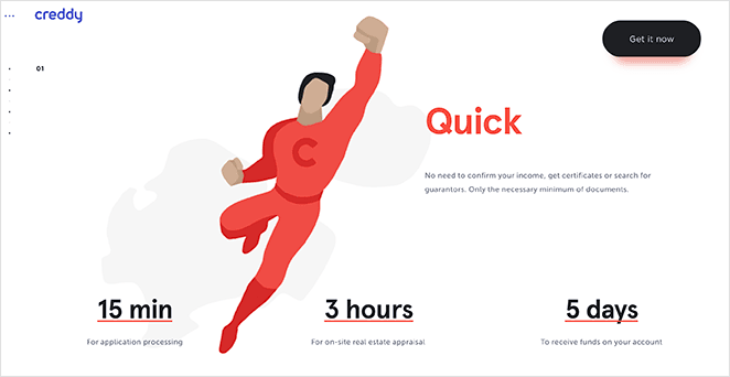
Moreover, at every point through the page, you’ll see a CTA button personalized to each section with phrases like:
- Get it now
- Settled, I’m in
- Ready to apply
This is an excellent example of reaching users at different stages in their decision-making process.
4. Brevo (Sendinblue): Reassuring Sign Up Design
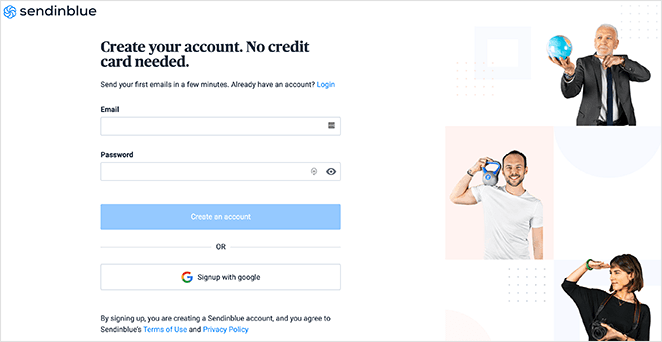
Next is a sign-up page example from Brevo, formerly Sendinblue, a popular email marketing service. On this page, users can register for an account to send emails to their contacts.
Like the other examples on this list, Brevo includes the essential elements on their landing page, including:
- Images – Many of the images use directional queues to direct users to the sign-up form.
- Headline – Includes action words and reassures people that no credit card is needed.
- Subheading – Confirms that it only takes a few minutes to get started or log in.
- Registration Form – Has only 2 form fields to reduce friction.
- CTA Button – Stands out from the page but includes the company’s unique branding.
We also like that this page includes an alternative method for registering. Users can sign-up with Google if they like, giving them an option that may suit them better.
5. LiveChat: Trustworthy Sign Up Page
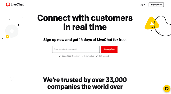
LiveChat is one of the best live chat and chatbot services for small businesses. Its sign-up page is an excellent example of how to keep things focused and engaging.
When you land on the page, you’ll see a bold headline explaining precisely what you can do with the service. That leads you to the promise that you can get LiveChat free for 14 days if you sign up now.
From there, the sign-up form has a single form field to enter your email address. And the CTA button reaffirms the promise of signing up for free.
If that wasn’t enough to convince potential customers, LiveChat goes on to reassure people of their trustworthiness. They do that with a powerful headline and logos from well-known brands that started with a free trial.
That approach is an excellent way to boost credibility and confirm that the company is legit.
6. Seven Thirty: Simple Sign Up Page Design
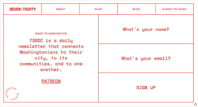
Seven Thirty offers a sign-up page design that’s a little different. Their homepage is also their sign-up page, and it works because the website promotes their email newsletter.
All of the information for this newsletter is above the page fold. That means users won’t need to scroll to learn more.
Furthermore, the sign-up form takes up half of the page, so it’s hard to miss. Again, the form only has 2 form fields, but instead of using traditional placeholder text, the brand uses them to ask questions:
- What’s your name?
- What’s your email?
Taking this approach is more engaging and less formal, which, given the nature of the newsletter, is a good fit for the audience. In the end, the whole page is simple and engaging and ticks all the right boxes.
7. Read Me: Friendly Sign Up Page Design
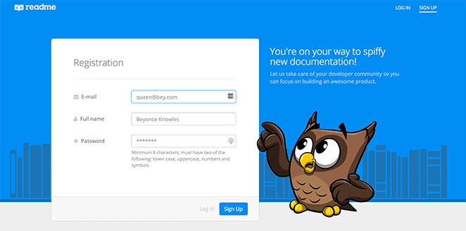
Read Me offers another excellent sign-up page design example that’s simple and engaging. The top area of the page has a contrasting background image that helps the sign-up form stand out.
From there, visitors can fill in 3 form fields to complete the sign-up process:
- Email address field
- Full name field
- Confirm password field
Then, users can either log in or sign up for a new account.
As you can see, this design doesn’t have much text. But the headline and description it does include are quirky, friendly, and reassuring.
Plus, the owl mascot points at the form, showing users where they should focus.
8. Bamboo HR: Successful Sign Up Page Design
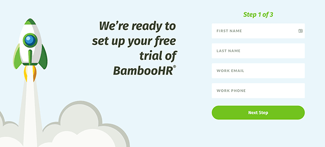
Bamboo HR is a human resources website for small businesses, and its sign-up page design offers a step-by-step process. A 3 step approach like that is a great way to reassure users that the process is easy.
In addition, the page has the following essential elements:
- Image – Evokes a feeling of success and achievement.
- Headline – Reassuring and offers value with a free trial.
- Sign-up Form – Only asks for the details needed to proceed.
- CTA – Entices users to take the next step.
- Social Proof – Logos from existing clients increase trust and boost credibility.
In the end, Bamboo HR has made a page that’s bright, inviting, and ready to help potential customers achieve results.
9. Postman: Eyecatching Sign Up Page
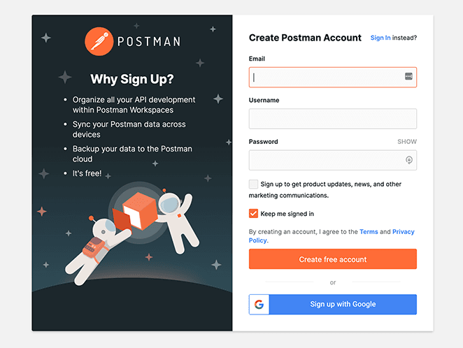
This sign-up page example from Postman has a unique design that aligns with the company branding. The boxed layout keeps the page tidy and the information easy to find.
First is an eye-catching image and bullet points listing the benefits of signing up. Then, on the right is a simple sign-up form asking for an email address, username, and password.
Again, this design includes a call to action button inviting users to create a free account, reminding people that no financial risk is involved. In addition, visitors can sign up with their Google account if they wish.
We especially like the link to the login form for people who already have an account.
10. Geckoboard: Hassle Free Sign Up Page
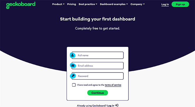
Geckoboard is a business that offers professional KPI dashboards without the hassle. And their sign-up page is similarly hassle-free.
The elements Geckoboard includes on their page are:
- Headline – Tells users exactly what they can do after signing up.
- Sub-heading – Reassures people that signing up is free.
- Sign-up Form – Reduces friction with only 3 form fields.
- Navigation Links – Direct users to useful information.
We’d change this page to remove any unnecessary navigation links as it gives users too many opportunities to leave your website.
11. Drift: Sign Up Page with Recaptcha
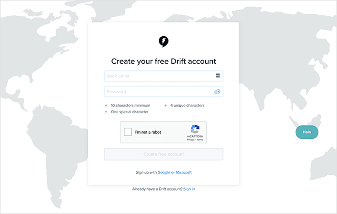
This sign-up page design from Drift is both minimal and engaging at the same time. The background features a full-width world map with animations of saying ‘hello’ in different languages.
Overlaying the map is a simple sign-up form with 2 form fields, an anti-spam Recaptcha, and a call to action button. By including anti-spam tools, Drift can limit the number of bots and fake sign-ups they receive.
And with 2 more sign-up options for Google and Microsoft, they offer users solutions that suit each individual.
12. Toggl: Multi-Sign Up Options
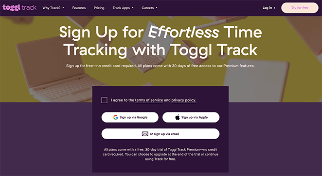
Toggle is a time-tracking tool with a sign-up page design that’s fun and effective. The headline emphasizes how using Toggl is ‘effortless,’ and the description reassures users it’s free to try.
But where Toggl differs is with how people can sign-up for the service. Instead of filling in a form immediately, you need to agree to the terms of service, then click 1 of 3 buttons:
- Sign up via Google
- Sign up via Apple
- Or sign up via email
The first 2 buttons send you to the sign-up process for each platform. But with the sign-up via email button, it reveals a simple 2 field sign-up form right there on the page.
Like many of the other sign-up pages on this list, a multi-sign-up approach is a great way to offer choices to potential customers.
13. Wise: Minimalist Sign Up Page Design
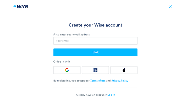
Similar to Toggl, Wise is another brand with a sign-up page offering multiple ways to register. On this page, you can enter your email address to sign-up, or log in via:
- Apple
The rest of the page is kept minimal, ensuring visitors focus only on what Wise wants them to do. In addition, they’ve removed the navigation bar to stop people from leaving the page.
How Do I Create a Sign Up Page?
Now that you’ve seen some compelling sign-up page designs, you might be wondering how to make one for your business. And if you’re a WordPress website owner, we have just the thing you need.
The easiest way to create a sign-up page in WordPress is with SeedProd.
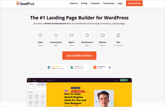
SeedProd is the best WordPress page builder with drag-and-drop functionality. It lets you create any landing page quickly without writing any code.
With hundreds of responsive landing page templates, there’s definitely a sign-up page design to suit your needs. With the live visual editor and powerful lead generation blocks, you can customize your page to your heart’s content without a developer.
Check out this guide to make a sign-up page in WordPress with SeedProd.
FAQs About Sign Up Page Designs
– Include logos from well-known companies that use your service.
– Add social proof testimonials from satisfied customers.
– Clearly state that signing up is free or that no credit card is required.
– Use security icons to show that your site is secure.
Clear benefit: Briefly explain how signing up will benefit the user.
Uncluttered design: Avoid using too many images, text, or navigation links that can distract users from the CTA.
Error handling: Make sure your form provides clear error messages if a user enters invalid information.
And there you have it!
We hope this article helped you find some sign-up page designs to inspire your next landing page. While you’re here, check out these top coming soon countdown plugins to add urgency timers to your landing page.
Thanks for reading. Please follow us on Twitter, Facebook, and YouTube for more helpful content to grow your business.

