Have you ever asked the question, “How to make my blog look like a website?”
Blogs have a distinctive and easily recognizable layout. However, as your business grows, you may want to give your blog a facelift and turn it into a fully functioning website.
Learning how to convert your blog to a website may sound tricky at first, but if you follow the tips in this post, you can make your blog look like a website in no time.
Can You Use a Blog As a Website?
The different purposes of blogs and websites can often be confusing. A blog is designed to showcase your latest blog posts in an easy-to-digest layout, whereas a website aims to educate visitors about your brand or business.
Some bloggers believe they’ll need to create a brand new website from scratch. But the truth is, you can take your existing blog and use it as a website with only a few easy tweaks.
Bottom line: yes, you can use a blog as a website without creating a new site from scratch.
Why Make Your Blog Look Like a Website?
There are many reasons for making your existing blog look like a website. Many bloggers transform their sites because they’ve outgrown a simple blogging setup and want to expand on the information they offer.
It could also be that when you started blogging, you didn’t plan on monetizing your website. A few years down the line, you may develop products that need landing pages, product pages, and other website features to promote them.
Similarly, you may start offering freelance services, such as copywriting, which will require an attention-grabbing homepage, service pages, and testimonials.

Whatever your reason, turning your blog into a website is an excellent way to help your business stand out and grow in an ever-crowded marketplace.
How to Make My Blog Look Like a Website
If you’re asking yourself, “how to make my blog look like a website,” you’re in the right place. Follow the tips below to transform your WordPress blog into a modern and professional-looking website your audience will love.
- 1. Start With the Right Setup
- 2. Create a Logo and Favicon
- 3. Build a Professional Homepage
- 4. Create an About Page
- 5. Customize Your Blog Theme
- 6. Make Your Blog Responsive
- 7. Add eCommerce Features
- 8. Add Ways to Gather Feedback
- 9. Keep to a Consistent Design
- 10. Add Lead Generation Forms
- 11. Integrate Social Media Features
1. Start With the Right Setup
The best blogs and websites start with a solid foundation:
- A custom domain name
- Fast web hosting
If you already have these for your WordPress blog, you can skip this tip, but we recommend reading this section if you haven’t.
Many people start blogging on a free blogging service like Blogger or WordPress.com. It makes sense because you won’t need to pay for any blogging features or to host your website, but it probably also means you’re stuck with a domain name like: yourblog.wordpress.com/.
Domain names like that look unprofessional, so we suggest getting a custom domain name if you want your audience to take you seriously.
The same is true for your website’s hosting.
Moving to a self-hosted WordPress solution gives you more control over your content and website setup. You’ll not only own your content, but you can also add more features to your websites, such as security, regular backups, email marketing, and more.
Luckily, many WordPress hosting providers offer website hosting and custom domains in a single package. Our favorite solution is Bluehost.

Bluehost is an officially recognized WordPress hosting partner with domain and hosting packages for websites of any size. Their plans come with free SSL, CDN, 1-click WordPress installation, free domain name, 24/7 support, and many other powerful features to help you get started quickly and easily.
Check out this Bluehost review for more information.
You can also see these helpful guides if you’re switching from Blogger to WordPress or WordPress.com to WordPress.org.
2. Create a Logo and Favicon
After setting up the perfect foundation, you’ll need a high-quality blog logo and favicon. Your logo is the first thing people see, and it’s what will help them recognize your blog in the future.

Similarly, your Favicon is an icon that helps users find your website when they have multiple browser tabs open. You can find favicons next to anything that identifies your website, including bookmarks, tabs, toolbar apps, RSS feeds, history results, and search bars.
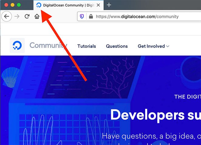
Even though favicons aren’t directly responsible for search engine optimization, they’re an essential tool for improving your rankings.
You can create a great-looking logo and favicon on a budget. There are many free tools, such as Canva, with customizable templates to help you get started. You can even sell Canva templates to monetize your site.
3. Build a Professional Homepage
Creating a homepage is an excellent way to make your blog look more like a website. Instead of the typical blog feed and sidebar, visitors will see an attractive page with all the information they need about your brand.
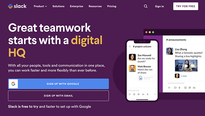
Most homepages have the following layout:
- Header with navigation menu
- Hero section with an introduction
- Features or services
- Testimonials and reviews
- Call to action
- Sample of blog posts
- Footer with contact details
What you include on your homepage largely depends on your blog or business type.
Creating your homepage in WordPress is as simple as creating a brand new page and setting it to display as your website’s front page. You can also use a page builder to customize your homepage design without hiring a developer.
Here is a step-by-step guide on creating a WordPress homepage that covers both options.
4. Create an About Page
Building an “About” page is another sure-fire way to give your blog a structure that looks more like a website.
An about page is where visitors learn more about you or your business. They often go by various names, such as “Start Here,” “Mission,” and “Our Story,” but they all do the same thing: tell visitors who you are and why they should choose your business.
Visitors don’t know you when they first land on your website. With an about page, you become less of a stranger, making users more likely to read your blog posts, join your email list, or buy what you’re selling.
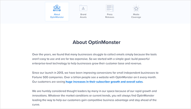
An about page often includes:
- Your business history and why you started
- Why your brand is unique
- Photos of your team
- Your core values
- Why users should choose you
Follow these step-by-step instructions to create an about page for your website.
5. Customize Your Blog Theme
You likely started your blog with a free WordPress theme, and it makes sense. Free themes give you everything you need to run a blog without worrying about costs.
However, free WordPress themes often lack the more advanced design features you’ll need to make your blog look like a website. That’s why it’s best to choose a premium WordPress theme or create a custom theme when you make the transition.
Creating a custom WordPress theme used to involve hiring a web designer with costs running into the thousands. These days, you can do the same thing with a page builder plugin like SeedProd without writing a single line of HTML code.
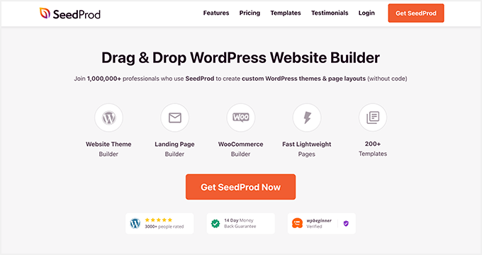
SeedProd is the best website builder for WordPress. It lets you create custom WordPress themes, landing pages, and flexible website layouts without hiring a web developer.
You can start with a premade website template, then customize your theme visually with the drag-and-drop page editor, including your:
- Header and footer
- Static pages like about/contact/services
- Homepage
- Blog page
- Sidebar
- And more
Its versatile page sections instantly help you create FAQs, Calls-to-action, and Hero areas. You can also hide your website behind a coming soon or maintenance page while your website is under development.
You can check out this complete tutorial to create a custom WordPress theme with SeedProd.
💡 Expert Tip
To make sure your blog content performs well in search engines, use tools like SEOBoost. It gives you AI-powered recommendations for keywords, structure, and readability, helping your blog stand out.
6. Make Your Blog Responsive
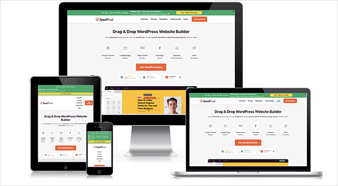
Making your blog mobile responsive is another excellent way to make it look like a website. Because more people browse from mobile devices, they expect websites to adapt seamlessly to different screen sizes.
If your website isn’t responsive, potential customers may leave because it’s hard to navigate, which results in lost leads and sales.
You can combat that by using a mobile responsive WordPress theme and installing mobile-friendly WordPress plugins. These tools will improve your site’s user experience by adding features such as hamburger menus for navigation, larger button sizes, and layouts that adapt to different screens.
If you’re not sure where to start, you can check out this guide on making your website mobile-friendly.
7. Add eCommerce Features
Selling products from your blog is another way to make it look more like a website but to do that, you’ll need to add extra features and functionality.
For example, you may need to create:
- Product pages
- Shopping carts
- Checkout pages
- Add-to-cart buttons
- Customer account dashboards
It might seem like a lot of work, but it’s an excellent way to improve user experience and generate sales or passive income.
You can start small by adding a PayPal payment form to your site. Then, as your website grows, you can branch out and install advanced eCommerce features with plugins like WooCommerce.
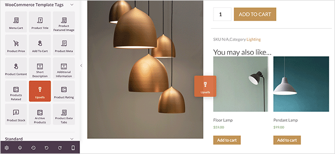
You can also customize your WooCommerce pages effortlessly with SeedProd’s page builder plugin. It lets you add user-friendly features like recommended products, product grids, menu cart icons, upsells, and product ratings to boost order values.
For more inspiration, check out these blog layout examples.
8. Add Ways to Gather Feedback
Whether you sell products from your blog or not, you’ll need a way to learn if you’re giving blog visitors enough value. One way to do this is with a Customer Effort Score (CES) survey.
CES surveys are a popular way to measure customer satisfaction by asking them to rate the effort required to complete a specific task. In the context of a blog, you can ask visitors to rate the effort required to find the information they need or to complete a specific action, such as leaving a comment or sharing a post.
The easiest way to add a CES survey to your blog is with the UserFeedback WordPress plugin. It lets you easily add a survey to your blog without writing code or hiring a developer.
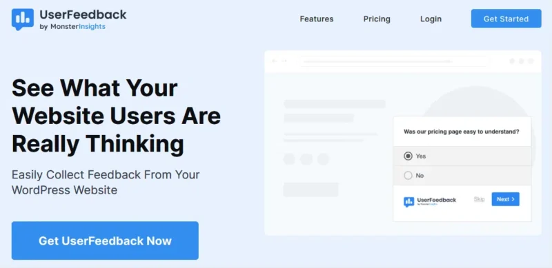
The survey forms popup in the bottom corner of the screen and comes with several templates to help you collect the most relevant information from your visitors. Here’s a guide to help you create a survey with UserFeedback.
9. Keep to a Consistent Design
Consistency is another massive factor in making your blog look like a website. A consistent design makes your website easier to remember, which is crucial considering how many websites there are.
For example, WPForms has the same orange color scheme throughout.
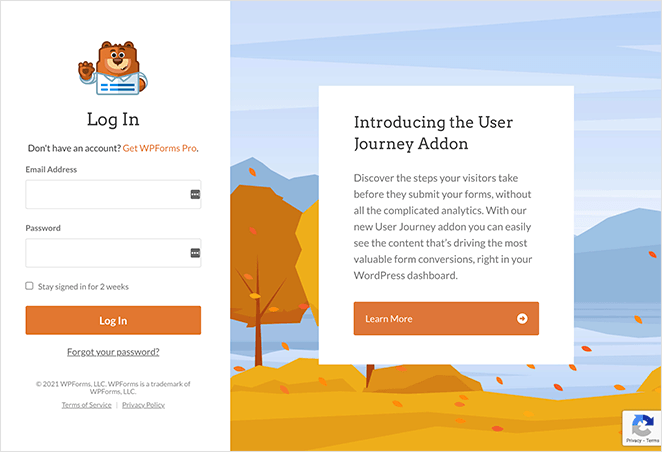
Even though your website should have a similar design scheme, it should also stand out. Here are some ideas for tweaking your website design to make it look unique:
- Create a different layout for your blog page
- Change your website banner images
- Use unique font combinations
- Add eye-catching site navigation
- Create custom sidebars for different pages
Check out these mobile-friendly website design examples for inspiration.
10. Add Lead Generation Forms
Creating a blog that looks like a website is an effective way to improve your lead generation efforts because if users have enough information, they’ll naturally want to learn more.
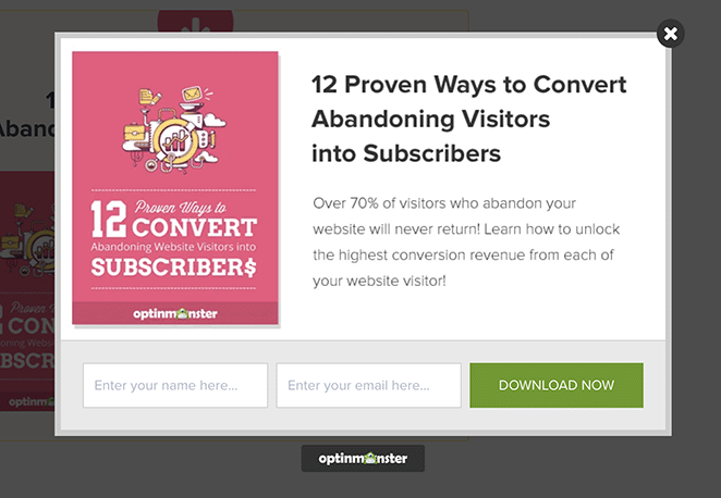
You can capitalize on your audience’s curiosity by adding forms strategically to your site. For example, you can add a contact form to your contact page, a newsletter signup form to your blog sidebar, and an optin-form to your homepage.
We particularly like this example from OptinMonster, which opens in a popup after clicking a lead magnet offer. Because users are getting something for free, they’re more likely to enter their email addresses.
11. Integrate Social Media Features
Social media integration is another popular feature you’ll see on the most successful websites. It’s an effective way to boost brand awareness and promote content to your target audience.
There are many ways to add social media features to your website, but here are some of the most effective tactics:
- Use social media sharing buttons for content promotion
- Include social profile icons to boost your followers
- Embed social media feeds to increase website engagement
The best way to embed social media content on your website is with Smash Balloon.
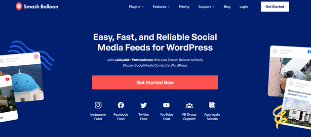
This suite of powerful social media plugins lets you add social media feeds for Twitter, Instagram, YouTube, and Facebook directly to your WordPress site without code. You can choose from multiple responsive layouts and filter your feeds to show specific topics for your blog to keep users engaged.
You can even combine your social profiles into a single social media wall that updates regularly with fresh content.
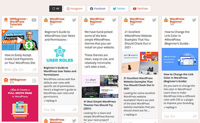
Follow this guide to add social media feeds to your website with a few clicks.
Next Steps
We hope this guide has helped you learn how to make your blog look like a website. You might also like this post on social media lead generation strategies to generate more traffic and leads and the best WordPress blog plugins.
Thanks for reading! We’d love to hear your thoughts, so please feel free to leave a comment with any questions and feedback.
You can also follow us on YouTube, X (formerly Twitter), and Facebook for more helpful content to grow your business.


