Do you want more email subscribers? Or do you want to increase conversions and boost sales?
The easiest way to do this is by creating effective calls to action that create a sense of urgency and encourage users to click and act now. And in this post, we’ll share some of the best call-to-action examples you can’t help but click on.
But first…
What Is a Call to Action?
A compelling call-to-action (CTA) is a phrase used to tell your website visitors the action they should take next.
In blog posts, it could be a simple call-to-action phrase like “Leave a Comment” to encourage users to engage in your comments sections. Or it could be a clickable button on your website asking users to subscribe to your email newsletter.
In both of these examples, your goal is to get users to take the next logical step or desired action. And great calls to action are the easiest way to do that.
But why are CTAs so important?
Why Do You Need a Powerful Call to Action?
It’s easy enough to add a simple CTA like “sign up” in your advertisements, and hope it’s enough. But after spending so much time, effort, and money on perfecting your marketing campaigns, a half-hearted CTA won’t get you the results you want.
Simply put: you don’t want any old CTA; you want a powerful and effective call to action that convinces people to act.
Your call to action has 2 primary purposes:
- To tell people what they should do
- To give people the motivation to do it
While many website owners remember the first purpose, they often forget to explain why users should take action. And without that crucial element, you won’t see the best conversion rates.
The content you show before your call to action buttons will often answer why users should act, such as your value proposition. But that said, adding a short sentence can make your CTA button more powerful and boost click-through rates.
How Long Should You Make Your Call to Action?
While your CTA can be as long as you like, it’s best practice to keep them short, concise, and straight to the point. You might even see a few CTAs with only 2 words.
But the most important thing is that you communicate what you want users to do while removing any distractions.
11 Best Call to Action Examples
Now that you know what an effective CTA is, let’s look at some real-world call-to-action examples to help your content marketing efforts.
1. OptinMonster
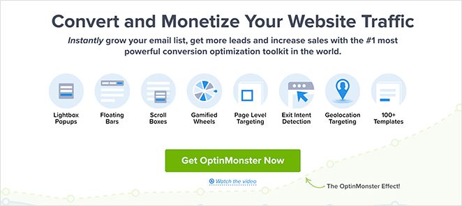
CTA: Get OptinMonster Now
Why It Works
OptinMonster’s homepage features a killer call-to-action example, which is no surprise since this SaaS company creates conversion optimization software. It has persuasive copywriting and attractive visuals that capture people’s attention instantly.
Anyone that wants to grow their business and email marketing results is compelled to read the rest of this strong CTA. And the copy appeals to business owners because it promises to:
- Grow your email list
- Get more leads
- Increase sales
Best of all, it offers instant gratification by using the word “Instantly” from the start, compelling users to take a specific action.
2. IsItWP
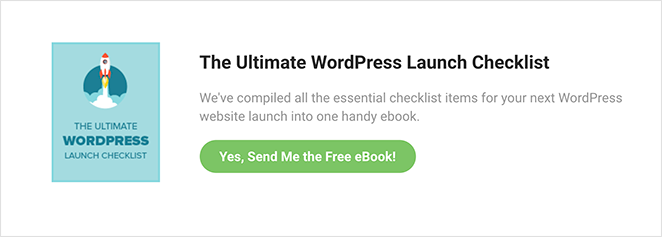
CTA: Yes, Send Me the Free eBook!
Why It Works
Go anywhere on IsItWP’s website, and you’ll see this eye-catching invitation to download a free eBook. This CTA example is a lead magnet designed to collect email addresses for lead generation in exchange for something of value to their target audience.
In this case, users interested in launching a WordPress website can download a free checklist. And because it promises to include all the essential items needed for a WordPress launch, you’re compelled to click.
Even better, action verbs like “Send” directly tell people what comes next, while first-person copy motivates them to act.
3. WPForms
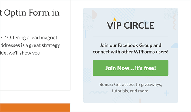
CTA: Join Now… it’s free!
Why It Works
Head to the WPForms blog, and you’ll see the above call-to-action example. It’s an ad designed to increase the membership of their Facebook Group, WPForms VIP Circle.
While the ad isn’t flashy or in-your-face, it’s perfectly positioned to encourage visitors interested in their brand to join the group and learn more. That’s because people browsing their blog likely have a natural interest in the product.
This CTA example promises several things:
- You can connect with other WPForms users
- It’s free to join
- You get access to exclusive bonuses
This is a good CTA with action words that buy into users’ hesitations. If it wasn’t free, users would be less likely to click. The color scheme also stands out from the web page’s banding, turning it into a type of CTA you can’t miss.
When combined, all of these things make a compelling reason to click and check the group out.
Click here to learn how to create the perfect call-to-action.
4. Crazy Egg
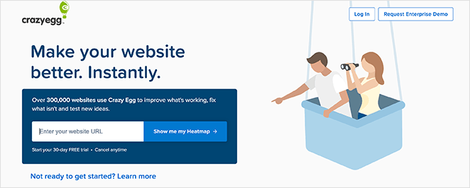
CTA: Show me my Heatmap
Why It Works
Crazy Egg’s call-to-action example has several features that make it so effective. First, it promises to make your website better instantly, something most website owners are interested in.
It then uses social proof to show you that thousands of companies already use Crazy Egg. If so many people use it, then it must be a great product, right?
The CTA button itself, “Show me my Heatmap,” uses the voice of their audience, making it irresistible. Moreover, the button color contrasts with the form background. Finally, they reassure potential customers with a 30-day free trial and that they can cancel at any time.
5. Moz

CTA: Grab my ticket!
Why It Works
Moz offers SEO software for marketers, so it’s no surprise that they know how to create an excellent CTA. The CTA example above advertises its virtual event with an eye-catching banner and compelling CTA copy.
The heading generates excitement by asking if you’re ready. And the supporting copy explains what the event is about and when it takes place.
Instead of asking you to register for a ticket, they tell you to grab a ticket now. Coupled with the custom graphics and agenda link, it includes everything potential attendees might need to sway them into registering.
6. Uber
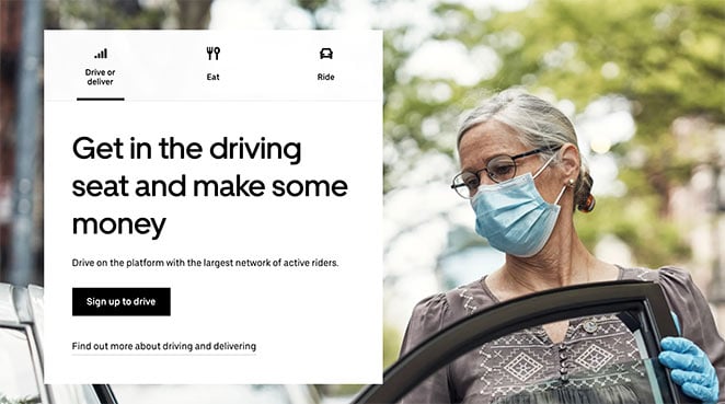
CTA: Sign up to Drive
Why It Works
Uber has several different CTA examples, but the one that stands out is the invitation to sign up to drive.
It draws users in with a bold headline that promises they can make money by getting in the driving seat. This use of words helps people visualize their success when using the service and encourages them to keep reading.
Uber follows up with a statement reassuring users they’re part of the largest networks of riders. This overcomes any objections about it not being a popular platform.
The CTA copy itself is actionable, straightforward, and compelling enough to spur action.
7. Madewell
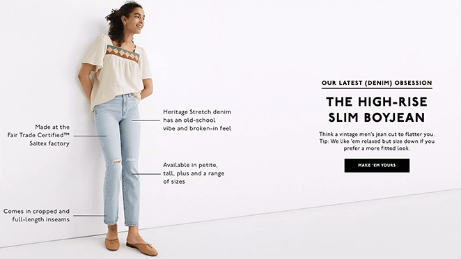
CTA: Make ‘em Yours
Why It Works
Clothing eCommerce retailer, Madewell, knows exactly how to tap into their audience’s pain points. Let’s face it, buying jeans can be hit-and-miss when it comes to fit and style.
But Madewell offers a solution to their customers with their ‘latest obsession’ that promises a flattering fit. The supporting image illustrates this by pointing out all the most critical aspects.
Yet, it’s the CTA button that shines by inviting you to make them yours. With a button like this, it’s hard to resist the call to shop now.
8. Traffic & Conversion Summit 2021

CTA: Claim Your Discounted Ticket
Why It Works
It’s impossible to talk about calls-to-action without mentioning landing pages. Creating a landing page is one of the most effective ways to generate leads and increase your conversions.
And this example from Digital Marketer’s Traffic and Conversion Summit ticks all the boxes.
The stand-out CTA on this page is the call to claim a discounted ticket. Right before the button, they explain exactly what buying a ticket offers.
The bullet points are easy to consume, use persuasive language, and naturally lead readers to the eye-catching button. Plus, the promise of a coupon or discount is super convincing for people looking to save money.
We’d improve this page by adding a countdown timer with a limited-time offer to evoke the fear of missing out (FOMO). Users are more likely to click the add-to-cart button if there’s a sense of urgency.
9. Yoga International
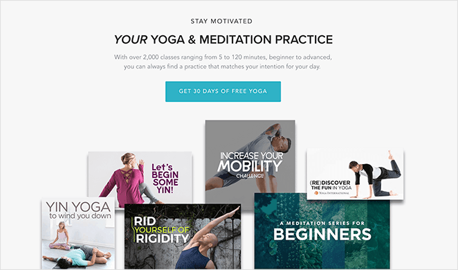
CTA: Get 30 Days of Free Yoga
Why It Works
Here’s another landing page from Yoga International, and the main CTA button isn’t just used once but three times. Once when you land on the page, once in the middle, and once more at the bottom.
Adding a CTA in multiple places is a great way to convert users at different stages in their decision-making process.
When users immediately land on the product page, they may need more information to make a decision. But after learning more, they have all the details needed to take action.
With this approach, you can capture leads at every stage. Plus, the CTA button copy promises users can do it for free.
10. GiftRocket
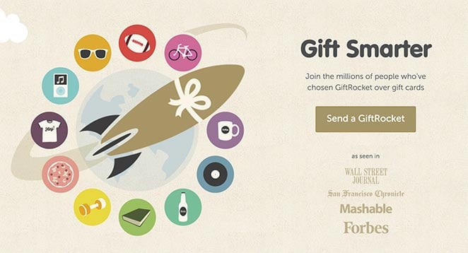
CTA: Send a GiftRocket
Why It Works
GiftRocket’s CTA example is super-effective because it doesn’t use generic language like “buy now” to convince users to take action. Instead, it invites you to send a GiftRocket which is a much more exciting way to send someone a gift card.
Even better, the images on the page are interactive. As you mouse over each circle, a text-box will pop-up showing you the types of GiftRockets you can send, which is great for user experience.
Combine this with the “as seen in” section, which lends the brand authority; why wouldn’t you want to send a GiftRocket?
11. I Will Teach You to Be Reach

CTA: Start the quiz
Why It Works
Our final call-to-action example comes from Ramit Sethi of I Will Teach You To Be Rich. Since he offers such a broad range of courses and webinars on his website, he invites users to take a quiz so he can send them content that best fits their needs.
While his audience has different pain points, they all share the same common interest: they want to make money quickly. Ramit takes that problem, asks a relevant question, and provides a solution in under an hour.
Because Remit’s courses are quite expensive, he doesn’t ask for too much at this stage in the buyer journey. He asks for something small – to take his quiz – which gives him everything he needs to nurture them through his sales funnel.
It’s important to note that even though the CTA copy is short, the supporting copy relates to his ideal buyer persona. So after clicking to start the quiz, he can gather more information to target them more effectively.
In our opinion, this is one of the best CTAs in this post.
And there you have it!
We hope this article helped you find some of the best call-to-action examples you can use to inspire your design.
After crafting the perfect CTA, why don’t you create a free landing page to increase your conversion rates?
And don’t forget to follow us on our social media channels: Twitter, Facebook, and YouTube, for even more helpful content to grow your business.

