Do you want to make a WordPress galley responsive on your website?
If you’ve ever used the default WordPress gallery, you’ll notice it lacks several important features. However, many responsive WordPress gallery plugins are difficult to use and can impact your site’s speed and load times.
That’s why this article will show you how to make a WordPress gallery responsive without impacting your WordPress website’s performance.
Why Make a WordPress Gallery Responsive?
Nowadays, almost 60% of all internet access is through a smartphone. So when adding new features and functionality to your website, you’ll need to ensure it works correctly on mobile devices.
Whether it’s a tablet, smartphone, laptop, or desktop, your new photo gallery layout needs to be flexible enough to adapt to each screen size. That way, your website visitors will have a better user experience.
More importantly, a responsive design is crucial for search engine optimization (SEO).
Search engines like Google consider mobile usability a factor when ranking your site in search results. Therefore, adding responsive gallery images to your site can help you see better rankings and, in turn, drive more organic traffic to your small business.
In the end, learning how to make a WordPress gallery responsive can go a long way in growing your business. With that in mind, here are 2 easy methods you can follow.
How to Make WordPress Gallery Responsive: 2 Easy Methods
Below you’ll find 2 ways to add a responsive image gallery to your WordPress site. First, we’ll use a powerful WordPress page builder with extensive features for enhancing your web design. Second, we’ll use one of the best responsive WordPress image gallery plugins on the market.
Click either method below to see the steps for adding a new gallery.
Method 1. Use SeedProd Advanced Gallery WordPress Block

For the first solution, we’ll use SeedProd, the best WordPress website builder. With its drag-and-drop page builder, responsive templates, and customizable WordPress blocks, it’s by far the easiest way to customize your website without HTML, PHP, or Custom CSS code.
You can use SeedProd’s WordPress Blocks to add galleries to your WordPress theme, pages, and widget-ready areas. It’s as simple as dragging, dropping, and clicking to create galleries that work with any screen size.
SeedProd’s easy-to-use features include:
- WordPress Theme Builder
- Pre-made Website Kits
- Landing Page Builder
- Responsive landing page templates
- 4 page modes: Coming Soon, Maintenance, 404, and Login
- Email marketing integrations
- Subscriber management
- WooCommerce support
- Access controls
- Dynamic text
- Domain mapping
- And more.
Follow the steps below to make responsive WordPress galleries with SeedProd.
Step 1. Install and Activate SeedProd
First, go to the SeedProd website and download the plugin. We suggest getting the Pro version of SeedProd to follow this tutorial because it offers the best features with competitive pricing.
Next, log into your SeedProd account, and click the Downloads tab to download the plugin file to your computer. You can also copy your license key at the same time, which you’ll need shortly.
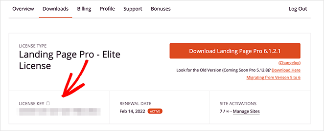
Now, upload and activate the plugin on your WordPress website. If you need help with this step, you can follow this guide on installing a WordPress plugin (opens in a new tab).
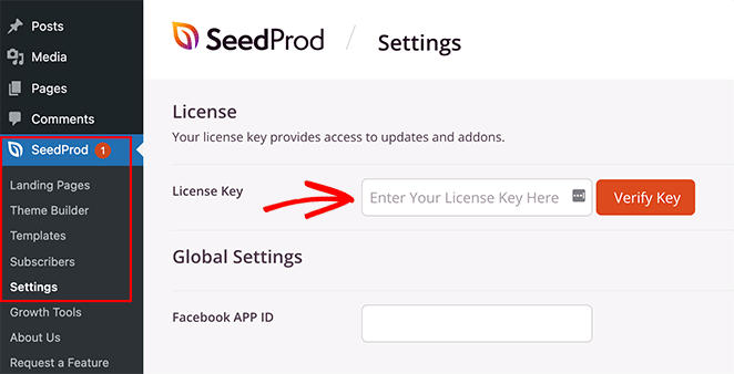
After installing and activating SeedProd, navigate to SeedProd » Settings from your WordPress admin and paste the license key you copied earlier. Make sure you click the Verify Key button, then move on to the next step.
Step 2. Create a WordPress Theme or Landing Page
Since this plugin offers 2 ways to use its drag-and-drop builder, the next step is to make either a WordPress theme or a landing page.
The Theme Builder is the easiest way to create a custom WordPress theme without hiring a developer. It replaces your current theme with fully customizable templates for every part of your website.
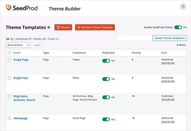
Alternatively, the landing page builder is a great way to build individual pages visually without changing your WordPress theme.
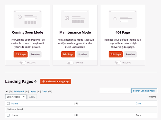
You can follow these step-by-step tutorials on creating a WordPress theme and building a landing page with SeedProd. Then, after choosing a template and creating your initial pages, you can follow the instructions in step 3 of this guide to add a responsive gallery to your site.
Note: For this guide, we’re using the Theme Builder method.
Step 3. Add the Advanced Gallery WordPress Block
For this step, open any page with SeedProd to customize it with the drag-and-drop page builder. For example, you can open the Homepage template from the Theme Builder dashboard to add responsive galleries to your front page.

If you’re building a landing page, go to SeedProd » Landing Pages and click Edit on your chosen design.
When you open your design, you’ll see a layout similar to the one below:
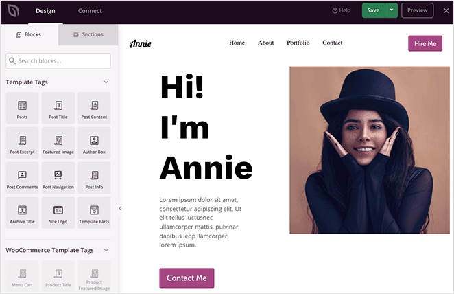
On the left are blocks and sections for adding content to your design, and on the right is a live preview. Clicking any element on your preview will open its settings on the left, and any changes you make happens automatically in real-time.
Some of the blocks you can use include:
- Social sharing buttons
- Social media profile icons
- Video block (Link to a YouTube or Vimeo video)
- Testimonial carousel
- Contact forms
- And more
Buy for this guide; we’ll use the Advanced Gallery block.
Creating a single responsive WordPress gallery
Let’s say you want to add a single responsive gallery to display the best examples from your portfolio. To do that, choose the Advanced Gallery block from the left-hand panel, and drag it onto your page design.
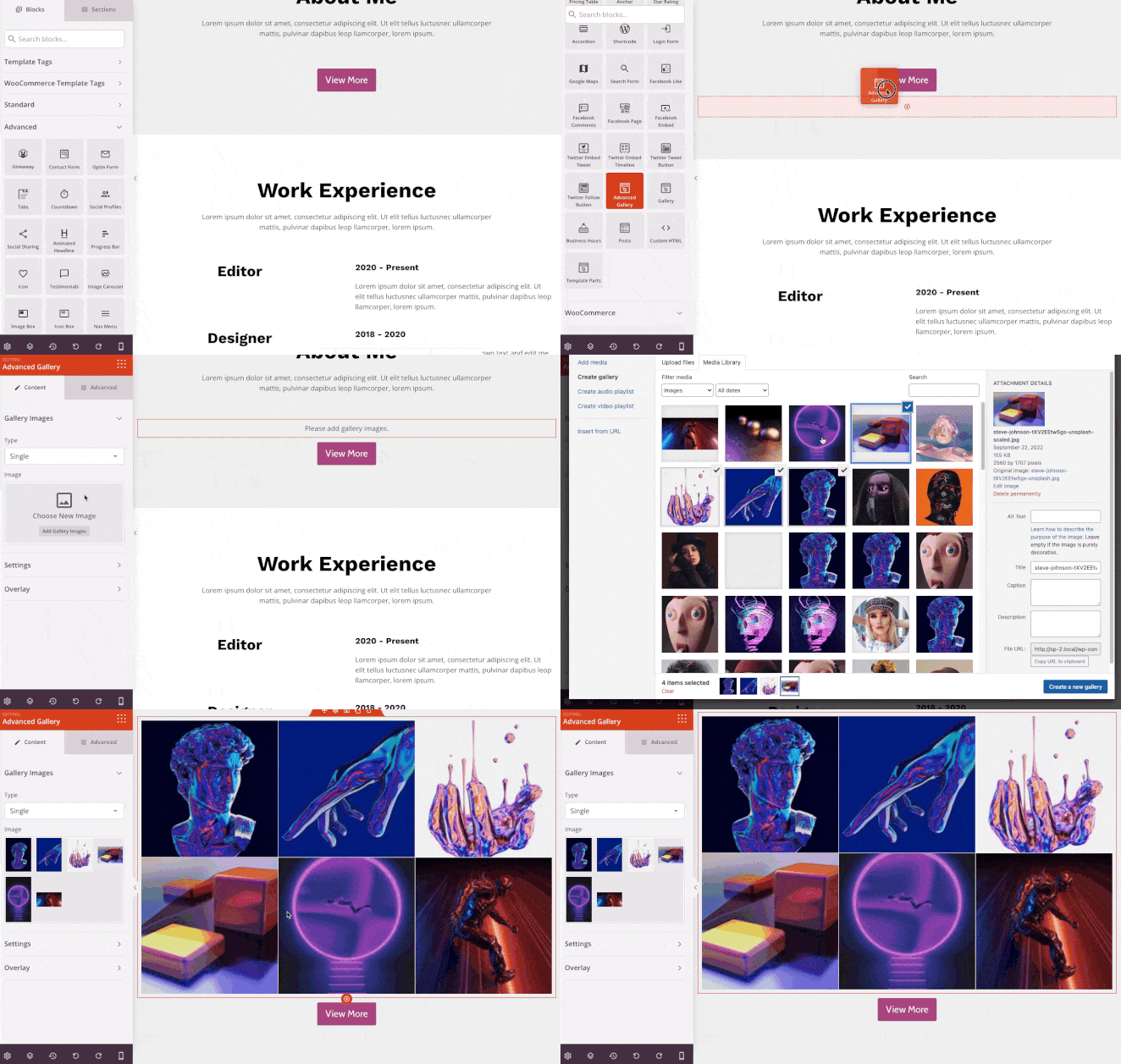
From there, you can open the gallery options and adjust the settings until your gallery looks exactly like you want. You can change the column number and spacing or link your gallery to the image file, a custom link, or none.
For example, the Media File option will display your gallery in a responsive full-size img lightbox when visitors click it.
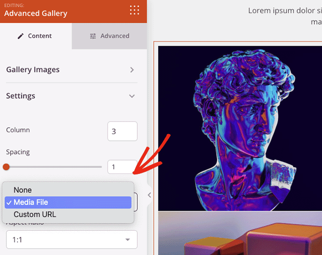
You can also change the aspect ratio for your image thumbnails and set the image size to thumbnail, medium, or large.
Want to add some information to each gallery image? Then click the Overlay tab, where you can add a background overlay color hover effect, titles, and descriptions to each image.
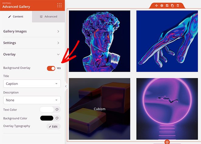
Whenever a website visitor hovers over an image, it will darken and show a description of your choosing.
Creating multiple dynamic WordPress galleries
You can also use the Advanced Gallery block on any other page on your website. For example, you can create a portfolio page and add multiple image galleries users can filter by specific parameters.
To do that, click the Type drop-down menu and choose the Multiple option. Then you can start adding as many galleries as you like.
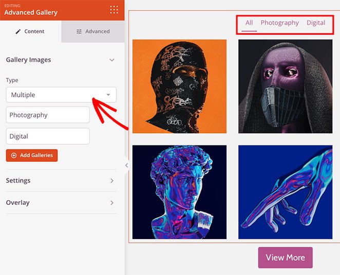
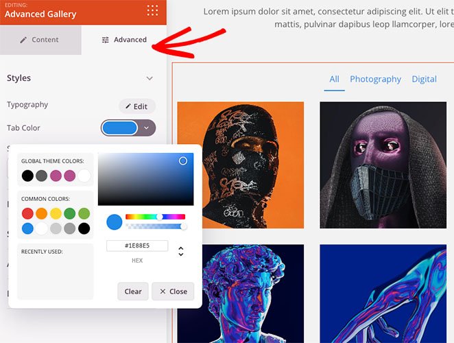
If you need more customization options, you can click the Advanced tab. From there, you can change the filter tab colors, typography, shadows, image borders, and much more.
Making your WordPress gallery responsive
Any gallery you create with SeedProd is responsive by default. However, you can check the mobile-friendliness of your galleries with the mobile preview option.
Click the mobile preview icon from the bottom toolbar, and you’ll see how your gallery looks on mobile devices.
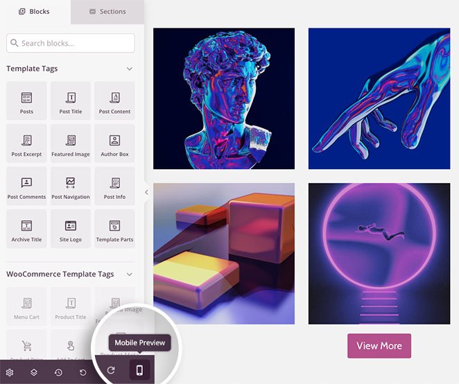
You can then edit your design so it looks great on any device.
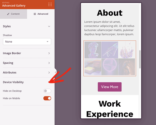
In the Device Visibility tab, you can also hide specific elements on mobile or desktop to improve the mobile experience.
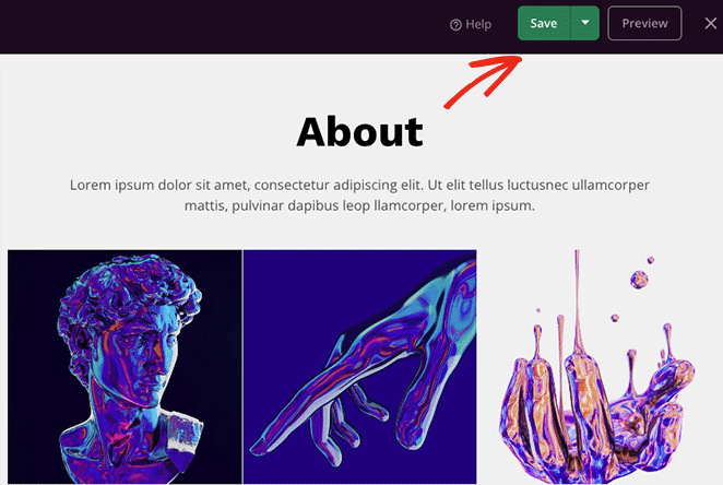
When you’re happy with your image gallery, click the Save button in the top-right corner of the page.
Step 4. Publish Your Responsive Image Gallery
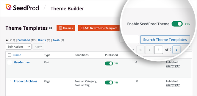
Now you’re ready to publish your gallery. To do this, head back to the Theme Builder dashboard, and turn the “Enable SeedProd Theme” toggle to the “Yes” position.
Alternatively, for landing pages, click the drop-down arrow on the Save button, and click Publish.
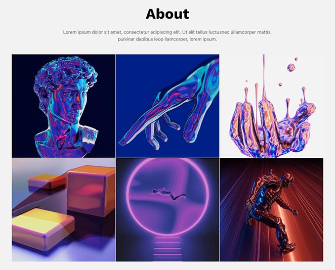
Now you can preview your responsive gallery to see how it looks.
Method 2. Use Envira GalleryWordPressPlugin
We’ll use Envira Gallery to make a responsive WordPress gallery for the next method. Unlike other WordPress gallery plugins, Envira Gallery is fast, responsive, and lightweight yet still offers extensive easy-to-use features.
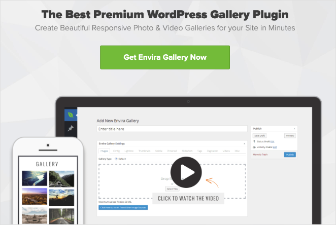
For example, it offers image resize options, slideshows, flexible layouts, and multiple image sources.
First, install and activate the Envira Gallery plugin on your WordPress website. Next, go to Envira Gallery » Add New to create a new image gallery.
To add images to your gallery, click either of the buttons shown below:
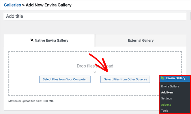
The first option lets you upload image files from your computer, while the second button enables you to choose images from your WordPress media library.
After choosing your images, you can reorder them with drag and drop. You can also click the eye icon to put specific images in draft mode and hide them from your published gallery.
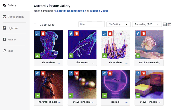
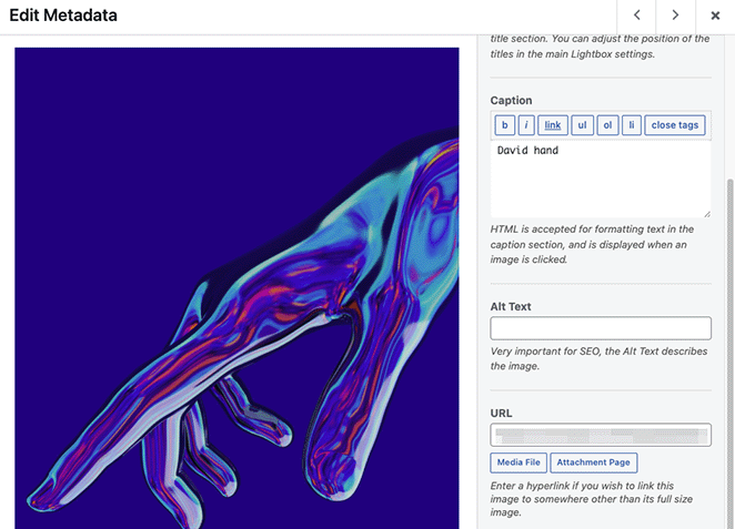
Additionally, clicking the pencil icon lets you edit your image metadata. For instance, you can change the image title, alt text, and caption and edit the attachment page src URL.
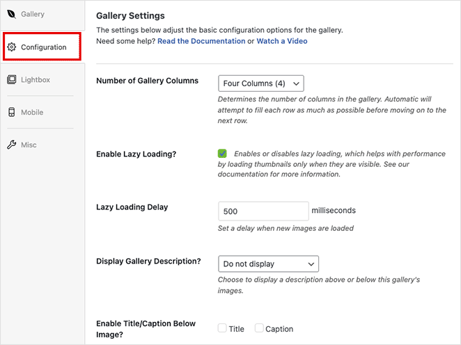
Next, click the Configuration tab where you can:
- Change the gallery column number
- Enable lazy image loading
- Show gallery descriptions
- Display captions and titles
- Set the pixel size, image crop position, and spacing
- Change the gallery templates
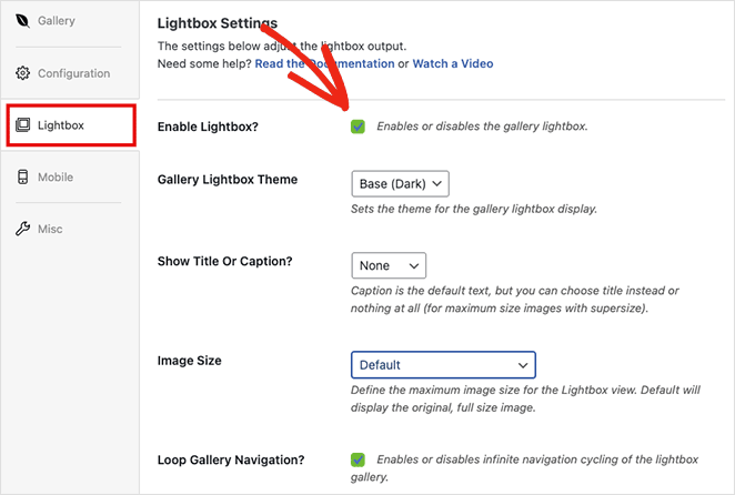
In the Lightbox tab, you can enable a responsive lightbox when users click an image. It also lets you adjust the settings to change your lightbox theme, display captions, add transition effects, and more.
Besides the above settings, Envira Gallery has a mobile gallery settings tab. This panel lets you automatically generate specific images for mobile devices.
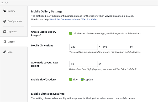
You can set custom mobile image dimensions and row heights and even tweak the mobile lightbox settings.
When you’re satisfied with your gallery design, click the Publish button in the top right corner.
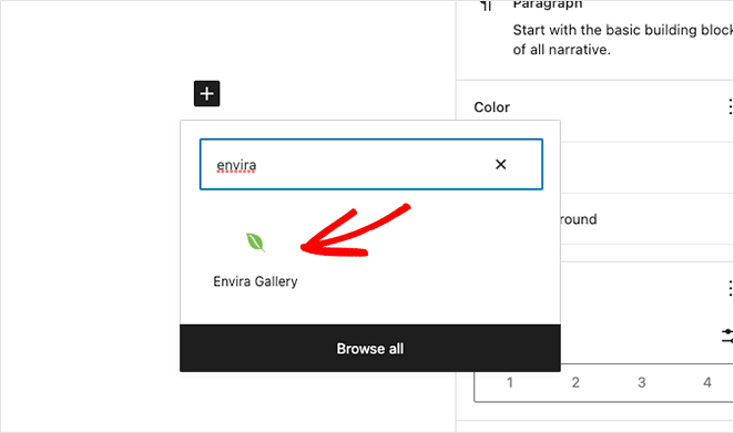
To add your mobile-friendly gallery to your website, create or edit a post or page, then click the plus (+) icon inside the WordPress block editor to add a new block.
Search until you see the Envira Gallery block, then click it to add it to your page.
From the drop-down menu, select the gallery you just created to embed it in the WordPress editor.
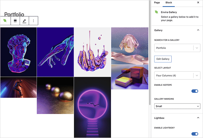
Now you can click the Update or Publish button to make your gallery live on your website.
Note: If you’re still using the classic WordPress editor, you can copy your Envira Gallery shortcode and paste it inside a post or page.
Next, preview your page, and see how your new responsive WordPress gallery looks.
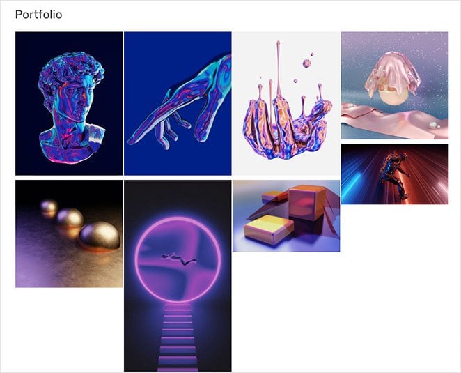
There you have it!
You now know how to make a WordPress gallery responsive.
We hope you found this article helpful. You might also like the following WordPress tutorials while you’re here:
- How to Add a Gallery to WordPress Pages and Posts
- Landing Page vs Microsite: Which One Is Best for Your Brand
- How to Customize WordPress Post Excerpts (Without Code)
- How to Add a Tweet Button to WordPress (3 Ways)
Thanks for reading! We’d love to hear your thoughts, so please feel free to leave a comment with any questions and feedback.
You can also follow us on YouTube, X (formerly Twitter), and Facebook for more helpful content to grow your business.

