Is your landing page bounce rate through the roof? Struggling to improve your landing page lead generation? Don’t know how to fix the problem?
It might sound difficult to overcome but getting better results from your landing pages is easier if you know what to test and experiment with.
So in this article, we’ll share our top landing page optimization tips to make your target audience do exactly what you want – convert.
What Is Landing Page Optimization?
Landing page optimization is the process of testing and improving important elements on your page to ensure they get the highest conversions from visitors. It’s a part of conversion rate optimization (CTO) and includes things like A/B testing and experimentation to get the results you desire.
There are several landing page types most businesses use, which are as follows:
- Sales Landing Pages – Sales pages provide potential customers with all the information they need to buy your product or service.
- Squeeze Landing Pages – Also known as lead-capture landing pages, squeeze pages are designed to collect the email address and other contact details of your visitors.
- Webinar Landing Pages – To encourage visitors to register their interest for your webinar and are often called Webinar registration pages.
- Thank You Pages – A thank you page is an excellent way to offer more value to visitors after taking action on your website. For instance, you could offer a coupon code, free download, etc., to say thanks.
- 404 Landing Page – If you have broken links or pages, you can show fun and engaging 404 error pages to point users where you’d like them to go. This is an excellent way to reduce your website bounce rate.
Related: Landing Page vs Website: What’s The Difference?
What Is a Landing Page Optimization Process?
In online marketing, a landing page is one of your most important tools. If you optimize your landing page effectively, it has the power to transform your marketing efforts and drive significant revenue.
When testing your landing page, you should follow a process to get the best results. One such approach is the Eisenberg brother’s conversion pyramid, which has 5 typical stages:
- Functional – First, your landing page should be functional. It shouldn’t have any technical issues or any friction that upsets the user journey.
- Accessible – Next, it should be easy for users to find your targeted landing pages on any device they use. Good SEO tactics, ad campaigns, social media marketing, and mobile responsive design will help you reach this goal.
- Usable – For your landing page to reach the usability goal, it should be readable, have no scrolling issues, and be clutter-free. With smooth navigation, you can prompt users to take action faster.
- Intuitive – Your landing page should make sense, so users get a good idea of what it’s about and what you want them to do instantly.
- Persuasive – Lastly, your landing page should persuade visitors to convert into leads, customers, and loyal brand advocates.
17 Landing Page Optimization Tips to Increase Conversions
Creating a successful landing page doesn’t have to be hard. It just requires some effort to ensure the page you’ve created gets the results you want. Besides the areas we mentioned above, here are our expert landing page optimization tips to boost your page’s performance.
- 1. Make Your Landing Page Offer Clear
- 2. Keep Your Landing Page Design Simple
- 3. Use Contrasting Colors to Stand Out
- 4. Add Important Information Above the Fold
- 5. Make Your Offer Limited
- 6. Keep Your Call to Action Buttons Obvious
- 7. Display Your Contact Information
- 8. Try Different Media Types
- 9. Experiment with Your Landing Page Copy
- 10. Keep Your Message Consistent
- 11. Repeat Your CTA on Long Pages
- 12. Persuade Undecided Users with Customer Testimonials
- 13. Experiment with Different Form Lengths
- 14. Optimize for Search Engines
- 15. Recapture Abandoning Visitors with Exit Popups
- 16. Decrease Your Page Load Times
- 17. A/B Test Every Landing Page Element
1. Make Your Landing Page Offer Clear
Visitors to your landing page should instantly understand what you’re offering. Start by thinking about your customer’s goal and address it in your page headline.
OptinMonster does this well:
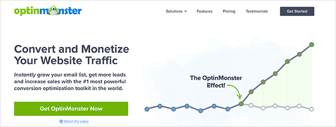
The words “Convert” and “Monetize” in this context speak directly to their target audience’s pain points. Their visitors want their website traffic to convert into leads and sales, and the headline assures them OptinMonster can help.
2. Keep Your Landing Page Design Simple
A cluttered landing page can distract visitors from what you want them to do. You want visitors to focus on your call to action (CTA) and nothing else. So keep your landing page design simple, distraction-free, and to-the-point.
TrustPulse is an excellent example of this:
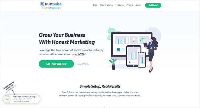
All the page elements above the fold tell users exactly what the product is, how it looks, the benefits of using it, and how to get it. Plus, it does all this without many words.
Not sure what TrustPulse is? Check out this TrustPulse review.
3. Use Contrasting Colors to Stand Out
The best landing pages use contrasting colors for clarity and to drive their message home. Instead of using color for the sake of it, they use color to highlight important page elements and direct people’s attention.
This example from Smash Balloon’s Social Wall plugin is hard to ignore.
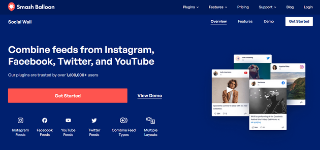
Your eye is drawn to the orange CTA button that stands out against the dark blue background.
4. Add Important Information Above the Fold
The term “Above the fold” goes back to traditional newspapers. The most exciting stories were added above where the paper would typically fold, ensuring people would see the headlines and want to buy it.
You can do the same thing for your landing page by keeping vital elements above the digital fold. This is the point where most users would have to scroll for more information.
While this might be harder nowadays with mobile browsing, you can create a mobile landing page to ensure all the right information is where it needs to be.
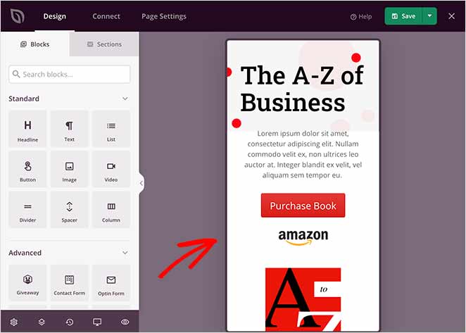
Did You Know: SeedProd’s WordPress landing page builder allows you to preview and edit your landing page in mobile. This makes it easy to ensure the right elements are visible to users without needing to scroll.
5. Make Your Offer Limited
You’ve probably seen the terms “limited quantity” and “limited-time deal” used frequently in marketing. This is because the idea of scarcity encourages your landing page visitors to act now for fear of missing out if they wait.
Almost every online store uses scarcity marketing, and you can too.
In this example, on SeedProd, we use both a countdown timer and scarcity phrasing to evoke a sense of urgency for our sale.

The countdown timer tells users how long is left until the offer runs out, adding an extra layer of urgency.
6. Keep Your Call to Action Buttons Obvious
Your landing page call to action button should be easy for readers to notice and shouldn’t confuse or stress them out.
Most companies stay away from complicated offers and language in their CTA buttons. Instead, they’re clear, concise, and obvious, with phrases like:
- Yes I Want This Deal
- Get Started Now
- Increase My Conversions
- Download Now
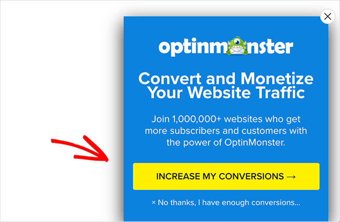
They explain exactly what users can expect from clicking.
7. Display Your Contact Information
Giving visitors an easy way to get in touch can help solve obstacles in the buying process and convince people to convert.
There are many ways to show your contact information to visitors. You can put your phone number and email address on your landing page. You can also embed a simple contact form or offer a live chat service.
Other companies include links to their help centers, where most users know they can find answers to their frequently asked questions.
Related: The Anatomy of a Landing Page
8. Try Different Media Types
Video has become so popular online that it’s become the best way to break down complex information.
Visitors are likely to spend more time on your landing page engaged in passive activities like watching a video because it’s easier than reading. This time can be the difference between people hearing and understanding your message and not.
Say something meaningful with the media you use on your video landing page. You could show a product demo screencast or walkthrough instead of a high production video. The key is getting your message across in the most effective way for your users to understand.
All in One SEO has an excellent example of this on their landing page:
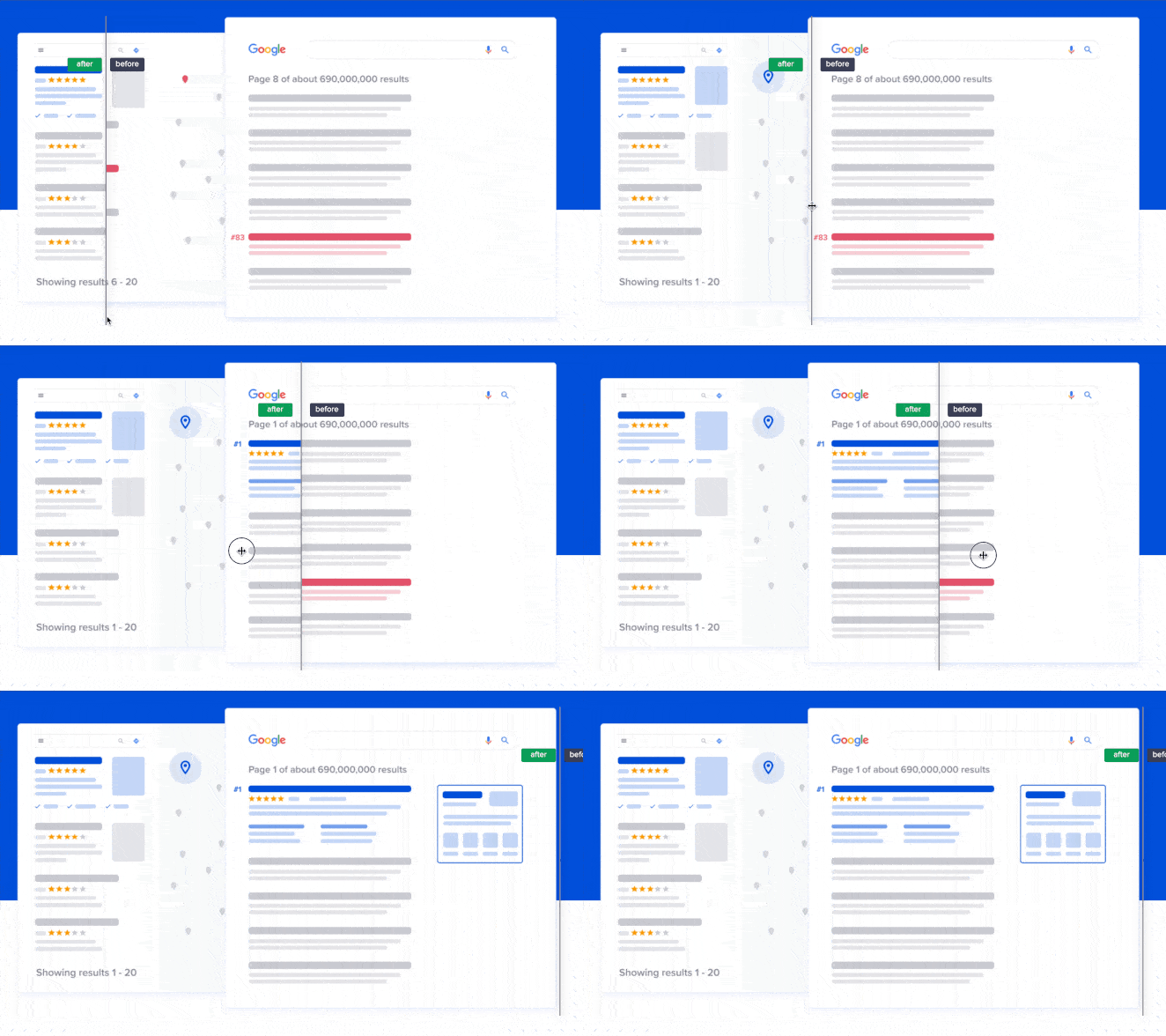
They used an interactive image slider to show your SEO results before and after using their plugin. It’s a simple and effective way to get their message across.
9. Experiment with Your Landing Page Copy
Even though the world is video and image focused, text still matters. People will read whatever you write, so it must resonate with your target audience.
You can try A/B split testing different headlines and pieces of copy on your landing page to see how they perform.
10. Keep Your Message Consistent
Visual consistency matters just as much as on-brand messaging. Plus, it can make a massive difference in your landing page conversion rates.
Imagine you placed an ad on Facebook like the one below:

Then you created a landing page for when users click the ad.
You’ll want all the elements of your ad, such as the text, imagery, colors, and other elements to be reflected in your Facebook landing page.
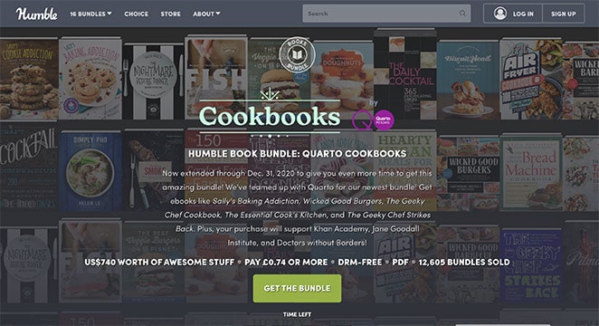
They should both look visually similar and have the same offer. If they’re not, your potential customers could get irritated or confused.
11. Repeat Your CTA on Long Pages
If you’ve created a long-form landing page, it’s important to place your CTA at comfortable intervals throughout the page. When you repeat your core message and CTA, you reinforce your landing page’s purpose.
People will react to your content differently. Some might be 2 thirds of the way down your page before they start believing what you’re saying. If there’s a button right at that crucial point, you might find those readers more likely to convert when it matches their emotional connection to your content.
12. Persuade Undecided Users with Customer Testimonials
Social proof plays a massive role when it comes to persuading hesitant users. Not only can it show that other people have used your products, but it also shows that those people are happy with the results.
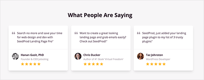
Testimonials are among the best ways to show social proof on your landing page. You could ask customers to create video testimonials to get an edge over your competitors, show quotes from happy users with their full name and headshot, or even show a few case studies.
13. Experiment with Different Form Lengths
Many marketers say that short forms are the only forms you should use on your landing page. They believe that asking for anything more than an email address is asking too much.
Yet, that’s not always the case.
If you want leads for high-value products or services, using a longer form could be more effective. Sure, you might get fewer leads, but the leads you get will be more qualified and highly targeted.
For example, if you’re a web design business, asking a potential client for their budget can save tons of time. People looking for a $600 web design probably won’t use your service if your cheapest package starts at $10,000.
And if you do decide you need a longer form on your landing page, create a multi-page form with WPForms. A multi-page form splits long forms into multiple pages to improve user experience. This will reduce form fatigue and boost conversions.
14. Optimize for Search Engines
Most traffic online is organic traffic. This is traffic from people searching for something via search engines, and your landing page could be the answer they click.
For that to happen, you should optimize your landing page for SEO. For instance, your landing page might be your homepage. This means that when people search for your company name, it comes up in search results.
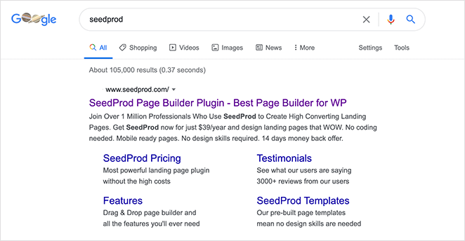
You can also use industry-related keywords. For example, if you search for WordPress giveaway plugins, our sister company RafflePress is one of the first organic results.

Use tools like SEMRush to find the best keywords and use them in your headlines, body text, image alts, and more to rank your landing page.
Check out this in-depth guide to learn more about WordPress SEO.
15. Recapture Abandoning Visitors with Exit Popups
Exit popups are lightbox popups that appear on your screen when visitors attempt to leave your landing page. This offers an extra opportunity for you to create a conversion.
Exit popups are less intrusive than popups that appear when users first arrive on your page and help reduce your landing page bounce rate and shopping cart abandonment.
Use attention-grabbing copy, compelling imagery, and a strong call to action to encourage people to click. If you like, you can also add an incentive like a special discount, or other offers.
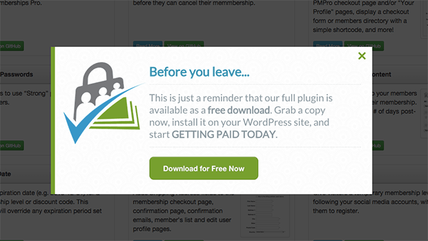
Using a tool like OptinMonster is the easiest way to add Exit popups to your landing page. It comes with tons of different campaign templates, an intuitive drag and drop builder, advanced targeting, campaign triggers, and more.
Plus, you can A/B test your popups to see which variant gets the most conversions. You’ll get lots of useful data and an easy way to convert visitors who decide to stay around because of your well-timed offer.
16. Decrease Your Page Load Times
As more people use their mobile devices to view your online content, page loading speeds play an important role in the user experience. If your landing page takes even a fraction of a second too long to load, people will leave, driving up your bounce rates.
You can speed up WordPress landing page load times by:
- Installing a WordPress caching plugin
- Compressing and optimizing your images
- Using fast and reliable WordPress hosting
- Keeping your website updated
- And more.
Check out this guide to boost WordPress speed and performance.
17. A/B Test Every Landing Page Element
Last but not least is A/B testing. The more you A/B test your landing page elements, the more accurate your data is. Each test you carry out should include a single change to one thing, for instance, your CTA button color.
If you change too many things at once, you won’t know which one had the most impact on conversions.
Here are some A/B testing examples to give you an idea of what you can try.

Once you have the data you need, you can use what you learned in a redesign and confirm that those changes improve your conversion rates.
There you have it!
We hope this article helped you learn more about landing page optimization and how to drive more leads and conversions.
You might also like this article on how to edit your WordPress homepage and these landing page best practices for even more tips.
If you enjoyed this article, then please follow us on Twitter and Facebook.

