Do you want to improve your landing page conversion rate? Not sure where to start and what to test?
Conversion rate optimization is one of the biggest problems website owners face. You want every website visitor to convert into leads or sales. Yet, achieving that goal is a lot harder than it looks.
With that in mind, we’ll show you how to increase landing page conversions by tweaking and testing essential elements on your page.
- 1. Make Sure You Target the Right Audience
- 2. Write Headlines That Connect Emotionally
- 3. Ensure Your Copy Understands the Problem
- 4. Offer Something Users Value (Above the Fold)
- 5. Use the Right Images
- 6. Create Videos for Complex Information
- 7. Include Reviews and Testimonials
- 8. Add Trust Badges to Reassure Visitors
- 9. Remove Your Navigation Menu
- 10. Limit the Number of Form Fields
- 11. Personalize Your CTA Button
- 12. Test Button Colors, Size, Shape, and Placement
- 13. Answer Questions Before They’re Asked
- 14. Use a Live Chat Tool
- 15. Add Visual Cues to Important Content
- 16. Optimize Your Page for Speed
- 17. Monitor On-page Behavior
- Bonus Tip: A/B Test Everything
What Does a Conversion Rate Mean?
In digital marketing, a landing page conversion rate is the number of people that convert into leads or sales, divided by the total number of visitors to your webpage. For instance, if your online store’s sales page gets 1,000 visitors in a month and has 50 sales, the conversion rate would be 50 divided by 1,000, which is 5%.
A conversion can be any action you want visitors to take, such as:
- Clicking a button to checkout and make a purchase
- Entering an email address to subscribe to your newsletter
- Completing the contact information on your contact form
- Requesting a product or service demo
- Registering for a webinar
- Downloading a white paper
But how do you know if your conversion rate is a good one?
What Is a Good Landing Page Conversion Rate?
The average conversion rate of a good landing page design can be anywhere between 2 and 4%. However, the results you get can vary across different industries.
If you’re comparing your results to the average conversion rate across all industries, it may not be entirely accurate.
For instance, the conversion rate of an eCommerce website could vary dramatically from a higher education website. So instead of asking, “what’s a good landing page conversion rate,” you should ask, “what’s a good landing page conversion rate for my industry.”
17 Tips to Increase Landing Page Conversions
Now that you know what a conversion rate is and the average rate across industries, how can you improve your landing page’s conversion rates?
Check out the tips below to get started.
1. Make Sure You Target the Right Audience
Before jumping into tackling landing page optimization, take the time to make sure you’re marketing your page to the right target audience.
Ask yourself:
- Who will read this page?
- What do I want them to read?
- How do I want them to feel?
- What do I want them to do?
Make sure your page focuses on answering those questions from the headline and body copy to the testimonials and call to action buttons.
If your landing page isn’t reaching the right people, your conversion rates and marketing strategy will suffer.
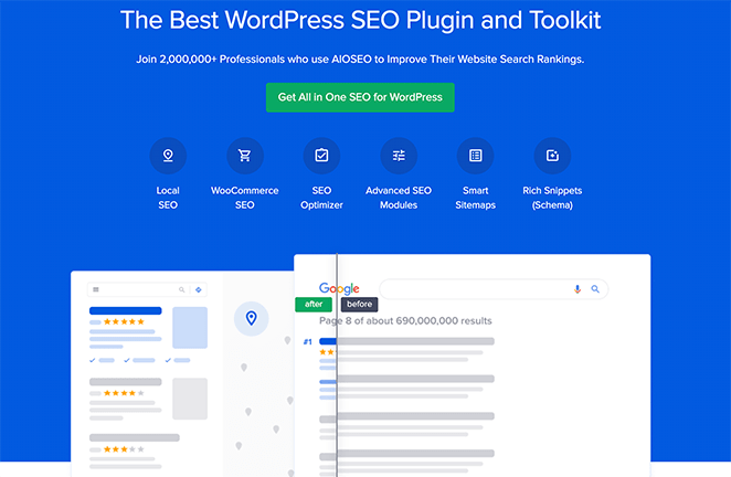
In the example above, All in One SEO clearly shows they know their audience is looking for an easy-to-use WordPress SEO plugin.
2. Write Headlines That Connect Emotionally
Your landing page headline is the first thing users see when they visit your page, and there are only a few seconds to grab their attention. So, it’s crucial your header and other headings are bold, straightforward, and resonate with your audience.
High-converting landing pages should have attention-grabbing headlines that offer visitors something promising and encourage them to continue down the page. An excellent way to do this is to lead with your product’s value proposition – a statement that demonstrates the value you offer.
Take a look at this example from Drip’s optimization feature page.
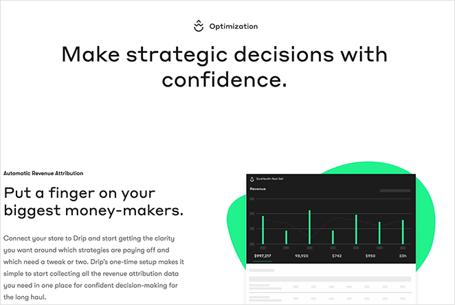
Instantly you’re reassured that this feature can help you make “strategic decisions with confidence.” This connects emotionally with the pain points of many marketers, making you want to learn more.
3. Ensure Your Copy Understands the Problem
Too often, brands don’t completely understand what their audience needs, resulting in messaging that doesn’t connect. You need your copy to relate with users on their level to build trust and reassure them that you know the problems they face.
If you’re struggling to express how your product or service can solve a problem, try a copywriting framework to ensure your message hits that mark.
When you tell a story using the following framework, visitors typically convert at a higher rate:
- The story with a character like them
- who has a similar problem
- and meets a guide like you
- who offers a plan to solve that problem
- and invites them to take action
- which helps them avoid failing
- ending in success.
This framework helps you understand exactly what your audience is looking for and craft a clear message to address their problem.
4. Offer Something Users Value (Above the Fold)
It’s easy to waste valuable landing page space introducing your business above the fold. Truth is, people don’t really care.
Instead, as soon as a potential customer lands on your page, you should tell them how your product or service benefits their lives and solves their problems. If they want to learn more about you, they can keep scrolling.
Take a look at this example from OptinMonster, the best popup builder and conversion optimization toolkit for businesses.
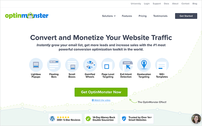
Before you naturally have to scroll down the page, it’s easy to see what they do and how their software can improve conversions for small businesses.
Doesn’t it make you want to learn more?
5. Use the Right Images
While crafting a compelling message is super-important, images can bring out the right emotions needed for users to take the desired action. Every image used on your landing page should sync with your content to make your message stand out.
Take Codecademy, for example.
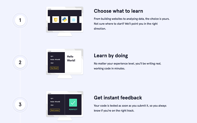
Every single image on their page supports their copy, allowing visitors to visualize their path to success.
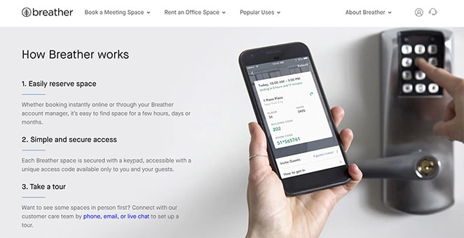
Breather offers another great example of how simple yet powerful images can create a compelling visual narrative.
6. Create Videos for Complex Information
Sometimes, no matter how good your copy or images are, it’s hard to express your message, so it’s easy for people to understand. This is often the case for software businesses where the information is technical.
In situations like this, a video is much more effective at getting your message across clearly. Not only can videos condense complicated information, but they’re also more engaging, keeping users on your page for longer and reducing bounce rates.
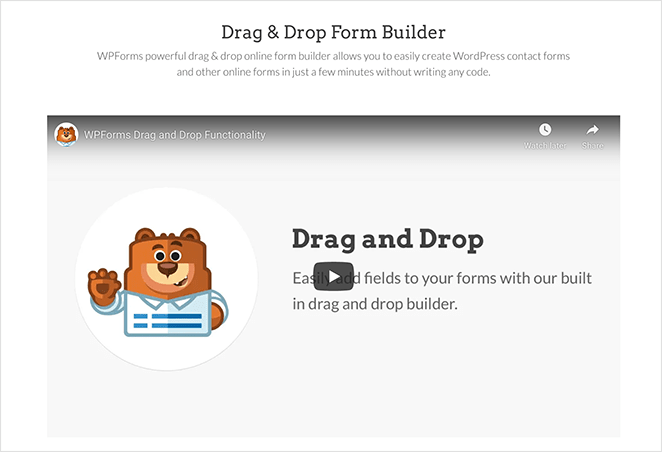
You don’t need a high-quality video production either. Your video could be:
- A quick screencast of your product’s features
- A short demo of how something works
- Answers to frequently asked questions
- A welcome message from your founder
- A visual case study guide walkthrough
Any of these types of videos can convey your message quickly and provide a more streamlined user experience.
Check out our guide on how to create a video landing page for the best results.
7. Include Reviews and Testimonials
Consider the last time you hovered over a purchase button. Did you confirm your purchase right away, or did you wait and look for recommendations first?
Our guess is it’s the latter. In fact, the majority of customers will search for reviews and testimonials in search engines before making a decision.
Social proof like this works because potential customers trust other customers. If they see that people are happy with your product or service, they’re more likely to take action and buy.
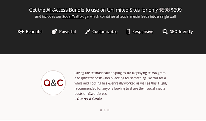
Try placing your reviews or testimonials near important elements on your landing page. For example, a carousel of testimonials near your call-to-action button can work wonders for lead generation and conversions.
8. Add Trust Badges to Reassure Visitors
Similar to our previous tip is trust badges. Trust badges are icons and symbols that show your page is reliable and the customer’s information is secure.
How they work is relatively simple. If someone hasn’t visited your landing page before, it’s hard for them to decide if you’re a brand they can trust.
Yet with a trust badge, you borrow authority from trustworthy brands to show your credibility and trustworthiness.

Popular trust badges include:
- SSL badges
- Money-back guarantees
- Free shipping badges
- Secure payment icons
- Accepted payment logos
- Industry award badges
- Client or customer logos
- And more.
As a result of these trust signals, it’s easier to show visitors you’re a legitimate business, ultimately increasing conversion rates.
9. Remove Your Navigation Menu
The desire to add tons of links to other pages on your website is often too strong to resist. But did you know that showing a navigation menu on your landing page can negatively affect your conversion rates?
Excess links and cluttered navigation bars are distracting for visitors. Do you want them to buy your product or visit your blog posts? This gives users mixed messages, preventing them from doing what you want them to.
A successful landing page should have only a single goal, so it’s crucial you remove distractions that don’t help you reach that goal.
This includes removing your navigation menu, so there’s no route for users to escape your page, increasing their chances of converting.

Related: Landing Page Navigation is Dead: Here’s Why
10. Limit the Number of Form Fields
Too many brands try to collect too much information from prospects all at once, such as unnecessary phone numbers. If people feel like they’re giving up too much information, chances are they won’t convert.
Think about where your landing page is in your sales funnel, how much information you really need, and what value you’re offering in return.
Most landing pages include 2-3 form fields, such as the visitor’s name and email address. You can always ask for more details later on in the customer journey.
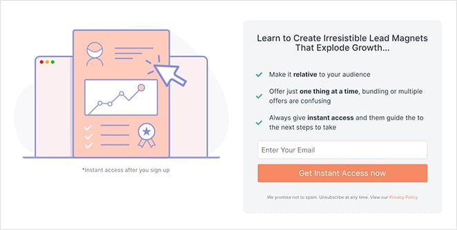
By asking for minimal information, you can establish a feeling of trust with users and reduce form abandonment.
11. Personalize Your CTA Button
One of the most crucial elements of your landing page is the call to action. Whether it’s a contact form, optin form, or call to action button, it needs to tell users exactly what to do next.
Many website owners mistake using generic text on their CTA buttons, like “Submit,” which doesn’t inspire action. Instead, you should personalize your button text, so users know exactly what to expect by clicking.
This landing page from Glo is a great example.
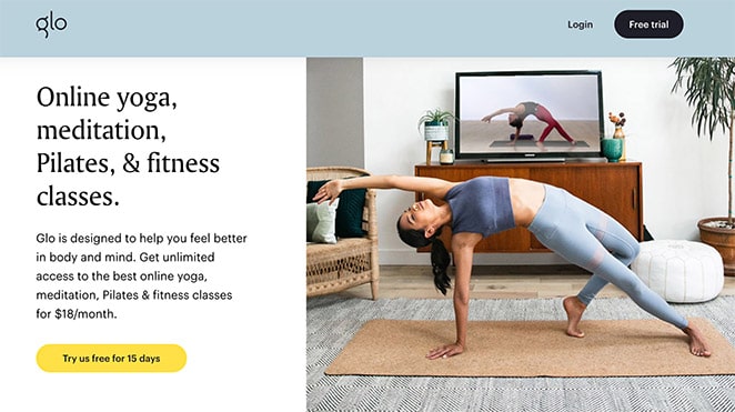
The CTA button text invites users to try the 15-day free trial. This demonstrates exactly what people get when they click.
12. Test Button Colors, Size, Shape, and Placement
Besides your CTA button text, how it looks and where you place it on the page can dramatically impact your conversion rate. Plus, people tend to respond to CTAs differently based on where they are in the customer journey.
Using the same example from tip 11, clicking Glo’s first CTA button takes users to a landing page designed to help them learn more.

By inviting people to customize their classes with a non-committal “sounds good”, the brand draws the user further into the experience before taking their first class.
You should also test which button colors and sizes work best, particularly for users browsing on mobile devices. For example, contrasting colors help buttons pop from the page.
If the button is too small to read or tap, people will swipe away. Whereas if it’s too big for the page, it can distract from other important page elements.
You can also experiment with countdown timers to create a sense of urgency.
13. Answer Questions Before They’re Asked
Removing objections that stop people from taking action on your page is another excellent way to increase landing page conversions. If you can answer common questions before they’re even asked, it makes people more likely to take the action you want.
An easy way to do this is to include a frequently asked questions section with your most popular customer queries.
You can do this easily with the ready-made landing page sections included in SeedProd. They’re entire groups of landing page elements that are already made for you, saving you having to build them manually block-by-block.
One such section is the FAQ section, which you can add to your landing page with a single click. There are several styles to choose from, and you can customize each section to match your brand perfectly.
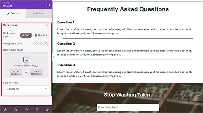
As a result, you can clear up any confusion, increasing the odds of increasing conversions.
14. Use a Live Chat Tool
Besides addressing objections with a FAQ section, you can also speak to your audience directly with a live chat tool.
People tend to respond better when they know their concerns are heard, so using live chat plugins on your landing page shows you genuinely care about your audiences’ experience and satisfaction.
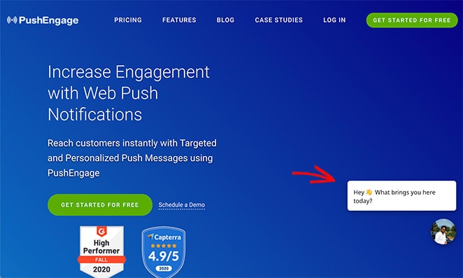
Not to mention, it gets their questions answered immediately and gives you an extra opportunity to make a good impression.
15. Add Visual Cues to Important Content
Directional cues are like pointing fingers. They direct people’s attention to wherever they’re pointing on your page.
You can use explicit directional cues like arrows, which obviously move your attention to things like buttons you want people to click.
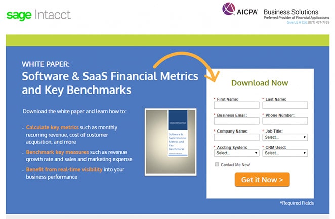
Or there are implicit directional cues that are more subtle, but which have the same impact, like this example from Hillary Clinton’s presidential campaign.

As you can see, she’s looking at the form with anticipation, encouraging you to join the campaign.
You can see which type of cue makes the most significant difference to your conversions by using a heat map tool.
16. Optimize Your Page for Speed
You could spend hours creating the perfect landing page, but none of that matters if your loading times are high. If your landing page doesn’t load within a few seconds, you can wave goodbye to your visitors. They’ll just move on to the next page for a better experience.
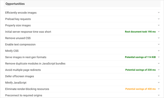
It’s essential that your landing page is as fast as possible if you want users to convert. So check your page loading times with a tool like IsItWP’s free website speed test tool.
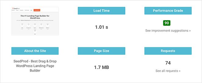
After entering your landing page URL, it will provide suggestions on how to improve your page speed. You can then work on those suggestions to optimize your page performance and provide the best experience for visitors.
If you’re still in the creation stage of your WordPress landing page, choosing the best landing page plugin can have a massive impact.
Many page builder plugins are bloated, which can slow down your site. So pick a light-weight solution like SeedProd, with minimal code, and that’s optimized to achieve the best page speeds.
17. Monitor On-page Behavior
If you’re not monitoring what people do on your landing page, you should start immediately. That way, you can see what users do before they click your CTA and make changes that improve your page’s logical flow.
Heat mapping is an excellent way to see user interaction.
For instance, you could see that people are more interested in your social media buttons than your CTA, which indicates you should remove them from your page.
Alternatively, you might notice attempted user interaction on non-actionable page elements. To solve this, you can turn that page section into an “actionable” area by adding a CTA to boost conversions.
Needless to say, you should absolutely install Google Analytics to check your conversion rate optimization (CRO) efforts.
Bonus Tip: A/B Test Everything
Our last tip is one thing you should do for every landing page on your website. In fact, it’s a mandatory step for increasing landing page conversions.
A/B test every page element.
A/B testing allows you to see which page elements are working the best to achieve your conversion goals. It’s also the best way to see what isn’t working the way you intended.
For instance, you can see if one button style works better than the other or which headline gets the most attention. Just remember, you should only test 2 versions of a single element each time; otherwise, you won’t be able to measure the difference accurately.

Here are some of the best A/B testing tools for WordPress to get you started.
That’s it!
We hope this article has helped you learn how to increase landing page conversions.
You might also like our guide on the best drag and drop WordPress page builders. And to make sure you start on the right foot, check out these landing page best practices.
If you found this article helpful, don’t forget to follow us on Facebook and Twitter for more tips and tricks.

