A wise man once said, “True progress quietly and persistently moves along without notice,” and he wasn’t wrong.
Behind the scenes, at SeedProd, we’ve been making progress towards creating the best Website Builder for WordPress, and today we’re ready to announce our latest release. SeedProd 6.15 is packed with powerful new features and improvements you’ve been asking for.
If you’re in a hurry, you can watch a quick overview of these features in the video below:
Otherwise, keep reading to see how our latest update can help grow your business.
Optimize Your Mobile Browsing Experience
One of our biggest feature requests was more control over how different elements look on mobile and desktop devices. Many things can go wrong when you switch to view your website on mobile: your buttons can misalign, columns can move to the wrong place, padding and margins can look strange – it’s frustrating.
With this in mind, we’ve added new advanced settings that allow you to fine-tune the margin, padding, and alignment of blocks for mobile and desktop screens.
Set Different Mobile Alignments
Alignment issues are a common problem in mobile web design. For example, if you have a two-column section with a headline aligned to the left, and an image aligned to the right, the two columns will switch to appear on top of each other on mobile screens.
Because of that, there’s no reason to keep the left and right alignment. It makes more sense to align them to the center.
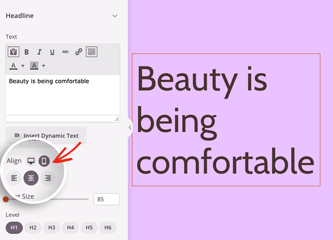
That’s why we’ve made it easy to set different alignments for desktop and mobile for the different blocks in SeedProd. Simply click the desktop or mobile icon to set your alignment preferences.
You can apply the same principles to buttons, aligning them to the left or right on desktop screens and center on mobile.
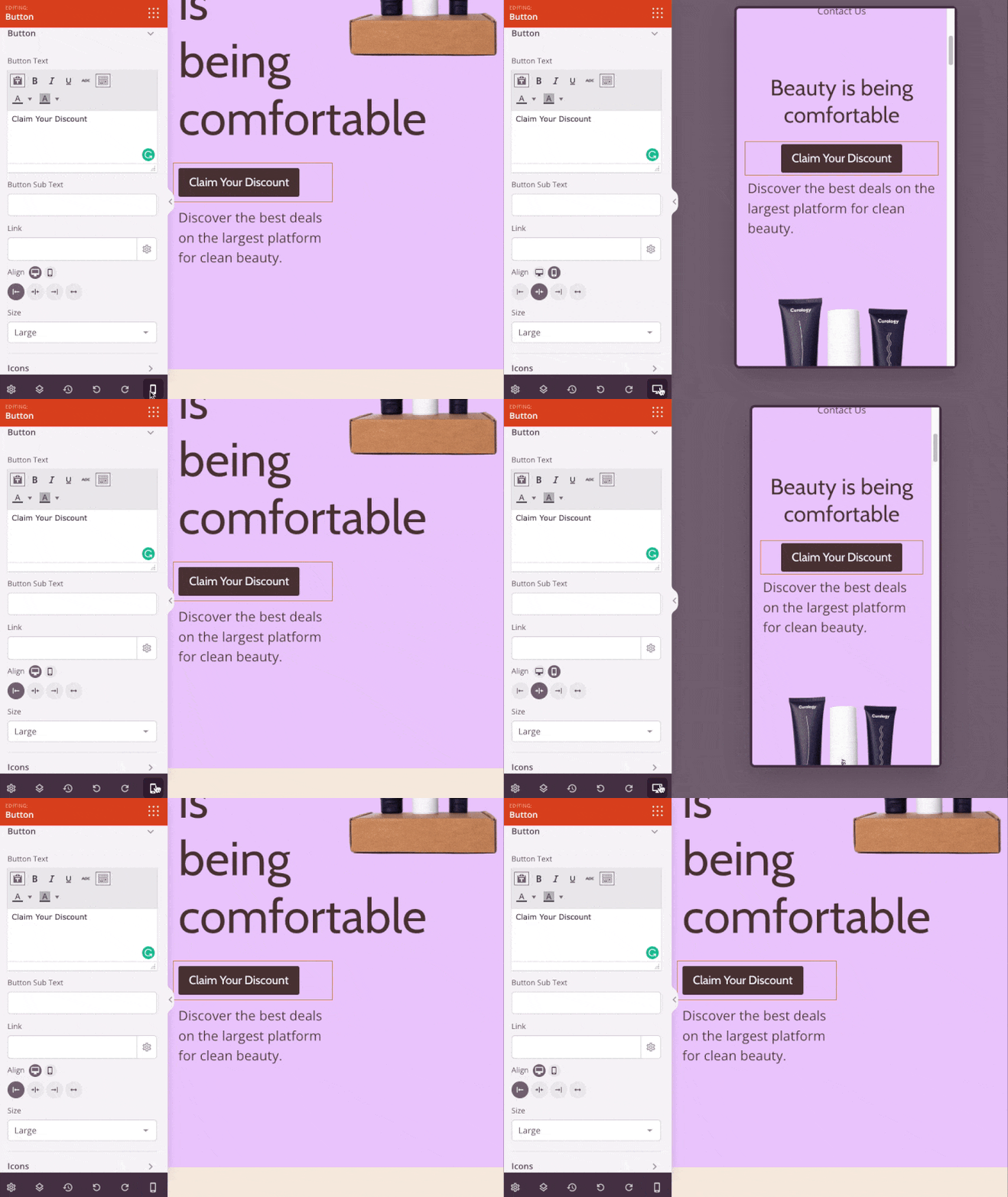
Set Padding and Margins for Mobile
Adding generous spacing between elements is an excellent way to let your whole web design breathe. Mobile screens have limited space to do this, so we’ve added the ability to set different margins and padding attributes for blocks, columns, and sections.
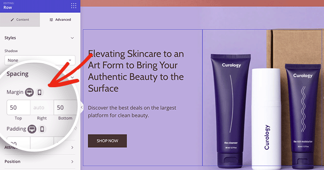
Instead of having large gaps between mobile elements, you can reduce margins and padding to create a seamless browsing experience for visitors.
Customize Your Social Profile Icons
Another improvement we’ve made is to the Social Profiles block. We understand that there are many more platforms available than the usual social suspects, and the easiest way for users to find you there is to add a clickable icon to your website.
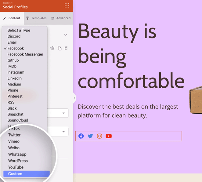
Besides allowing you to choose from 23 social profile icons, you can now add custom social profiles to your website with SeedProd.
Just choose the Custom option from the Social Profiles drop-down menu.
Then you can select a custom icon from our icon library, set the icon color, and enter a link to your profile.
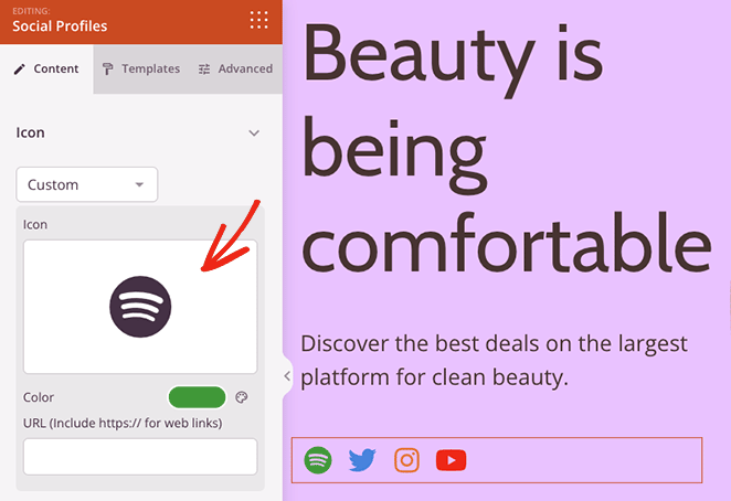
Here are some handy ways you can use this feature:
- Podcasters can link to a Spotify profile
- Real Estate brands can display their Airbnb profile
- Small Businesses can link to their Etsy stores
- Designers can showcase their Behance profile
With more control over your social links, it’s much easier to grow your social media audience and promote your brand outside your website.
Separate Your Content with Style
In a previous update, we added fancy section dividers to make highlighting different sections of your website easier. Continuing this theme, we’ve improved our Divider block so you can separate pieces of content with more than a simple line divider.
With this SeedProd release, you can add text and icons to line dividers. In the Divider settings, you’ll see a new drop-down menu that lets you choose text or icon element types.
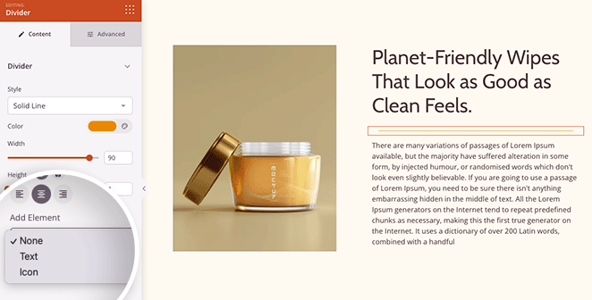
The Text option allows you to add custom text in the middle of your line divider and set the HTML heading tag to suit your SEO needs.
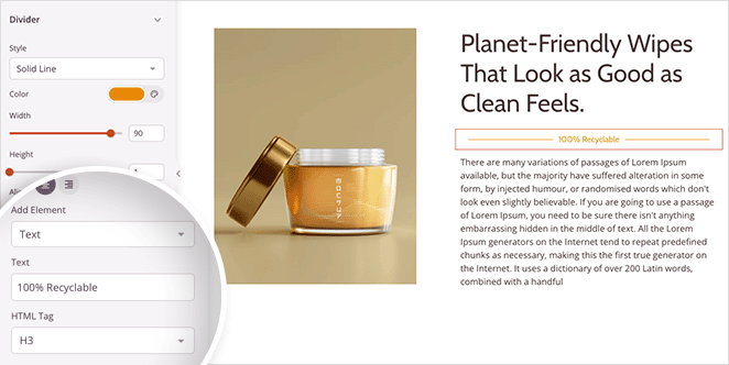
With the Icon option, you can choose an icon from our Font Awesome library and control the icon size, color, and more.
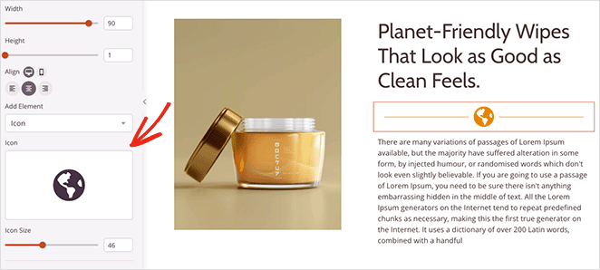
This feature is a great way to add interest to your content, drawing visitors’ attention to crucial information.
For instance, you can use Dividers on your checkout page to highlight your money-back guarantee. Or you can add dividers to a custom sidebar to create clear headings, making it easier for users to find what they need.

Tell Visitors When You’re Open
Did you know that 54% of smartphone users search for the business hours of local companies online? Whether it’s to visit your physical store or get in touch with your support team, showing your business hours can help improve the user experience of your website.
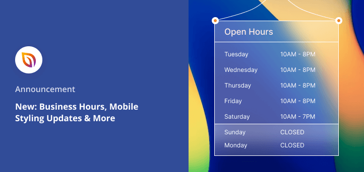
With SeedProd’s new Business Hours block, you can display your opening times with a few clicks. You can add dates and times for every day of the week, control the text size, and customize the alignment easily.
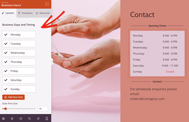
Clicking an item reveals even more customization options, allowing you to style individual days, times, and background colors. For example, if you’re closed on a Sunday, you can style that day to stand out more.
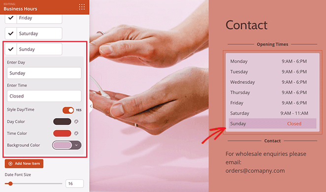
Additionally, the Business Hours block includes 3 custom templates:
- Striped Effect
- Divider
- Background
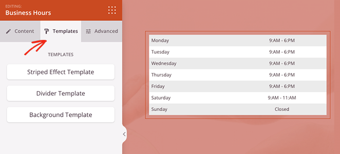
This allows you to instantly add an attractive style to the block without changing each setting individually.
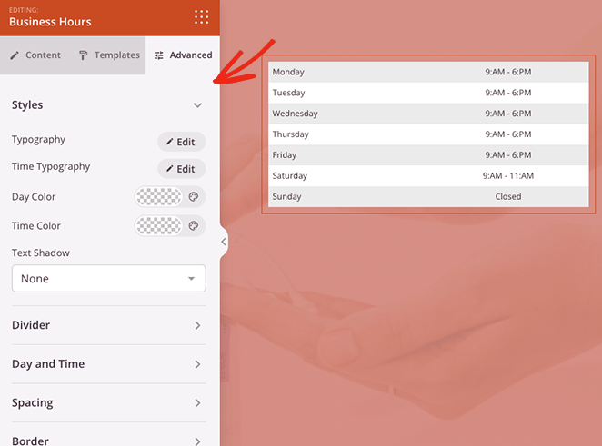
As with all of our blocks and sections, you can further customize things in the Advanced block settings. You can change background colors, adjust fonts, and edit spacing and borders, all without code.
Bonus: Easier Website Kit Browsing
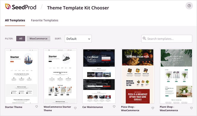
In our last announcement, we introduced Website Kits for SeedProd, and it’s gone down well with our users. Because we’re constantly adding new kits to our library, we decided it was time to add filtering options, so it’s easier to find a design you love.
With this in mind, we’ve redesigned our Website Kits chooser to look similar to our Landing Page Templates library.
From today, you can filter kits to see the entire library or just WooCommerce templates. You can also sort the kits by popular, newest, and oldest, helping you find our latest designs quickly.
Looking for a specific template? Simply enter a phrase into the search box, and you’ll see templates that match your search term.
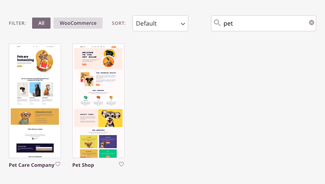
This redesign can shave minutes off your web design process, so it’s even easier to create a stunning WordPress website.
Aside from these exciting features, we’ve also added several other tweaks and fixes to the blocks and sections you love. You can see them in our full product changelog.
Update Your SeedProd Plugin Today
That’s all for now. Update your site to SeedProd 6.15 today to try these new powerful changes.
If you’re new to the SeedProd plugin, now is the best time to get SeedProd Pro and take these features for a spin.
If you have questions about these features, don’t hesitate to contact our customer support team. We’re always ready to help.
We’re so grateful for your support, suggestions, and feedback. Please keep them coming. Our commitment to making SeedProd the best WordPress website builder is only getting stronger as we continue to win together with our customers.

