Creating a landing page for your event shouldn’t be a headache. You need a page that gets people excited and signing up, right?
But finding good examples can be tough. Generic templates are boring, and they don’t capture what makes your event special. What if you could peek behind the curtain and see what truly effective event landing pages look like?
In this article, I share my favourite event landing page examples and break down why they work so you can create a landing page that gets people registering for your event.
Event Landing Page Examples:
- 1. WPEngine Decode Event Landing Page Design
- 2. Collision Conference Ticket Landing Page
- 3. Superweek Digital Marketing Conference Landing Page
- 4. Marketing Exchange B2B Event Landing Page
- 5. Email Marketing Virtual Event Landing Page Example
- 6. Adobe Virtual Summit Landing Page
- 7. Affiliate Summit West Event Page
- 8. Confab Event Landing Page
- 9. Red Hat Summit Landing Page
- 10. Running Remote Event Page
- 11. TEDxSydney Event Landing Page
- 12. SaaStr Annual Conference
- 13. The Next Web Conference
- 14. HubSpot INBOUND
- 15. Social Media Marketing World
- 16. Dreamforce by Salesforce
- 17. MozCon
- 18. Web Summit
- 19. Content Marketing World
- 20. Google I/O
Why Do You Need an Event Landing Page?
An event landing page is a dedicated webpage made to tell people about that particular event. Its goal is to turn those visitors into attendees. It does this by giving important details about the event, making it easy to register, and getting people excited about it.
What Should an Event Landing Page Include?
To get people excited about your event and actually signing up, your event landing page should include the following elements:
- Event information: Make sure it’s crystal clear what the event is called, when and where it’s happening, what they’ll be doing there, and who’s speaking.
- Easy sign-up: Have a simple form right there for people to register or buy tickets.
- CTA button: This is your “call to action”. Use something like “Register Now” or “Get Your Tickets!” so people know exactly what to do.
- Incentives to attend: Give them a little taste of how awesome the event will be. What will they learn? Who will they meet? Why is it unmissable?
- Engaging mages and videos: Use exciting pictures and videos to show potential attendees what to expect. Highlight your speakers and give a feel for the event’s vibe.
- Additional details: Have a section with FAQs, contact info, and info about sponsors (if you have any).
Ready to see some awesome examples of event landing pages that really work? Let’s do it.
20 Successful Event Landing Page Examples
I’ve hand-picked some excellent event pages so you don’t have to. Even better, I go into why they work so you can replicate them on your website.
1. WPEngine Decode Event Landing Page Design
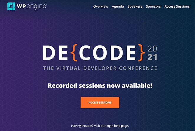
Let’s kick things off with WP Engine’s event page for their Decode conference. Right off the bat, they hook developers with a super techy-looking heading (clever, right?).
As you scroll, they tell you exactly what the conference is about, who the big-shot speakers are, and even give you sneak peeks of past Decode events. Plus, they don’t let you forget to sign up – they’ve got those “Register Now” buttons sprinkled everywhere.
Takeaways from this event page design:
- Headline – The headline is eye-catching and aimed at their target audience.
- Description – Visitors can quickly learn what the event is about and when they can attend.
- Speakers – The main speakers are featured with headshots, titles, and expertise.
- Sponsors – Adding sponsor logos to the event page gives the event more credibility.
- CTA – With more than 1 CTA, it’s easier for users to sign up and register for the event.
How I’d optimize for conversions:
- Use a countdown timer to show when the early bird discount ends.
- Instead of just describing the event, explain what attendees will learn and gain.
- Show videos of people talking about how much they enjoyed past Decode events.
- Make the “Register Now” button bigger and brighter, and use words like “Get Your Ticket” or “Register Today.”
2. Collision Conference Ticket Landing Page
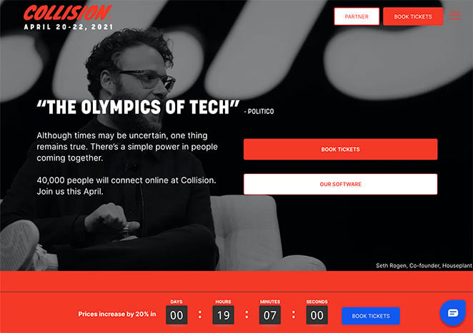
The Collision Conference is a big event about technology and its impact on the world. It features famous speakers from different fields, such as business leaders, professors, and even celebrities. A lot of people go to this event, so they must be doing something right.
Their event page is really cool. It’s easy to look at and understand, and it really shows what the event is all about. This is a great example to look at when designing your own landing page.
Takeaways from this ticket landing page:
- Branding – The page has a consistent branded design that is easy for visitors to recognize.
- Social Proof – Throughout the page, several examples of quotes, testimonials, and social proof give the event trust and credibility.
- Presenters – The speakers appear prominently on the page, and you can click each headshot to learn more.
- Video – The use of video makes the page more engaging and convincing to potential attendees.
- Urgency – A countdown timer ticking down until the price increase encourages people to get their tickets now, generating the fear of missing out (FOMO).
- CTA – Multiple CTAs make it easy for users to register for the event.
How I’d optimize for conversions:
- Put the signup form higher on the page so people see it right away.
- Give more details about what topics will be covered in each session.
- Add a section with answers to common questions people might have.
- Make the signup process two steps: email first, then details, to get more signups.
3. Superweek Digital Marketing Conference Landing Page
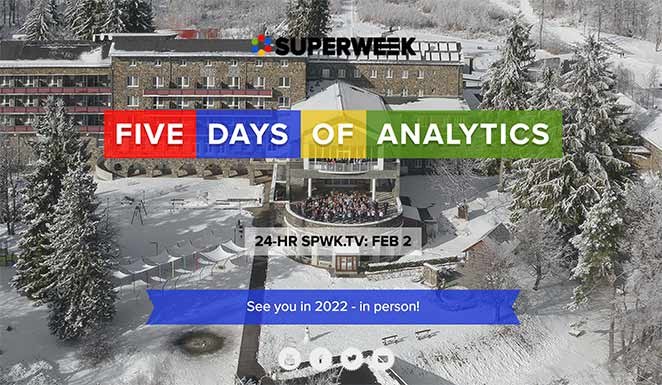
Superweek is an annual conference for digital marketing professionals, thought leaders, and analysts. As soon as you land on the page, you can see it’s dedicated to the analytics industry.
Superweek’s design is remarkably clear and concise. The essential event details (date, location, key speakers) are prominently placed at the top, and the effective use of headings and spacing makes the page easy to digest.
Takeaways from this event page design:
- Images – The use of images throughout the page makes it exciting and engaging for users.
- Video – Adding video to the page gives users a taste of the type of content they can expect.
- Social Stream – Embedding a social media feed on the landing page shows a vibrant and active community, adding trust and credibility.
- Agenda – A detailed agenda with travel and flight information helps people plan for the event in advance.
How I’d optimize for conversions:
- Show the prices clearly upfront.
- Include more pictures or videos of the event venue and what it’s like to be there.
- Make it seem like there are limited spots available.
- Use a popup message to try and get people to sign up if they’re about to leave the page.
4. Marketing Exchange B2B Event Landing Page
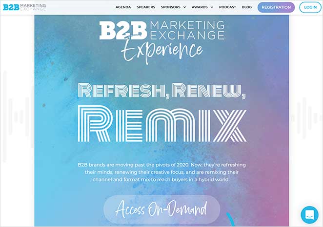
Next is an example from the B2B Marketing Exchange Experience. Their event page has a streamlined flow that directs visitors from one section to another.
The design is simple, straightforward, and easy to navigate, and it includes all the essential features of a successful event page.
Takeaways from this event page design:
- Animation – The use of simple animations helps guide the eye down the page to each different section.
- Sections – Each part of the page is divided into sections that focus on a different part of the event.
- Testimonials – Reviews and testimonials make the event more trustworthy and worth attending.
- Speakers – Each speaker is featured with a link to learn more about what they do.
- Social Feeds – Including a Twitter feed from past events makes it clear that the event is popular.
- Sponsors – Using sponsor logos is another way to give the event more credibility.
- CTA – There are many CTAs throughout the page, making it easy to register.
How I’d optimize for conversions:
- Make the page simpler and remove anything distracting.
- Explain exactly what attendees will learn and be able to do after the event.
- Offer a live chat option so people can ask questions quickly.
- Offer different ticket types at different prices, each with clear benefits.
5. Email Marketing Virtual Event Landing Page Example
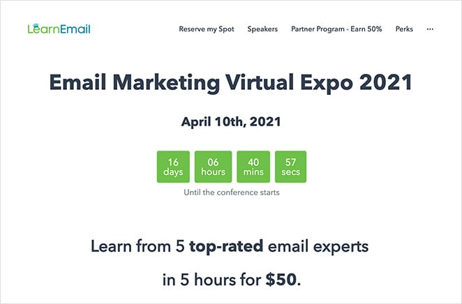
This email marketing virtual expo page from Learn Email has a simple yet effective design that ticks all the right boxes. It’s an excellent example of how even a minimal event landing page design can get your desired results.
Takeaways from this event page design:
- Design – The minimal design puts all the focus on the page content.
- Headline – The headline and sub-headings are benefit-driven, making it more likely you’ll keep reading.
- Countdown Timer – The countdown timer creates urgency, spurring people to register before the event starts.
- Form – The registration form has only a single form field, making it easy for people to sign up.
- Speakers – The speaker carousel takes up less space on the page, keeping the whole design compact and attractive.
- Sponsors – The use of sponsor logos adds authority and credibility to the event.
- CTA – Users have multiple opportunities to register.
How I’d optimize for conversions:
- Add pictures or videos to break up the text.
- Include a sample schedule so people know what to expect.
- Talk more about the chances to meet other people at the event.
- Add buttons so people can easily share the event on social media.
6. Adobe Virtual Summit Landing Page
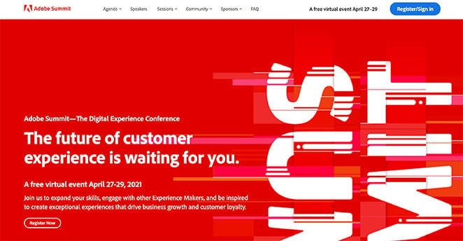
Adobe’s Digital Experience Conference is an excellent example of good branding and great event page design. Right away, you can see it’s an Adobe event from the way the hero area is designed with its brand colors.
The page explains everything you can expect from attending the event. It even gives you a sneak peek at some featured celebrities to generate excitement.
Takeaways from this event page design:
- Branding – Something you’d expect from Adobe is how the entire page is on-brand and beautifully designed, giving it a professional look and feel.
- Speakers – The speakers feature right after the main page header, giving the page weight and authority.
- Headings – All page headings are benefit-driven, explaining what you can learn from attending.
- FAQ – The FAQ section answers the most common questions potential attendees may have.
How I’d optimize for conversions:
- Make the page feel more personal by using information about the visitor.
- Let people “save their spot” without fully registering yet.
- Add a quiz or poll to make the page more interactive.
- Offer limited-time deals to encourage people to sign up quickly.
7. Affiliate Summit West Event Page
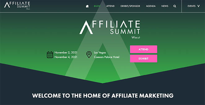
Affiliate Summit is a conference dedicated to the world of affiliate marketing. Its page covers all the information needed to attend without compromising the eye-catching design.
Takeaways from this event page design:
- Design – The overall page design is consistent, attractive, and sectioned, making it easy to navigate and find the information you need.
- Location – The conference’s locations and timing are immediately visible in the page hero area, so it’s easy for visitors to plan.
- Animation – We love the slide-up tab animations for the different points of interest. They make the page engaging without distracting from the primary goal.
- Speakers – The speaker grid is an excellent use of space that doesn’t detract from the overall design.
- Testimonials – With reviews and testimonials, it’s easy for users to see the value of registering.
- CTA – Multiple CTAs make it easy to sign up for the event.
How I’d optimize for conversions:
- Show how much money people have made by attending past events.
- Offer a money-back guarantee to reduce risk.
- Create different landing pages for different types of attendees.
- Add trust badges near the signup form to make it feel more secure.
8. Confab Event Landing Page
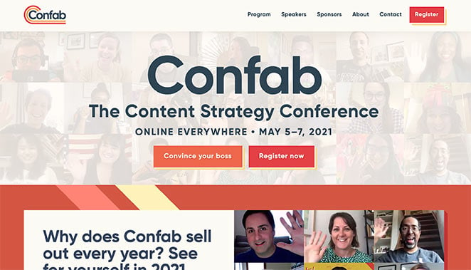
Confab’s content strategy conference page has a bold design that stands out from the other landing pages on this list. It has an almost retro color palette with a bold layout that’s both eye-catching and engaging for visitors.
Takeaways from this event page design:
- Branding – The entire page design links with the Confab logo colors and style. This gives the page a unified look that’s pleasing to the eye and easy to recognize.
- CTA – The CTA buttons contrast with the page and use action-oriented copy to encourage users to click now.
- Speakers – The speaker grid links to a page dedicated to each speaker, making it easy to learn more about them.
- Social Proof – The testimonials grid is a great way to add trust and credibility to the page without looking overwhelming.
- Social Media Buttons – Social buttons in the footer help users find the brand elsewhere online.
How I’d optimize for conversions:
- Add videos of people talking about how much they enjoyed past Confab events.
- Show a chart comparing the different ticket types and what they include.
- Offer a free download in exchange for email addresses.
- Show little pop-up messages when people register, to create social proof.
9. Red Hat Summit Landing Page
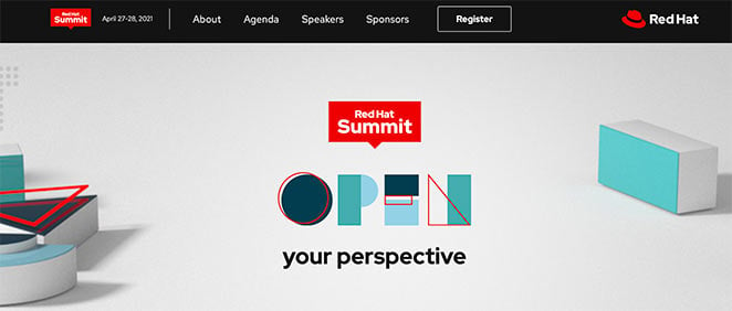
Red Hat’s enterprise IT summit has a modern landing page design tailored to its target audience. It clearly outlines what users can expect by attending without being too overwhelming or distracting for visitors.
We especially love the use of color on this page to tie the design to the brand’s logo. The clever use of white space draws your attention to the necessary page details.
Takeaways from this event page design:
- Hero – The hero area features a great image that links to the main heading. Using similar typography to the image, it adds interest to the page, making it more engaging.
- Video – The use of video immediately after the hero section keeps users on the page to learn more about the event.
- Guests and Speakers – Focusing on different speakers and guests is an excellent way to give the event authority.
- Schedule – The recommended schedule helps users plan their day around the event.
- CTA – Multiple CTA buttons give users more opportunities to register.
How I’d optimize for conversions:
- Make the main menu simpler and focus on getting people to register.
- Add a “Register Now” button that stays on the screen as people scroll.
- Give more specific details about the agenda earlier on the page.
- Offer lower prices for people who register early.
10. Running Remote Event Page
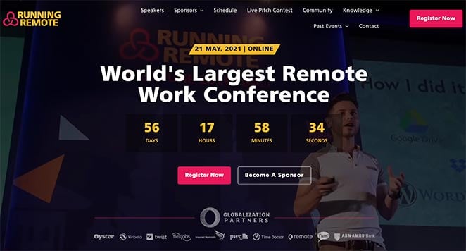
Running Remote’s event page is a fantastic example of event promotion. As soon as you visit, you know what the conference is about, when it takes place, and how to register.
The hero area has all of that information right at the top of the page. This makes it easier to see the details you need right away.
Takeaways from this event page design:
- Video – Video is used in the hero area background and further down the page to keep visitors engaged.
- Numbers—The number of attendees, speakers, sessions, and hours convinces users that this event is worth attending.
- Speakers – The speakers are featured prominently and are linked to individual pages with more information.
- Testimonials – A section dedicated to testimonials helps users see the value of registering.
- CTA – Multiple CTA buttons throughout the page give users plenty of chances to sign up.
How I’d optimize for conversions:
- Give clearer information about how to attend virtually.
- Add a tool to help people calculate how much they could earn back by attending.
- Encourage people to share the event with their friends by offering a reward.
- Add more pictures or videos of what it’s like to be at the event.
11. TEDxSydney Event Landing Page
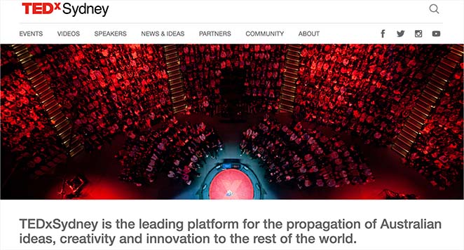
TEDxSydney’s landing page features a clean design with a compelling call to action (CTA). It showcases a list of prominent speakers and includes an engaging video that captures the event’s essence.
Detailed information about the event schedule, venue, and virtual participation options are also provided, ensuring attendees have everything they need in one place.
Key Takeaways from this event page design:
- Hero: The hero area features a captivating image that seamlessly complements the main heading, making the introduction visually appealing.
- Video: The engaging video immediately after the hero section keeps users interested and provides more details about the event.
- Speakers: Highlighting prominent speakers adds credibility and attracts a broader audience.
- Schedule: A detailed event schedule helps attendees plan their participation effectively.
- CTA: Clear and prominent CTA buttons encourage registration and engagement.
How I’d optimize for conversions:
- Add a countdown timer to show when the event starts.
- Give more details about the talks and speakers.
- Offer a discount for early registrations.
- Include testimonials from people who attended previous TEDxSydney events.
- Add a chatbot to answer common questions instantly.
12. SaaStr Annual Conference
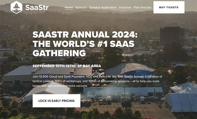
SaaStr Annual Conference utilizes a modern design with vibrant colors, a countdown timer, and multiple CTAs. It highlights the agenda, keynotes, and networking opportunities and includes testimonials from past attendees.
The engaging layout and detailed content make it easy for potential attendees to grasp the event’s value.
Key Takeaways from this event page design:
- Hero: The hero section features bold colors and a countdown timer, creating a sense of urgency.
- Countdown Timer: Emphasizes the event’s start date, encouraging quick registration.
- Testimonials: Social proof from past attendees builds trust and interest.
- Schedule: A detailed agenda and keynote highlights provide clear insights into the event’s content.
- CTA: Multiple strategically placed CTA buttons make it easy for users to register.
How I’d optimize for conversions:
- Simplify the page layout to make it easier to understand.
- Add more “Register Now” buttons.
- Explain how attending can help people make more money.
- Make a chart comparing the different ticket types.
- Use pop-up messages with special offers when people try to leave the page.
13. The Next Web Conference
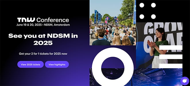
The Next Web Conference landing page is dynamic, featuring animated elements and a bold color scheme. It showcases event highlights, a speaker lineup, and partnership opportunities, along with various ticket options and pricing, making the page visually appealing and informative.
Key Takeaways from this event page design:
- Hero: Animated elements and bold colors grab attention immediately.
- Event Highlights: Clearly showcased event highlights inform users about the main attractions.
- Speakers: Featuring the speaker lineup builds authority and interest.
- Ticket Options: Providing various ticket options and pricing details aids in user decision-making.
- CTA: Clear and compelling CTAs drive registrations.
How I’d optimize for conversions:
- Give more specific information about the topics covered in each session.
- Add a section with answers to frequently asked questions.
- Offer a document to help people convince their bosses to let them attend.
- Show little pop-up messages when people register.
- Encourage people to share the event by offering a reward.
14. HubSpot INBOUND
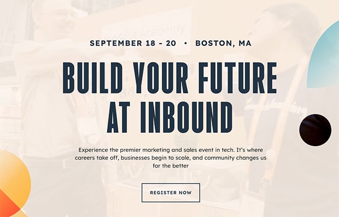
INBOUND’s event landing page features a minimalist design that focuses on clarity and ease of navigation. It prominently displays featured speakers, event tracks, and registration information.
Additionally, it includes testimonials and a FAQ section to address common queries, making it user-friendly and informative.
Key Takeaways from this event page design:
- Hero: A minimalist hero area ensures clarity and focus.
- Speakers: Highlighting featured speakers adds value and attracts attendees.
- Event Tracks: Clearly defined event tracks help users understand the event’s structure.
- Testimonials: User testimonials provide social proof and build credibility.
- CTA: Prominent and clear CTA buttons facilitate easy registration.
How I’d optimize for conversions:
- Add pictures or videos to make the page more visually appealing.
- Include videos of people talking about how much they enjoyed past INBOUND events.
- Make it seem like there are only a limited number of spots available.
- Offer a live chat option so people can get quick answers.
- Make the registration process two steps to increase conversions.
15. Social Media Marketing World
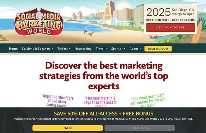
Social Media Marketing World’s landing page uses a professional yet inviting design, emphasizing social proof through testimonials and social media feeds. It provides detailed information about the schedule, workshops, and speaker sessions, ensuring attendees have a clear understanding of what to expect.
Key Takeaways from this event page design:
- Hero: A professional and inviting hero area with clear event branding.
- Testimonials: Social proof via testimonials enhances trust and interest.
- Workshops: Detailed information about workshops helps attendees plan their participation.
- Speakers: Featuring speakers adds credibility and draws attention.
- CTA: Multiple CTA buttons throughout the page make registration straightforward.
How I’d optimize for conversions:
- Put the signup form higher on the page.
- Explain the benefits of attending each specific track.
- Add a tool to help people calculate the return on investment of attending.
- Offer limited-time deals.
- Add trust badges near the signup form.
16. Dreamforce by Salesforce
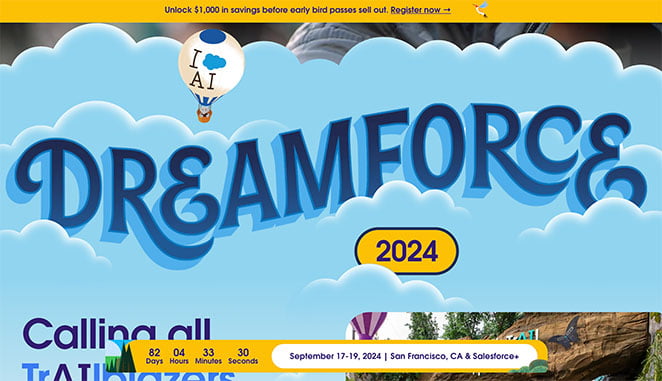
Dreamforce’s landing page is highly interactive, featuring videos, live chat options, and a detailed event agenda. The design is visually appealing, with vibrant colors and clear CTAs that encourage users to register and engage with the event content.
Key Takeaways from this event page design:
- Hero: An interactive hero area with engaging visuals and vibrant colors.
- Video: Videos provide an immersive experience and detailed event insights.
- Live Chat: Live chat options enhance user engagement and provide instant support.
- Agenda: A detailed event agenda ensures attendees are well-informed.
- CTA: Clear CTAs throughout the page encourage registration and participation.
How I’d optimize for conversions:
- Make the main menu simpler and focus on registration.
- Explain what attendees will learn and be able to do after the event.
- Offer a money-back guarantee.
- Create different landing pages tailored to different types of attendees.
- Add a “Register Now” button that stays on the screen as people scroll.
17. MozCon
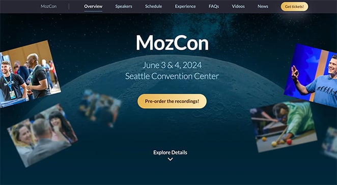
MozCon’s event landing page is straightforward and professional. It focuses on speakers, sessions, and networking opportunities.
The page also includes a section for ticket purchasing and information about virtual attendance options, making it accessible to a wide audience.
Key Takeaways from this event page design:
- Hero: A professional hero section with clear event branding.
- Speakers: Detailed information about speakers adds value and interest.
- Sessions: Highlighting sessions helps attendees understand the event’s content.
- Tickets: Easy access to ticket purchasing information enhances user experience.
- CTA: Prominent CTAs make registration simple and effective.
How I’d optimize for conversions:
- Add more pictures or videos of what it’s like to be at the event.
- Include a sample schedule.
- Highlight the networking opportunities more clearly.
- Offer something free, like a guide or checklist, in exchange for email addresses.
- Add social sharing buttons.
18. Web Summit
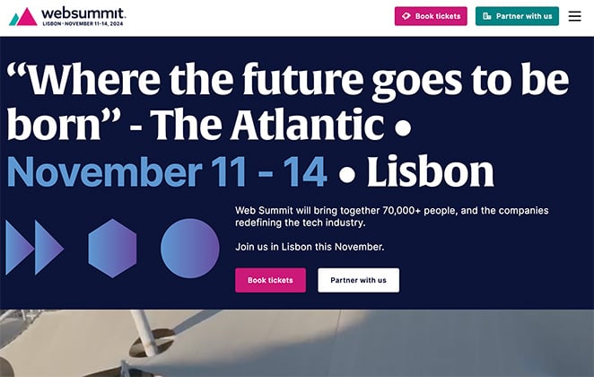
Web Summit’s landing page is sleek and modern. It features a countdown timer, multiple registration options, and detailed information about speakers and sessions.
The page also includes sections for sponsorship opportunities and media coverage, providing comprehensive event details.
Key Takeaways from this event page design:
- Hero: A sleek and modern hero area with a countdown timer to create urgency.
- Countdown Timer: Emphasizes the event’s approach, encouraging quick action.
- Speakers: Detailed speaker information adds credibility and interest.
- Sponsorships: Information about sponsorship opportunities appeals to potential partners.
- CTA: Multiple CTAs encourage user engagement and registration.
How I’d optimize for conversions:
- Explain how to attend virtually.
- Show statistics about how attending past events has helped people.
- Offer limited-time deals.
- Let people “save their spot” without fully registering.
- Add a chatbot to answer common questions.
19. Content Marketing World
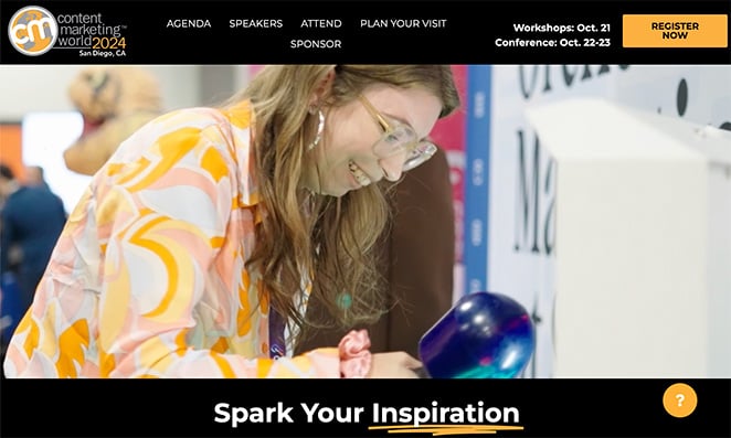
Content Marketing World’s landing page highlights the event’s schedule, speakers, and networking events. The design is clean and professional, with clear CTAs and a section dedicated to testimonials from past attendees, ensuring potential participants have all the necessary information.
Key Takeaways from this event page design:
- Hero: A clean and professional hero area with clear event details.
- Schedule: A detailed event schedule helps attendees plan their participation.
- Speakers: Featuring speakers enhances credibility and attracts attendees.
- Networking: Information about networking events adds value for attendees.
- CTA: Clear and effective CTAs facilitate easy registration.
How I’d optimize for conversions:
- Add videos from past events.
- Make a chart comparing different ticket options.
- Offer lower prices for early registrations.
- Add interactive elements like quizzes or polls.
- Use pop-up messages with special offers.
20. Google I/O
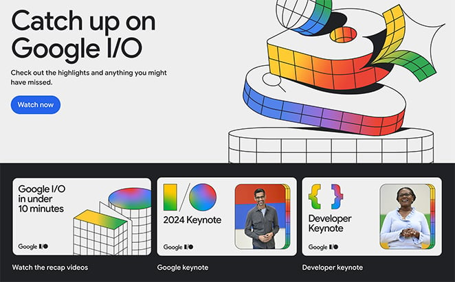
Google I/O’s landing page is tech-focused, with an emphasis on interactive elements and detailed event information. It features sections for keynote speakers, session tracks, and a virtual participation guide, ensuring attendees know what to expect and how to engage.
Key Takeaways from this event page design:
- Hero: A tech-focused hero area with engaging visuals.
- Keynotes: Detailed information about keynote speakers draws interest.
- Session Tracks: Clearly defined session tracks help attendees navigate the event.
- Virtual Guide: A comprehensive virtual participation guide enhances user experience.
- CTA: Prominent CTAs encourage registration and engagement.
How I’d optimize for conversions:
- Give more details about what’s covered in each session.
- Include testimonials from past attendees.
- Make in-person attendance feel special and exclusive.
- Use a countdown timer to create urgency.
- Encourage people to share the event with friends by offering a reward.
How to Create an Event Landing Page
If your business is hosted on WordPress, the easiest way to create your next event landing page is with a page builder plugin like SeedProd.
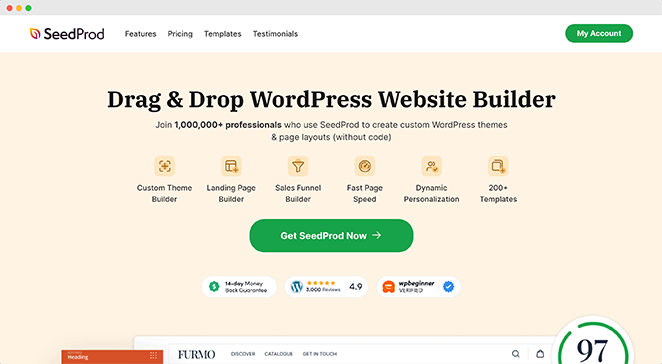
SeedProd is the best WordPress landing page builder with drag-and-drop functionality. It makes it super-easy to create any type of landing page in WordPress without hiring a developer.
With tons of responsive landing page templates, getting your event page to look how you want is super easy. Every design is completely customizable in the visual drag-and-drop builder. This means you won’t have to write a single line of code.
Follow our guide on how to create an event landing page in WordPress to get started.
FAQs About Event Landing Pages
You can also optimize images and videos by using alt tags and providing descriptive filenames.
We hope this guide helped you find inspiring event landing page examples to use on your website. If you’re building more types of landing pages, check out these other examples:
- Blog Landing Page Examples
- Social Media Landing Page Examples
- Request a Demo Landing Page Examples
- eCommerce Landing Page Examples
Thanks for reading! We’d love to hear your thoughts, so please feel free to leave a comment with any questions and feedback.
You can also follow us on YouTube, X (formerly Twitter), and Facebook for more helpful content to grow your business.

