Like many website owners, I learned about mobile landing pages the hard way.
Back when I started working with WordPress sites, I only focused on how they looked on desktop computers. Then I noticed something alarming, hardly anyone was signing up or buying on their phones. That’s when I knew I needed to fix my mobile pages.
These days, most people browse the internet on their phones. So having a mobile-friendly landing page is a must. And after years of running my sites, I’ve figured out what makes mobile landing pages work (and what makes them fail).
That’s why I’ve put together this collection of mobile landing page examples that actually get results.
Mobile Landing Page Examples:
Why Mobile Landing Pages Matter
The last time I checked my Google Analytics, over 70% of my visitors were using phones or tablets. And this isn’t just my experience, it’s happening everywhere. By 2025, we’re looking at 187 million people shopping on their phones in the US alone.
But while most people browse on mobile, they’re much less likely to buy or sign up if your page isn’t mobile-friendly. I’ve seen conversion rates jump from 1% to 5% just by fixing mobile landing pages.
Take Creatopy, for example. They used heatmaps to see how people actually used their mobile pages, then redesigned based on what they learned.

Their sign-ups went up by 25% just by making their pages more mobile-friendly.
Google knows this too. They now look at your mobile site first when deciding how to rank your pages. If your mobile experience isn’t great, you’re probably losing out on both rankings and visitors.
What makes visitors leave a mobile page? From my testing and research, it usually comes down to these basics:
- Text that’s too small to read
- Buttons that are hard to tap
- Forms that are frustrating to fill out
- Pages that load too slowly
- Content that requires too much scrolling
The good news is these are all things you can fix. And in the examples I’m about to show you, you’ll see exactly how successful websites are doing it right.
What Makes a Great Mobile Landing Page?
After working on hundreds of mobile landing pages, I’ve found that the best ones share some key features. Let me break these down into what actually matters for your visitors:
- A layout that adjusts to any screen size
- Images that scale properly without slowing things down
- Text that’s readable without zooming
- Buttons and links that are easy to tap
- Pages that load fast
- Important elements in the “thumb zone”: where thumbs naturally reach
- Short, clear headlines that get to the point
- Plenty of white space to avoid crowding
- One main action per screen
- Forms with only essential fields
Remember, people browsing on phones are often rushing or multitasking. Your job is to make it easy for them to take action, whether that’s making a purchase, signing up, or getting in touch.
15 Outstanding Mobile Landing Page Examples
In the examples coming up next, you’ll see exactly how successful websites put the landing page best practices I mentioned above into action.
E-commerce Mobile Landing Pages
Let’s start with some e-commerce examples that really nail the mobile experience. These sites understand what mobile shoppers need and deliver it perfectly.
1. Tykees

Tykees proves that simple works best for fashion. Their sandal collection page opens with a compelling “Get 10% Off” offer and makes it impossible to resist with clean, stunning product photos.
The whole experience feels like browsing a high-end boutique on your phone: clean, uncluttered, and focused on making that first purchase irresistible.
2. Briogeo

Briogeo takes a before-and-after approach to selling hair care. Their interactive slider lets shoppers see real results with a simple finger swipe.
What stands out is how they mix education with shopping, explaining ingredients while keeping the “Shop Now” button always within reach.
3. Good Health Organic (by Utz)

Good Health Organic makes healthy snacks look irresistible on mobile. Instead of long health claims, they use bright, appetizing photos and offer multiple ways to buy.
Their page works because it speaks to busy parents, making healthy choices look easy and convenient.
What Makes These Mobile Landing Pages Work
- Tykees uses simplicity and social proof
- Briogeo educates while selling
- Good Health Organic makes healthy look fun
- All prioritize clear, tappable buttons
- Each knows their mobile audience
If you’re looking for more inspiration, see these top ecommerce landing page examples.
Service-Based Mobile Landing Page Examples
Now let’s look at how service businesses make their mobile landing pages work. These examples show how to turn phone visitors into real leads.
4. Sophie Dallamore

Sophie Dallamore’s fashion consulting page works like a mobile portfolio. Rather than telling, she shows her expertise through carefully chosen client photos.
The page feels more like an Instagram feed than a traditional service site, which is perfect for her fashion-conscious audience.
5. Bill Ragan Roofing

Bill Ragan takes the local expert approach. Their “Let Your Roof Problem Be Our Problem” speaks directly to Nashville homeowners’ concerns.
They use their 30+ years of local experience to build trust before asking for the quote request.
6. Lawn Doctor

Lawn Doctor turns lawn care scientific. Instead of just promising a green lawn, they explain their systematic approach.
Their “No Nonsense Guarantee” and easy quote form make the decision feel risk-free.
What Makes These Mobile Landing Pages Work
- Sophie shows rather than tells
- Bill Ragan emphasizes local expertise
- Lawn Doctor makes complex services simple
- All offer clear next steps
- Each builds trust differently
SaaS Mobile Landing Page Examples
Next, let’s look at how software companies design their mobile landing pages. These examples show how to explain complex products simply and get people to sign up for free trials or demos.
7. OptinMonster

OptinMonster tackles objections head-on with “Yes, Popup Opt-in Forms Work.” Instead of long explanations, they use before/after examples and real numbers to make their case.
The page feels more like a quick proof session than a sales pitch, which works perfectly for skeptical marketers on their phones.
8. MonsterInsights

MonsterInsights takes the opposite approach. Rather than convincing you about analytics, they focus purely on making the upgrade decision simple.
Their feature comparison uses clear checkmarks and plain language, perfect for quick mobile scanning. It’s like a good friend telling you exactly what you’ll get.
9. Moz

Moz keeps things minimal but powerful. They lead with social proof (“500,000 SEOs use Moz”) and strip away everything except what matters for a trial signup.
The page feels more like a quick application than a traditional landing page, which matches how people actually use their phones.
What Makes These Mobile Landing Pages Work
- OptinMonster proves their point with examples
- MonsterInsights simplifies complex choices
- Moz builds confidence through numbers
- All prioritize quick mobile decisions
- Each matches their audience’s mindset
Want to see more great SaaS designs? Take a look at these additional SaaS landing page examples.
Lead Generation Mobile Landing Pages
Now let’s look at how businesses capture leads on mobile. These examples show different ways to turn phone visitors into email subscribers, consultation requests, and demo signups.
10. Marie Forleo

Marie Forleo takes the “value first” approach. Instead of just asking for emails, she offers her, 2025 Success Guide as an immediate reward for joining the waitlist.
The page feels more like getting exclusive access than signing up for marketing emails. Her personal photos and student success stories make it feel like joining a community rather than just another email list.
11. BigCommerce

BigCommerce goes the educational route with their 17-minute product tour. They respect your time by telling you exactly how long it’ll take and what you’ll learn.
Rather than promising vague benefits, they lay out specific learning points. It’s like having a knowledgeable friend walk you through their platform.
12. WordStream

WordStream uses curiosity about competitors to drive signups. Their “How do your Facebook Ads stack up?” approach taps into marketers’ natural competitiveness.
The free grading tool turns lead generation into a useful service. Their Meta partnership badge adds credibility to the whole experience.
What Makes These Mobile Landing Pages Work
- Marie builds a connection through exclusivity
- BigCommerce respects time with clear expectations
- WordStream turns curiosity into action
- All deliver immediate value
- Each matches their audience’s motivations
For even more inspiration, see these other lead generation landing page examples.
Event/Conference Mobile Landing Pages
Let’s look at how events make their mobile landing pages work. These examples show how to sell tickets and get registrations from people browsing on their phones.
13. Adobe Summit

The Adobe Summit page gets straight to the point with “Innovation ignites.” They’ve turned a huge conference into something that feels manageable on a phone screen, leading with keynote speakers and partner logos from Google and PayPal.
You can quickly see what you’ll learn in each session without endless scrolling.
14. Running Remote

Here’s a different take on event pages. Running Remote focuses on the community aspect of their conference. They highlight real stories from remote work leaders and practical takeaways you can use right away.
I particularly like how they show the venue and networking opportunities. It makes the whole event feel more tangible, even on a small screen.
15. INBOUND by HubSpot

Inbound takes a more dynamic approach. Instead of just listing speakers and sessions, they create excitement with interactive elements and bold visuals.
The page feels more like scrolling through a social media feed than a typical conference site, which works really well on mobile.
What Makes These Mobile Landing Pages Work
- Adobe keeps it professional but accessible
- Running Remote emphasizes community and practical value
- Inbound creates energy with interactive elements
- All make registration simple on mobile
- Each shows clear benefits of attending
How to Create High-Converting Mobile Landing Pages
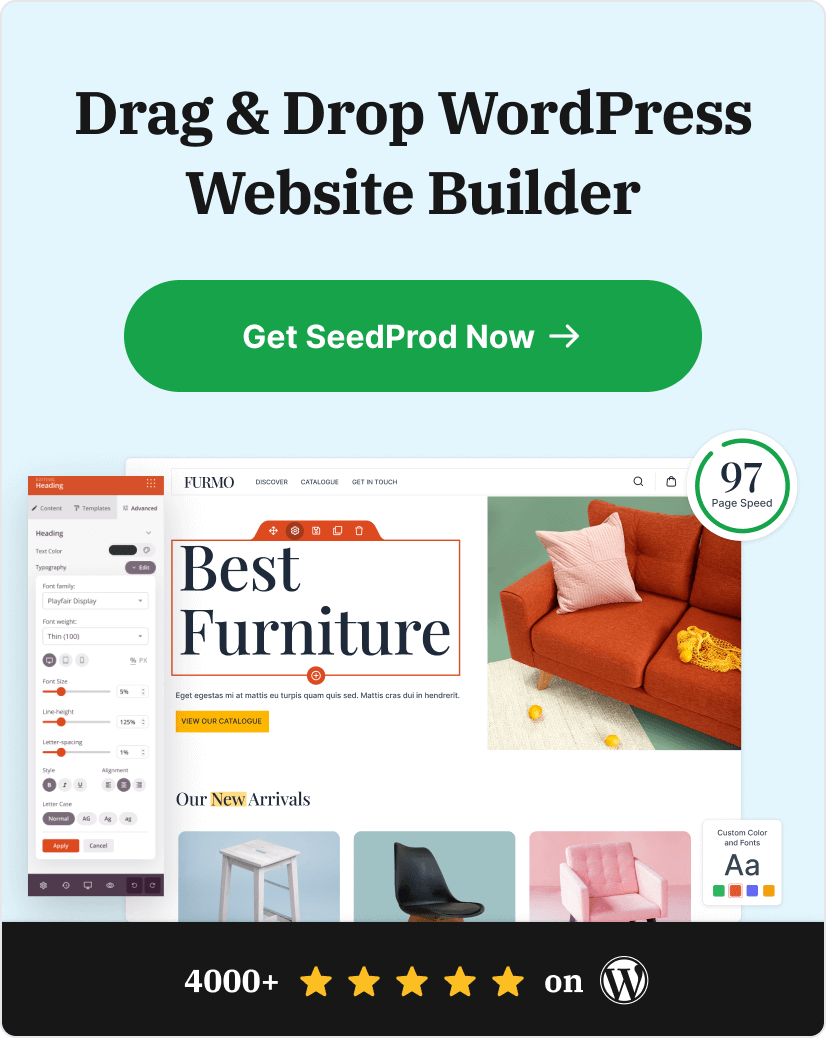
When it comes to building responsive landing pages in WordPress, you have plenty of tools at your disposal. But if you want the easiest way to make sure your pages look great on phones, a landing page builder is your best bet.
While there are many WordPress landing page plugins out there, I always SeedProd for my projects.

The drag-and-drop builder is genuinely easy to use, which means you can create professional-looking pages without touching code. You’ll also get access to hundreds of pre-made templates, so you never have to start from scratch.
What really sets SeedProd apart is its built-in mobile customization options. You can tweak how any element looks on phones without affecting your desktop design.

Plus, it’s fast and lightweight, which means your pages load quickly, which is essential for keeping mobile visitors around.
For a full step-by-step walkthrough, see my guide on how to make a mobile landing page in WordPress.
Bonus Mobile Landing Page Tips
Want to dive deeper into mobile optimization? Here are some helpful guides I’ve put together:
- How to Edit Mobile Menus in WordPress (Beginner’s Guide)
- How to Hide Images in Mobile View on WordPress
- Mobile-Friendly Website Examples for Responsive Design Inspiration
- How to Make a Desktop Only Website Mobile-Friendly (Easy Steps)
- Best WordPress Mobile Plugins for Mobile-Friendly Websites
Frequently Asked Questions About Mobile Landing Pages
Build a Better Mobile Landing Page
Looking at these examples, it’s clear that simplicity wins on mobile. The best pages focus on making it easy for phone users to take action.
If you’re ready to create your own mobile-friendly landing page, get started with SeedProd and turn more phone visitors into customers.
Thanks for reading! We’d love to hear your thoughts, so please feel free to leave a comment with any questions and feedback.
You can also follow us on YouTube, X (formerly Twitter), and Facebook for more helpful content to grow your business.