You know how important first impressions are, right? Well, your website has less than 50 milliseconds to make a good one. That’s why your website’s welcome page is so crucial. It’s the first thing people see, setting the tone for their entire experience.
Essentially, it’s a welcome mat. It needs to be warm and inviting and tell people they’re in the right place.
In this guide, I’ll show you how to write a welcome page for your website that grabs attention and turns casual visitors into loyal fans.
How to Write a Welcome Page for Your Website:
What Is a Welcome Page?
A welcome page is the first page visitors see when they arrive at your website. It’s usually the homepage, the starting point of their journey. Think of it as your website’s introduction, giving visitors a quick overview of who you are and what you offer.
There are a few different types of welcome pages:
- Homepage Welcome Pages: This is the most common type, where your homepage serves as your site’s main welcome page.
- Splash Pages: These are designed to grab attention quickly and are often used for promotions or announcements.
- Coming Soon Pages: If your website is still under construction, a coming soon page acts as a placeholder to build excitement for the launch.
No matter the type, the goal is to greet visitors, spark their interest, and guide them further into your website.
Why Is a Welcome Page Important?
Since your welcome page is the first thing visitors see, making a solid first impression is crucial. It should instantly communicate what your business is about and why visitors should care.
A well-designed welcome page goes beyond looks. It provides clear direction and guides visitors to the information they need. This information could be about your products, services, contact information, or anything else essential to your business.

When visitors can quickly find what they’re looking for, they’re more likely to stay on your website, explore further, and ultimately become customers.
With a clear and engaging welcome page, you can avoid losing potential customers before they even have a chance to see what you offer.
How to Create a Welcome Page: Essential Elements
Creating a welcome page for your WordPress website doesn’t have to be complicated. While there are many ways to do it, using a WordPress landing page builder is one of the easiest, especially if you want more customization than the default WordPress editor offers.
However, not all page builders are created equal. Some can be clunky and difficult to use. That’s why I recommend SeedProd.
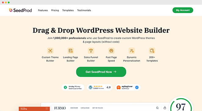
SeedProd’s lightweight drag-and-drop builder and ready-made landing page templates make it easy for anyone to build a stunning welcome page — no coding required.
After downloading the plugin, follow our easy guide on installing SeedProd on your website.
Know Your Audience
Before you even open SeedProd or start brainstorming catchy headlines, take a moment to think about your audience. Who are you trying to reach with your website?
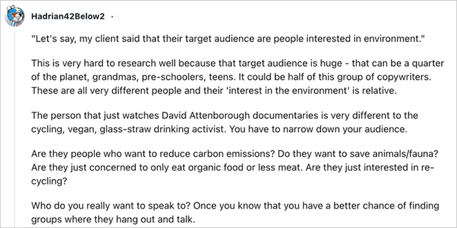
As one expert notes, a vague audience like “people interested in the environment” is too broad – you need to narrow it down to more specific segments.
Consider these questions:
- Demographics: What is the age range of your ideal visitor? Where do they live? What do they do for a living?
- Interests and Pain Points: What are their hobbies and interests? What problems or challenges do they face that your website can help solve?
- Goals: What do they hope to achieve by visiting your website? Are they looking for information, entertainment, or to make a purchase?
Understanding your target audience allows you to create a welcome page that speaks directly to them. It helps you tailor your message, choose the right visuals, and make a call to action that resonates with their needs and desires.
After researching your audience, you’re ready to create your welcome page. To help you get started, check out this step-by-step guide on how to create a landing page in WordPress.
For specific types of welcome pages, you can also see these guides:
- Before you launch: how to create a coming soon page
- Your front page: how to edit your WordPress homepage
- During updates: how to create a maintenance mode page
- Registered users: how to customize your login page
- Grab attention: how to create a splash page
Hook Readers with Your Headline
Your headline has a split second to grab your visitor’s attention—that’s how important it is. It’s the first thing people see, which can make or break their decision to explore your site. It needs to communicate value and instantly make visitors curious to learn more.
Instead of just listing features, focus on the benefits. How will your product or service make their lives easier, better, or more enjoyable?

Use simple language that gets straight to the point, and keep it concise at around 10 words or less. Here are some examples to spark your creativity:
- Welcome to [Your Company] – [Your Unique Value Proposition] (Example: Welcome to Acme – We Make Project Management Easy)
- Transform Your Business with [Your Product/Service] (Example: Transform Your Business with AI-Powered Marketing)
These landing page headline formulas are also worth checking out.
Explain What Makes You Different
Right after your headline, you need to answer the visitor’s unspoken question: “What’s in it for me?”
This is your chance to showcase your unique value proposition (UVP) – that special sauce that sets you apart from the competition. What problem do you solve better than anyone else? Why should visitors choose you?

Here are a few tips for crafting a compelling UVP:
- Focus on a Specific Problem: Don’t try to be everything to everyone. Instead, pinpoint the one problem your target audience cares about most and how you solve it.
- Use Strong Verbs: Make your UVP active and persuasive. Instead of saying, “We offer affordable solutions,” say, “We help you save money without sacrificing quality.”
- Back Up Your Claims: If you make bold statements, support them with evidence, data, or testimonials.
Zoom’s value proposition, for example, is clear and direct.
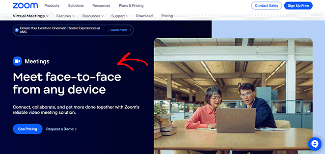
It highlights the service’s benefits — ease of use and accessibility. This helped contribute to Zoom’s rapid growth, especially during the COVID-19 pandemic.
Guide Visitors with a CTA
A welcome page without a call-to-action (CTA) is like a shop without a cash register – visitors might browse around, but they’re unlikely to take any action.
Your CTA tells visitors exactly what you want them to do next. It should be clear, compelling, and aligned with your website goals.
Here are a few common types of CTAs:
- Download Now: Perfect for offering free resources like ebooks, checklists, or templates.
- Learn More: Encourages visitors to explore your products, services, or content in more detail.
- Get Started: Ideal for prompting sign-ups, free trials, or demos.
- Sign Up Free: Great for building your email list or attracting users to a free plan.
Instead of generic phrases, try making your CTAs more specific and action-oriented.
For instance, instead of a “Download Now” button, consider something like “Grab Your Free Ebook!” or “Get Your Checklist Now.”

If you’re using “Learn More,” spice it up with options like “Explore Our Solutions” or “See How It Works.”
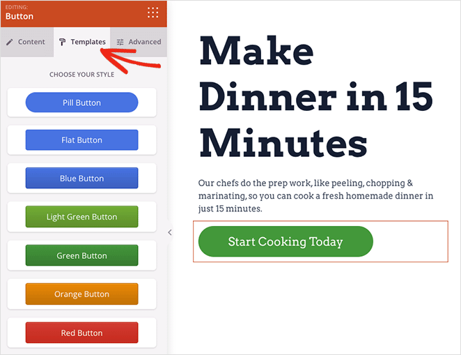
Make sure your CTA stands out from the rest of your page. Use contrasting colors, larger font sizes, and consider adding whitespace around it to draw attention.
In this example, I’ve used SeedProd’s “Button” block and customization options to make my CTA pop:
Boost Engagement with Powerful Visuals
According to an MIT neuroscience study, the human brain can process images seen for as little as 13 milliseconds. That’s incredibly fast!
As MIT professor and senior study author Mary Potter explains:
“The fact that you can do that at these high speeds indicates to us that what vision does is find concepts. That’s what the brain is doing all day long — trying to understand what we’re looking at.”
We’re wired to respond to visual information, so using powerful visuals on your welcome page is essential for capturing attention and keeping visitors engaged. When choosing visuals, always consider your target audience and the message you want to convey.
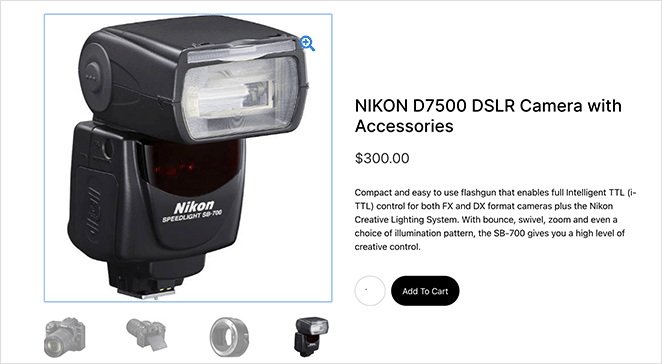
High-quality product photos can entice potential customers, while lifestyle photos help your audience envision themselves using your products or services.
An explainer video can be incredibly effective for explaining complex ideas or showcasing a product’s functionality.
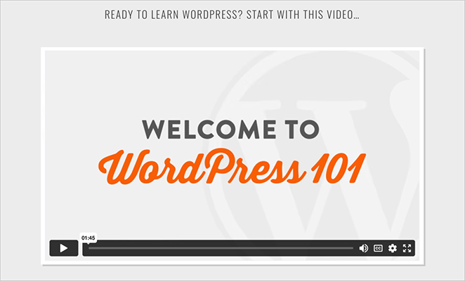
In fact, 82% of people have been convinced to buy a product or service by watching a video.
Build Trust with Social Proof
Think about it: you’re likelier to try a new restaurant if it’s packed with happy diners or if a friend recommends it, right? The same principle applies to your website. Social proof builds credibility and trust with your visitors.
Here are a few ways to add social proof to your welcome page:
- Testimonials: Show glowing reviews from satisfied customers. Don’t be afraid to highlight specific results or benefits they’ve experienced.
- Client Logos: Display the logos of well-known companies you’ve worked with to demonstrate your expertise and experience.
- Case Studies: Dive deeper into success stories, outlining the challenges, solutions, and results you achieved for your clients.
- Data and Statistics: If you have impressive numbers to share (like customer satisfaction rates or website traffic), don’t be shy about showing them off.
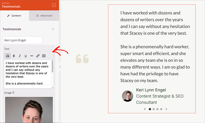
When adding social proof, always prioritize authenticity. Avoid using fake testimonials or exaggerating your achievements. Being genuine builds real trust with your audience.
I particularly like this example from OptinMonster. Each of the testimonials on their welcome page links to a more detailed case study:
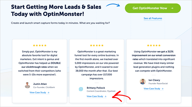
Ensure the social proof you choose is relevant to your target audience and the problems you solve. And remember, to display it prominently on your welcome page where visitors can see it.
How to Write Content for Your Welcome Page
You have the essential elements. Now it’s time to bring your welcome page to life with compelling copy. Remember, every word counts. Your content should grab attention, communicate your value proposition clearly, and gently guide visitors toward taking action.
Create the Right Tone and Voice
Imagine receiving two different greetings: one is a stiff, formal handshake, the other a warm, genuine smile. Which one makes you feel more welcome?
Your welcome page’s tone and voice matter as much as your words. They set the overall mood and can instantly connect visitors to your brand.
Write as if you’re talking to a friend. Use everyday language, contractions, and even a touch of humor if it suits your brand’s style.
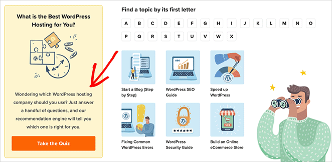
The key is to be approachable and welcoming. Avoid using jargon, technical terms, or overly complicated language that might alienate your audience.
Above all, let your brand’s personality shine through in your writing style. Are you fun and playful? Professional and authoritative? Your welcome page should reflect your brand’s true character.
Structure Your Content for Easy Reading
No one wants to land on a website and see a giant wall of text. It’s overwhelming and difficult to read! That’s why structuring your content for easy readability is so important.
Use clear headings and subheadings to organize your content and guide your readers through the information.
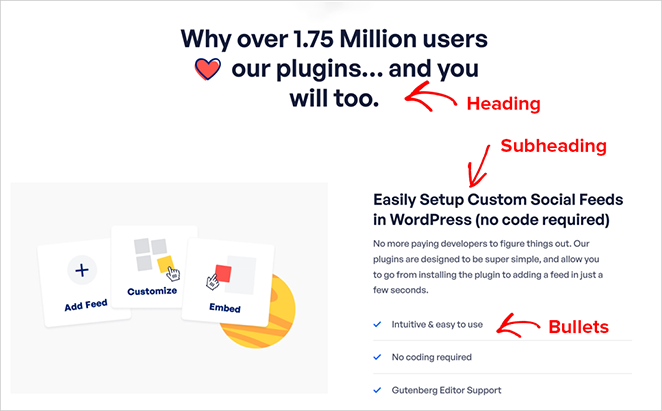
As John Mueller, a Google Search Advocate, puts it:
“When it comes to text on a page, a heading is a really strong signal telling us this part of the page is about this topic.”
Keep your paragraphs short. Aim for 2-3 sentences per paragraph for optimal readability.
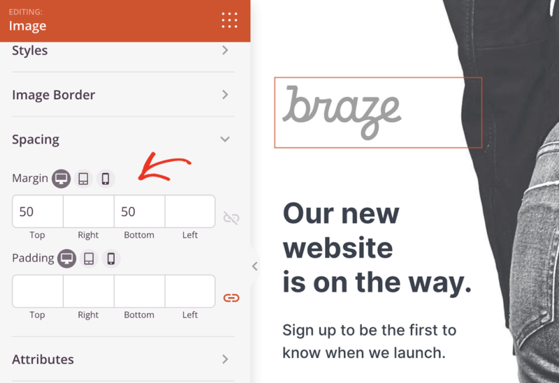
And don’t be afraid of whitespace. Adding margins and spacing between elements makes your content more visually appealing and less intimidating.
Optimize for Search Engines
You’ve created a fantastic welcome page, but don’t forget about search engines like Google. Optimizing your content for relevant keywords will help people find your website organically.
Don’t worry; it’s not as complicated as it sounds. Naturally, weave keywords related to your business and what you offer throughout your welcome page.
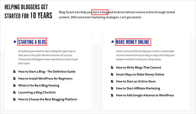
Think about what your ideal customer might type into Google to find you. Use those keywords (without overdoing it) in your headline, subheadings, and body text.
Similarly, add descriptive alt text to your images, including relevant keywords.
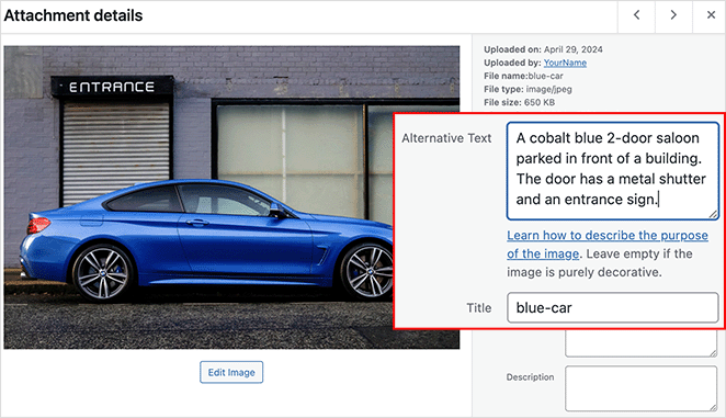
This helps search engines understand what your images are about, which can boost your search ranking.
For a more detailed explanation, see our in-depth WordPress search engine optimization guide.
Welcome Page Examples to Learn From
Feeling stuck? Sometimes, the best inspiration comes from seeing what others have done well. Let’s look at some inspiring welcome page examples that really hit the mark.
Prelaunch Welcome Page
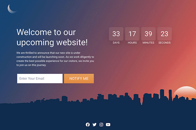
This prelaunch welcome page nails it! It combines a clear headline, countdown timer, and a compelling value proposition to generate excitement and capture leads before launch.
The prominent “Notify Me” CTA and the clean, modern design further contribute to the page’s effectiveness.
Maintenance Welcome Page
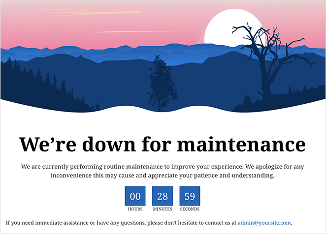
This maintenance welcome page does a great job of letting visitors know what’s happening and when they can expect the website to be back up. Instead of just a boring message, it reassures people that the site is down for improvements and will be back soon.
The countdown timer keeps things transparent, and the calming picture makes the wait more pleasant.
Login Welcome Page
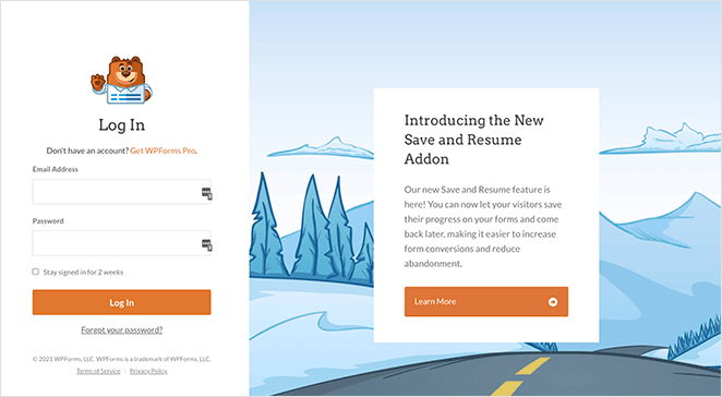
This login welcome page goes beyond a basic login form to create a more engaging experience. The friendly bear mascot adds a welcoming touch, while the clear headline and straightforward form make it easy for users to log in.
At the same time, the page promotes a new feature with a compelling headline, clear benefits, and a prominent “Learn More” button.
This example shows how a login page can effectively combine functionality with marketing to enhance the user experience and promote valuable features.
Podcast Welcome Page
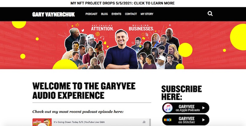
This podcast welcome page pulls you right in! Gary Vaynerchuk’s energetic image and “Subscribe Here” button make it super easy to become a listener. Showcasing a recent podcast episode directly on the page is a smart way to provide instant value and encourage engagement.
For more inspiration, see our roundup of website welcome message examples.
How to Test and Optimize Your Welcome Page
Creating your welcome page is a big step, but ensuring it performs at its best is important. Continually testing and optimizing your page can lead to even better results.
A/B Testing
A/B testing involves creating two slightly different versions of your welcome page (version A and version B) and showing them to separate groups of visitors. Then, you track key metrics to determine which version leads to more conversions, sign-ups, or whatever goal you’ve set.
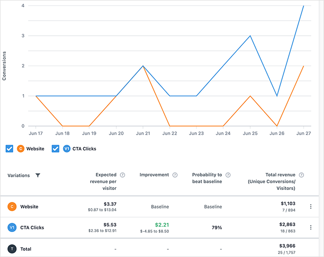
For example, you could A/B test:
- Headlines: “Get Your Free Consultation” vs. “Schedule Your Free Consultation Today!”
- Images: A product photo vs. a lifestyle shot
- CTAs: “Start Now” vs. “Get Started for Free”
To learn more, check out our guide on how to a/b test landing pages.
Metrics to Track
To make data-driven decisions, keep a close eye on key performance indicators (KPIs). Here are some essential metrics to track for your welcome page:
- Bounce Rate: The percentage of visitors who leave your site after viewing only one page (your welcome page, in this case). A high bounce rate could indicate that your page isn’t engaging enough or is not resonating with your target audience.
- Click-Through Rate (CTR): The percentage of visitors who click on your CTA. A low CTR might suggest that your CTA isn’t compelling enough or isn’t in the optimal place.
- Time on Page: How long visitors spend on your welcome page. A short time on the page might indicate that they’re not finding the information they need quickly enough.
- Conversion Rate: The percentage of visitors who complete a desired action (e.g., purchase, sign up for a newsletter, download an ebook).
Google Analytics is a powerful (and free) tool that provides a wealth of data about your website’s performance, such as your bounce rate, click-through rate, and conversion rate. It’s essential for tracking these metrics over time and identifying areas for improvement.
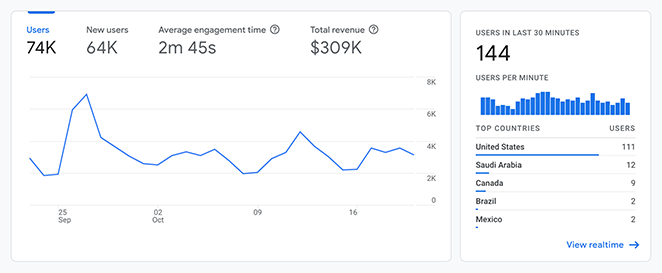
If you’re new to Google Analytics, our guide on how to add Google Analytics to WordPress will walk you through the process step by step.
And if you need a simple way to make sense of that data, give OnePageGA a go.
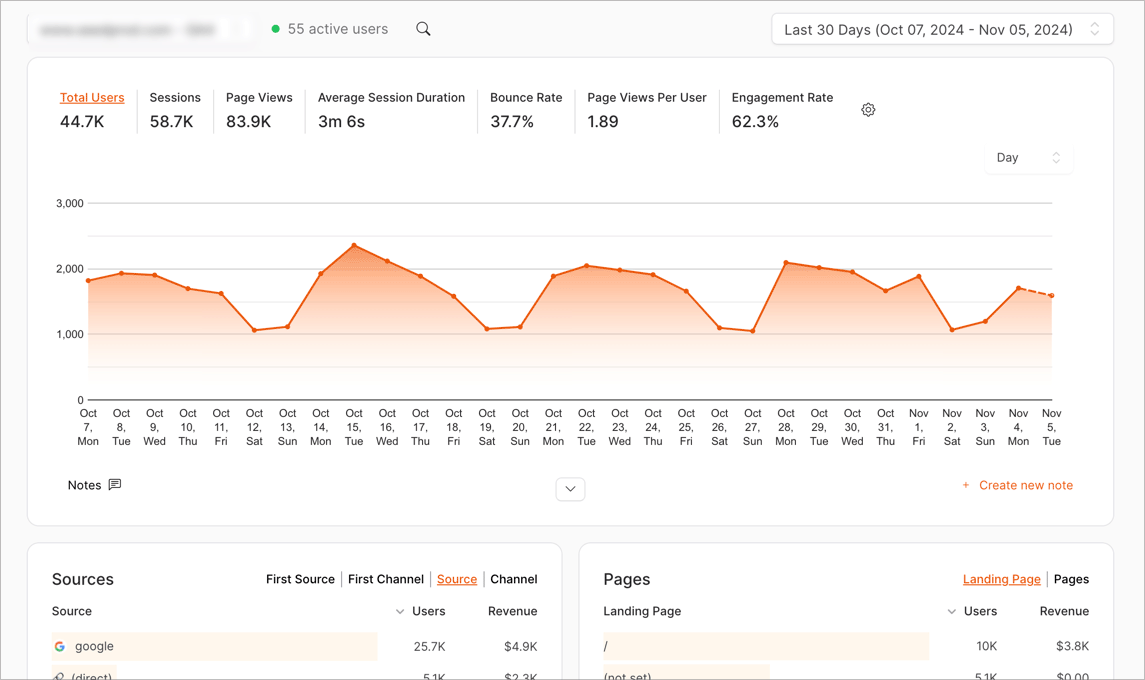
It’s a simple dashboard that displays only the key Google Analytics information you need to grow your business, all on a single page.
Write Your Welcome Page Next
Your welcome page is your audience’s first impression of you—make it count. By following my tips, you’ll learn how to write a welcome page for your website that captures attention, drives conversions, and helps you achieve your business goals.
Remember to:
- Target your ideal visitor
- Write an attention-grabbing headline
- Highlight what makes you unique
- Use engaging visuals
- Guide visitors with a clear CTA
- Continuously test and improve your page
Now it’s your turn. Put these tips into action and create a welcome page without writing code:
Thanks for reading! We’d love to hear your thoughts, so please feel free to leave a comment with any questions and feedback.
You can also follow us on YouTube, X (formerly Twitter), and Facebook for more helpful content to grow your business.

