Want to improve your landing page bounce rate?
If your landing page bounce rate is high, it’s harder to accomplish your business goals. This is because visitors simply bounce away before you’ve given them the chance to convert. Discovering why your bounce rate is high can also be a challenge. But whatever the reason, it’s easy to solve.
In this article, we’ll show you how to improve your landing page bounce rates to achieve the very best results.
How to Improve Landing Page Bounce Rate:
- 1. Check Google Analytics Is Set Up Correctly
- 2. Match Your Page to Your Message
- 3. Understand Your Landing Page Traffic
- 4. Make Your Landing Page Readable
- 5. Use Images to Direct The Eye
- 6. Engage Visitors with Video
- 7. Make Your Form Less Intrusive
- 8. And Don’t Ask for Too Many Details
- 9. Make It Easy to Get In Touch
- 10. Show Your Page Is Trustworthy
- 11. Ensure Your CTA Is Visible and Compelling
- 12. Remove Your Navigation Menu
- 13. Target Abandoning Users
- 14. Optimize Your Landing Page for Mobile Users
- 15. Improve Your Page Speed
What Is a Landing Page Bounce Rate?
A landing page bounce rate shows the percentage of people who visit a page but leave without clicking anything or visiting other pages on the site. A high bounce rate suggests that visitors aren’t finding what they expected.
Related: Landing Page vs Website: What’s The Difference?
What Is a Good Landing Page Bounce Rate?
A “good” bounce rate for a landing page is generally between 26% and 40%. This range means that most visitors find the page useful and may interact further. Bounce rates between 41% and 55% are typical and not necessarily a concern, while rates above 70% may indicate the page doesn’t fully meet visitor needs or expectations.
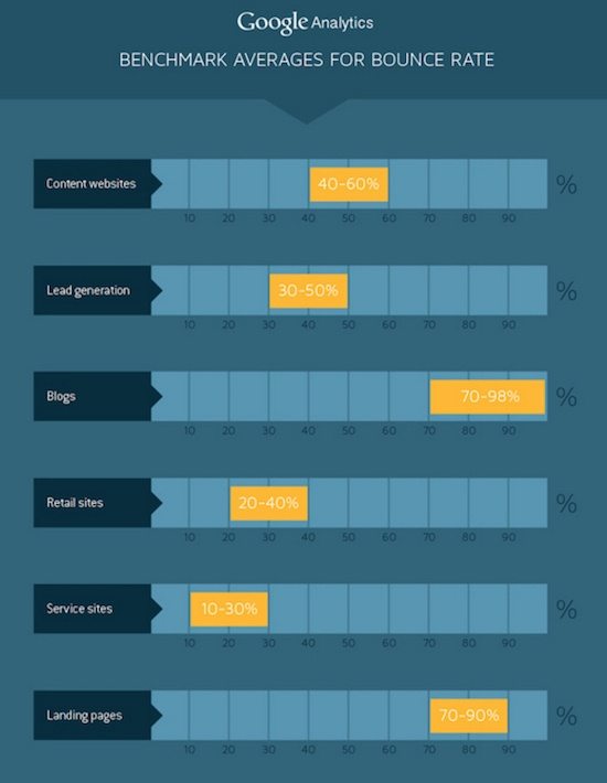
Landing Page Bounce Rate vs Other Bounce Rates
As we mentioned above, there are different bounce rate goals for different page types. But what’s the difference between landing page bounce rates and other bounce rates?
Let’s look at blog posts first.
Ideally, after visiting your blog post, users will navigate to another page on your website. And from there, they’ll enter your marketing funnel. So reducing your bounce rate in this scenario makes perfect sense.
Yet, with a landing page, lowering your bounce rate shouldn’t always be your primary goal. Remember, reducing bounce rates involves getting people to visit another page on your site.
For landing pages, the only page you want users to visit is your thank you page once they convert.
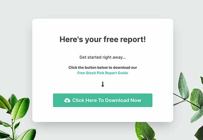
So while a 50% landing page bounce rate might, at first glance, look better than 70%, chances are people are exiting to your homepage through your logo link. In this case, your low bounce rate is detracting from your landing page conversion rate.
With this in mind, a low bounce rate is only desirable if your page is free from external links in your navigation, footer, and logo.
But why should you lower your bounce rate?
Why You Should Lower Your Bounce Rate
After taking the above information into account, you’re probably wondering why you should lower your landing page bounce rate.
If you have no outbound links and your bounce rates are still high, it means your page isn’t satisfying enough for people to convert.
As such, you should optimize your landing page to meet your target audience’s needs better and show the value of your product or service.
With improved bounce rates, more visitors will convert into leads and paying customers.
How to Improve Your Landing Page Bounce Rate
Now that you know why having a high bounce rate isn’t great, let’s look at all the ways you can improve your landing page bounce rate. Before you start, check out these landing page best practices for actionable tips.
1. Check Google Analytics Is Set Up Correctly
Before you do anything to your landing page, make sure Google Analytics is set up correctly. If it isn’t, it may not capture bounced visits on your page and could provide inaccurate results.
First, check if you’ve installed the Google Analytics tracking code properly. The easiest way to do this is to install MonsterInsights, the best Google Analytics plugin for WordPress.
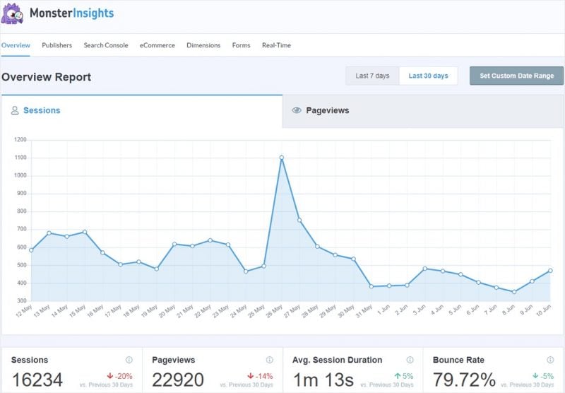
With MonsterInsights, you can set up Google Analytics in WordPress in just a few clicks without any code. You can then track your page performance with reports right inside your WordPress dashboard.
With accurate bounce rates, you can optimize your landing page to lower your bounce rate and achieve better conversions.
2. Match Your Page to Your Message
One reason why people could be bouncing from your landing page is that they feel misled. Perhaps your landing page copy doesn’t match the benefits you promise in your headline.
While a benefit-driven headline increases the odds that people will click through, it’s not enough on its own to convince them to keep reading.
Your landing page should meet your visitor’s expectations, and the best way to do that is to ensure your message matches your ads.
Take this example from Conqueror Virtual Challenges.
First is the Facebook ad:

Then the landing page:
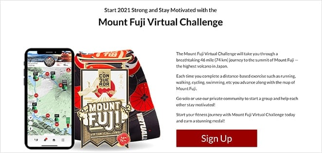
Notice how the landing page headline matches the ad? The images and colors also match and are carried on through the rest of the page.
This helps readers know where they are when they land on the page, reassuring them that they’ll get what they’re promised.
3. Understand Your Landing Page Traffic
One of the most significant contributors to your landing page bounce rate is your traffic. After all, it’s the individual that’s in control of whether they stay or leave.
Understanding who they are and where they’re coming from can have a massive impact on how they interact with your page. To make things easier, you can break your traffic down into 4 different types:
- Low-value referrers like content aggregators that click through from the bottom of an article.
- Links from other websites, which, when clicked, sends the user to your landing page.
- Search engine traffic where users search and click through to your page in the results.
- Loyal visitors who regularly visit your page through sources like email newsletters and social media.
To drive the best quality traffic, you should understand your different advertising channels and who uses them. That way, you can create detailed buyer personas to target the most relevant traffic for your landing page.
Otherwise, you risk attracting the wrong traffic who will have a high chance of bouncing.
4. Make Your Landing Page Readable
A common reason for people bouncing off your page could be that your copy is simply too hard to read. Nowadays, people consume content differently. They don’t read; they skim through the points that stand out.
If your page has large blocks of text and is hard for readers to skim over, they’ll lose focus and move on. This results in a bounced session and no conversion for your landing page.
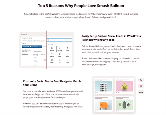
You can improve your bounce rate by organizing your copy in an easy-to-read format, including:
- Subheadings to separate sections of your copy
- Short, concise paragraphs that get straight to the point
- Bullet points to explain the benefits and steps quickly
- Examples to explain difficult concepts
- Images to break up your text further
It’s also a good idea to improve your copy’s readability level to ensure it’s easy to understand. Popular WordPress SEO plugins like All in One SEO include useful settings that help make your content more readable.

5. Use Images to Direct The Eye
Images are another effective way to improve your landing page bounce rates. Not only can high-quality images break up large chunks of text, but they can also help direct people’s attention to where you want them to focus.
In digital marketing, this is called explicit and implicit directional cues.
Explicit directional cues directly point out elements on your page using arrows, lines, pointing fingers, etc.
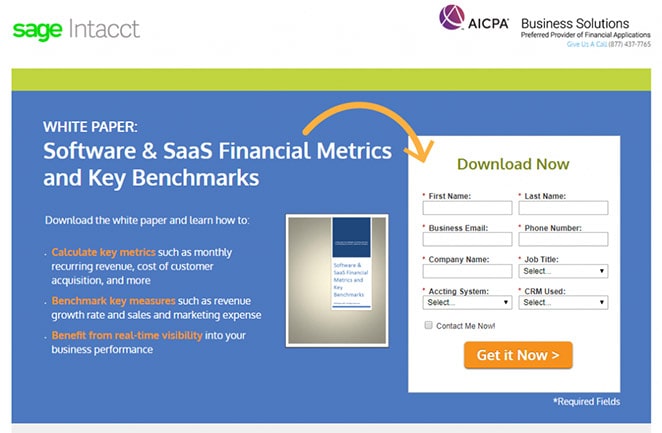
Implicit direction cues mostly go unnoticed by visitors and are a lot more subtle. For instance, it could be white space used to focus on a specific page element or contrasting colors to make it stand out.
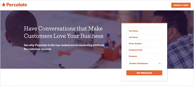
With this style of visual marketing, you can shift people’s attention and convince them to act.
6. Engage Visitors with Video
Videos are highly engaging and can grab attention more easily than images. They’re also an excellent way to break down complicated information in a way that’s easy for visitors to grasp.
For instance, you could create a demo video explaining how your software works. Or, you could record a personal message answering common questions.
We use video to show people all the benefits of using SeedProd to create high-converting landing pages.
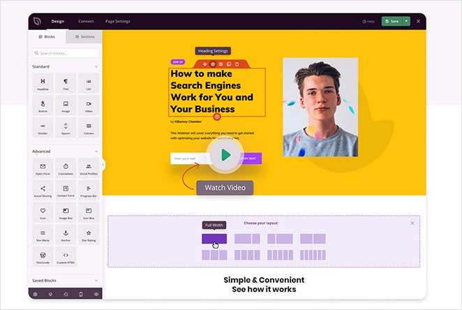
While it may seem simple, it’s effective in demonstrating the benefits of using the plugin and encouraging people to click and learn more.
7. Make Your Form Less Intrusive
Another reason for seeing higher bounce rates on landing pages could be that your sign-up form or contact form is simply too distracting.
Most people decide if they like a page or not within a few seconds, so if they’re bombarded with massive forms in that time, they won’t stick around.
Instead, think about where in the user’s journey through your page they’re most likely to convert. Then use a simple landing page form to capture them as leads.
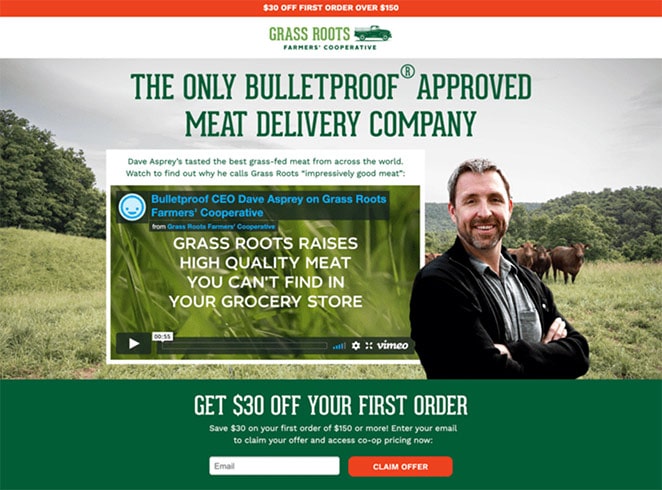
In this example, the form is visible after people have watched the video, which is the next logical step for them to convert.
8. And Don’t Ask for Too Many Details
Besides the placement of your landing page forms, you should also think about how much information you ask people to provide.
For instance, if users have never shopped with you before, they won’t trust you enough to hand over lots of personal details.
Instead, keep your forms short and only ask for the information you need, such as a name or email address. This can reduce the chances of people bouncing out of frustration.
9. Make It Easy to Get In Touch
At times all it takes is a little more information to turn landing page visitors into happy customers.
Imagine you found a page via search engines promising to solve your pet hair problems with a handy rubber-bristled broom. The only problem is you’re allergic to a specific type of rubber and want to make sure you won’t react.
If you can’t find the information you’re looking for, you’ll probably leave the page, resulting in a bounced session.
Yet, if you could ask about the broom’s rubber content, you could discover it’s the type of rubber that won’t affect you. In turn, you’ll buy the product – pet hair issues solved.
This is where having a live chat service can be incredibly useful. It allows users to connect directly with a member of your team and get the information they need to follow through with the purchase.
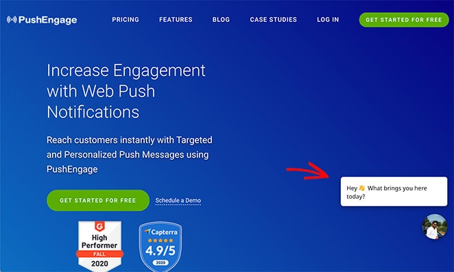
Check out our list of popular live chat plugins for WordPress to get started.
10. Show Your Page Is Trustworthy
We mentioned earlier that visitors don’t immediately trust a landing page at first glance. It takes time to build that trust and reassure them that what you’re offering is legit.
One way to speed up that process is to show that you’re trustworthy with trust badges and social proof.
Trust badges are icons and logos that give your page authority and tell people that their details are safe, including:
- SSL certificate badges
- Accepted payment trust badges
- Secure checkout badges
- Money-back guarantees
- Third-party endorsements
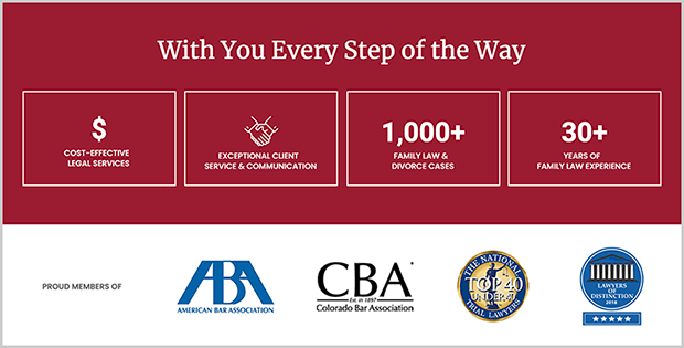
Social proof is visual proof that real people love and use your product. This could be anything from customer reviews and testimonials to recent sales notifications.
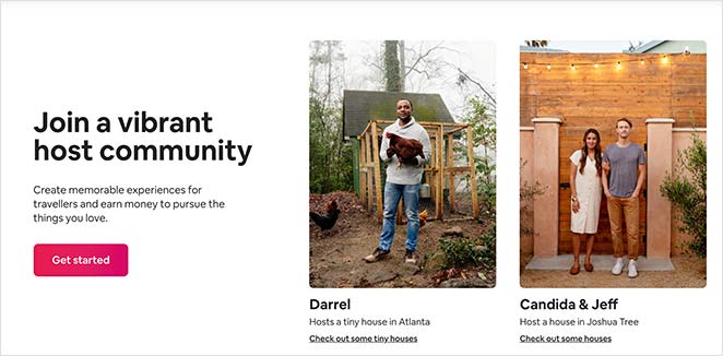
Trust indicators like this improve your credibility, making people less likely to bounce and more likely to take action.
11. Ensure Your CTA Is Visible and Compelling
Your landing page call to action (CTA) is the most important element on your page. It’s via your CTA that visitors will become leads and customers. Yet, if your CTA is hard to find or blends in too much, people won’t click it, resulting in lost leads and another page bounce.
When optimizing your CTA button, make sure it stands out and is in a place that attracts the most attention.
Take this example from Time Doctor.
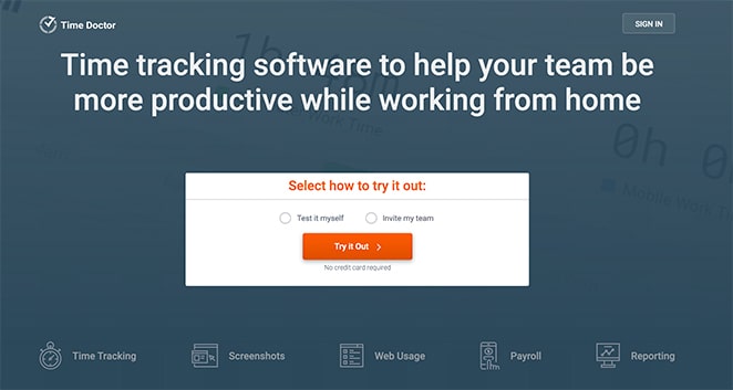
Upon entering the page, the heading perfectly describes what the product is for. This leads to a CTA inviting users to try it out for free.
Because everything is explained at-a-glance, it’s more likely people will give the product a try rather than exiting the page.
12. Remove Your Navigation Menu
Another great thing about the example above is there is no navigation menu. The users’ only option is to either sign in or try the software, giving them no logical page exit.
Earlier in this article, we mentioned that having internal links on your page is a poor design decision. This is because they focus people’s attention away from the goal you are trying to accomplish.
To avoid this, get rid of your site search, navigation bar, footer links, and other unnecessary elements. All they do is keep visitors’ attention away from where you want it: your message and CTA.
13. Target Abandoning Users
Another easy way to combat landing page exit rates is to target people when they’re about to leave. One way you can do this is to use an exit popup like those offered by OptinMonster.
With OptinMonster’s Exit-Intent® technology, you can learn when users are about to leave your landing page. Then you can show them a targeted message at that precise moment. This is a super-effective technique with a high success rate.
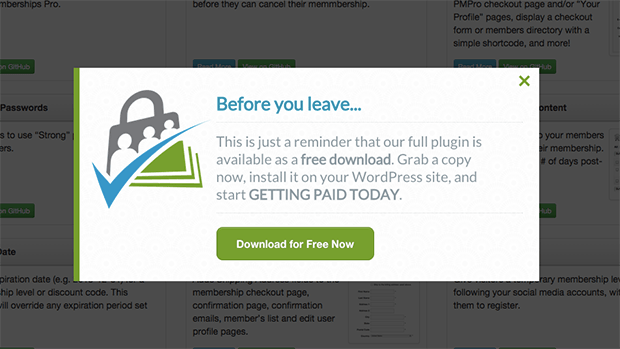
With an exit popup, you can ask users for their email address to keep in touch. Then you can send them special offers and eventually convert them into paying customers.
You can also show a last-minute discount with your exit-intent popup. Remember, if a user doesn’t wish to accept the offer, they can just close the window and never return.
If you combine an exit offer with a subscription form, it gives your visitors the chance to stay in touch.
Check out our OptinMonster review to learn more.
14. Optimize Your Landing Page for Mobile Users
It goes without saying that if your landing page isn’t easy to browse from mobile devices, you’re missing out on a vast demographic of users.
If your website analytics shows that your mobile landing page has a high bounce rate, it’s a clear red flag that your page isn’t mobile-friendly.
Luckily as a WordPress user, it’s easy to create mobile landing pages with SeedProd’s WordPress landing page builder. Every landing page template adapts perfectly to mobile devices, making it easy for mobile users to convert.
You can also use the live mobile preview option to ensure all your page elements are just as easy to navigate before publishing.
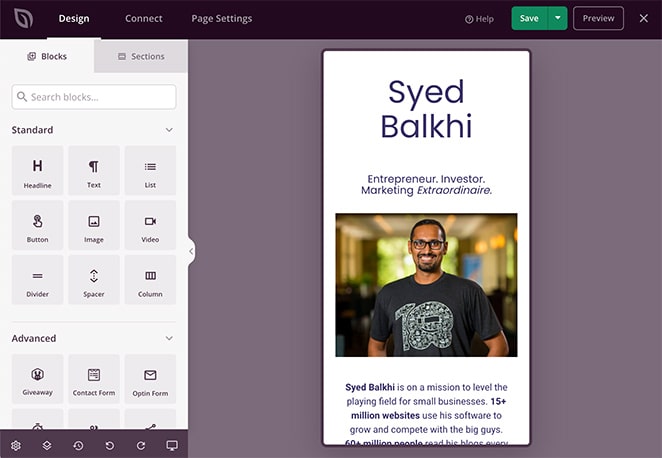
Plus, SeedProd works independently from your existing WordPress theme. This means there won’t be any design or styling conflicts.
15. Improve Your Page Speed
As we mentioned earlier, people make up their minds about a website in just a few seconds. The last thing you want is to waste that precious time by showing them a blank page that’s busy loading scripts and downloading heavy images.
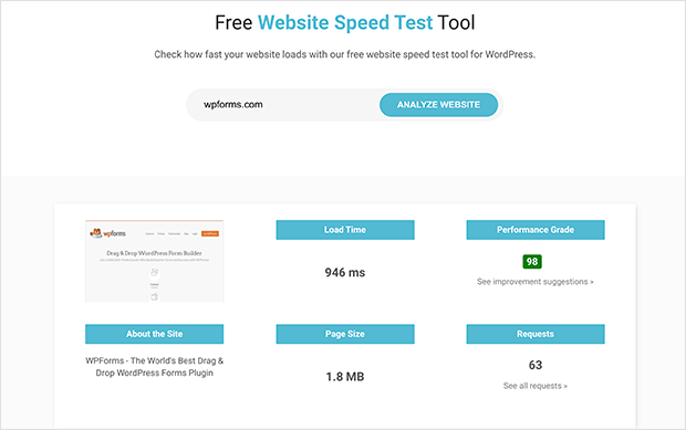
Instead, use a page speed service like IsItWP’s free website speed test tool to determine what’s contributing to slow loading speeds. You can then use its suggestions to make improvements to keep your landing page as fast as possible.
To speed up your landing page, you should:
- Reduce page elements: According to Google research, many pages are larger than 1MB, with 36% bigger than 2MB and 12% over 4MB. If you’re loading a page of 1.49MB over a fast 3G connection, it can take as long as 7 seconds. This is down to too many page elements, such as images, headlines, buttons, and other components. Consequently, visitors tend to bounce off before they can view the entire landing page.
- Optimize your images: Logos, product images, and favicons can add up to ⅔ of a page’s size. Researchers found that, compared to pages that couldn’t convert visitors, pages that could have 38% fewer images. However, if you need to include them all, consider optimizing your images with an image compressor to reduce their size.
- Minimize JavaScript: JS can slow down how quickly landing pages display to visitors by halting the parsing of HTML code. Fortunately, there are tools such as AMP and AMP for ads that provide developers with a structure to create pages without JavaScript, allowing them to load quickly.
- Use a Content Delivery Network (CDN): CDNs can improve landing page speeds by distributing your content across multiple servers in various locations around the world. When a user visits your page, the CDN will identify the user’s location and serve the content from the server that is closest, reducing the time it takes for the content to be delivered to their device.
- Add better caching: Caching can improve landing page speeds by storing frequently accessed data or content on the user’s device or on a server close to them. When a user revisits a website or accesses a different page on the same website, the cached content can load quickly without the need to make a new request to the server, reducing the load time and improving the overall speed of the landing page.
And maybe even consider switching to a faster WordPress hosting provider.
There you have it!
We hope this article has helped you learn how to improve your landing page bounce rate. Almost all the tips above are easy to put in place, so you should see better results for your business in no time.
If you’re unsure which landing page builder is the best choice for you, check out our comparison of Divi vs Beaver Builder vs SeedProd.
And if this article helped, then please follow us on Twitter and Facebook for more useful content to help grow your business.

