Do you want to learn how to edit a mobile menu in WordPress?
Mobile menus are navigation links that make it easier for mobile users to browse and interact with your website. If you’re using WordPress, editing your mobile menu is relatively easy and can greatly improve user experience, website load times, and mobile navigation.
In this article, we’ll walk you through how to edit your mobile menu in WordPress so that you can create a user-friendly experience for mobile visitors.
Why Edit Your Mobile Menu in WordPress?
Editing and customizing your WordPress mobile menu is important for the following reasons:
- Improved user experience: Mobile users have different needs and habits than desktop users. By customizing your mobile menu, you can create a user-friendly experience that fits their unique needs.
- Faster website load times: A menu optimized for mobile devices can help reduce page load times, which is important for users with slower internet connections.
- Better navigation: A well-designed mobile menu can make it easier for users to find what they need on your website, leading to better engagement and conversion rates.
- Mobile-first indexing: Google uses a mobile-first indexing system, which means that websites are ranked based on their mobile version. A well-designed mobile menu can help improve your website’s ranking on search engines.
Overall, editing your WordPress mobile menu is essential in optimizing it for mobile visitors, improving user experience, and increasing engagement, conversion rates, and SEO.
How to Edit Mobile Menu in WordPress
In this guide, we’ll share 2 different ways to edit a mobile menu on your WordPress website.
The first method lets you customize your menus completely and show or hide certain elements on desktop or mobile screens. However, the alternative method is a free solution with fewer customization options.
Click any of the links below to choose the method you want to use:
Let’s get started!
Customize Mobile Menus with SeedProd Page Builder
To kick things off, we’ll use a page builder plugin to customize and edit mobile menus visually, without code. For this, we’ll use SeedProd, the best WordPress website and landing page builder.

It comes with hundreds of pre-made templates, a drag-and-drop interface, and countless design elements to make customizing any WordPress page effortless. Whether your menu is in your header, footer, or WordPress sidebar, you can edit it easily with SeedProd’s builder.
Moreover, this plugin’s powerful visibility options allow you to hide specific design elements on mobile or desktop screens. As a result, you can tailor your navigation menus to different screen sizes.
Step 1. Install and Activate SeedProd
To get started, you’ll need to download the plugin from SeedProd’s website. Even though SeedProd has a free version, we’ll use SeedProd Pro for its WordPress theme-building features.
If you need help, you can see this guide on installing a WordPress plugin.
After activation, head over to SeedProd » Settings, where you can enter your plugin license key. You’ll find this information in the Downloads section in your SeedProd account dashboard.
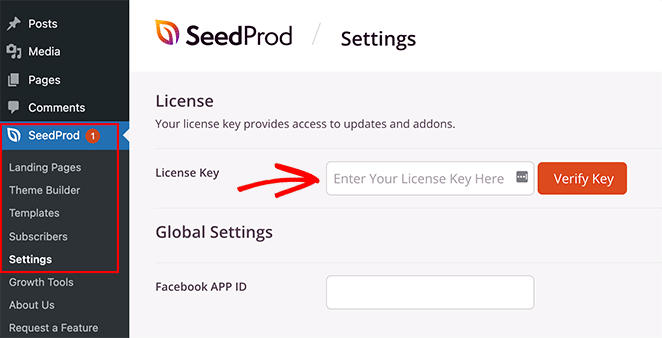
Paste your key into the blank field and click the Verify Key button to store your license.
Step 2. Choose a Premade Template
Next, you’ll need to choose a pre-made design to use as a starting point. You can either build a whole new WordPress theme from scratch with the Theme Builder or create individual pages with the landing page builder.
For this guide, we’ll use the Theme Builder, but if you prefer to make a landing page, you can follow this guide on how to create a landing page in WordPress.
To choose a pre-made design for your WordPress theme, navigate to SeedProd » Theme Builder from your WordPress dashboard and click the Theme Template Kits button.
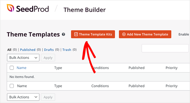
This will open SeedProd’s library of premade website templates you can install with 1 click.
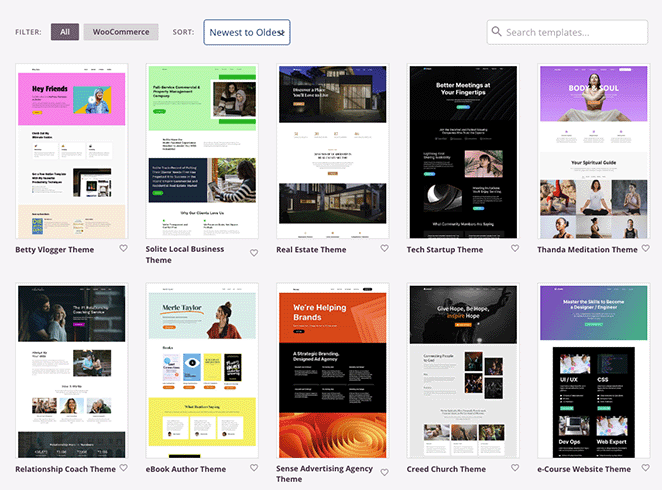
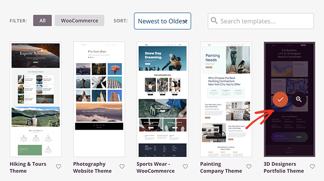
Simply scroll through the designs until you find a template you like, then click the checkmark icon to import it.
Once you import your website kit, you’ll see all the template parts of your theme in a list like this:
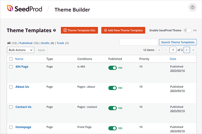
These are the individual templates that make up your complete theme, and you can customize each of them with SeedProd’s drag-and-drop page builder.
We’ll show you how to do that next! It’s super-easy and won’t require writing any HTML, Jquery, or custom CSS code.
Step 3. Customize the Header Template
Since the WordPress menu we want to edit is in the header, scroll through your template parts until you find the header template. Then, hover over it and click the ‘Edit Design’ link.
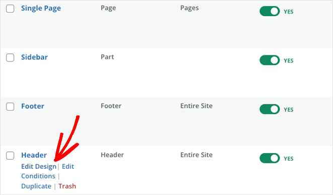
When it opens, you’ll see a layout with a live preview of your header on the right and WordPress blocks on the left. You can drag any block over to the preview to add new elements to your page easily.
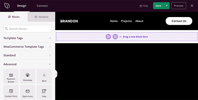
Clicking elements in your header lets you see their settings in the left-hand sidebar. For example, selecting the logo will open options to change the logo image and its size, alignment, and link.
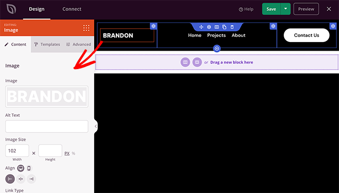
Similarly, clicking the Nav Menu block will show different menu settings.
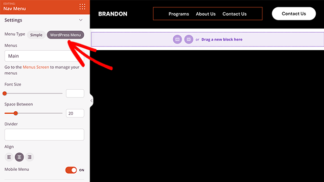
For instance, the block lets you choose between a ‘Simple’ or ‘WordPress Menu.’
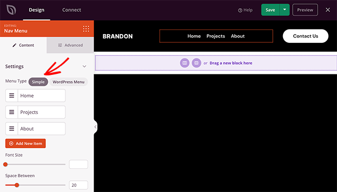
The Simple option lets you add new menu items inside the page builder interface. You can add links to any page, post, category, tag, or external web page.
Because this is a simple approach to menu building, you can’t add dropdown menus, choose custom menus you’ve already made, or assign a custom mobile menu.
However, you can customize the menu alignment, font size, spacing, and divider. Plus, in the Advanced tab, you can choose between horizontal and vertical menus and customize the typography, background colors, borders, CSS classes, and more.
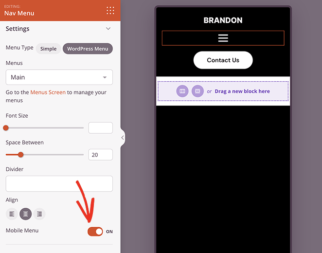
The WordPress Menu option has a different approach. You can choose existing menu locations from the dropdown and activate the mobile navigation menu toggle for small screen sizes.
When you activate this setting and switch to the mobile view, you’ll see that your mobile menu has a hamburger icon instead of standard menu links, which is much better for the mobile user experience.
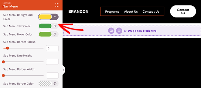
It also has a link to the default WordPress menu page to edit your menu layout. Like the Simple menu, the Advanced tab has customization and animation options, and unlike the simple menu, you can customize your sub-menu styling options.
Step 4. Edit Your Header Visibility Settings
So far, you know how to edit your main menu and activate a hamburger menu for mobile screens. But what if there are elements in your header that you don’t want to display on smaller screens?
The good news is you can edit the visibility settings for every page element and choose what displays on different screen sizes.
Let’s say you want to hide your header’s call to action (CTA) on mobile devices because it hurts the user experience. In that case, you can go to that block’s Advanced settings tab and turn on the ‘Hide on Mobile’ toggle in the Device Visibility menu.
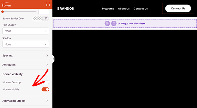
When you preview your header in mobile view, you’ll see it’s grayed out, which means the button won’t be visible to mobile visitors.
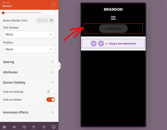
Continue customizing your mobile menu options until you’re happy with how everything looks. Then, go ahead and click the Save button to save your changes.
Step 5. Continue Customizing Your WordPress Theme
After editing your menu, you can customize the rest of your WordPress site using SeedProd’s page builder. For example, you can edit your WordPress homepage, create a custom WordPress sidebar, and customize your blog page template.
You can even edit your WordPress footer and add a vertical menu widget like this:
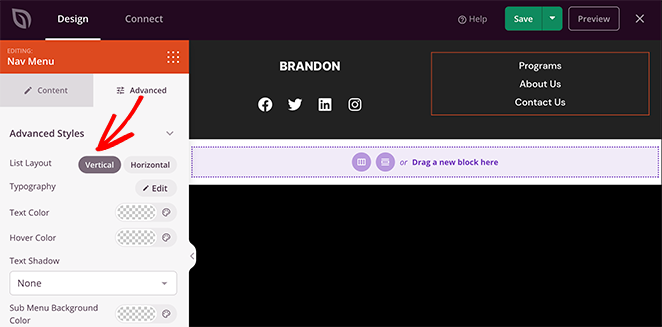
If you have an eCommerce website, you can also customize your product pages with SeedProd’s WooCommerce blocks.
Step 6. Publish Your Changes
When you’re ready to make your changes live on your WordPress site, head back to the SeedProd theme builder dashboard and look for the toggle called ‘Enable SeedProd Theme.’ Simply switch this toggle to the ‘Yes’ position to activate your SeedProd theme.
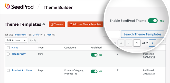
Now you can visit your website and see your mobile menu in action.

Alternative: Edit Mobile Menus with a Free WordPress Plugin
Another way to edit your mobile menus is by using a WordPress menu plugin. For example, with the plugin we’ll use next, you can make a hamburger menu that slides out on mobile screens.
First, you’ll need to download, install, and activate the Responsive Menu WordPress plugin.
Once the plugin is activated, you’ll see a new label called ‘Responsive Menu’ in your WordPress admin bar. Clicking it will take you to the menu screen to add a new responsive menu.
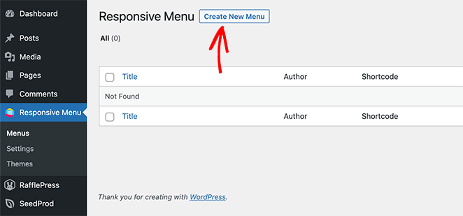
So go ahead and click the Create New Menu button. You’ll see a popup with different menu themes to choose from, including default, Electric Blue, Full-Width, and more.
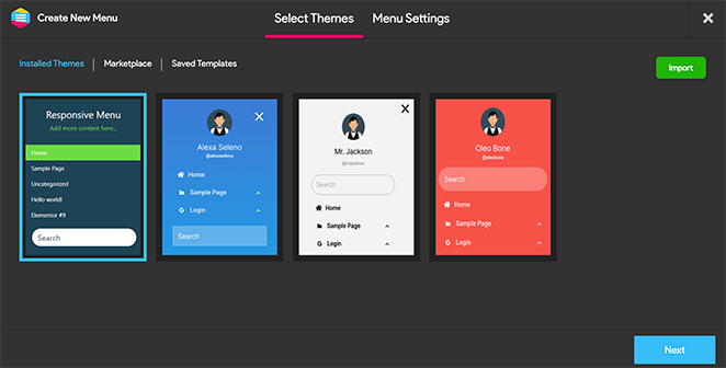
Choose a theme you like, then click the Next button.
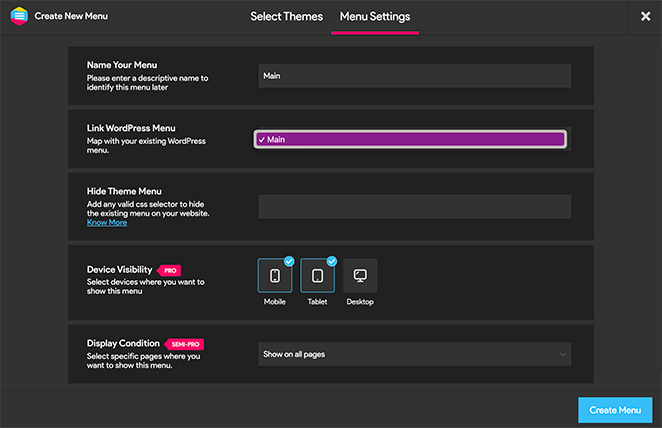
You can now enter a name for your menu, choose an existing WordPress menu to display, and click the Create Menu button.
Now, you’ll see a visual interface where you can edit your responsive menu options. You can show and hide different elements and change the mobile responsive minimum screen width and max width.
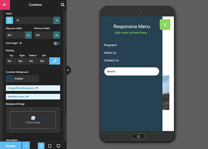
The responsive menu plugin has many other mobile menu options to change the behavior and appearance of your menu. You can explore them on this page and adjust them as needed.
Don’t forget to click the ‘Update’ button to store your settings
From there, you can visit your website to see the responsive menu in action.

That’s it!
We hope this guide has helped you learn how to edit mobile menus in WordPress. Here are a few other tutorials you may also find helpful, including the following:
- How to Add a Custom Alert Message to WordPress
- Best WordPress Plugins: Top 25 Must-Have Tools
- How to Create an Author Site in WordPress Without Coding
Thanks for reading! We’d love to hear your thoughts, so please feel free to leave a comment with any questions and feedback.
You can also follow us on YouTube, X (formerly Twitter), and Facebook for more helpful content to grow your business.

