Black Friday. It’s the biggest shopping day of the year, and for businesses, it’s a huge chance to boost sales.
Think about it: $280 billion in online sales and another $710 billion in stores – that’s what Statista predicts for the holiday season in the US alone.
But there’s a catch. Just having a Black Friday sale isn’t enough. To really cash in, you need a way to grab shoppers’ attention, get them interested in what you’re selling, and turn them into paying customers.
And that’s exactly what a great Black Friday landing page can do for you. In this guide, you’ll learn how to create a black friday landing page design that actually drives sales.
How to Create a Black Friday Landing Page:
Why Your Black Friday Landing Page Matters
Black Friday landing pages help you boost sales and gather leads like email addresses for future campaigns. They can also improve your position in search engine rankings, making your brand look even better.
The numbers speak for themselves. The average conversion rate for online stores during Black Friday is 4.3%. This is higher than the annual average of 2.5%.
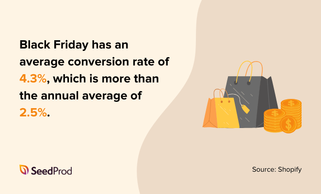
It means more shoppers are likely to become paying customers on a well-designed landing page.
Here are some more reasons why Black Friday landing pages are important:
- Landing pages load quickly and help shoppers find what they’re looking for without complicated menus or distractions.
- By including the right keywords on your landing page, you can ensure that it appears higher in search results.
- A well-designed landing page can encourage visitors to click on products, which can lead to a higher click-through rate.
- Your landing page is often the first interaction a customer has with your brand, so it’s important to make a good impression.
- Landing pages are a chance to showcase deals and present them clearly and attractively
- A dedicated landing page can be a focus for your marketing strategy and allow visitors to learn about offers before buying.
- Above all, your landing page should focus on one goal, such as launching a new product or announcing sales.
Things to Include on Your Black Friday Landing Page Design
A successful Black Friday landing page needs more than a basic design. It should grab attention, build interest, and ultimately drive conversions.
Here’s what to include.
An Irresistible Offer
It goes without saying, but you can’t have a Black Friday landing page without a great deal. This is the heart of your page – the reason shoppers are here in the first place. So, make it good.
The first thing people see on your landing page is the headline. It needs to be clear, short, and make them want to keep reading.
Use words that create excitement, tell them exactly what the deal is, and make sure it’s something your target audience will be interested in.

Here are some examples for inspiration:
- Black Friday Blowout: 50% Off Sitewide!
- Your Dream [Product] Awaits: Up to 70% Off This Black Friday!
- Don’t Miss Out! Black Friday Deals You Won’t Find Anywhere Else.
For even more inspiration, check out my landing page headline formulas.
Persuasive Copywriting
The words you use on your landing page are super important. You want to write in a way that makes people feel like they need to buy your products. Keep it simple and clear.
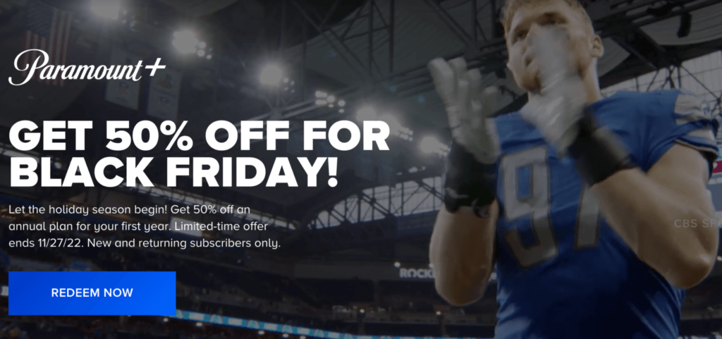
When I’m writing copy for landing pages, I always focus on these things:
- Tell Them What They Get: Don’t just tell shoppers about your product’s features, tell them how those features will benefit them. Will it make their lives easier? More fun? Explain it clearly.
- Shout About the Discount: Make sure your discount is super obvious. Use big, bold text so people don’t miss it. It’s also a good idea to show the original price crossed out next to the sale price.
- Create a Little Pressure: People get more excited about deals when they think they might miss out. Use phrases like “Don’t miss out,” “Only a few left,” or “Sale ends soon” to create a sense of urgency.
Unmissable CTA Buttons
Your call to action (CTA) button tells shoppers what to do next. You want them to click it so they can buy your product, so make sure it’s impossible to miss.
Use a color that really stands out from the rest of your page, and make sure the button is big enough to see without squinting.
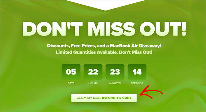
When it comes to the words on the button, be clear and direct.
Tell people exactly what will happen when they click. Instead of a boring word like “Submit,” try something more exciting like “Shop Now,” “Get My Discount,” or “Claim Your Deal.”
And don’t make people hunt for your button. Put it near the top of the page so they see it right away.
You can even add a few more CTA buttons throughout the page just to be safe.
Engaging Visual Content
A picture is worth a thousand words, right? That’s definitely true for your Black Friday landing page.
Use high-quality images and videos to make your products look amazing. Would you want to buy something from a page with blurry or boring pictures? Probably not.
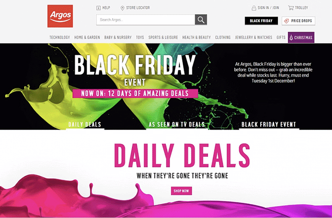
Keep your design simple and appealing so people enjoy looking at it. A cluttered page will just make them click away.
Trust Boosting Social Proof
You’re more likely to buy something if you see other people have bought it and loved it. It’s like getting a recommendation from a friend. And these days, people trust online reviews almost as much as they trust their friends – a whopping 88% of shoppers, to be exact.
So, sprinkle in some glowing testimonials from happy customers, positive reviews, and official-looking trust badges. It shows shoppers your brand is legit, and they can buy from you with confidence.
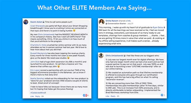
And if you need help, here’s my guide on how to add testimonials to WordPress.
Urgency and Scarcity Signals
Want to give shoppers a nudge to buy now? Remind them that your Black Friday deals won’t last forever.
In fact, businesses that use this “hurry up” tactic can often keep their customers coming back for more at 2x the rate.
Try adding a countdown timer to your landing page so people know exactly how much time is left to snag the deal. And if some products are running low in stock, don’t be afraid to let shoppers know.
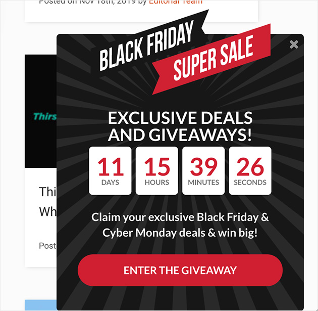
A little bit of scarcity can go a long way in convincing people to buy.
How to Create a Black Friday Landing Page in WordPress
There are a few different ways to create a landing page in WordPress. You could use the regular WordPress editor, but to be honest, it doesn’t have that many customization options.
In my experience, the easiest way to create a custom landing page is to use a drag-and-drop page builder plugin.
One of my favorites is SeedProd, which has over 1 million users.
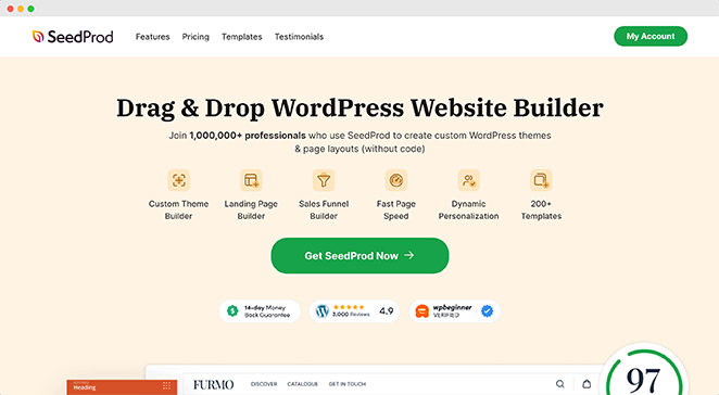
It comes with ready-made landing page templates, and customizing them is as easy as pointing and clicking. Plus, you don’t need to mess around with any code.
Follow me as I show you how to create a Black Friday landing page using SeedProd.
Step 1. Install & Activate SeedProd
First, install and activate SeedProd on your WordPress website. SeedProd has a free version, but I’m using SeedProd Pro for this guide, which includes Pro templates.
If you need help, you can see our guide on how to install SeedProd.
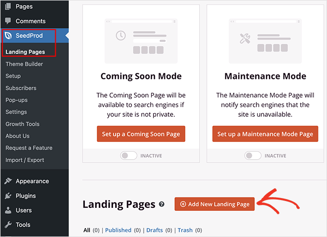
After installing the plugin, go to SeedProd » Landing Pages from your WordPress dashboard. Then, click the “Add New Landing Page” button.
Step 2. Choose a Black Friday Landing Page Template
Now, it’s time to pick out a design. SeedProd has many pre-made templates. There are even a few just for Black Friday.
To find them, click through the filters at the top. Then pick the one that best fits your brand and what you’re selling.
For example, if you click the “Sales” filter and scroll down, you’ll see a Black Friday sales page template.
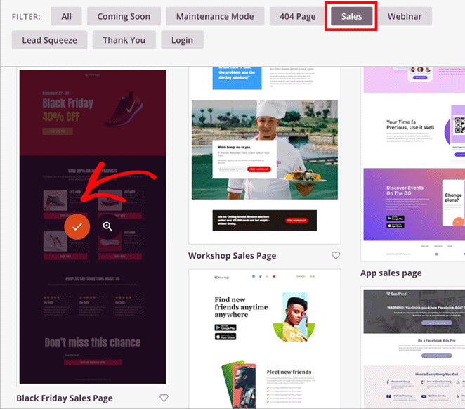
I’ll choose this one for my page. To do this, hover your mouse over it and click the orange checkmark icon.
Now, you can enter your page name. SeedProd will also create a URL for the page automatically.
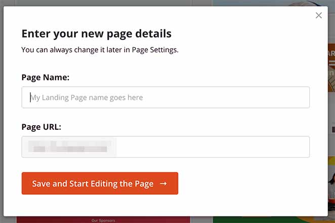
I recommend using a descriptive name and URL so search engines understand your page better. This will help the right people find your page during the Black Friday period. You can change this now or later via the settings page.
Now, go ahead and click the “Save and Start Editing the Page” button to continue.
Step 3. Add Your Black Friday Content
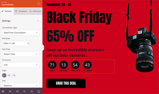
Now it’s time to bring your Black Friday landing page to life. SeedProd makes this super easy with its drag-and-drop page builder. You’ll see your chosen template, and you can start customizing everything right away.
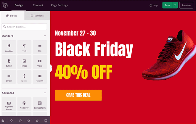
The template is made up of different “blocks.” They’re like building blocks for your page. You can change the text in any block, swap out images, add your logo, and even add countdown timers and customer testimonials.
Just click on a block, and you’ll see all the ways you can customize it in the left-hand menu.
For example, click an image to swap it with one that highlights your Black Friday offer.
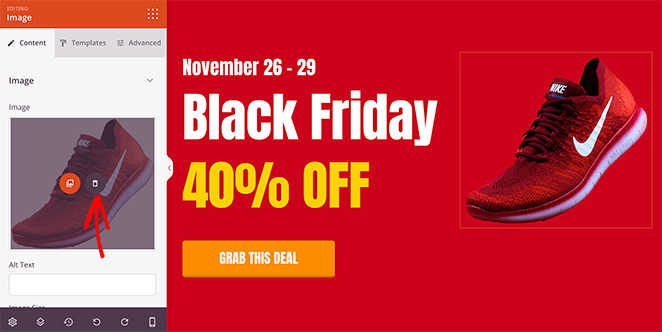
Remember the things we talked about earlier?
- A catchy headline
- Clear product descriptions
- Eye-catching pictures
- A button that tells people exactly what to do next.
Add these to your page so shoppers get excited about your Black Friday deals.
Step 4. Customize Your Black Friday Landing Page Design
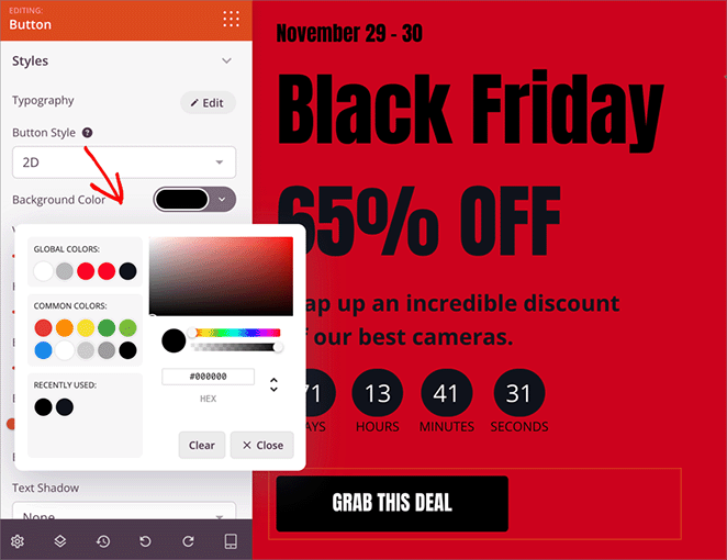
Okay, your landing page has all the right info – now let’s make it look amazing. SeedProd gives you tons of ways to customize the design and make it match your brand perfectly.
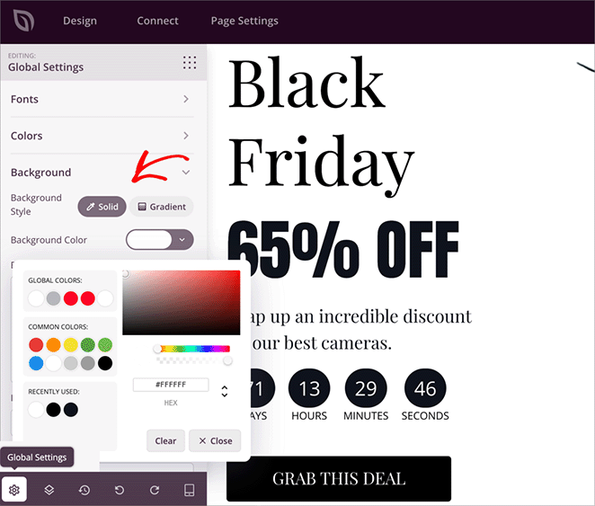
Each block has several settings you can play with. For example, you can easily change the color scheme to match your brand. Just click on the block, find the color settings, and pick your perfect shade.
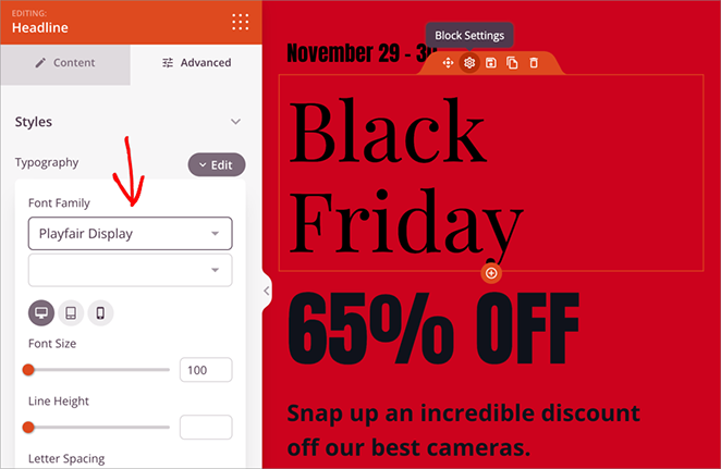
You can do the same with fonts. Choose a text block, find the font settings, which are typically in the “Advanced” tab, and start experimenting.
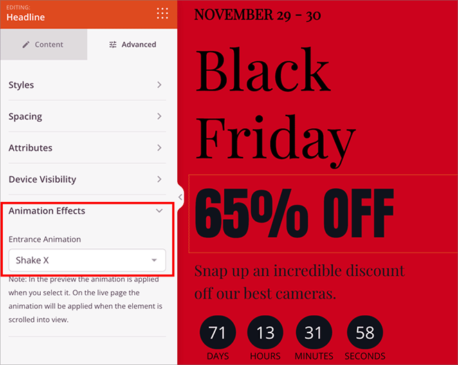
And it’s not just colors and fonts. You can adjust the spacing between elements, add animations, and even put in shape dividers to break up your content.
Here’s a pro tip: instead of changing each block individually, check out the “Global Settings”. Here, you can set things like your brand colors and font styles once and apply them everywhere, saving you tons of time.
Step 5. Connect Your Email Marketing Service
Black Friday is a prime time to grow your email list, so if you’ve used the opt-in form block on your landing page, you’ll want to connect it to your email marketing service. That way, every time someone signs up for your deals, they’ll be automatically added to your email list.
It’s super simple to do this with SeedProd. Just click on the “Connect” tab at the top of the page builder, and you’ll see a list of popular email marketing providers.
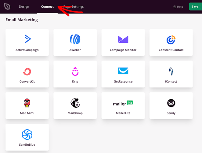
Just find yours, follow the instructions, and you’ll be all set. Instructions for setting up each provider are in our email marketing documentation.
Step 6. Test and Publish Your Black Friday Landing Page
Your landing page is this close to being ready. But before you hit publish, let’s do a quick check to make sure everything looks perfect on all devices. You want shoppers to have a great experience, whether they’re on their laptop, tablet, or phone.
Thankfully, you can preview your landing page on different screen sizes. Just click on the little phone icon at the bottom of the page to see how it looks on desktop, mobile, or tablet devices.
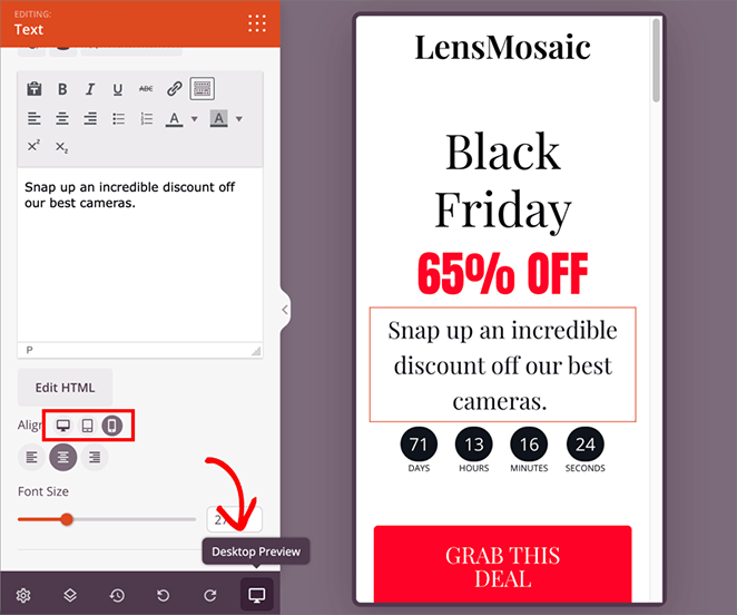
If anything seems off (like text that’s too small or images that are cut off), don’t worry. Just go back and adjust the design until it looks good everywhere.
Once you’re happy with your masterpiece, it’s time to share it. Just click the green “Save” button at the top of the page, choose “Publish,” and you’re all set.

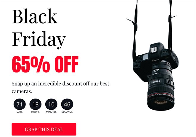
Your Black Friday landing page is now ready to start bringing in those sales. Here’s a final look at the page I created during this tutorial:
Black Friday Landing Page Examples I Love
Need some inspiration for your own Black Friday landing page? Check out some of my favorite Black Friday landing page examples.
OptinMonster
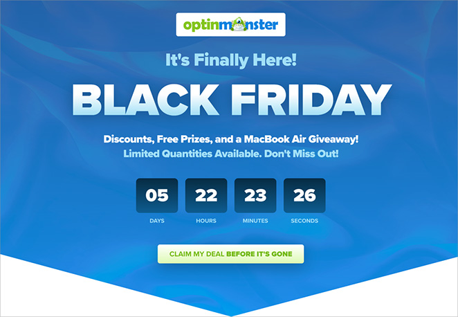
Why I love it: OptinMonster doesn’t mess around – they hit you with a huge 60% discount right away! The countdown timer creates that “don’t miss out” feeling, and they explain exactly why you need their product in a few short words.
Smash Balloon
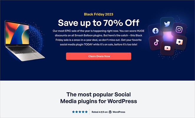
Why I love it: Smash Balloon’s landing page just feels happy and festive! They offer a solid 30% discount and even highlight that over 100,000 people already use their products (that’s social proof in action!). They also do a great job of explaining why their plugin bundle is the perfect Black Friday deal.
WPForms
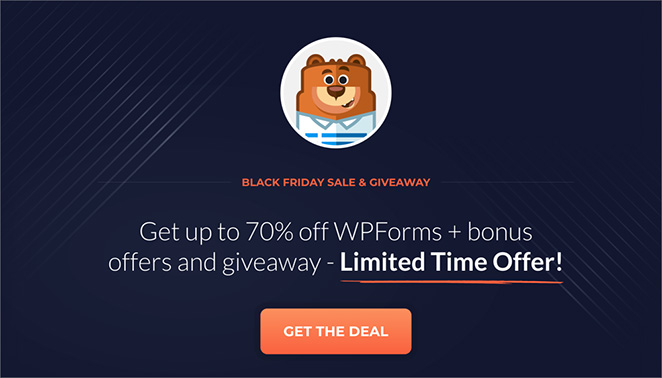
Why I love it: WPForms uses a really eye-catching image and a bold headline to tell you about their biggest sale ever. They make it crystal clear what you get and how much it costs, and that big “Get WPForms” button is hard to miss!
Create Your Black Friday Landing Page
You’re now a Black Friday landing page expert.
Remember, the goal is to:
- Grab those eyeballs: Hook shoppers with a catchy headline and a deal they can’t refuse.
- Get them interested: Use persuasive writing and cool visuals to keep them reading.
- Build trust: Show off those happy customer testimonials.
- Light a fire: Add a countdown timer to create that “gotta-have-it-now” feeling.
Ready to turn Black Friday shoppers into paying customers? Build a high-converting landing page today with SeedProd.
Here are even more tips and tricks to make your landing page a huge success:
- Anatomy of a Landing Page: 9 Essential Elements
- A/B Testing for Landing Pages in WordPress
- Landing Page URL Examples and Best Practices
- What Is a Good Landing Page Conversion Rate?
- Landing Page Best Practices for Incredible Conversion Rates
- How to Point a WordPress Landing Page to a Different Domain
Thanks for reading! We’d love to hear your thoughts, so please feel free to leave a comment with any questions and feedback.
You can also follow us on YouTube, X (formerly Twitter), and Facebook for more helpful content to grow your business.

