Are you looking for the best FAQ pages to inspire your next design?
A FAQ page is a landing page that helps site visitors view commonly asked questions and answers about your product or service. Creating a FAQ section improves customer experience and removes objections users may have about making a purchase.
We share the best FAQ pages and explain what makes them work in this post. You can then use them as inspiration for creating a FAQ page for your website.
Table of Contents
Why Do You Need a FAQ Page?
A FAQ page doesn’t only help with finding answers to common questions; it’s also an excellent way to bolster your customer support.
Here are some popular reasons for creating a FAQ page for your website:
- Saves time: FAQ pages save time for potential customers and your customer support team. Customers won’t need to sit on a phone waiting for answers, and your customer service team won’t need to answer individual questions.
- Boosts trust: A FAQ page shows potential customers you understand their pain points and want to offer solutions. If shoppers can quickly get the answers they need, they’re more likely to trust you and continue shopping on your site.
- Reduces negative reviews: You can easily avoid most negative reviews, such as confusion around shipping, by providing a FAQ section with the answers. Instead of directing users to send a support ticket, send them to your FAQ page.
- Improves SEO: Many shoppers turn to search engines to answer pressing questions. With an SEO-optimized FAQ page, you can appear in search results with the solution. You can then direct users to your product pages, turning them into customers.
What Makes a Good FAQ Page?
Even though this post’s goal is to share some enviable FAQ page examples, it’s essential to know how to get started with a new FAQ page or improve an existing one. Here are some best practices to consider when creating a FAQ page or knowledge base:
- Give your FAQ page a clear structure that’s easy to navigate.
- Make your answers clear and concise. If you need to provide more details, you can link to a more comprehensive guide.
- Regularly update your questions and answers as your business grows, and add more Qs and As when needed.
- Add your most common questions to the top of the page and use categories to organize the rest.
- Include a search bar for users to find answers quickly.
- Link to relevant and related resources to guide users through your sales funnel.
FAQ pages are also increasingly important for search engines. Google displays FAQs in a unique format that stands out in search results and can help boost clicks to your site, like this:

You’ll need to add FAQ schema markup to your FAQ page to show this type of featured snippet in search results. Here’s a handy guide on adding FAQ schema to your WordPress site.
Best FAQ Page Examples and Ideas
Now let’s look at some excellent FAQ page examples from which you can learn and take inspiration.
1. Dropbox
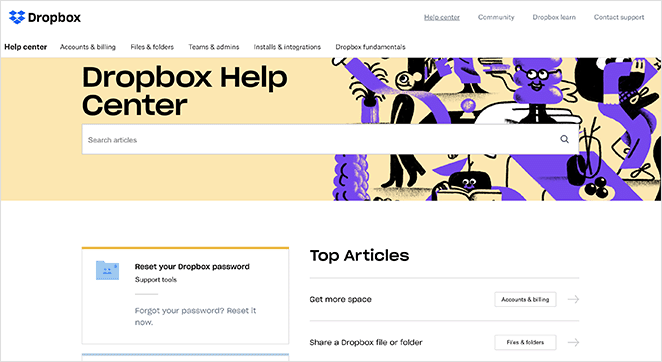
Dropbox has a fantastic FAQ page that puts a fun spin on an otherwise dry topic like cloud storage.
The most commonly asked questions are at the top of the page, making them easy to find. Yet they also have a search bar and categories to keep the page user-friendly.
Internal linking to pages with more details helps the user experience, and bright, eye-catching graphics are engaging and in keeping with the brand.
2. Pinterest
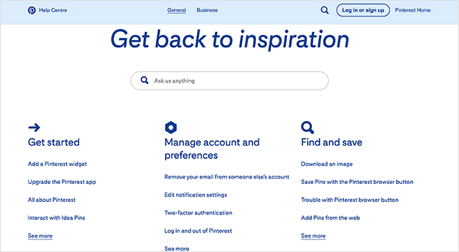
Pinterest offers a more straightforward FAQ page design with a search bar that stands out at the top. Below the search bar are different categories with multiple links directing users to the information they need.
Further down the page is an accordion that contains some of Pinterest’s featured articles. By including these posts, Pinterest can educate users on how to do some of the most common Pinterest actions, like editing their profile, etc.

The page also includes tips, links to log in, and ways to contact Pinterest for more help.
3. Twitter
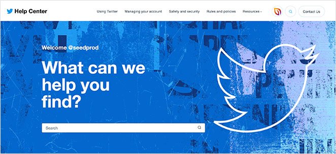
Twitter’s help center has a similar design to Pinterest. They dedicate the top of the page to a prominent search bar, encouraging users to search first to find answers quickly.
After that section is clear categories linking to single pages that answer questions in detail. The overall design is clean, and uniform, and avoids unnecessary distractions.
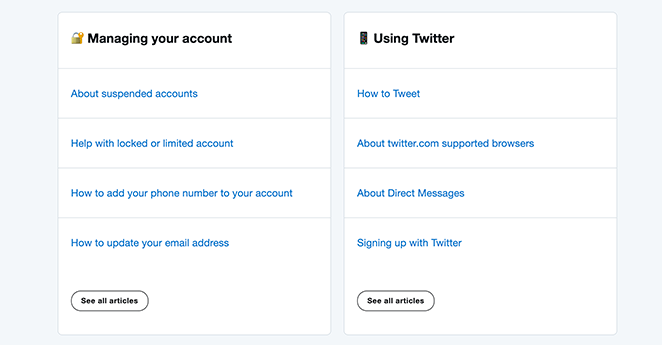
We love the “What’s New” section which features a scrolling carousel of new Twitter features. It doesn’t take up too much space but gives users access to information they might otherwise miss.
4. Nintendo Switch
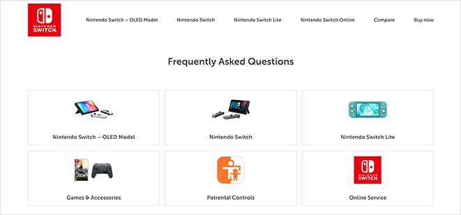
Nintendo Switch offers one of the best FAQ pages due to its simplicity. Because its audience includes younger users, they’ve made the page super-easy to navigate without overwhelming visitors with too much information.
At the top of the page are visual cues for the most common questions. Clicking each image automatically jumps you to the relevant section, saving time scrolling through the page.
Nintendo also uses an accordion to show and hide different questions and answers. It’s another space-saving solution that improves user experience while helping Nintendo rank in search results for relevant queries.
5. Etsy
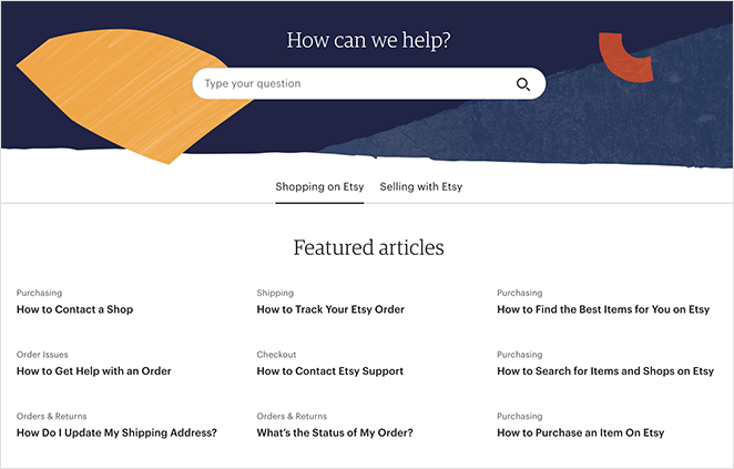
Etsy’s FAQ page is straightforward, educational, and aesthetically pleasing. It includes a search box at the top and featured articles below for shopping or selling.
Each FAQ article includes the topic name, and when you click each article, you can see links to other articles in that topic cluster.
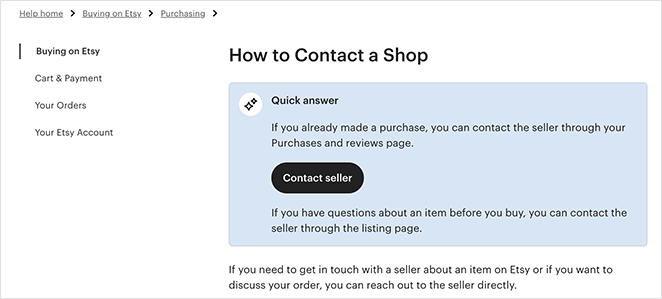
If users can’t find what they need, they can click further links for more help and call to action buttons to contact support.
6. McDonald’s UK

McDonald’s UK’s FAQ page design is visually appealing and easy to navigate on mobile and desktop devices. It offers several ways to search for answers, including typing a query into the search box or scrolling through detailed articles.
You can filter the articles by category, which is an excellent way to omit irrelevant content. A “Load More” button also allows you to continue browsing without leaving the page.
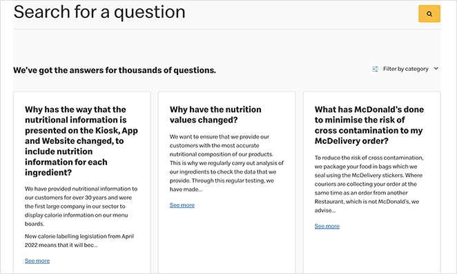
The compact design is ideal for browsing on mobile devices. Plus, the elements are large enough to tap from mobile screens, making for easier navigation.
7. Lego VIP
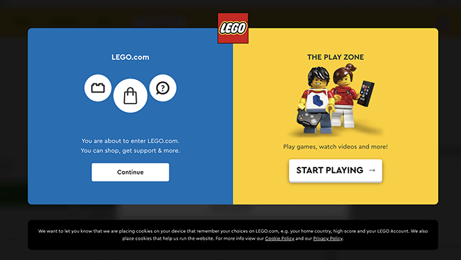
Lego VIP takes a different approach to its FAQ page and help center. It offers 2 options: to continue to the Lego website or head to the play zone to play games.
The 2 options clearly show that Lego understands its audience wants different things and that they may include children who simply want to have fun.
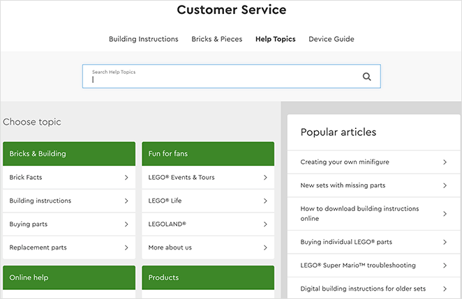
Clicking through to the website shows a knowledge base similar to other examples on this list. You can search through help topics, choose a topic from specific categories, and browse popular articles in the handy sidebar.
Towards the end of the page are different ways to contact customer support, including email, live chat, phone, and mail.
8. Pure App
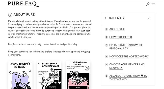
Pure App takes a minimalistic approach to its FAQ page. It offers a single page with numbered sections that users can browse for answers to their most pressing questions.
The topics include information about the app, registering, how it works, and more. Users can either scroll through all the information or jump to a specific section by clicking the table of contents.
Pure App frequently links to relevant articles, providing more information where required. They also include screenshots throughout the page to demonstrate how the app works.
We think this page could benefit from an accordion to make the page shorter and more manageable for mobile users to navigate.
9. Potion
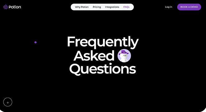
Potion has a gorgeous FAQ page that’s easy to navigate, perfect for mobile users, and fun to browse. The small purple cursor follows you around when you browse the page, adding an exciting element.
The key feature is an expanding FAQ section that uses an accordion to show and hide answers. It also features larger fonts, making it easy to read on mobile screens.
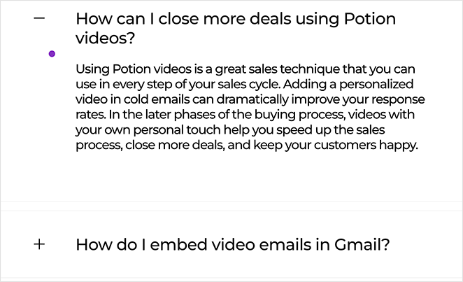
The entire layout of this page is mobile-friendly, easy to use, and stays relevant to the company’s branding.
10. First Direct
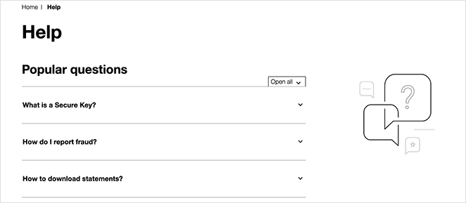
The best FAQ pages don’t always need bells and whistles to get the job done well. You can see that with this design from First Direct.
Popular questions are at the top of the page with an expanding accordion to save space. Each section links to relevant articles that expand on the topic or direct users to more information.
Below are several links users can search by categories such as bank accounts, fraud and security, and other topics. Clicking each link takes you to a single page that often includes a video explaining things.
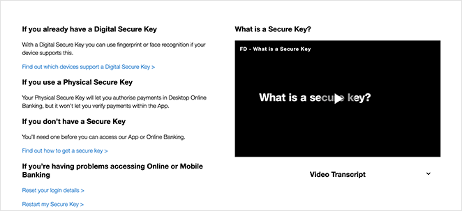
First Direct also includes plenty of internal links to other pages on the site, moving users through their sales funnel.
11. Headspace
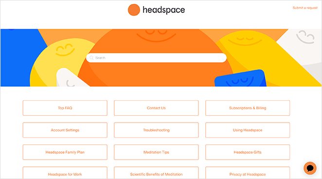
Last but not least is this colorful FAQ page from Headspace. The page is vibrant and aligns perfectly with Headpace’s branding, boosting trust and credibility with users.
There’s a user-friendly search bar at the top, with a fun background image to draw attention. Below are clear boxes users can click to view information about different Headspace topics.
You’ll head to a separate page with links for each subtopic when you click on a link. You can then find more specific answers that go into more detail.
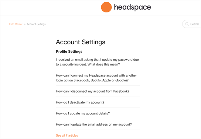
This logical approach to organizing a knowledge base offers users a direct and easy experience.
How to Create a FAQ Page in WordPress?
Now that you know more about FAQ pages, you probably want to jump in and make one for your website. While you can use a WordPress FAQ plugin, the easiest way to add a FAQ page to your WordPress site is with a drag-and-drop page builder plugin, like SeedProd.
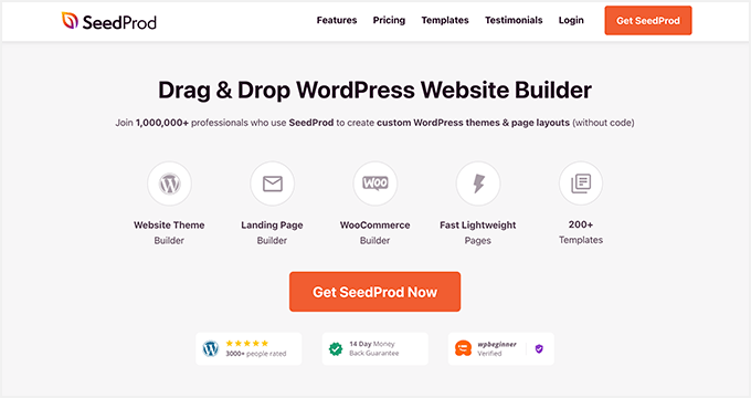
SeedProd is the best website builder for WordPress. It lets you create WordPress themes, landing pages, and flexible layouts for your WordPress site without code.
SeedProd includes everything you need to create an optimal FAQ page design, such as:
- Premade landing page templates
- Ready-to-use FAQ sections
- Accordions to expand and hide answers
- Built-in search bars for finding answers quickly
- Anchor links to jump to relevant FAQs
You can also customize any part of your page in the visual editor, saving you spending time and money on a developer.
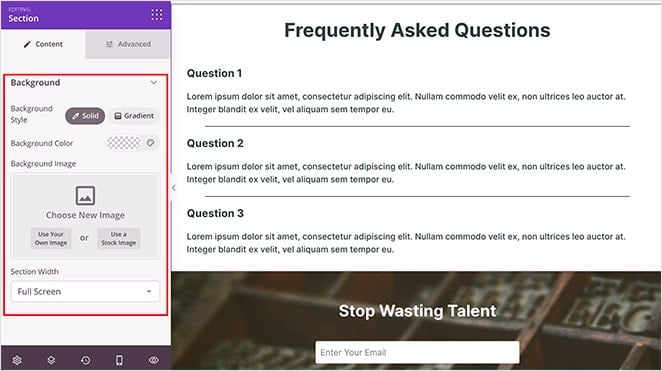
Here’s a step-by-step guide on creating a FAQ page with SeedProd. Or, if you’d like to jump right in, click the button below.
There you have it!
We hope this article helped you find the best FAQ pages, examples, and ideas. You might also like these other helpful guides:
- How to Make a Page Full Width in WordPress
- 8 Best WordPress Accordion Plugins for FAQ
- 25+ Best WordPress Plugins to Revamp Your Site
Thanks for reading! We’d love to hear your thoughts, so please feel free to leave a comment with any questions and feedback.
You can also follow us on YouTube, X (formerly Twitter), and Facebook for more helpful content to grow your business.

