When someone clicks the unsubscribe link in your email, it usually feels like the end of the road. But it doesn’t have to be.
I’ve worked on email campaigns where a simple unsubscribe screen either lost people for good or gave them a reason to stay. One small change, like adding a resubscribe option or linking to a discount, can actually bring people back.
In this guide, I’ll show you what makes a good email unsubscribe page, share real examples I’ve seen work, and walk you through how to build one for your own site without touching a line of code.
Quick Summary: How to Create an Effective Email Unsubscribe Page
- ✔️ Show a clear opt-out confirmation message
- ⚙️ Let users adjust frequency or content preferences
- 🔁 Offer a resubscribe button or pause option
- 📣 Add social links, discount offers, or testimonials
- 🎥 Use video or humor to leave a lasting impression
- 🛠️ Build and customize your page in WordPress with SeedProd
What Is an Email Unsubscribe Page?
An email unsubscribe page is a landing page on your email marketing provider’s website or your business website that lets contacts unsubscribe from your email list. Contacts can click a simple unsubscribe link sending them to your unsubscribe page whenever you send an email.
The purpose of this page is to confirm that users want to opt-out of your mailing list. It’s also your last chance to convince them to stay on your list and continue benefiting from valuable content.
What to Include on an Unsubscribe Page?
You can do several things to convince users to change their minds about clicking the unsubscribe button. Here are a few things to include on your unsubscribe page to convince valuable subscribers to stay:
- Re-subscribe: Sometimes, users click the unsubscribe link by mistake. Including this on your email unsubscribe landing page can help you recover lost contacts quickly.
- Frequency: It could be a user doesn’t want to unsubscribe, but they’re simply getting too many emails. Use your unsubscribe page to let users change their email preferences and reduce how often they receive your emails.
- Personalization: Your content may not be offering the best value to specific users. Change that by letting users choose what you send to their inbox.
- Alternatives: If people genuinely don’t want your emails anymore, there are still other ways to stay in touch. You can include links to your social media profiles, so users can follow you to stay in the loop about new updates.
Customizing your unsubscribe confirmation page gives you a final opportunity to connect before someone leaves your list completely.
8 Effective Email Unsubscribe Page Examples
Your unsubscribe page doesn’t need to be fancy to generate results. Here are some excellent email unsubscribe page examples for your inspiration.
1. SeedProd

| Strength | What SeedProd Does Well |
|---|---|
| Re-engagement CTA | Links to latest deals to spark interest before users leave |
| Clean design | Minimal layout keeps attention on the offer |
| On-brand experience | Matches SeedProd’s tone and visuals |
First is an email unsubscribe page from yours truly. At SeedProd, we wanted a way for people to unsubscribe from our weekly newsletter while continuing to get important product announcements.
We created a rule in our email marketing software that removes users from our newsletter list when clicking the unsubscribe link. The user will see the above unsubscribe screen after.
The design is clean, and simple, and includes a call-to-action button inviting users to view SeedProd’s latest deals. This approach encourages users to re-engage with SeedProd, improving conversion rates.
This kind of unsubscribe experience works well when it feels intentional and helpful, not just a dead-end screen.
Pro Tip: We made this unsubscribe page with SeedProd’s landing page builder. We’ll show you how to create one later in this article.
2. Jean Scene
| Strength | What Jean Scene Does Well |
|---|---|
| Humor and personality | Animated GIF creates a memorable moment |
| Resubscribe option | Quick way to undo the unsubscribe |
| Simple layout | Keeps things casual and easy to understand |
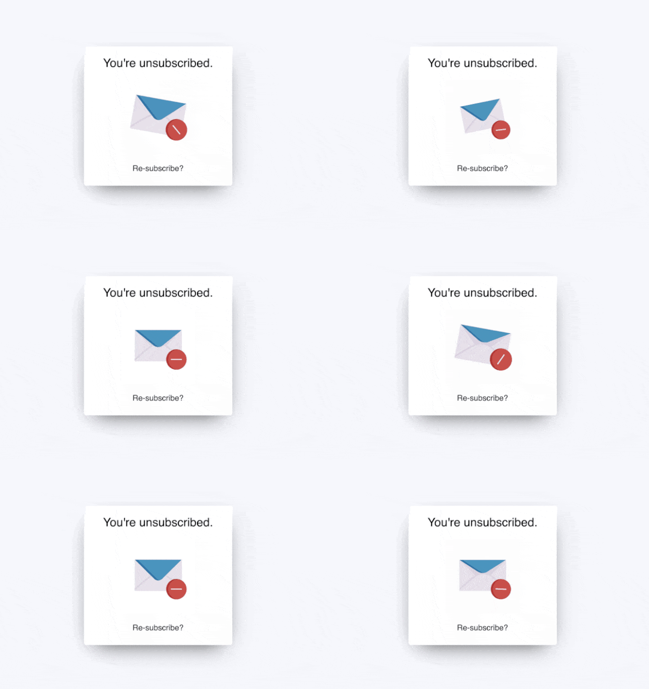
Here’s another simple email unsubscribe page from Jean Scene, the men’s jeans and fashion website. This example has even less information than the first but is still just as effective.
Users see a simple message telling them, “you’re unsubscribed.” Then it draws the eye with an engaging animated GIF and invites users to re-subscribe.
We mentioned earlier that this is an excellent way to re-capture leads who clicked unsubscribe by mistake or changed their minds about leaving your list.
3. Email Uplers
| Strength | What Email Uplers Does Well |
|---|---|
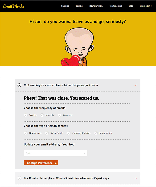
| Full preference control | Users can change frequency and content types |
| Personalization | Page feels tailored to the subscriber |
| Clear choices | Empowers users instead of pushing them away |
It’s no surprise that Email Uplers, a full-service email marketing agency, knows what it takes to create an effective email unsubscribe page. Their example includes many of the elements we mentioned earlier, including the ability to:
- Adjust email frequency
- Change the email content type
- Update your email address
- Unsubscribe completely
We also love that the page is personalized to the user. It gives the entire design a more authentic feeling, convincing you that Email Uplers genuinely values having you on their list.
4. HubSpot
| Strength | What HubSpot Does Well |
|---|---|
| Emotional connection | Personal video message acknowledges the user’s journey |
| Soft retention | Encourages staying in touch without pressure |
| Social follow options | Offers alternate ways to keep the relationship going |
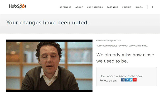
HubSpot clearly understands that some people don’t want their inboxes full of marketing messages. They demonstrate that on their email unsubscribe page with this emotional video message from their inbound marketing specialist:
Like a committed relationship, Dan reminds you of the good times, explains that he saw you open his emails, then follows up with a heartfelt plea to stay in touch. There are even links to HubSpot’s social media channels to back it up.
Sometimes, your audience just wants to feel valued. If you take a leaf out of HubSpot’s book and show some love, you’ll likely win users back.
5. Charity: Water
| Strength | What Charity: Water Does Well |
|---|---|
| Humor | Fun video makes the brand feel human |
| High engagement | Entertaining content keeps people watching |
| Unconventional approach | Stands out from typical email unsubscribe pages |
Charity: water, a non-profit clean water organization, also uses humor to engage users wanting to unsubscribe from their email list. Instead of showing a standard email unsubscribe page, users can either confirm they’re opting out or watch a video of the CEO getting water-bombed.
The results of this campaign were incredible. The email was sent to over 70,000 people, and out of that, only 100 unsubscribed, and 740 watched the video.
Examples like this show that if it’s relevant to your brand, a little humor can go a long way in re-engaging and entertaining your audience.
6. Vimeo
| Strength | What Vimeo Does Well |
|---|---|
| Granular control | Lets users choose specific types of emails |
| Minimal design | Easy to scan and select without friction |
| Retention focus | Encourages adjustments over full unsubscribes |
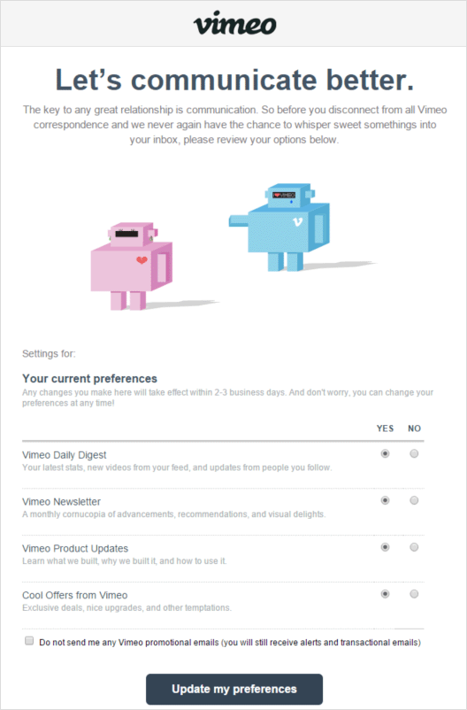
Vimeo’s unsubscribe page is another example of how you can free people from unwanted emails without causing them to unsubscribe. They focus on communication, inviting users to change their email preferences and choose which types of emails they’d like to receive.
The options are straightforward:
- Daily digest
- Newsletter
- Product updates
- Offers
The page also includes a checkbox for users to opt-out of all promotional emails and only receive alerts and transactional emails.
7. Yankee Candle
| Strength | What Yankee Candle Does Well |
|---|---|
| Smart timing control | Pause option respects seasonal email fatigue |
| Subtle retention | Reduces opt-outs without being pushy |
| Great for reactivation | Brings users back without extra work |
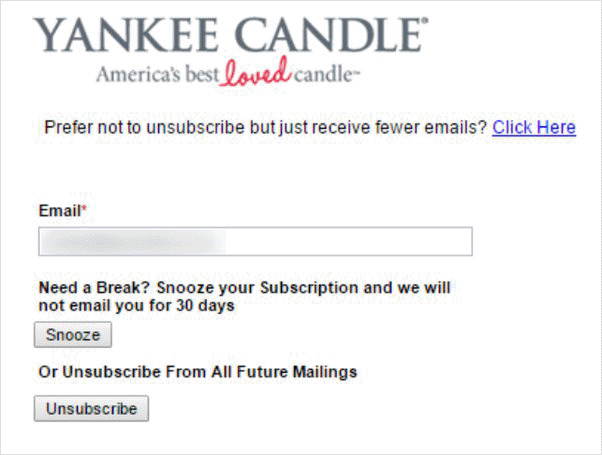
Yankee Candle has a different approach for its email unsubscribe confirmation page. Users can enter their email address and “snooze” emails for 30 days, taking a break from marketing messages.
The design is simple yet effective because people will often forget they paused email updates. Once the 30 days are up, they’ll start getting emails again and may change their mind about removing themselves from the list.
Unsubscribe pages like this are perfect for the busy holiday season, where people are inundated with promotional emails.
8. Wistia
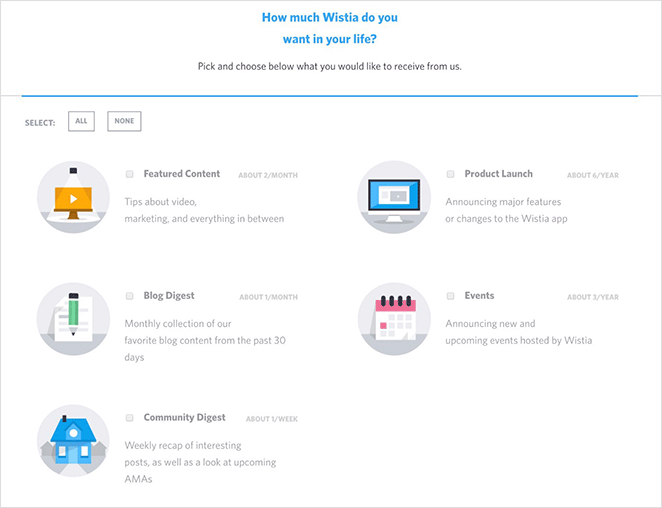
| Strength | What Wistia Does Well |
|---|---|
| Transparency | Shows frequency for each email category |
| Personalization | Users can pick only what’s relevant |
| Subscriber trust | Clear expectations build long-term engagement |
The final email unsubscribe page example comes from Wistia, the video hosting platform. Like several of the other examples on this list, Wistia gives users the option to personalize their emails and only opt-in to specific topics, including:
- Featured content
- Blog posts
- Community digest
- Product launch
- Events
Beside each option is a short description and estimate of how many emails of that type you can expect to receive each month or year. Users can then choose the email frequency and content types that best suit their needs.
How to Create an Email Unsubscribe Page
Now that you’ve seen some inspiring email unsubscribe pages, you’re probably wondering how to make one. You could use a simple WordPress page with an unsubscribe confirmation message, but we suggest customizing your page with a page builder like SeedProd to add advanced features more easily.
SeedProd is the best website builder for WordPress with drag-and-drop functionality. It lets you create entire website layouts and landing pages without writing code or hiring a developer.
You can start by choosing from hundreds of professionally designed landing page templates, then customize your page visually and see the changes in real time. The plugin also offers many content blocks and sections for adding advanced features, including opt-in forms, social media icons, call-to-action buttons, etc.
Follow these step-by-step instructions to create an email unsubscribe page with SeedProd.
Step 1. Install and Activate SeedProd
First, click here to get started with SeedProd and download the plugin to your computer.
Note: There is a free version of SeedProd, but we’ll use the Pro version for the advanced features.
Next, install and activate the plugin on your WordPress website. If you need help with this step, you can follow this guide on installing a WordPress plugin.
Once SeedProd is installed, you’ll be able to build your own custom unsubscribe confirmation page inside WordPress.
After installing the plugin, go to SeedProd » Settings and enter your license key.
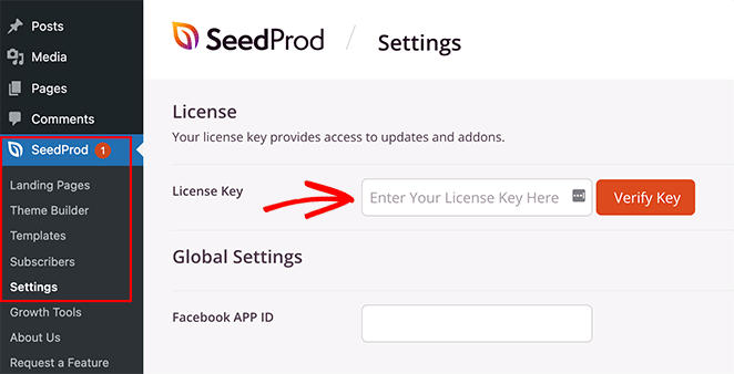
You can find your license key in your SeedProd account under the Downloads section.
Click the Verify Key button and save your settings before moving to the next step.
Step 2. Choose a Landing Page Template
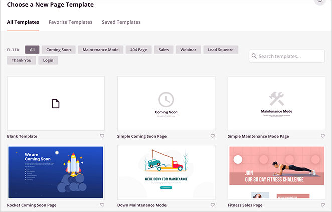
Next, go to SeedProd » Landing Pages and click the Add New Landing Page button.
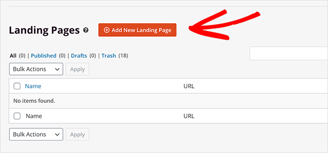
You’ll see many different landing page templates that you can filter by type on the next screen.
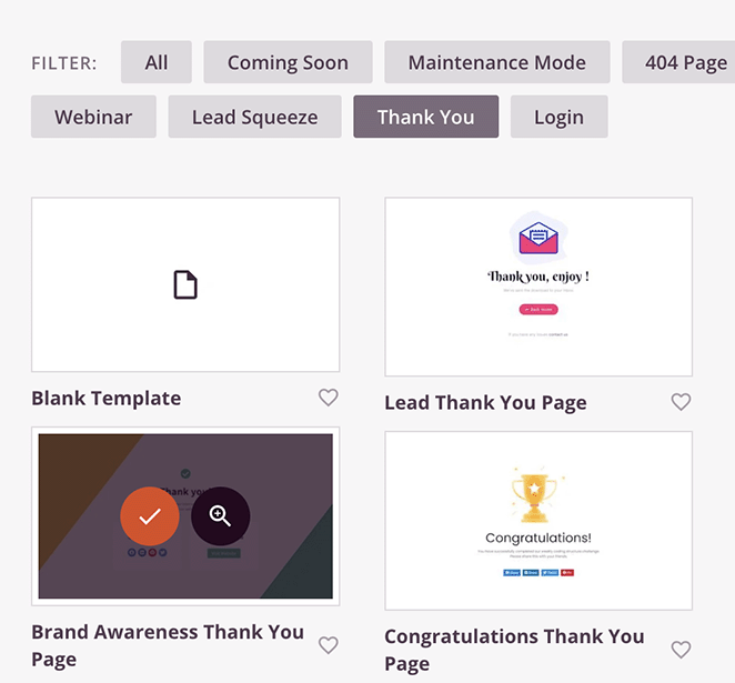
Once you find a template that resembles the type of design you want, hover over the thumbnail and click the checkmark icon.
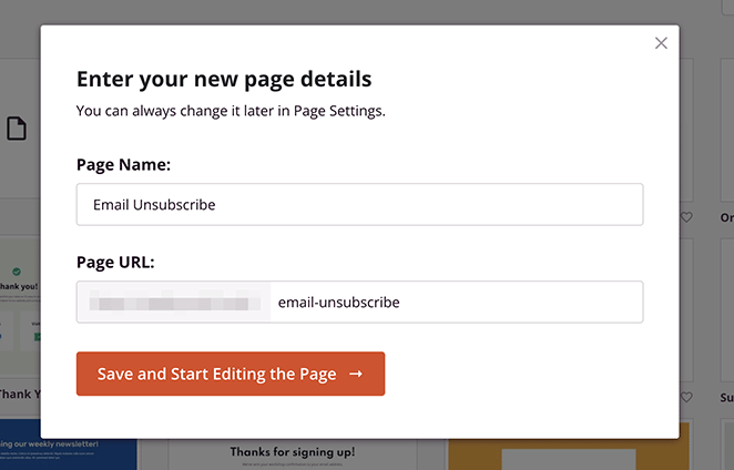
Now you can enter a name and URL for your page and click the Save and Start Editing the Page button to customize it.
Step 3. Customize Your Email Unsubscribe Page
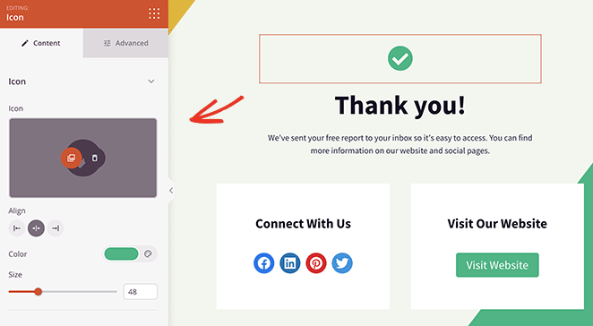
Your landing page template will open in SeedProd’s visual drag-and-drop editor. You can change the default content with your unsubscribe message and add page elements to re-engage your contacts on this page.
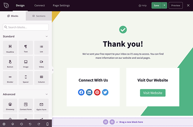
For example, you can click the icon block to remove the checkmark and replace it with a more relevant icon. The block settings panel will open on the left-hand side, and you’ll see a preview of your changes on the right.
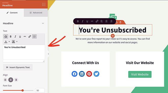
You can also click on any text block to enter a custom message and confirm that users wish to unsubscribe.
Here are some other ideas for customizing your email preferences page:
- Use the social media icons block so visitors can follow you for updates
- Add a call-to-action button inviting users to check out your latest discounts
- Include testimonials from happy email subscribers
- Use the video block to display an engaging video message
- Customize your background image in the Global Settings panel
I like using the video block here to create a more personal unsubscribe experience. It makes your email opt-out page feel more human and less robotic.
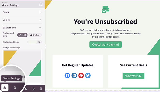
In this example, we added the Optin Form block so users can re-subscribe. Because SeedProd integrates with popular email marketing providers, anyone resubscribing to your list is added automatically.
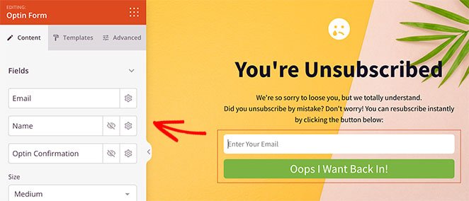
All it takes is clicking the Connect tab at the top of your screen and following the instructions to link your email service.
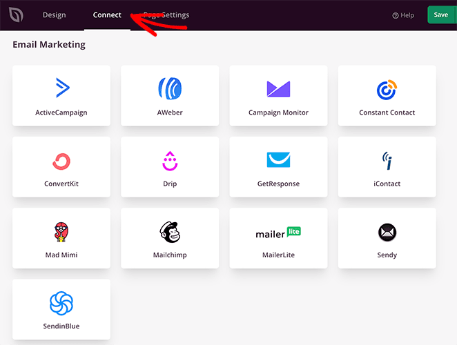
You can also read our email marketing documentation for instructions on each email integration.
Step 4. Publish Your Email Unsubscribe Page
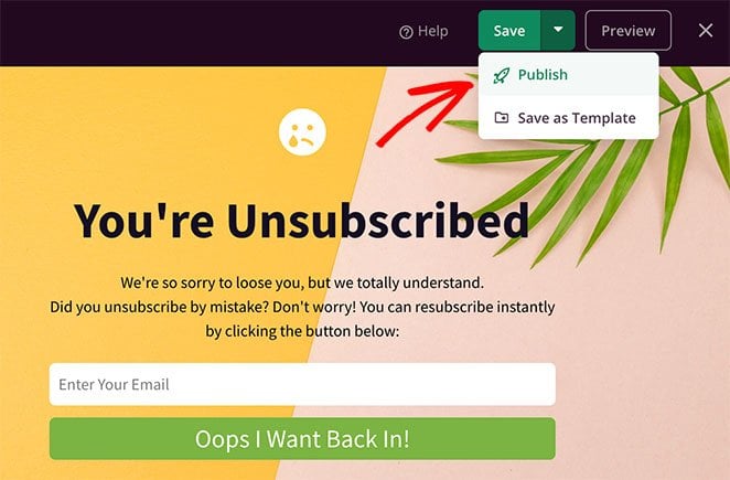
When you’re happy with how your landing page looks, click the Save button in the top-right corner. You can then click the dropdown arrow and select Publish to make your page live.
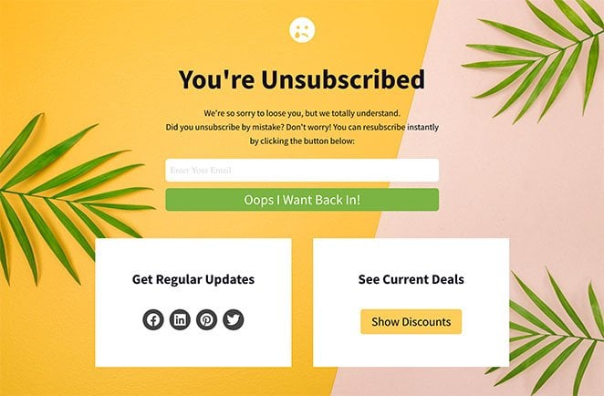
Here’s an example of the email unsubscribe page we made with SeedProd:
All that’s left is to link your page to the unsubscribe link in your emails. Check with your email provider for instructions on the best way to do that because each provider has different settings.
Frequently Asked Questions
SeedProd and Your Small Business
We hope this article helped you find some inspiring email unsubscribe page examples. If you’re ready to turn your email unsubscribe screen into a way to keep subscribers engaged, SeedProd makes it easy.
Get started with SeedProd Today!
SeedProd is here to help you grow your business in all ways. Check out our blog for more small business tips. Here are a few of our favorite relevant posts:
- Best SMTP Plugins for Successful Email Delivery
- How to Write a New Website Announcement Email
- How to Set Up a Professional Free Business Email Address
Thanks for reading! We’d love to hear your thoughts, so please feel free to join the conversation on YouTube, X and Facebook for more helpful advice and content to grow your business.

