The Progress Bar block lets you add animated, visual progress bars to any SeedProd page. Whether you want to highlight a fundraising goal, display skill levels, show campaign completion, or communicate any percentage-based metric, this block makes it easy to present that information in a clean and engaging way.
Each progress bar is fully customizable — set the label text, progress percentage, and bar color in the Content tab, pick from four ready-made style templates, and then fine-tune the typography, background color, border radius, and shadow effects in the Advanced tab. The block also includes per-device spacing and visibility controls so your progress bars look great on every screen size.
Adding the Progress Bar Block to Your Pages
Follow these steps to add a Progress Bar block to your SeedProd page:
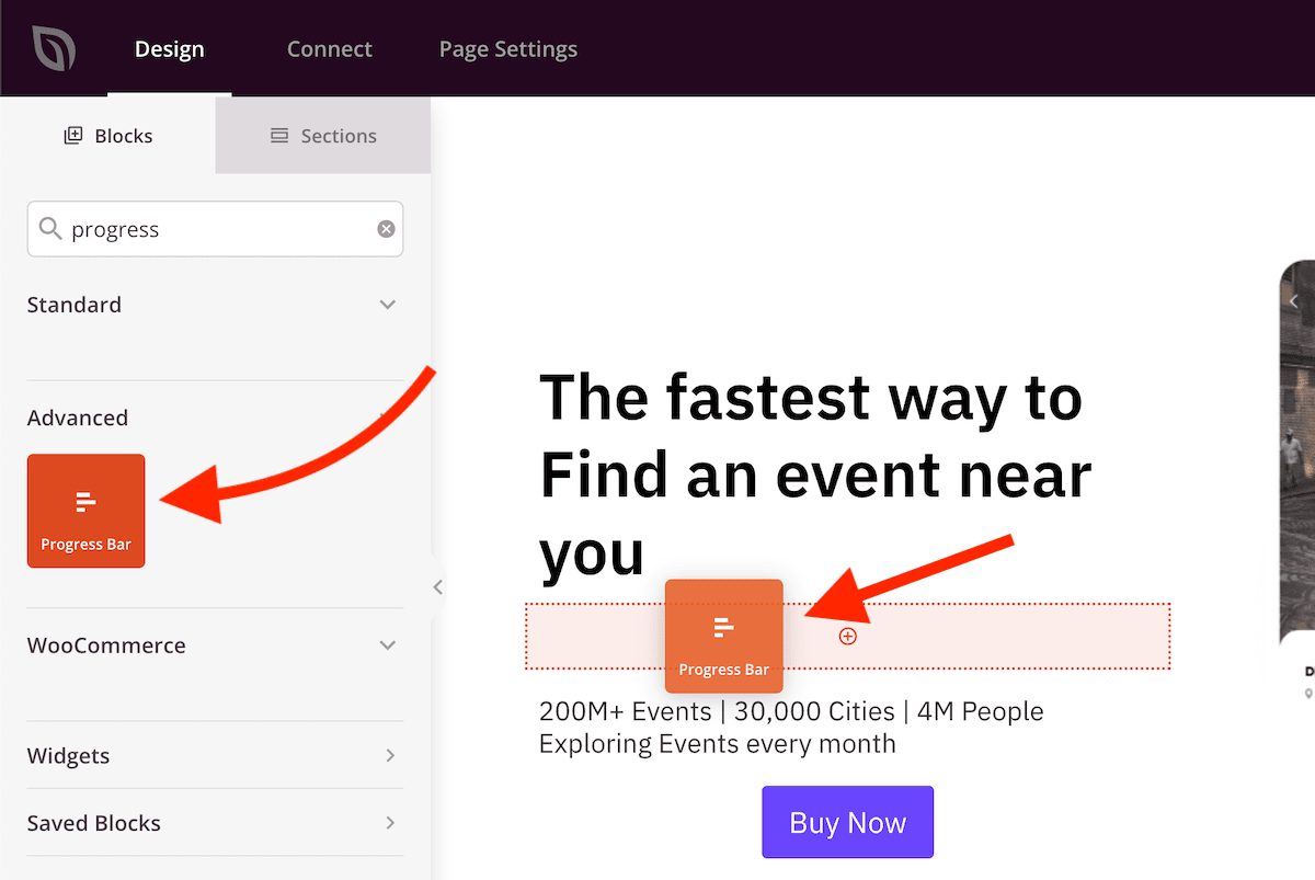
Step 1: Add the Block
Under Design > Blocks, drag and drop the Progress Bar block into the desired section of your page.
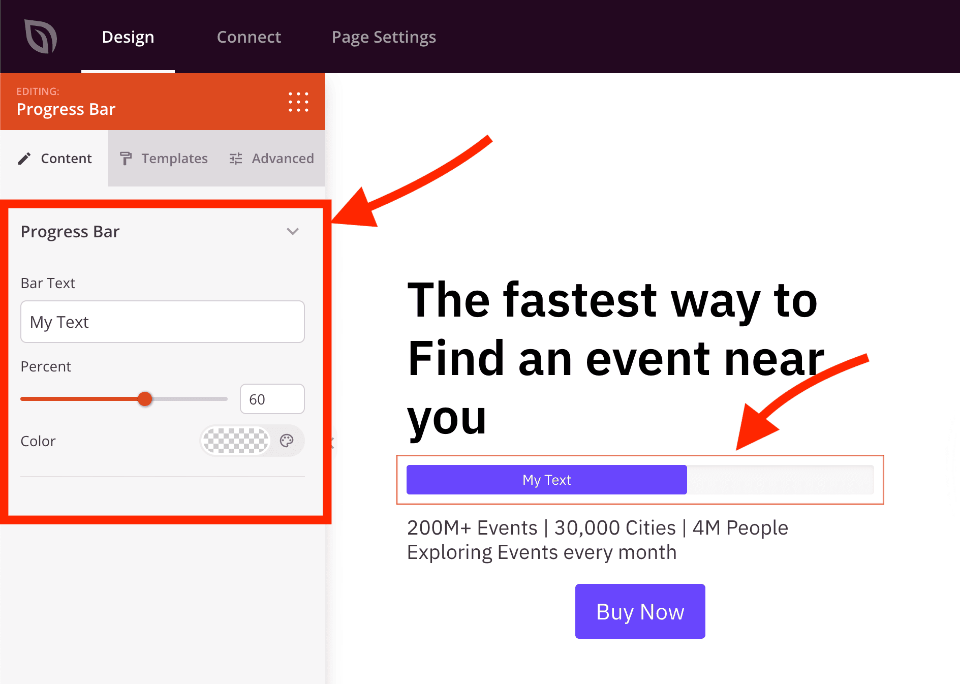
Step 2: Configure Content Settings
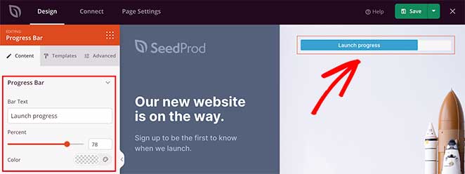
Once added, click on the Progress Bar block to open its settings. In the Content tab, the Progress Bar section lets you set the label, percentage, and fill color for the bar.
- Bar Text: Enter the label displayed inside the filled portion of the progress bar (e.g., “75% Complete”, “Funding Goal”, or a skill name). This text overlays the bar fill so visitors immediately see what the progress represents.
- Percent: Set the fill level of the bar using the slider (0–100). This value controls how much of the bar is visually filled and represents the progress percentage displayed to visitors.
- Color: Set the fill color of the bar. This color applies to the filled (progress) portion of the bar, while the unfilled background color is set separately in the Advanced tab.
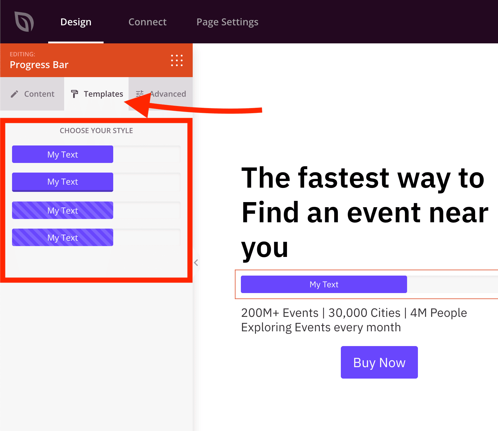
Step 2a: Choose a Template Style
In the Templates tab, you can select from pre-designed progress bar styles to quickly change the overall appearance of your bar.
- Style Templates: Choose from 4 different template designs, each with a unique visual style and color treatment. Click any template to apply it instantly — you can always return to the Content and Advanced tabs to make further adjustments after selecting a style.
Step 3: Customize the Design
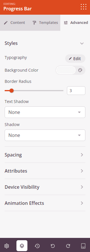
In the Advanced tab, you can fine-tune the appearance of your progress bar with typography, colors, shadow effects, and more.
Styles:
- Typography: Set the font family, size, weight, line height, letter spacing, and text transform for the bar label text.
- Background Color: Set the color of the unfilled (track) portion of the progress bar — the background visible behind the filled section. Defaults to a light gray (
#F7F7F7). - Border Radius: Set the corner rounding for both the bar track and the fill (0–25px). Increase this value to create a pill-shaped or fully rounded bar.
- Text Shadow: Add a shadow effect to the bar label text. Choose from preset sizes (None, Hairline, Small, Medium, Large, X Large, 2X Large) to add depth or make the label more legible against the bar color.
- Shadow: Add a box shadow to the overall progress bar element to give it a sense of depth and separation from the page background.
Spacing:
- Margin: Control the outer spacing around your Progress Bar block (Top, Right, Bottom, Left). This determines how much space appears between the bar and surrounding elements on the page.
- Padding: Adjust the inner spacing within your Progress Bar block (Top, Right, Bottom, Left). This creates breathing room between the bar and the block edges.
Attributes:
- CSS ID: Displays the auto-generated unique identifier for your Progress Bar block. This ID is created automatically by SeedProd for custom styling or JavaScript targeting.
- Custom Class: Add custom CSS classes to apply specific styles from your theme or custom CSS.
- Custom Attributes: Add any HTML attributes to the block wrapper element. Enter each attribute on a new line using the format: attribute-name|value (e.g., data-progress|75).
Device Visibility:
- Hide on Desktop: Hide the Progress Bar block on desktop screens.
- Hide on Tablet: Hide the Progress Bar block on tablet devices.
- Hide on Mobile: Hide the Progress Bar block on mobile devices.
Animation Effects:
- Entrance Animation: Choose from various animation effects that play when the Progress Bar block scrolls into view. Options include Bounce, Fade In, Zoom In, Rotate In, and many more — great for drawing attention to an important metric as visitors scroll down your page.
Step 4: Save Your Changes
Once you have finished configuring the Progress Bar block and customizing its appearance, make sure to save your work.
You’ve successfully added a Progress Bar block to your page! Progress bars are a powerful way to communicate completion, skill levels, fundraising goals, or any percentage-based metric at a glance. Experiment with different template styles, fill colors, border radius values, and entrance animations to create progress bars that catch attention and reinforce your page’s message.