Do you want to create a real estate landing page for your business?
Getting a prospect’s contact information is super helpful in real estate marketing. With that information, you can follow up with buyers and sellers and turn them into loyal customers.
But it all starts with capturing your target audience’s attention, and that’s where high-converting real estate landing pages come in.
In this article, we’ll share some top real estate landing page examples to inspire your real estate business.
What Is a Real Estate Landing Page?
A real estate landing page is a standalone web page that has a specific conversion goal. Moreover, this type of landing page is separate from other pages on your real estate website, and potential leads can only access it by clicking an ad, email, or social media link.
Landing pages are the best place to send someone who clicks your ad because, unlike your homepage or a generic property listing, they’re built to match your advertisement. Even better, real estate landing pages can boost conversions with a relevant call to action (CTA).
Why Do You Need a Real Estate Landing Page?
If you don’t have a real estate landing page on your site, you’re probably missing out on a whole host of benefits. Creating landing pages for your real estate website can help you:
- Impact targeted traffic: Landing pages are more effective than other pages on your website. For example, if someone clicks an ad for a ‘Florida beach house’ and lands on your homepage, they may think you’re not delivering on your promise and leave the page. Yet, if the ad takes them to a page built entirely around buying or selling Florida beach houses, it increases your chances of closing the deal.
- Grow your email list: By including a lead capture form on your landing page, you can collect contact information that makes it easier to nurture your leads into clients.
- Showcase homes in detail: If you want to sell a home with desirable features, you can use landing pages to highlight them to a highly targeted audience. And since your page is built around 1 CTA, you can focus on the details that appeal most to that audience.
- Build urgency: You can use landing pages to give potential clients a sneak peek at upcoming listings and time-sensitive offers to build excitement without updating your entire website.
- Measure results: With a general property listing site, it’s hard to learn how effective your ads are because you don’t have access to relevant metrics. But with a landing page, you can see where your traffic comes from and how well it’s converting so you can measure your results.
What Should a Real Estate Landing Page Include?
Even though your real estate landing page should be unique and match the ad driving traffic to it, there are still some common elements that you should include.
Here are some elements that most high-converting real estate landing pages have in common.
A Call to Action
All effective landing pages include a powerful call to action telling users what to do next. Think about your conversion goal and craft a CTA that helps you achieve it.
For example, if you’re a real estate agent looking to book more appointments, you can encourage visitors to choose a timeslot from your calendar or enter their phone number to book a call.
Compelling Visual Content
Real estate is all about selling your customer’s vision of their dream home, so give them a feast for their eyes. Include high-quality property photographs, virtual tours, and even videos of the properties you have on offer.
Benefit Driven Language
Instead of telling prospects what your properties include, paint a picture of how your homes can improve their lives. What benefits will clients get from their home search?
But don’t forget to be transparent and include details like costs, square footage, and locations to demonstrate your real estate business is one people can trust.
Authentic Social Proof
Include genuine reviews and testimonials from past and existing clients on your real estate page. Testimonials from satisfied clients are an excellent way to showcase your reputation and build credibility.
Even if you already have a glowing reputation, your leads may not know about it yet. So including a variety of social proof helps potential clients learn about you before filling out the form.
To learn more about what you should include, check out this anatomy of a landing page guide.
11 Real Estate Landing Page Examples
Now that you have a solid idea of what makes a real estate landing page effective let’s see them in action. Below you’ll find some killer real estate landing page examples from successful businesses online.
1. YHM Property Solutions
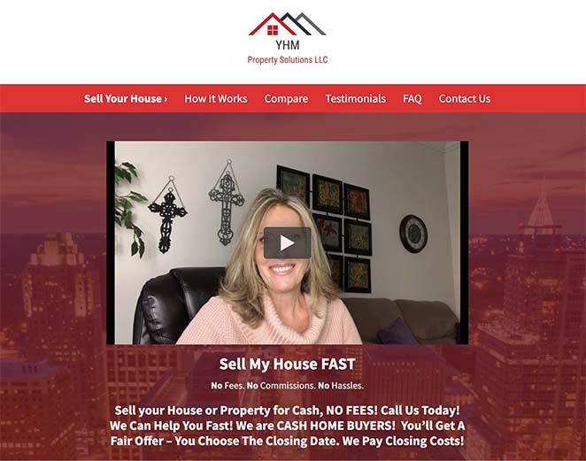
Our first example is YHM Property Solutions, a real estate solutions company that buys properties from homeowners in emergencies. The landing page is simple with a straightforward layout, but the header area is where your attention is diverted immediately.
Right at the top is a video welcoming clients to the page. Video content is an excellent way to engage visitors and add a personal touch that builds trust and credibility.
As you move down the page, the video content is supported by benefit-driven copy and testimonials from past and existing customers as quotes and video testimonials.
The signup form is short and only asks for the information needed to make an offer. Moreover, the form is repeated 2 more times further down the page, presenting 2 more chances for visitors to convert.
2. Quick Move
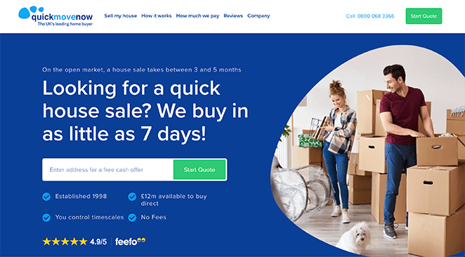
Quick Move is another home buyer with a stunning real estate landing page example. The page design is bold, eye-catching, and in keeping with the company’s branding. Plus, the opening headline is benefit-driven and taps into the seller’s pain points.
This page has all the essential elements you’d expect from a high converting landing page, including:
- Relevant images that grab attention
- Transparent text written with short, easy to-skim sentences
- Star ratings and testimonials to improve trust
- Minimal form fields to collect email addresses
- Contrasting CTA button color
The overall effect is a professional design that’s compelling, easy to trust and navigate.
3. Agent Home Values
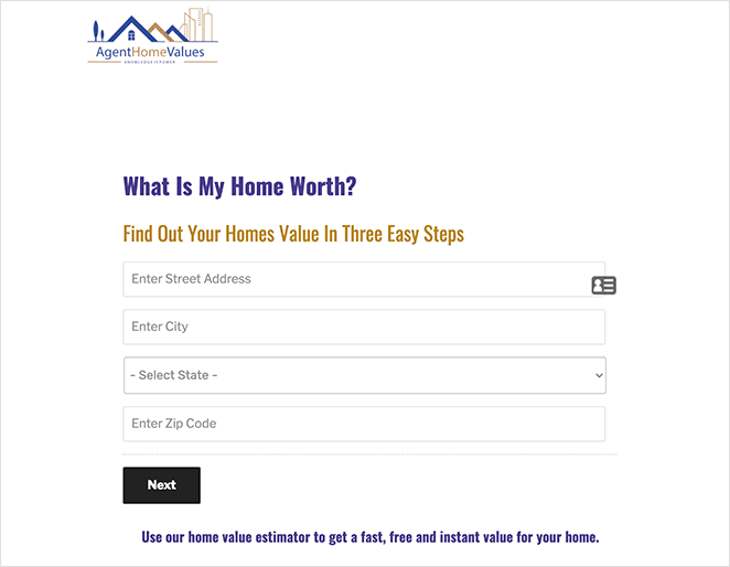
Sometimes all you need is to keep things simple. And Agent Home Values does that with their real estate page example.
All they include on their landing page design is a logo, form, subheading, and CTA button. And while it doesn’t have all the bells and whistles, it’s a practical approach to lead generation.
To get a fast, free valuation, all visitors need is to enter their address and hit Next. After, there are only 2 more steps to get a quote.
Breaking your landing page down into a 3-step process is an effective way to combat hesitation, making it more likely users will complete the process.
However, we’d include some testimonials and images to make the page even more compelling and professional.
4. Property Wealth System

Next is an excellent real estate landing page example from Property Wealth System, promoting its real estate webinar. The design uses all of the best landing page practices to boost webinar registrations, including:
- A compelling landing page headline
- Webinar features section with short, benefit-driven sentences
- Reviews and testimonials to improve credibility
- Bold CTA button with actionable text
- FAQ section to address questions
We especially like the use of a countdown timer at the top of the page. Countdown timers are an excellent way to increase urgency and encourage people to act now, so using them on your page is a sure-fire way to boost leads.
5. Agent Pronto
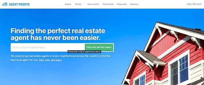
Agent Pronto offers a real estate landing page example that’s packed with information. The clean heading at the top promises leads they’ll find the perfect real estate agent, while the search box acts as the primary CTA.
Visitors can learn more about the company from its short services sections as they move down the page. And below that are testimonials from happy customers, highlighting the company’s credibility.
To double down on the landing page goal, Agent Pronto has added their search box CTA once more to the bottom of the page. That way, they have an extra opportunity to convince prospects to convert.
6. Real Estate Investar

Next is Real Estate Investar, with a landing page offering a free ebook download. The overall page design is simple, free of distractions, and includes only the details to convince users to convert.
At the top is a headline telling users exactly what the ebook does. And below that is a supporting statement offering further information. It also includes a high-quality image of the ebook, giving users a tangible idea of what they’ll get.
Moving on is a section detailing what users can learn from the book. Since this information is organized in short bullet points, it’s easy for visitors to skim.
In addition, the sign-up form only asks for minimal personal information, like:
- Name
- Answer a question
- Marketing opt-in
Keeping the details you collect to a minimum is an excellent way to convince users to complete your form. Too many questions are intimidating to first-time leads.
For more designs like this, check out these ebook landing page examples.
7. The Kingdom Real Estate

Next is another simple real estate landing page with a twist. The Kingdom Real Estate offers a landing page with 2 different CTAs. While it’s a best practice only to use 1 type of CTA, this example works.
The reason for that is both types of CTA lead visitors towards the same goal. Whether users join the training or speak to someone about it, both CTAs head in the same direction of signing up for the training session.
We also love the different types of testimonials that this company includes on its page. You can see that the messages are from real people in genuine conversations, which adds to the company’s credibility.
Plus, the contrasting yellow and black color scheme instantly stands out from what many other real estate pages do, making it recognizable and unique.
8. Capital Concept Group
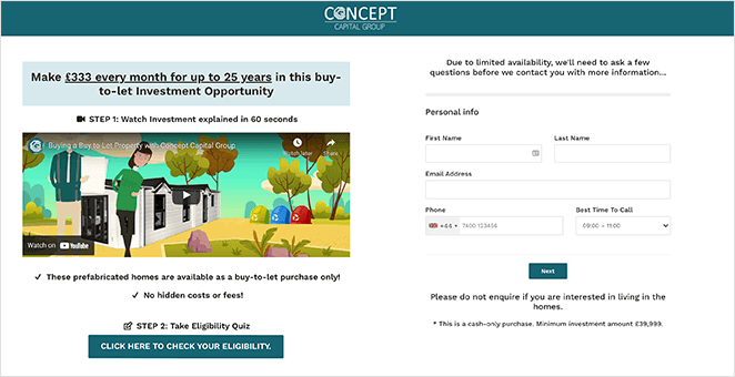
This real estate landing page example from Capital Concept Group uses a solid variety of landing page tactics to convince and convert visitors.
First, it presents visitors with a step-by-step process of how they should navigate the page:
- Step 1 is to watch an explainer video that is both eye-catching and engaging
- Step 2 requires checking your eligibility
- Step 3 is to fill in a short form to request more information
While that approach may look like a lot of hand-holding, it actively leads people down the path the company wants them to take, improving the chances of converting.
If people need more information, all they need to do is scroll down the page. The short, actionable paragraphs give potential customers everything they need to take the next step.
The only other thing we’d include on the page is some form of social proof to make the offer even more convincing.
Real Estate Landing Page Templates
If you’re still looking for some eye-catching designs, check out these real estate landing page templates made with SeedProd’s drag-and-drop WordPress landing page plugin.
9. Habitat Sales Page
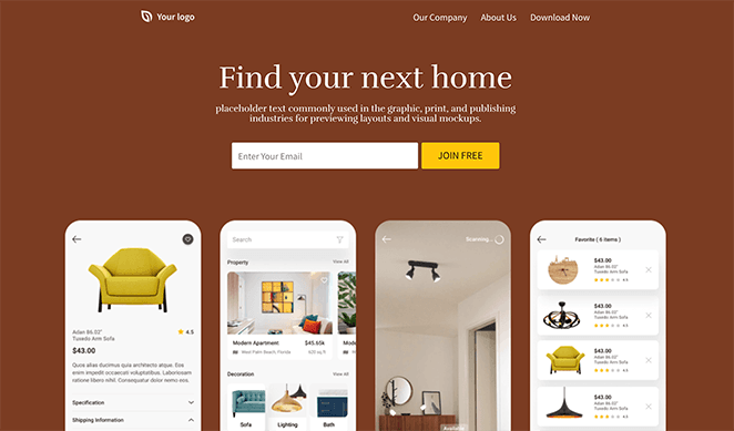
The Habitat real estate template is a stunning example of how you can set up your real estate landing page. It includes everything you need to create a compelling design, including:
- Optin form to collect email addresses
- High-quality images to create interest and illustrate your services
- Testimonial section to highlight customer reviews
- Social media profile buttons to help prospects find you on social media
This landing page would make a compelling design for real-estate apps or even a real-estate consultancy service.
10. Real Estate Sales Page
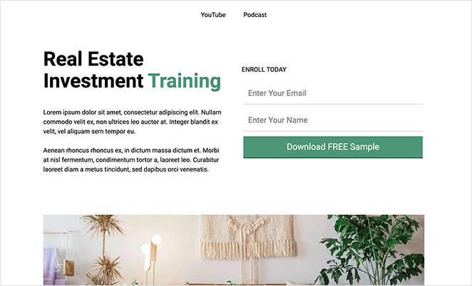
Next, is the appropriately named Real Estate Sales page designed to promote real estate training services. The hero area includes a bold headline, an area for supporting text, and a short form for users to sign up.
As you move down the page, you’ll see areas you can customize to add more information about your offer, including:
- Bullet lists
- Info boxes
- Images
- CTA button
And once more, at the bottom is a sign-up form, giving you one more chance to secure leads.
11. Real Estate Squeeze Page (SP)
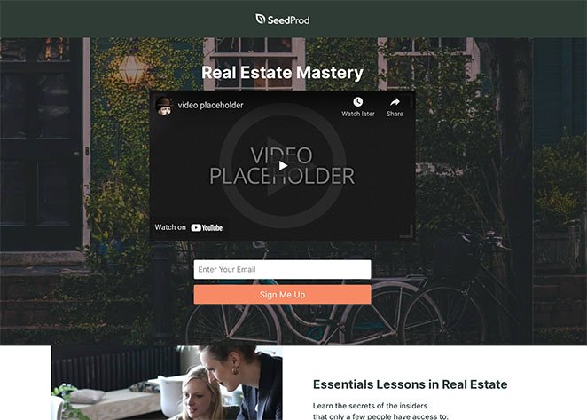
This squeeze page design is the perfect template for promoting your real estate course, ebook, or services. It features a video at the top, the best way to grasp and hold visitors’ attention.
And because the sign-up form is immediately after the video, it’s in the best position to collect leads. If visitors need more information, they can move onto the bullet list to add content that convinces users of the benefits of using your company.
Again, there’s a second version of the CTA to help you increase landing page conversions.
How to Create a Real Estate Landing Page
After looking at the examples above, you might be wondering how to make a real estate landing page for your website. If you’re a WordPress website owner, we have the ideal landing page solution.
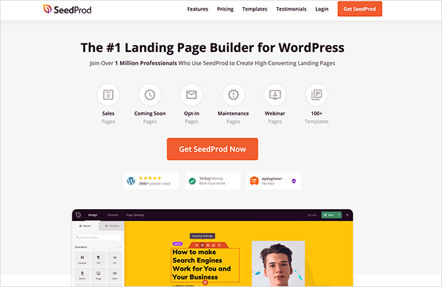
SeedProd is the best WordPress page builder with drag-and-drop functionality. It helps you create any type of landing page in WordPress without writing a single line of code.
With hundreds of responsive landing page templates, you can create a real estate landing page in less than 30 minutes. And the live visual editor allows you to customize your design without help from a developer.
SeedProd offers tons of lead-generation tools to increase landing page conversions. You can also integrate with popular email marketing tools and make your page work with any WordPress theme.
Best of all, SeedProd is fast and bloat-free, so your design will always load fast, offering the best experience for your target audience.
Follow this guide to learn how to create a landing page in WordPress with seedProd.
There you have it!
We hope this article helped you find real estate landing page examples and ideas to use for your property business. You might also like this guide on adding testimonials to WordPress to display social proof, or this showcase of the best real estate themes for WordPress.
Thanks for reading. Please follow us on Twitter, Facebook, and YouTube for more helpful content to grow your business.


