Looking for great product landing page examples?
The average landing page converts at 5.89%, but the best ones do much better. This shows how important a well-designed landing page is for online sales.
To help you boost your conversions, I’ve studied many successful pages and picked out some of the best.
I’ll show you:
- Top examples of high-converting product landing pages
- What makes these pages work so well
- Tips you can use to improve your own landing pages
Let’s dive in and see what makes these pages stand out.
Best Product Landing Page Examples:
What Is a Product Landing Page?
A product landing page is a web page that’s designed to promote a specific product or service to potential customers. The main goal of a product landing page is to convert visitors into customers by providing them with all the information they need to make a purchase decision.
Here’s what the best product landing pages usually have:
- Eye-Catching Images: Attractive photos of the product (or screenshots if it’s software).
- Target Audience: Information about who the product is for.
- Engaging Copy: Well-written, attention-grabbing text.
- SEO Optimization: Features that help people find the page on search engines.
- Key Features Highlighted: Clear explanations of what makes the product special.
- Pricing Information: The price or clear links to where to find it.
- Social Proof: Testimonials or reviews from happy customers.
- Detailed Specs (If Needed): Links to more technical information.
- Easy Purchase Process: A clear way to buy the product.
Not every product landing page will have all of these things, but you’ll see most of them in the examples we’re about to share.
Best Product Landing Page Examples of 2025
I think the following examples of product landing pages are some of the very best:
1. Apple Airpods Max
If you need product landing page inspiration, you can’t go wrong with Apple’s digital marketing campaigns. Its AirPods Max landing page is an excellent lesson in product page design.

Upon landing on the page, you’re hit with a full-width image of the product, allowing you to get up close and personal. Then, right after is a compelling headline describing how Airpods Max can give you the perfect listening experience.
Already, that’s 2 best practices ticked off our list: high-quality images and a problem-focused headline. The page then continues with benefit-driven descriptions supported by pixel-perfect product photos.
Since the page has plenty of white space and a neutral color scheme, the CTA buttons to buy now instantly pop out of the screen. Additionally, the price comparison table is another great way to improve user experience by helping shoppers make the best choice for their needs.
Pros:
- High-Quality Images: Makes the product look appealing.
- Clear Headlines: Tells you why you should want the product.
- Easy Buying Process: Multiple “Buy Now” buttons.
- Good Use of Space: White space makes everything easy to read.
Cons:
- Minimal Information: Some people might want more details.
- Slow Load Time: Big images might slow the page down.
Personal Thoughts: I love the sleek design and the focus on the product’s features. The landing page is clear and concise, and it uses high-quality visuals to showcase the product.
2. Cowboy 4
Cowboy offers a similar experience to Apple for its Cowboy 4 product landing page. Again, users get a complete visual experience of the product with full-width images, videos, and product photos.

The landing page copy is friendly and simple and explains how this electric bike can transform your riding experience. And phrases like “break free,” “newfound freedom,” and “fear less” all evoke an emotional response from visitors.
One feature we particularly like is the accordion. That area expands and collapses to show product specifications and features for users who need more information. Then, there’s the comparison table, which helps shoppers find the perfect product.
Pros:
- Interactive Features: Keeps users engaged.
- Emotional Connection: Video and images create a bond.
- Simple Messaging: Text is easy to read and understand.
- Credible Reviews: Testimonies build trust.
Cons:
- More Detail Needed: Could offer more specifics about the bike’s features.
- Load Time: High-quality visuals might slow the page.
Personal Thoughts: I’m impressed by the use of lifestyle imagery and the focus on the benefits of the product. The landing page is well-designed and easy to navigate.
3. Maserati MC20
Next is a product landing page example for Maserati’s MC20. This page exudes class and sophistication, something shoppers will expect from such a luxury product.

With clever animations and videos, Maserati has turned their page into a wholly visual experience, helping shoppers experience the car from the comfort of their homes. It also supports its imagery with language like “beating heart,” “lightning fast,” and “hot-blooded,” creating an emotional response in visitors.
The only CTA on the page invites users to “Create Your MC20.” However, the button scrolls with the user, providing multiple chances to convert.
Pros:
- Emotional Impact: Images and words evoke strong feelings.
- Detailed Specs: Information about performance and features.
- Custom Options: Let you explore different models and features.
- Persistent CTA: Scroll-lock button ensures you always see it.
Cons:
- Overwhelming Info: Can be too much for some visitors.
- Page Speed: Rich media can slow down the page.
Personal Thoughts: I find this page’s emotional appeal and use of high-quality visuals truly stunning. It’s sure to capture the attention of potential customers.
4. Oura Ring
Here’s a stunning product landing page example from Oura Ring, a health monitoring and activity tracking ring.

This page has clear sections that guide visitors seamlessly down the page. Each section explains different benefits and product features.
Multiple product photos help users get an idea of how the products work. The “Meet the Community” section acts as robust social proof with product reviews and stories from people who use the product.
Lastly, the page closes with a CTA inviting users to claim their offer. That approach is a great way to convince people to buy now for fear of missing out.
Pros:
- Clean Design: Easy to follow and visually appealing.
- Informative: Sections detail different benefits and features.
- Strong Reviews: User stories and reviews add credibility.
- Effective CTA: Clear call to action encourages buying.
Cons:
- More CTA Needed: Could benefit from more call-to-action buttons.
- Detailed Specs Needed: Might need more technical details for some users.
Personal Thoughts: I value Oura Ring’s focus on the data and insights it provides. Coupled with its great design, we’re much more likely to trust this page.
5. Bellroy Wallet
This product landing page example from Bellroy features an interactive experience for visitors shopping for a new wallet. The image slider expertly demonstrates the wallet’s size compared to a typical wallet, giving users an accurate idea of what to expect.

That information is then supported by a product demo video that helps engage potential customers. With so much information available, shoppers can use the product grid to see more details about the wallet they like best.
And if they’re still on the fence, the testimonials help to ease any hesitations.
Pros:
- Interactive Elements: Keeps users engaged and informed.
- Clear Comparisons: Helps users understand product benefits.
- Engaging Content: Video and grid make it interesting.
- Credible Testimonials: User reviews build trust.
Cons:
- More CTAs Needed: Could include more call-to-action buttons.
- Detailed Specs Needed: Might need more product details.
Personal Thoughts: The simple and functional design of the Bellroy Wallet landing page is exactly what I look for in a design (and wallet). The landing page is clear and concise, and it uses high-quality visuals to put the product at center stage.
6. Absurd Design
Next is a digital product landing page example from Absurd Design, which offers free surrealist illustrations and vector art. The page has a monochrome color scheme and includes examples of its illustrations to give users an idea of what to expect.

Moreover, the landing page copy is quirky, evoking the brand’s fun persona. Users can then preview different design packs, and if there’s any hesitation, they can see the designs in action on the websites of people who already use them.
The whole landing page journey leads users to a pricing table where they can instantly download a range of illustrations or sign up for membership.
Pros:
- Eye-Catching Design: Unique style stands out.
- Consistent Theme: The monochrome scheme keeps focus on the content.
- Real Use Cases: Shows how illustrations can be used.
- Effective CTA: Clear directions for what to do next.
Cons:
- More Color Needed: Could benefit from adding a bit of color for emphasis.
- Detailed Info Needed: Might need more information about the illustrations.
Personal Thoughts: I absolutely love the creative and attention-grabbing design of this digital product landing page. It’s quirky, matches the brand personality, and leaves a lasting impression on visitors.
7. Square Hardware Reader
Payment processor Square offers another professional product landing page design for its mobile credit card reader. The page draws you in immediately with a bold headline and a CTA button to download a free reader.

But if you’re not ready to commit, you can continue down the page to see how the reader works and all its benefits. Some of the tactics that Square use include:
- Short, actionable sentences
- Easy to skim bullet lists
- Lifestyle product photos
- Trust badges for mobile apps
- Multiple CTA buttons
And at the bottom of the page is one more CTA encouraging users to sign up for free.
Pros:
- Simple and to the point.
- Clear buttons and sections.
- Reviews and badges add credibility.
- Encourages users to get started.
Cons:
- Could offer more information about features.
- Adding videos or demos could enhance user experience.
Personal Thoughts: The focus on the benefits is exactly what I want to see on a landing page. The whole page is clear and concise, with well-placed visuals that highlight the product.
8. Orangina
This fun and vibrant product landing page example from Orangina does a great job of representing the brand’s personality. Each section of the page includes a short animation every time you move the cursor over it, generating interest.

I love how the headlines use active words like “shake the pulp” and “stay cool” because they help users imagine using the product in the real world.
Moreover, each CTA button leads to an equally vibrant page explaining what you can expect from each bottle of juice.
Pros:
- Fun Design: Bright and engaging visuals.
- Interactive: Animations keep it interesting.
- Clear Messaging: Active language makes it lively.
- Effective CTAs: Clear buttons lead to more info.
Cons:
- More Information Needed: Could have more product details.
- Page Speed: Animations might slow down the page.
Personal Thoughts: The landing page’s use of humor and focus on the refreshing taste of Orangina are delightful. It is sure to put a smile on visitors’ faces—it definitely did on mine.
9. Flowkit
What do you imagine when you think of the word “flow”? Chances are it’s something like this landing page example. Taking its name literally, Flowkit’s product landing page demonstrates flow in all the right ways.

As visitors learn more about this flowchart tool, they also flow down the page. From a product demo video to a step-by-step guide, each scroll guides visitors to the CTA.
Flowkit also expertly uses social proof to build trust. They do that by including logos from popular brands who use their product and testimonials from real users.
In the end, this product page has everything needed to perfect Flowkit’s lead generation efforts.
Pros:
- Flowing Layout: The page flows well, just like the product name.
- Detailed Demo: The step-by-step guide makes it easy to understand.
- Trustworthy: Testimonials and brand logos build credibility.
- Strong CTA: Clear call to action to start using the product.
Cons:
- More Visuals Needed: Could have more images showing the product in action.
- More Interactive Elements: Interactive elements could improve engagement.
Personal Thoughts: I really like how Flowkit sticks to a minimal design, putting the focus on their product. The entire design perfectly encapsulates the concept of “flow.”
10. Mailbrew
Looking for a product landing page example that’s a little different? This design from Mailbrew is small but mighty by design.

Mailbrew is a product that delivers a personal email digest from your favorite blogs, social media platforms, calendar events, and more. To sign up for the service, visitors simply need to enter their email address.
Even though this design isn’t as long and detailed as other examples on this list, it still covers all the best practices to capture landing page leads.
Pros:
- Straightforward Design: Easy to understand.
- Clear Messaging: Explains the value quickly.
- Trustworthy: Testimonials add credibility.
- Simple Sign-Up: Easy to use email form.
Cons:
- More Detail Needed: Could provide more information about features.
- More Visuals Needed: Could use more images to illustrate benefits.
Personal Thoughts: What I love most about this page is its simplicity. Even though it lacks bells and whistles, it does exactly what it needs to do: engage and convert visitors.
How Do You Create a Landing Page for a Product?
So, you’ve seen some effective product landing page examples. But how do you actually create one for your own products or services? Don’t worry, it’s not as difficult as you might think! Let’s break it down into a few easy steps.
1. Get to Know Your Customers and Goals
Before you start designing anything, take some time to understand who your ideal customers are and what they’re looking for. What problems are they trying to solve? What makes them tick?
Once you know who you’re talking to, set clear goals for your landing page. Do you want to collect email leads, boost sales, or just get more people to know about your brand?
Finally, take a peek at your competition’s landing pages. What’s working for them, and where can you do even better?
2. Write Words That Sell
Now, it’s time to craft some persuasive copy. Your headline is the first thing visitors see, so make it catchy and focus on the benefits of your product.

Then, in the rest of your copy, explain how your product solves your customers’ problems and makes their lives easier. Keep it simple and straightforward, using language your audience will understand.
Remember a strong call to action (CTA) button—make it clear what you want visitors to do, like “Buy Now” or “Get Started for Free.”
3. Design a Page That Pops
A great landing page looks as good as it sounds. Go for a clean, visually appealing design that guides visitors through the information without overwhelming them. Use high-quality images and videos that showcase your product in the best light.

Remember, many people will be viewing your page on their phones, so make sure it looks great on mobile devices, too. And don’t forget to keep things consistent with your brand’s overall look and feel.
4. Make it Even Better: Testing and Optimization
Once your landing page is live, the work doesn’t stop there. You need to work on landing page optimization.
Try A/B testing different headlines, CTAs, or images to see what works best. The winning version should result in a landing page that converts.
Also, make sure your page loads lightning fast – no one likes to wait. For help with this, you can see our guide on how to speed up WordPress.

Adding relevant keywords to your copy can even boost your search engine rankings. Tools like Google Analytics can help you track how your page is performing so you can improve it over time.
Other landing page best practices include:
- Removing your navigation menu
- Using minimal form fields
- Adding urgency countdown timers
- And more.
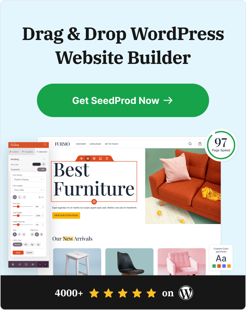
If you’re using WordPress, I recommend SeedProd to create a product landing page without breaking a sweat.

SeedProd is the best landing page builder for WordPress. It’s got everything you need to create a high-converting landing page, like drag-and-drop building, ready-made templates, and tons of cool features.
Check out this guide to learn how to create a landing page in WordPress with SeedProd.
Or if you want to dive right in…
Product Landing Page FAQs
What types of products can I sell?
You can sell any type of product on a product landing page. For example:
- Digital Products: Ebooks, online courses, templates, and workshops.
- SaaS Products: Information management tools, WordPress plugins, and project management tools.
- Membership Sites: Teaching courses, social media networks, and professional forums.
- Physical Products: eCommerce products, different variations of a single product.
What is the difference between a showcase page and a product page?
Product pages help businesses connect visitors to the right products and generate leads and sales. Showcase pages come in the middle of the funnel and educate users about the products and their benefits.
Which part of the product page you should optimize?
Optimize your product page title tags, meta descriptions, image alt text, and landing page copy to increase organic search traffic. Optimize image sizes to reduce page loading speeds.
I hope this guide helped you find some inspiring product landing page examples. For even more inspiration, check out the following landing page example showcases:
- 8 Blog Landing Page Examples + How to Make One
- 7 Social Media Landing Page Examples to Grow Your Company
- 7 Request a Demo Landing Page Examples Proven to Boost Leads
- 9 Top eCommerce Landing Page Examples to Drive Sales
- 9 Startup Landing Page Examples and How to Make One
- 7 Lead Generation Landing Page Examples + Optimizations
- 11 Real Estate Landing Page Ideas & Examples
- 10 Best Free Trial Landing Pages: Examples, Ideas + Tips
Thanks for reading! We’d love to hear your thoughts, so please feel free to leave a comment with any questions and feedback.
You can also follow us on YouTube, X (formerly Twitter), and Facebook for more helpful content to grow your business.