Want to know the difference between a landing page vs splash page?
Landing pages and splash pages are often used interchangeably, but they’re pretty different in their design and function. In this article, we’ll explain what a landing page and a splash page are and outline how each page is different.
| Criteria | Landing Page | Splash Page |
|---|---|---|
| Goal | Drive a specific conversion | Share quick info or gate access |
| Placement | Standalone URL, used in campaigns | Appears before main site content |
| Length | As long as needed to persuade | Very short, minimal copy |
| SEO | Can target keywords and rank | Minimal SEO value; keep non-intrusive |
| Testing | Commonly A/B tested | Rarely tested beyond UX checks |
| Typical uses | Lead gen, sales, webinars | Age verification, language, promos |
What Is a Landing Page?
A landing page is a standalone web page designed to promote marketing campaigns, a specific product or service, or boost your lead generation efforts. It’s the type of page users “land on” after clicking a link in an:
- Email campaign
- Social media post
- Ad from search results
- Other related websites
A powerful landing page design is the best solution for increasing conversion rates and lowering the cost of meeting your conversion goals. That’s because landing pages focus on guiding users to convert, with a combination of compelling content, social proof, and clever design.
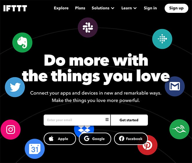
Landing pages can have different conversions goals, such as:
- Growing newsletter subscriptions
- Increasing webinar registrations
- Promoting content downloads
- Boosting competition entries
- e-Commerce product or service promotions
- Generating qualified leads
But their primary purpose is to increase conversions while supporting your business goals and improving your search engine traffic and leads.
What Is a Splash Page?
A splash page is a page on your website that appears before any other pages. They can appear as a static page that users have to click through to interact with or click an exit link. Or they can show as a popup that disappears after users meet the instructions.
In most cases, splash screens gather data about visitors, yet there is no universal purpose for how splash pages work. They can vary depending on your business niche or industry.

Most businesses use splash pages for the following purposes:
- Draw attention to a specific product or service
- Lead users to a specific page on the website
- Provide age verification
- Display a warning or disclaimer
- Share discount information
It’s also important to note that splash pages usually have a specific call to action (CTA).
Related: How to Create a Landing Page without a Website
Landing Page vs Splash Page: How Are They Different?
Now that you know what landing pages and splash pages are, how are they different? Here’s a detailed explanation of the difference between each type of page.
Length
First, landing pages and splash pages have different lengths.
A landing page can be long or short because it needs to include enough information to engage your visitors. If you only need a small amount of content to convince users to convert, then your landing page is likely to be short.
But if you need more relevant content, such as:
- Explainer videos
- Features and benefits
- Testimonials
- Countdown timers
- FAQs
- Contact information
Then, your landing page will be a little longer. In essence, a landing page can be as long as you need to generate conversions.
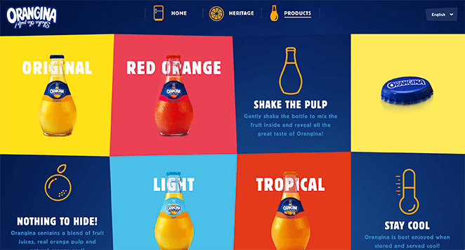
On the other hand, a splash page is typically about communicating something fast and specific, so it won’t need much content. In fact, splash pages are designed to be brief so users can quickly read and interact with them.
For example, a splash page may only include minimal copy, an image, and CTA to convey the information you want to share.

Purpose
Another way that landing pages and splash pages differ is their purpose. Splash pages often have a single, clear purpose that they can achieve with fewer words, including:
- Gathering data
- Audience screening
- Offer promotions
- Announcements
For example, a splash page designed to verify a visitor’s age may only have a short introductory sentence, a dropdown menu or checkbox, and a CTA button. Or, if you create a splash page to announce a promotion, you may only need an eye-catching headline, image, and CTA button.

Yet a landing page is designed to support your conversion goals, so its purpose is more often about generating leads and sales.
For instance, one purpose of a landing page might be to encourage visitors to download your lead magnet, allowing you to collect email addresses to grow your list.

Or, if you’re launching a new product, you can create a sales landing page explaining the benefits of choosing your product over your competitors.
Design Time
The length of time landing pages and splash pages take to design is another way that they are different. Since splash pages are short and have less information, they’re quicker to set up and publish.
But, depending on the type of landing page you make and the details you need to include, landing pages can take longer to plan, design, and build. For example, to get your landing page to rank well in search engines, you’ll need to carry out keyword research and optimize your content with the best SEO practices in mind.
You’ll also need to spend time creating compelling copy, sourcing high-quality images, and gathering customer feedback for social proof.
Accessibility
Now, let’s look at how visitors can access landing pages vs splash pages.
Since splash pages typically exist as part of a website, users will need to visit the website hosting them first to see them. Then, after entering the site, the splash screen is the first thing visitors see.
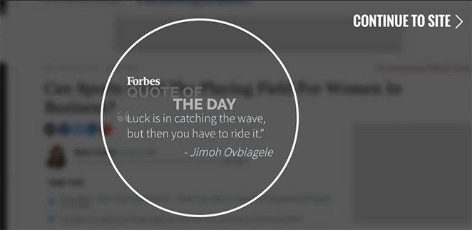
In contrast, you can visit a landing page in various ways. Because it’s a stand-alone web page, users need some way to click the URL to see its content.
There are several methods to attract potential customers to your landing page. For instance, you can send promotional emails with a link to the page, include a link in social media posts and even advertise your landing page through Google with search ads.

In the end, it comes back to user experience. Landing pages are tailored to convert users, while splash pages are designed to be quick and informative.
Landing Page vs Splash Page: Anatomy
If you’re thinking about creating a landing page or a splash page, you’ll need to know the essential elements to include. That way, you’ll have a much better chance of accomplishing your goals.
With that in mind, here’s what you should include on landing pages and splash pages.
Anatomy of a Landing Page
Landing pages are generally bigger to generate conversions with the least possible expense. So what you include on a landing page is different from that of a splash page.
Landing pages should include:
- A compelling headline to hook the reader
- Limited navigation to keep users on the page
- High-quality images and video for high engagement
- Social proof to build trust and credibility
- CTA to empower users to convert
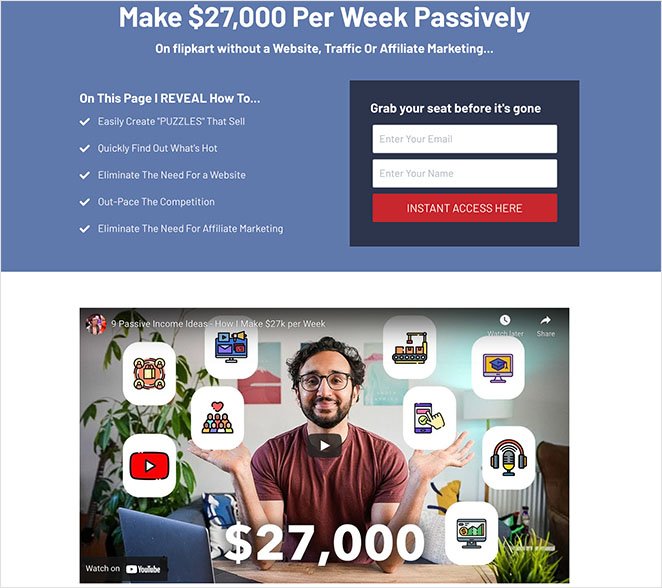
Check out our article: Anatomy of a Landing Page: 9 Essential Elements for a more detailed explanation of what to include.
Anatomy of a Splash Page
A splash page typically includes but is not limited to 3 main elements.
First are high-quality visuals. These are usually a visitor’s first introduction to your site, so they must be visually appealing, relevant to your online market, and consistent with your brand.
If your images don’t meet those requirements, visitors will likely exit your page soon after entering it.
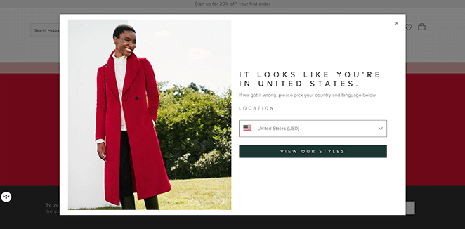
That said, there are several visual elements you can use other than relying on images. For instance, videos, animations, and product photography.
Next is your splash page copy, which needs to be short and actionable. Stay away from writing paragraphs of text, and instead, give users instructions directing them on how to act.
It’s important to note that most visitors will view it from a mobile device. So if you have huge blocks of text, you’ll discourage visitors from clicking through.
The third element to include is a CTA. Your CTA should direct visitors to do exactly what you want, such as confirming their age or viewing an offer.
A few other things to consider adding to your splash page include:
- Choices on how to enter the site
- Content warnings
- An option to exit your page
Which Should You Choose: Landing Page or Splash Page?
In the end, landing pages are more effective for driving conversions. But they often require more work to get right. Splash pages, however, are a great way to collect data and communicate important information and take less time to set up.
Choosing between the two assets depends on your business objectives. If all you need is to relay some crucial information, a splash page is a good choice.
But if you want to persuade your target audience to convert and become verified leads or paying customers, a landing page is the best choice.
FAQs on Landing Page vs Splash Page
We hope this article helped you learn the difference between a landing page vs splash page. You might also like this guide on a landing page vs sales page or creating a waitlist landing page in WordPress. Alternatively, you can learn to create a lead generation landing page.
Thanks for reading! We’d love to hear your thoughts, so please feel free to join the conversation on YouTube, X and Facebook for more helpful advice and content to grow your business.

