Are you looking for the best 404 page examples? And did you know that a great 404 page can increase your site conversions and boost revenue?
It might sound like a pretty wild claim. But a properly optimized 404 page has the power to transform lost site visitors into loyal, returning customers.
In this article, we’ll explore the best 404 error page examples we’ve discovered and why they work so well.
Before sharing the best 404 pages, let’s see why having a 404 landing page matters for your business.
What Is a 404 Error Page and Why Do You Need One?
You might already know that over time some website links go bad. It might be due to missing pages, deleting poor content, changing your web design or home page, or even changing your website’s permalink structure.
But here’s the thing…
Those deleted or moved pages will often appear in search engines or social media on their old URLs. So when someone users land on them, they’ll see a 404 error page showing a page not found message. This can also happen if they miss-type a URL or click on a broken or dead link.
With that in mind, take a good, hard look at your current WordPress 404 page design. Does it accurately reflect your brand?
If it doesn’t, you could be losing visitors and potential customers.
For instance, if your 404 error message page looks like this…
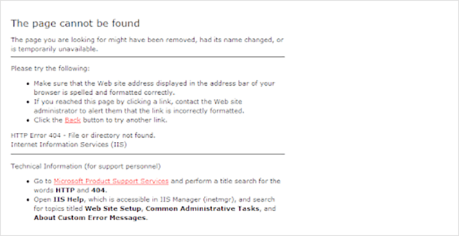
… it’ll put people off, and they might never come back.
Yet, if you optimize your 404 not found landing page with:
- Great images
- Excellent copy
- Helpful information and links
- Methods to collect email addresses
You can reduce your bounce rate and increase your website subscribers and conversions.
Now that you know what a 404 error page is and why it matters for your website, let’s look at the best 404 page examples. With a bit of luck, you’ll get some 404 design inspiration to help create your own custom 404 pages.
11 Best 404 Page Examples from Real Brands
The following 404 error page designs are taken from genuine brands online. We’ll explain why that particular design works and offer some tips for how to do it yourself.
- 1. Lego – Friendly 404 Page Design Inspiration
- 2. Slack – Scrolling 404 Page Not Found Example
- 3. Mantra Labs – 404 Screen with Redirection
- 4. 20th Century Studios – 404 Page with Movie Ideas
- 5. Figma – Interactive 404 Page Deisgn
- 6. Behance – 404 Page Example with Project Suggestions
- 7. eBay – 404 Page with Trending Deals
- 8. 9gag – Call-to-Action 404 Page
- 9. IMDB – 404 Page Design Inspiration
- 10. Ueno – Creative 404 Page Example
- 11. CloudSigma – Funny 404 Page Design
- 12. Brett Terpstra Simple 404 Page
- 13. Marvel Animated 404 Example
- 14. CSS Tricks 404 Page Design
- 15. Mailchimp 404 Page Examples
- 16. Broken Egg SeedProd 404 Page
- 17. SeedProd eCommerce Oops Page Not Found Template
- 18. SeedProd Sunset 404 Page Examples
- 19. SeedProd Funny 404 Page Examples
1. Lego – Friendly 404 Page Design Inspiration
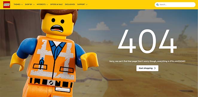
Lego’s 404 page is an excellent example of using humor and good branding to engage website visitors.
Users see a recognizable character, Emmet, who is sorry for not finding the page you’re looking for. He then tells you not to worry, reassuring you that everything is awesome, an excellent movie reference, and a nod to the lego movie song.
By that point, with the song buzzing through your head, he invites you to start shopping with a clear call-to-action (CTA) button.
The whole concept works because it’s friendly, recognizable, and completely on-brand.
To create a similar 404 page design, remove any technical language and replace it with something more human. Use words like don’t worry, oops, and sorry to reassure users the error page isn’t their fault.
You can also use images related to your brand so users know they’re almost in the right place. Then, with a CTA button, you can help them find what they’re looking for and keep them on your website longer. Including a search box or search bar is another great way to improve user experience and improve your SEO performance.
2. Slack – Scrolling 404 Page Not Found Example
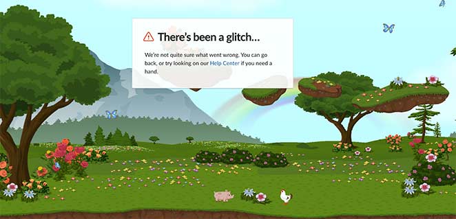
This custom 404 screen design from Slack offers a more interactive user experience than some of the other webpage examples in this article.
Upon landing on the page, you enter a magical landscape complete with trees, flowers, and even a rainbow off in the distance. Butterflies flit across the sky, and you can even see the odd piglet and chicken wandering around.
Even better, the entire page scrolls horizontally as you move your mouse cursor, revealing more lush scenes to enjoy.
It’s easy to think that reality glitched out for a moment, something Slack seems to think too, as you can see from their messaging.
The error message makes no mention of a 404 error. Instead, they use words and phrases that are easy for anyone to understand. It also suggests what you should do next: go back or look in the help center for a solution.
By giving users a choice, they keep them around on their website for longer instead of closing the tab.
3. Mantra Labs – 404 Screen with Redirection
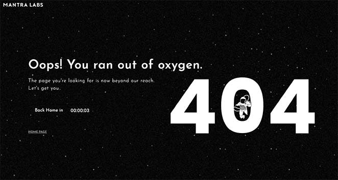
The custom 404 page design from Mantra Labs is a clever example of deciding out of the user’s hands.
On reaching the page, you see a simple illustration of an astronaut floating in space with the headline of “Oops! You ran out of oxygen.” The astronaut sits over the ‘0’ in 404 and slowly falls in. It’s like they’re falling into a black hole or floating out into space.
You then see a countdown timer ticking down until they take you “back home,” redirecting you to the website’s homepage. If you blink, you might miss the 404 page entirely.
The great thing about this example is there’s no time to think. In just 10 seconds, you head to the homepage, where you can look for the content you need, which is hardly enough time to decide to leave.
4. 20th Century Studios – 404 Page with Movie Ideas
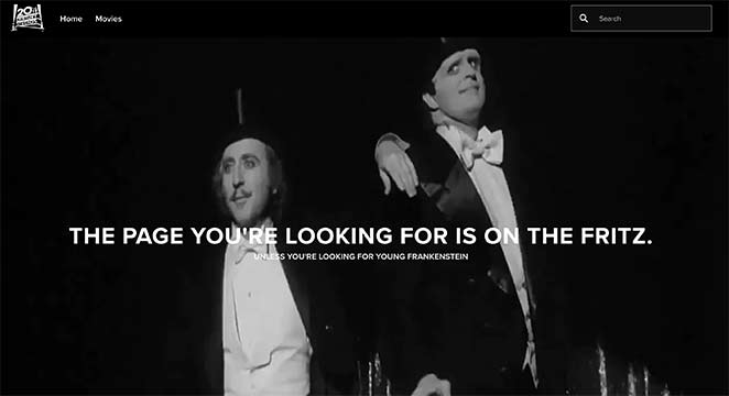
Another great example of creative 404 page branding done right is this one from 20th Century Studios. If you visit a broken link or removed article on their website, you’ll see a message and a still from one of their cult movies.
Further down the page, they suggest several movies from their collection where you can click to learn more and buy a copy.

This is a fantastic way to keep users engaged on the website, naturally progressing to qualified leads.
You can use a similar approach for your site by suggesting popular articles or products.
For example, with SeedProd’s custom WooCommerce blocks, you can easily add a product grid to your 404 screen to display recent products, sale products, best-selling products, and more.

Now you can make sales right from your 404 page!
5. Figma – Interactive 404 Page Deisgn

We love Figmas’ 404 page design for its simplicity. The page is pretty straight to the point, minimal, and has no extra bells and whistles.
Unless, of course, you consider that you can manipulate and play with the anchor points on the 404 text.
While at first, this might seem pointless, it’s pretty clever. This little design game perfectly encapsulates Figmas’ branding as a design tool. You get an instant idea of what you can do with it, encouraging you to find out more.
Getting more info isn’t hard, either. Figmas’ 404 page includes a navigation menu and helpful links to find what they need quickly.
6. Behance – 404 Page Example with Project Suggestions
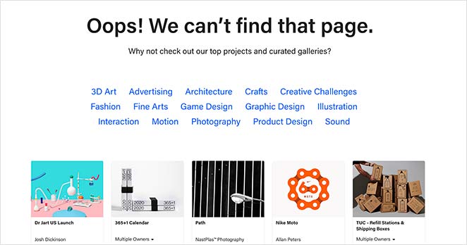
Behance, similar to Dribbble, provides another great 404 page example that helps users find the correct information.
The page has a simple headline of “Oops! We can’t find that page” with a subheading suggesting visitors check out their curated project galleries.
Under the headline, you can click various project categories to head to the right page. Then you have the option to browse several featured projects for inspiration.
With this page, users don’t need to hang around. If you don’t land on what you were looking for, there are so many suggestions on offer to help you find something similar or better.
7. eBay – 404 Page with Trending Deals
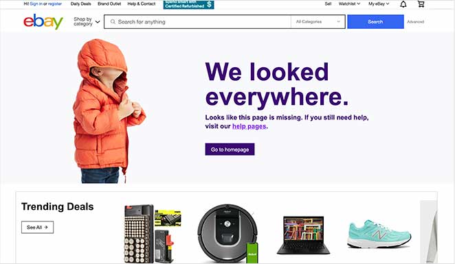
eBay is a popular eCommerce website that leverages its custom 404 error page message to showcase the hottest products.
On visiting the page, you see a fun image and quirky headline saying they “looked everywhere” for your desired page. This helps users relate to the situation. It then links to their homepage with an eye-catching button.
After, they go on to suggest looking on their help pages if you still need help. Or, you can go straight to browsing their trending deals, which most users are probably looking for anyway.
By organizing their 404 page design this way, they offer more opportunities for people to keep using their site without being too pushy.
8. 9gag – Call-to-Action 404 Page
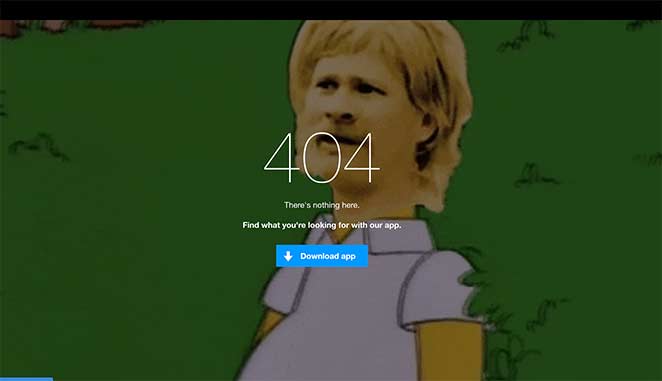
Knowing your audience is crucial for converting them into paying customers. If you don’t know what they like, you can’t offer the content, products, and services they crave the most.
In this 404 error page, 9gag demonstrates that they know their audience well.
Their 404 landing page features a popular meme which the majority of their users will be familiar with. This leaves little doubt that you’re in the right place, even if it’s not the page you were looking for.
What follows is a simple message and a CTA to download their app, an instant solution for getting more business leads.
9. IMDB – 404 Page Design Inspiration
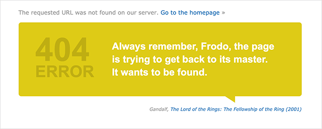
Most people know that IMDB is the go-to website for movie news and suggestions. So it’s no surprise that their 404 screen is film-focused.
On entering, users can see a custom quote from a popular film. In the above example, it’s a well-known quote from Gandalf in The Lord of Rings.
The film title beneath the 404 message is linked to its respective page, giving people the chance to learn more. Or, you can navigate to the homepage to continue browsing. Either way, the users remain on the website.
10. Ueno – Creative 404 Page Example
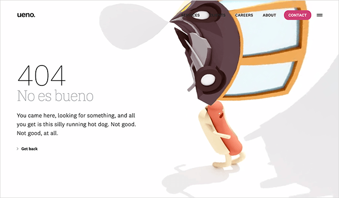
Another way to use your custom 404 page is to showcase your brands’ creativity. That’s what Ueno, a full-service agency, did with this 404 page example.
You can’t see the full effect in the screenshot above.
The image is an animation of a hotdog running through strange and surreal scenery. What’s more, each time you refresh the page, you’ll see a different message explaining the situation.
This 404 page demonstrates the full range of the agency’s creativity, which is perfect for potential clients. Plus, getting back to the homepage is easy with a well-placed “go back” link.
11. CloudSigma – Funny 404 Page Design
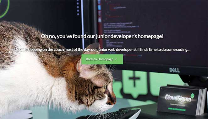
Cloud hosting isn’t necessarily a fun topic to showcase, even if it’s a handy service for many website owners. That’s why we love this 404 page design from CloudSigma.
Their tongue-in-cheek messaging gives visitors a peek behind the scenes of life as a developer. Yet, the humor is light-hearted enough not to cause any offense.
The entire page creates an engaging and friendly impression, making you click through to the homepage to learn more.
Hopefully, the 404 page examples above provide enough inspiration for you to go ahead and make one for your website.
12. Brett Terpstra Simple 404 Page
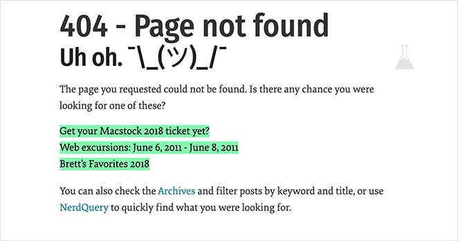
If your 404 page isn’t well designed, it could signal a dead end for visitors and offer them nowhere else to go. This can result in losing a ton of potential customers.
Instead, you can do something like this 404 page from Brett Terpstra. He immediately recognizes something went wrong, and instead of leaving it at that, he offers suggestions for what you might be looking for.
While the page isn’t flashy, it’s super-useful.
You can create something similar by looking at your website analytics to find the most articles people search for.
13. Marvel Animated 404 Example
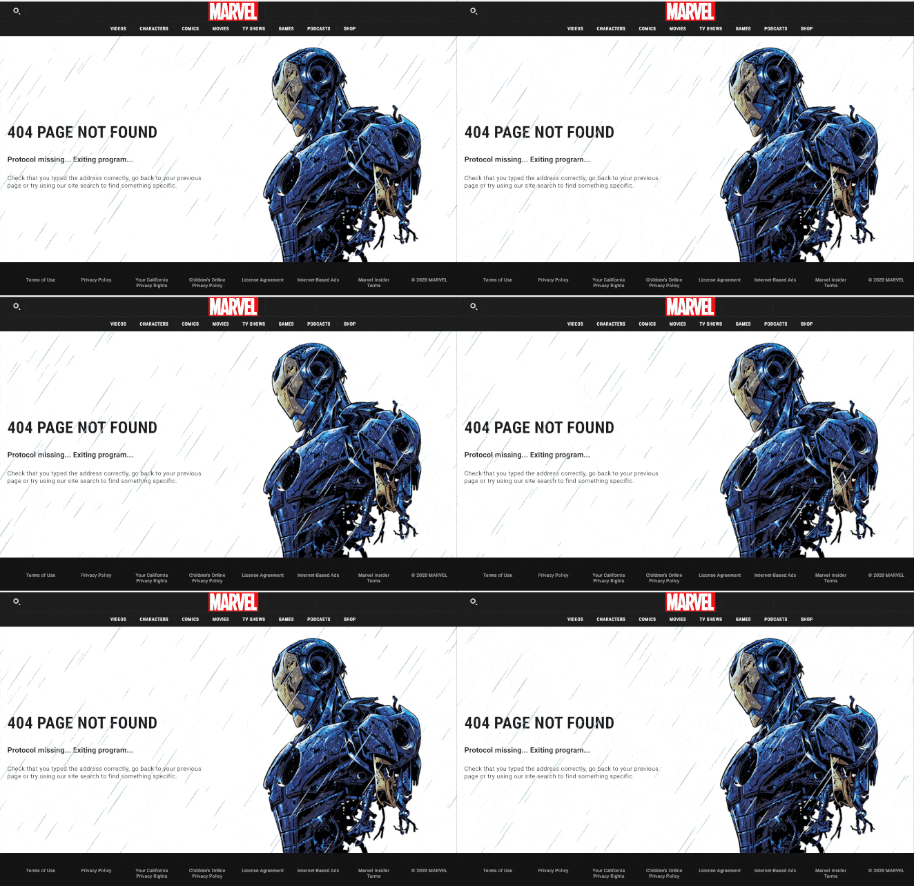
Marvel’s 404 pages come in all shapes and sizes. In fact, they have many error pages themed around different characters in their universe.
This example has a 404 page animation about Iron Man that many fans will relate to.
The movement of the animated gif draws your eye to the instructions. And that encourages visitors to either hit the back button or use their search function to find what they’re looking for.
14. CSS Tricks 404 Page Design
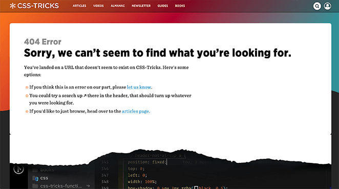
This functional yet straightforward 404 page from CSS Tricks is an excellent example of knowing your audience well. The page has a rip at the bottom, revealing its CSS, which will resonate with many developers.
As you can see, they also include links to relevant pages to keep people from exiting their website. Plus, internal linking is an excellent way to boost your SEO.
15. Mailchimp 404 Page Examples
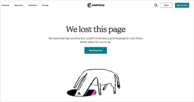
When things go wrong, often the best way to handle the situation is to come clean and admit it’s your fault. That’s what Mailchimp does with their 404 page design.
The page features an animated gif of a character “searching” for what you’re looking for. Plus, the message is candid about having lost the page. That said, they offer a solution to readers by showing a button leading visitors back to their homepage.
16. Broken Egg SeedProd 404 Page

The broken egg 404 page from SeedProd is a straightforward design with an easy, customizable message. It includes an area for your site logo, a navigation menu, and a CTA directing users back to your homepage.
The background image is an excellent sign that something doesn’t work. And the menu links make for easy navigation to other areas of the website.
17. SeedProd eCommerce Oops Page Not Found Template
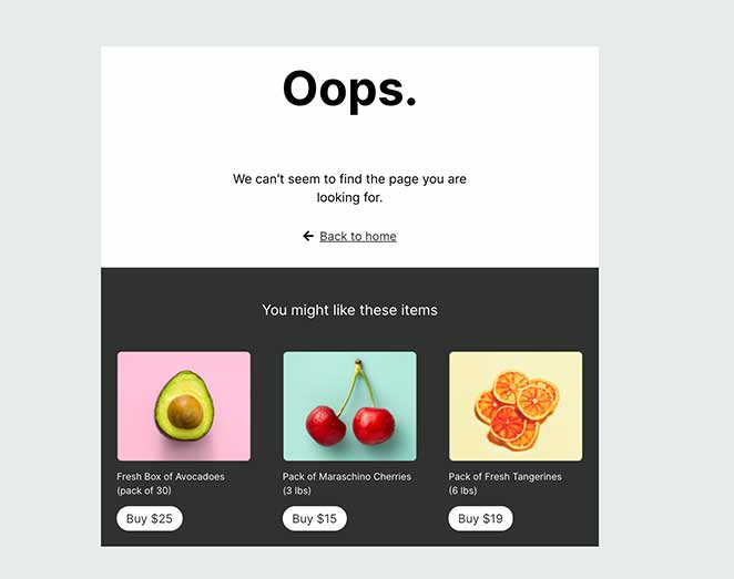
eCommerce websites will find this 404 page useful. It has a simple message declaring something went wrong but also includes product suggestions to keep users browsing.
18. SeedProd Sunset 404 Page Examples

In this design from SeedProd, you can create a stunning, full-screen 404 page that makes an impact. The full-screen display immediately grabs attention with the warm, sunset image. Users can then click the large “home” button to find their way back to your homepage.
19. SeedProd Funny 404 Page Examples
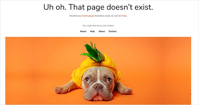
Who can resist a cute dog in a pineapple costume?
In this bright and cheerful 404 page design, it tells you the page doesn’t exist. But with a bit of help, you can head to the homepage that does exist.
It also includes a handy navigation menu so users can find other pages on your website easily.
404 Page FAQ
What should be on a 404 page?
When creating a 404 page, you should first tell people that the page they’re looking for can’t be found. You can then enrich the page with helpful links to other pages on your site or even add an optin form to sign up for your email newsletter.
How do I redirect a 404 page?
You can use an SEO plugin to redirect 404 error pages to another page on your website. We recommend using All in One SEO, as it’s the easiest and most user-friendly WordPress SEO plugin. Check out their guide on How to Easily Find and Fix 404 Errors in WordPress.
How do you make a good 404 page?
When it comes to building your custom 404 pages, there are several options.
Many WordPress themes include ready-made 404 page designs as part of the theme package. So you could see if the theme you currently use has that functionality.
You could also hire a developer to design and code a 404 page or 404 page animation, but this could become expensive.
Or, you can create a 404 page using a landing page builder like SeedProd.
SeedProd is the best drag-and-drop landing page builder for WordPress. It makes it super-easy to create any landing page and provides an easy drag and drop builder for creating pages without needing code.
It also comes with a wide variety of landing page templates you can customize in the visual builder. Plus, the plugin is bloat-free, with minimal code, so that it won’t slow down your website.
So what are you waiting for?
And if you liked this article, please follow us on Twitter and Facebook for more useful content to help grow your business.


