Most landing pages are designed for desktop computers, but what if your potential customers are on mobile?
It’s hard to show device-specific content without using a separate URL. So in this announcement, we’re excited to offer the ability to do just that!
Now you can create one page that works perfectly across all devices. And as a result, you can serve completely different content based on any screen size.
There are several more game-changing updates for all paid SeedProd plans, so let’s dive in and check out what’s new.
Device Visibility Settings
Around 55% of consumers in 2020 purchased something online using a mobile device. But do you really want to create 2 different versions of your website to serve that audience?
SeedProd’s new Device Visibility settings are the ideal solution to this problem.
With Device Visibility, you can show different content on a single URL depending on whether or not users view it on a mobile or desktop device. This means that visitors will only see the content relevant to them, and they’ll convert more because of it.
The best part about Device Visibility is how easy it is to use.
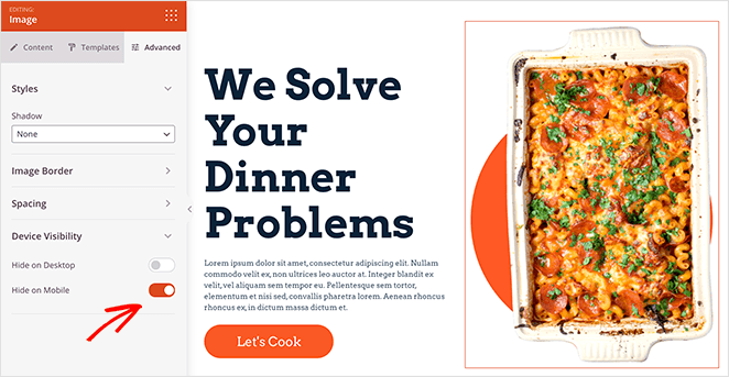
Just click any element on your page, click the Advanced tab in the left-hand panel, and set that element to hide on desktop or mobile. It doesn’t get much easier than that!
In your page preview, the element appears greyed out to show that it’s hidden.
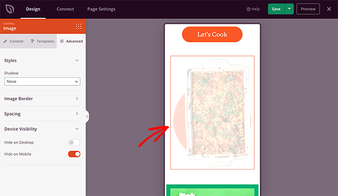
But once you publish the page, you’ll no longer see it on your chosen device.
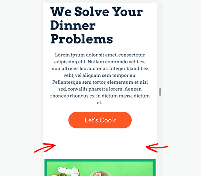
For example, image-heavy websites can hide unnecessary photos to speed up your mobile site and make your content easier to navigate. And by doing this, you can improve engagement and conversions for each type of audience.
Or, you can show larger, easy-to-tap CTA buttons on mobile and hide them on the desktop version of your website.
Navigation Menu Updates
Next is a shiny new update to SeedProd’s navigation menus. Previously, you had to enter each menu item manually, which was time-consuming for busy website owners.
With that in mind, we’ve reimagined menus, so you can use the built-in WordPress menu system.
This new block makes it easy to add menus on landing pages without changing your existing code. It’s also mobile-responsive, so it looks great across all devices, including smartphones and tablets.
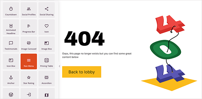
Simply pick a menu from your existing WordPress menu in the settings panel or click the Menus Screen link to set up a new menu.
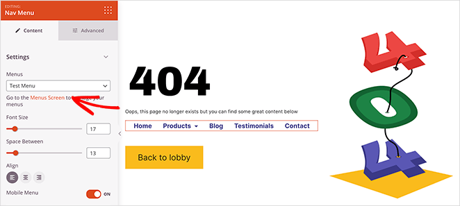
From there, you can change the alignment, set the font size and toggle the option to show a mobile menu.
Then in the Advanced tab, you can choose a vertical or horizontal list layout, change the menu color, and of course, set your device visibility.
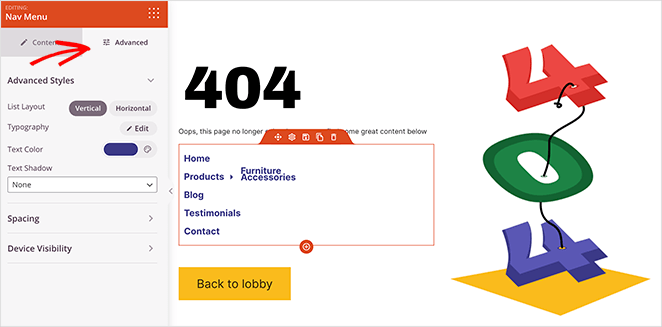
We think this is an excellent feature to use on your custom 404 pages. That way, you can quickly add links for users to find what they’re looking for.
And the result? They stay on your website longer, increasing the odds that they’ll convert.
You can also use navigation menus on thank you pages so users know where to head after buying a product or joining your email list.
But don’t worry. Any pages created with the old navigation menu will continue to work as intended. Only new blocks will show the fresh, updated menu.
New Search Form
Now let’s talk about how hard it is sometimes to find the information you need. Whether you’re looking for contact details or a quick guide on doing something, many sites don’t make that info easy to access from landing pages.
After all, it makes sense to keep your pages optimized for conversions. But in our experience, you can help your customers more by giving them what they need right away.
That’s why we made the new Search Form block.
This discreet search box lets you add a quick search function to landing pages. So when visitors search for something specific, they’ll see the results on your default WordPress theme’s search page.
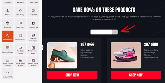
You can completely customize your search form content by choosing custom placeholder text, icons, sizing, and more.
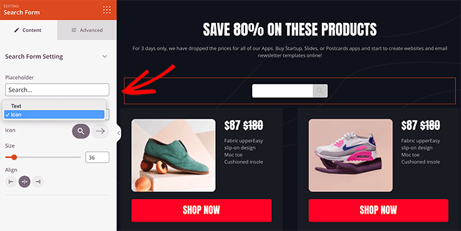
Then from the Advanced tab, you can match the styling to your website’s color scheme with custom background, text, and button colors. And like every SeedProd block from today, you can set the visibility to display on desktop, mobile, or both.
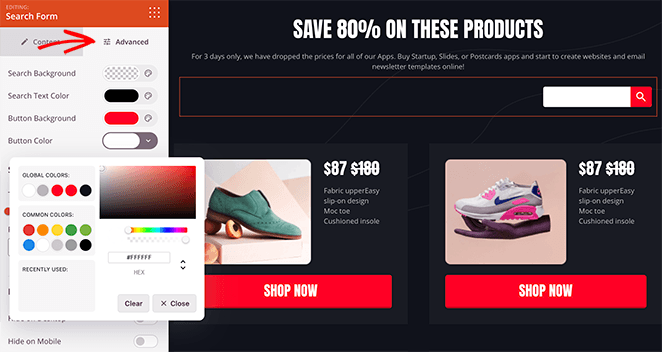
For example, eCommerce website owners with hundreds of pages can use this feature to help shoppers find the right products for them. And if it’s not a feature you want to show on mobile, you can easily turn it off for those devices.
Update Your SeedProd Plugin Today
That’s all for this update. We hope you enjoy these features as much as we do. And don’t fret if what you’re eagerly waiting for isn’t in today’s announcement. We have so many exciting things in the works, so stay tuned.
All of these features are available now for all SeedProd paid plans, so update your SeedProd plugin to try them for yourself.
These updates happen because of your input. Please, keep the feature requests and feedback coming and reach out to us with your thoughts!
And if you’re still using SeedProd lite, upgrade today for all the benefits of creating high-converting landing pages in WordPress.
Get Started with SeedProd Today!
As always, thank you for your continued support in making SeedProd the best WordPress page builder plugin.

![seedprod-announcement-device-visibility - SeedProd [Announcement] Device Visibility, Updated Nav Menus + Search Forms](https://www.seedprod.com/wp-content/uploads/2021/08/seedprod-announcement-device-visibility.jpg)


