Looking for inspiring blog layout examples?
I’ve been there – you find an interesting post, but the blog is just too hard to look at. Maybe it’s clunky, maybe it’s overwhelming, but either way, you don’t stick around for long.
The truth is, a well-designed blog layout is just as important as the content itself. It’s the first thing people see, and it can make a big difference in whether they stay or click away.
That’s why I’ve put together this collection of 21 blog layout examples I really like. Hopefully, they’ll give you some ideas for your own blog design.
Key Elements of the Best Blog Layouts
Before we dive into the examples, let’s break down the essential ingredients of a great blog layout. Think of these elements as the foundation of your blog’s design:
- Header: This is the top section of your blog, usually containing your logo, navigation menu, and search bar. It’s like a signpost for your website, helping visitors navigate it.
- Content Area: This is where the magic happens. Your blog posts, images, videos—all the good stuff lives here. A well-designed content area makes your posts visually appealing and easy to read.
- Sidebar: Not every blog layout uses a sidebar, but they’re helpful for including widgets like “About Me,” social media feeds, or category lists. Think of it as a way to offer additional information and encourage engagement.
- Footer: You know that section at the very bottom of the page? That’s the footer. It usually houses copyright information, contact details, and sometimes additional links.
Responsive Design is Non-Negotiable
Your blog layout also needs to look amazing on every device—from desktops to smartphones and tablets. Responsive design ensures that your website automatically adjusts to different screen sizes, providing a seamless experience for all visitors.
Now that you know the building blocks of an effective blog layout, let’s get inspired by some real-world examples. Since it’s a long list, I’ve broken the examples down by blog type so it’s easier to find what you need:
Personal Blog Layout Examples
You know those blogs that just feel like you’re having a conversation with a friend? The ones that are packed with personality and make you feel like you really connect with the person behind the screen? These are those blogs.
1. The Everywhereist

The Everywhereist is a blog that immediately draws you in with its stunning travel photography. I love how they use large images to give you a glimpse into each post. The overall design is clean and uncluttered, making it really easy on the eyes.
The layout itself is very straightforward, with a simple header, a sidebar for extra information, and a footer at the bottom. Everything is clearly labeled, so you always know where you are on the site.

Plus, The Everywhereist is just as enjoyable to browse on my phone as it is on my laptop, which is important to me. It’s clear they put a lot of thought into the user experience, and it shows.
2. Jen Carrington
I’m a big fan of websites that feel really personalized, and Jen Carrington’s blog totally nails that vibe. It’s like stepping into her world – from the soft color palette and elegant fonts to the way she seamlessly blends her passions for style, business, and travel.

I love how her personality shines through in every little detail, like the handwritten font on her logo and the way she uses personal anecdotes in her blog posts. It feels like you’re getting advice from a friend, not just reading another generic blog.

And while her design is beautiful, it’s also super functional. The layout is clean and easy to navigate, with clear categories and a prominent search bar. Plus, it looks just as great on my phone as it does on my laptop.
Jen Carrington’s blog is proof that you can have a website that’s both stylish and user-friendly.
3. Design for Mankind

Design for Mankind has a really clean, modern look that perfectly matches its content. I like the crisp color scheme, the mix of fonts they’ve used, and the high-quality images that give the blog a polished feel.

The layout is straightforward and easy to navigate, with a clear header, a sidebar for additional information, and a footer that’s actually useful (not just an afterthought!).

It’s also super easy to use, which is always a big plus in my book. It’s mobile-friendly, the layout makes everything easy to read, and it loads quickly, so you can get straight to the good stuff.
Lifestyle Blog Layout Examples
I’m always on the lookout for blogs that feel both aspirational and approachable, and this next category is full of them! Get ready for a dose of style, inspiration, and clever design.
4. The Chriselle Factor
The Chriselle Factor nails that chic, sophisticated vibe right from the start. The blog uses eye-catching images and an elegant, neutral color palette to create a visually appealing experience. I especially like how they incorporate high-quality visuals without sacrificing readability.

The layout is clean and well-organized, featuring a simple header, a varied grid layout, and a footer with all the essential links. Navigation is a breeze, and the ample spacing makes everything easy to read.

Plus, The Chriselle Factor is fully responsive, so it looks fantastic on any device. It’s clear they’ve prioritized a seamless user experience – the site loads quickly, and all the interactive elements are clear and intuitive.
5. Ape to Gentleman
Ape to Gentleman reminds me of those really nice men’s magazines – you know, the ones with amazing photography and articles that actually make you want to up your style game. The whole blog has this classy, put-together vibe, with a clean layout and fonts that feel classic and easy to read.

What I really like is that it’s super easy to find what you’re looking for. The menu is straightforward, the sidebar has handy links to popular articles, and even the footer is well-organized. It’s one of those blogs that just feels really well thought-out.

And even though it looks pretty fancy, it’s surprisingly easy to read. They use a lot of white space, so it doesn’t feel cramped or overwhelming, and it looks just as good on my phone as it does on my computer. Ape to Gentleman proves that you don’t have to sacrifice style for practicality.
6. Mind Body Green
Mind Body Green just makes you feel calmer the second you land on the page. The colors are really fresh and soothing, and the fonts they use are clean and easy to read. I like how they’ve chosen really nice photos that fit with their whole vibe of wellness and taking care of yourself.

The layout is super straightforward. The menu is easy to figure out, and they’ve got a handy footer with social media links and even some recommended pages that you might like.

The whole site loads quickly, and I never have any trouble reading the articles or finding what I’m looking for. Mind Body Green is definitely a blog that practices what it preaches about creating a stress-free online experience.
Travel Blog Layout Examples
Confession: I’m a total sucker for a gorgeous travel blog. You know, the kind that makes you want to pack your bags and hop on the next flight out? These next examples definitely fit the bill.
7. Young Adventuress
Young Adventuress is one of those travel blogs that just makes you want to pack your bags and go explore! The homepage is full of beautiful photos, and each post has a little teaser that makes you want to read more. You can easily get lost scrolling through all the amazing places she’s been.

Finding your way around the site is super easy. They’ve got a clear menu at the top, and if you want to see older posts, they’ve got those little numbered pages at the bottom. There’s a search bar if you’re looking for something specific and a list of categories to help you narrow things down.

I also like that it’s easy to connect with the blogger behind the adventures. They’ve got an “About” section with a photo and a little bit about her story, and you can find links to her social media pretty much everywhere.

It’s clear they’ve put a lot of thought into making the blog user-friendly, and it definitely pays off.
8. Backpacker Banter
Backpacker Banter feels really approachable, like reading a friend’s travel journal. The homepage is clean and easy to look at, with the newest posts front and center.

Each post has a great photo and a title that makes you want to learn more. They even give you a little preview of what the post is about, which is helpful for deciding what to read.
The sidebar is ideal for finding your way around. You can check out the “About” section to learn more about the person behind the blog (they even have a picture), find them on social media, or browse posts by category.

I like the “Recent Posts” and “Popular Posts” sections, too – perfect for when you need a little travel inspiration.

Of course, they’ve got all the usual stuff, like a menu at the top, more links at the bottom, and even some ads (hey, you gotta keep the lights on).
Overall, Backpacker Banter is a great example of a blog that’s both visually appealing and easy to use.
9. The Blonde Abroad
It’s easy to lose yourself scrolling through The Blonde Abroad, with its beautiful photos and tempting previews of each blog post. They’ve got this really nice grid layout that showcases all their latest adventures – you’ll want to click on every single one.

I like that they’ve covered all the basics, like a menu at the top, a search bar if you’re looking for something specific, and a bunch of helpful links down in the footer. They even have a spot to sign up for their email list if you want to stay updated.

But what really makes this blog stand out is the vertical sidebar. They’ve got a little bit of everything over there – a quick “About” section with a picture of the blogger and even sections for recent posts, popular posts, and destination guides.

It’s clear they’ve spent a lot of time making it easy for readers to find what they’re looking for.
Creative Blog Layout Examples
Sometimes, you just want to see a blog that breaks the mold and tries something totally different. These next examples get major creativity points from me.
10. Unheard Voices
Unheard Voices: Narratives of Migrant Women of Mumbai is a blog with a powerful mission—to share the stories and aspirations of migrant women workers. The way they’ve designed their website is just as unique as their content. Instead of a typical blog layout, they use an interactive world map to let you explore these powerful stories.

Each marker on the map represents a different woman’s experience, particularly during the COVID-19 pandemic in Mumbai. You can click around to learn about their lives, their challenges, and their hopes for the future. It’s a really immersive way to understand the systemic challenges these women face.

Of course, they still have the usual stuff like a menu, about page, and links to more information. But the visual map is definitely the heart of this blog, and it’s a great example of how a creative layout can make a real impact.
11. The House That Lars Built
The House that Lars Built is one of the most colorful and creative blogs I’ve ever seen. The photos are amazing, the fonts are super fun, and the whole thing just makes you happy to look at it.

You can tell right away that it’s run by someone who loves what they do.
Even though there’s a ton of stuff going on, it’s actually really easy to find your way around. The menu is straightforward, and if you’re looking for something specific, you can just use the search bar.
They’ve got blog posts, DIY projects, recipes, and even a shop where you can buy Lars’s stuff – it’s pretty cool.

If you’re looking for a blog that’s both inspiring and fun to browse, definitely check out The House that Lars Built. It’s proof that a website can be bold and colorful without being confusing or overwhelming.
12. Mammoth Media
I’m always a bit wary of websites that look overly slick—like they care more about being flashy than delivering substance. But Mammoth Media’s blog surprised me. It’s definitely got a bold, edgy vibe – think black backgrounds, white text, and those unexpected pops of color. But underneath all that, it’s actually a really well-designed blog.

One of the things I appreciate most is how fast it loads. As someone who’s guilty of clicking away if a page takes too long, I can tell you that speed makes a difference. Plus, the layout itself is super easy to navigate. The articles are displayed in this clear grid format, and they’ve got these big, eye-catching thumbnails that make you want to click.

Mammoth Media clearly knows its audience. It’s all about video and visual storytelling, and the blog reflects that. Video is integrated seamlessly throughout the site, so it feels like a natural extension of its content.
Simple Blog Layout Examples
As much as I love a visually stunning website, sometimes you just need a break from all the bells and whistles. These minimalist blogs prove that simplicity can be incredibly effective.
13. James Clear
James Clear’s blog is a masterclass in minimalist design. It’s incredibly simple, but that’s exactly what makes it so effective. The focus is entirely on the content—his insightful articles on habits, decision-making, and personal growth. You won’t find any flashy visuals or distracting elements here, just clear, easy-to-read text and a straightforward layout.

The blog page features a clean, uncluttered list of his latest articles, each with a concise title and a link to read more. The navigation is super intuitive – a simple menu at the top takes you to different categories or to his popular “About” page.

It’s all about removing any barriers between the reader and the information they’re looking for.
It’s clear that James Clear understands that less is often more. His blog is a refreshing reminder that you don’t need a complicated design to make a big impact. Sometimes, the most effective approach is to simply get out of the way and let the content speak for itself.
14. Zen Habits
Zen Habits is a blog that truly lives up to its name. The design is clean, uncluttered, and instantly calming. It’s all about simplicity and clarity, allowing you to focus on the content without any distractions.

The homepage features a single-column layout, with Leo Babauta’s latest posts presented in a straightforward, chronological order. Each post title is a direct link to the article, inviting you to dive right in.
There’s a distinct lack of visual clutter – no flashy images or fancy graphics here, just thoughtful writing in a serene online space.

Zen Habits is a great example of how a minimalist design can enhance the message. By stripping away everything but the essentials, the blog encourages mindfulness and intention – values that are at the heart of its philosophy.
15. Copyblogger
Copyblogger’s blog knows exactly who its audience is: people who care about words. And its design reflects that focus on content above all else. The layout is clean, straightforward, and free of any unnecessary distractions – no flashy visuals or design elements competing for your attention.

The homepage presents a simple, scrollable list of their latest articles. Each post title is clear, concise, and immediately tells you what the article is about. The typography is sharp and easy to read, making for a comfortable reading experience.

While some might call it minimalist, Copyblogger’s blog feels more like it’s intentionally getting out of the way. It’s a blank canvas for their expert advice on writing, content marketing, and online business – letting the power of their words take center stage.
Fashion Blog Layout Examples
Get ready for a serious dose of style inspiration! These fashion blogs have mastered the art of using design to showcase their unique aesthetics.
16. Color Me Courtney
Color Me Courtney’s blog always brightens my day. It’s impossible not to smile when you see her website – it’s just so full of life and positive energy. The moment I land on her homepage, I’m greeted by this explosion of color and personality. Courtney’s love for bright hues and bold patterns is contagious, and it makes her blog a total joy to browse.

I love how she uses a clean, easy-to-navigate layout that lets her photos shine. The grid format is perfect for showcasing her fashion sense, and each post preview gives you a taste of the fun content inside.

More than just a fashion blog, Color Me Courtney celebrates individuality. It reminds readers that it’s okay to stand out and embrace their own unique style—a message perfectly conveyed through her vibrant design choices.
17. He Spoke Style
I’m a sucker for a website that looks really clean and put-together, and He Spoke Style definitely delivers. It’s got this cool, minimalist vibe – think lots of black and white, sharp photos, and not a lot of clutter. It just feels classy, you know?

One of the first things I noticed was how easy it is to find what you’re looking for. The latest posts are laid out in this nice grid, and each one has a great photo and a title that tells you exactly what it’s about. Plus, it’s super easy to use on my phone, which is a major plus in my book.

He Spoke Style proves that a website doesn’t need a fancy design to look good. Sometimes, keeping things simple is the best option—it lets the content and the photos speak for themselves.
18. The Zoe Report
The Zoe Report feels instantly glamorous—like flipping through the pages of a high-end fashion magazine. The first thing I noticed was the use of bold, eye-catching photography. They’re not afraid to take up space with those big, beautiful images, and it definitely pays off.

The layout is clean and well-organized, making it easy to browse through their articles on fashion, beauty, and lifestyle. I like how they use a grid format to showcase different categories, and the headlines are super clickable—they always draw me in.

Overall, The Zoe Report feels polished and professional but not intimidating. It’s definitely a fashion blog I turn to when I need some style inspiration or want to stay up-to-date on the latest trends.
Business Blog Layout Examples
Who says business blogs have to be boring? These examples prove that even corporate websites can have personality and style – without sacrificing professionalism, of course.
19. Tushy
Okay, I have to admit, I was intrigued by Tushy’s blog from the name alone! And their blog design definitely lives up to their brand personality—it’s fun, a little edgy, and totally on-brand. They’ve ditched the typical corporate blog look for something way more playful and engaging.

I love how they use bold colors, eye-catching graphics, and even a touch of humor throughout the design. It doesn’t feel stuffy or boring at all. Plus, the layout is surprisingly clean, considering all the personality they’ve packed in. It’s easy to navigate, and the articles themselves are formatted in a way that makes them a breeze to read.

Tushy’s blog is proof that a business blog doesn’t have to be boring. They’ve done a great job of creating a space that feels both informative and entertaining—perfect for their target audience.
20. OptinMonster
As someone who spends a lot of time reading blog posts about digital marketing, I really appreciate it when a website makes the experience easy and enjoyable. OptinMonster’s blog definitely gets it right. The layout is clean and organized, and the focus is right where it should be—on the content.

I love how they use clear headings, concise paragraphs, and plenty of white space to make their articles super-readable. Plus, they’ve got those handy little social sharing buttons on the side, so it’s easy to spread the knowledge.

The overall design is professional and trustworthy, which is important for a company that specializes in conversions and lead generation.

It’s clear they’re not just talking the talk when it comes to creating a user-friendly website.
21. HubSpot
I have to give props to HubSpot – their blog is a masterclass in content marketing, and their layout is a big reason why. What I love most is that it just feels welcoming and easy to navigate, even though they cover a ton of different topics related to sales, marketing, and customer service.

They’ve nailed that balance between visual interest and readability. The homepage features a mix of featured articles with large, eye-catching images and a grid layout that lets you quickly scan through their latest posts. Plus, they’ve got those handy topic filters, so you can zero in on the stuff you’re most interested in.

Honestly, HubSpot’s blog always leaves me feeling informed and inspired. It’s a great example of how a well-designed layout can elevate your content and keep readers coming back for more.
Tips to Improve Your WordPress Blog
Okay, so now you’ve seen a bunch of awesome blog layouts – pretty inspiring, right? But maybe you’re also thinking, “How do I actually make my WordPress blog look like that?”
I get it – I’ve totally been there. Here are a few resources I’ve found that are really helpful for making your WordPress blog look amazing:
- How to change blog layout in WordPress
- Best WordPress blog plugins
- Blog landing page examples
- How to make your blog look like a website
- How to create a blog page in WordPress
- How to promote your blog
Ready to Give Your Blog a Makeover?
So, we’ve looked at a TON of awesome blog layouts, and hopefully, you’re feeling inspired to give your own blog a little refresh. As you’ve seen, a good layout can really make a difference. It’s not just about making things look pretty – it’s about making your blog easy and enjoyable for people to read.
Think about the blogs that you love to visit. What is it about their design that keeps you coming back? Use those as inspiration and start thinking about how you can make your own blog even better.
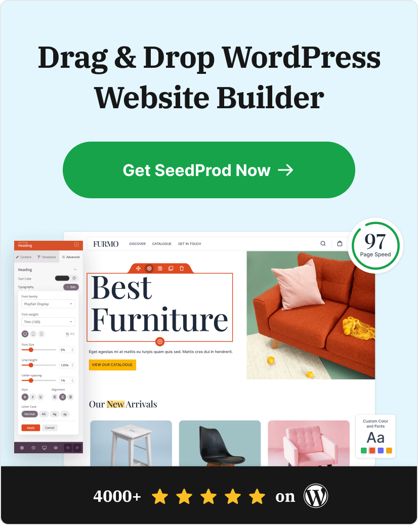
And if you’re looking for an easy way to create a beautiful, professional-looking blog (without needing to know any coding), definitely check out SeedProd. It’s a game-changer.
Thanks for reading! We’d love to hear your thoughts, so please feel free to leave a comment with any questions and feedback.
You can also follow us on YouTube, X (formerly Twitter), and Facebook for more helpful content to grow your business.