You only have 50 milliseconds to make a first impression on someone visiting your website. That’s barely enough time to blink, so your layout really matters.
I’ve built a lot of websites over the years, and one thing that always makes the biggest difference is the layout. It’s what helps visitors feel confident, stay longer, and actually take action.
I’ve worked on everything from landing pages to full business sites, and the layout is often what makes or breaks the first impression. These are some of the most effective website layout examples I’ve used or bookmarked for inspiration.
Table of Contents
What is Website Layout?
Your website layout is how your website looks and how it’s organized. A good website layout means your visitors can easily find what they’re looking for and understand what your website is about.
If a website is confusing or hard to use, people will leave before they even read anything. In fact, the research suggests that they’ll stay for no longer than 15 seconds.
That’s why yours should include these key layout elements:
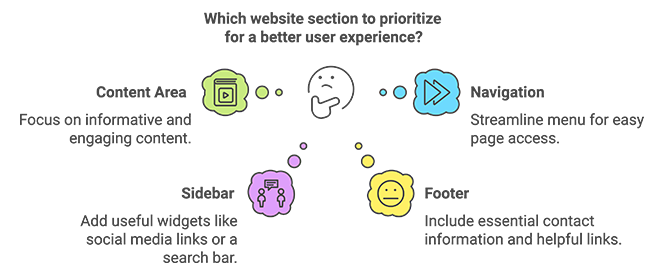
- Header: The top of your website. It usually has your logo, a short description, and a menu.
- Navigation: Your website menu. It helps visitors find the page they’re looking for.
- Content Area: The main part of your website, where you put all the important information, images, and videos.
- Sidebar: An extra area on your website to add more information, such as social media links or a search bar.
- Footer: The very bottom of your website, often with contact information and links.
I didn’t always plan layouts properly when I was starting out. But once I started paying attention to structure and flow, visitors stayed longer and interacted more. Whether you’re building a homepage or a landing page, choosing the right layout can change how people experience your site.
Website Layout Examples by Type
Now that you understand the building blocks of a good layout, let’s look at some popular website layout examples that work. You can use these as inspiration for your own design.
F-Pattern Website Layouts
Imagine you’re looking at a website for the first time. Where do your eyes go first?
You probably look at the top left corner and then scan across the page to the right. Next, you might look a little further down the page, scanning from left to right again. Finally, your eyes move down the left side of the page.
This is called the F-pattern because it looks like a giant “F.”
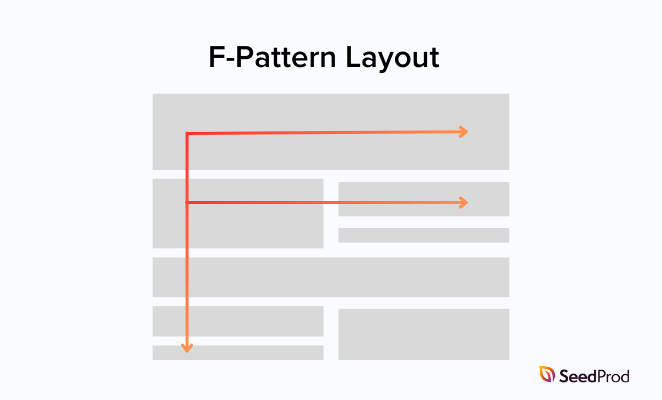
Many website designers use the F-pattern because most people look at websites this way. They put important things like headlines and buttons where your eyes are most likely to see them.
The F-pattern layout makes it easy for people to quickly see what your website is about. It also feels familiar to visitors because many popular websites use this design. However, if it’s not designed well, an F-pattern layout can look a bit boring.
You’ll see the F-pattern layout used a lot on blogs, news sites, and content-heavy pages.
To give you a better idea of how this website layout works, here are some famous examples:
The New York Times
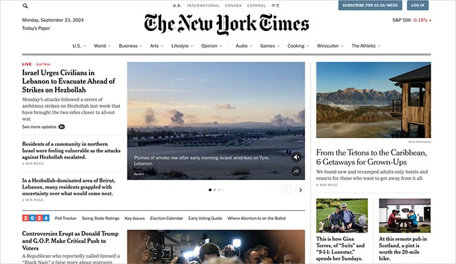
The New York Times uses the F-pattern to showcase its top news stories. When you visit their website, your eyes likely go straight to the biggest headline at the top left.
As you move to the right, you’ll see their logo and sections for subscribing or logging in. Following the F-pattern down the page, your eyes will hit more headlines and images for other important news articles.
CNN
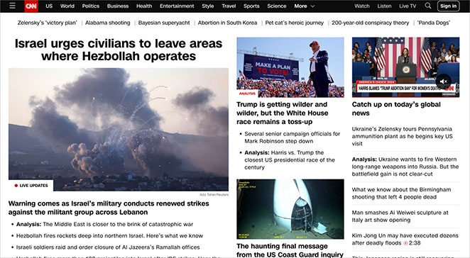
Like The New York Times, CNN uses the F-pattern to display its top news stories.
At the top left, you’ll see their logo and a menu of news categories. The day’s most important news gets the biggest headline, often with a large picture underneath. As you move down the page, your eye will catch more headlines and images for other top news stories.
The Washington Post
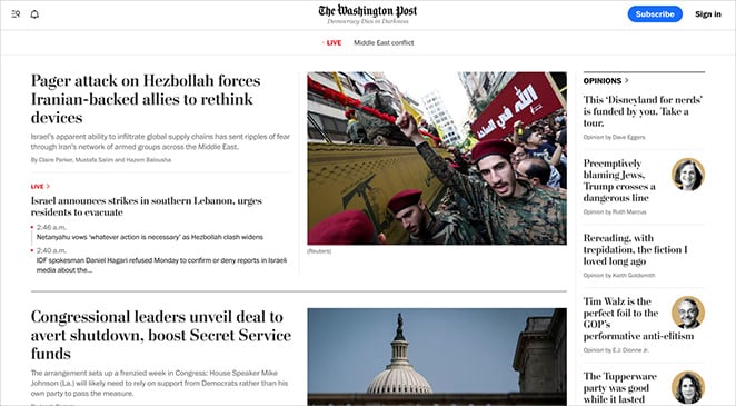
Like CNN and The New York Times, The Washington Post uses the F-pattern to show you what’s most important on its website. Most people look at the logo first, which helps build brand recognition right away.
You’ll also see buttons to subscribe or log in if you move your eye across. You’ll see even more news headlines following the F-pattern down the page.
Z-Pattern Website Layouts
Another way to design a website is by using a Z-pattern layout. This layout uses the shape of the letter “Z” to guide your eye across the page. I’ve used this layout for sales pages and find it really helps draw attention to the signup or buy button without overwhelming visitors.
Look at the top left corner, then move your eyes to the top right. Next, look diagonally down to the bottom left, and finally, move your eyes across to the bottom right. That’s the Z-pattern in action.
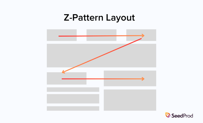
This layout helps visitors notice key content and calls to action in a natural flow. For example, you might use this layout to highlight a button encouraging you to buy or sign up for something.
The Z-pattern layout is great for grabbing your attention and showing you what to do next. It’s exciting to look at and easy to follow. It’s best for simpler pages. If your site has a lot of content, it might start to feel cramped.
This layout is ideal for pages with one clear focus, like promoting a product or collecting signups.
Here are a few examples of websites rocking the Z-pattern:
Steelsync
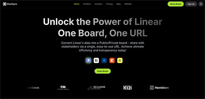
SteelSync helps businesses organize their data. Their website uses the Z-pattern to show how their service works.
First, you see their logo at the top left. If you keep following the “Z” shape, you’ll see their headline and a short explanation of what they do. At the bottom of the “Z,” there’s a button you can click to see a demo of SteelSync.
Dropbox
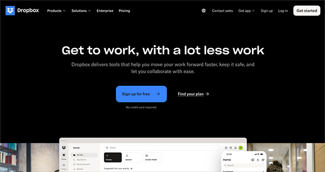
Dropbox is a service for storing files online. Its website uses the Z-pattern to encourage sign-up.
You see their logo at the top left, and if you follow the Z-pattern across the page, you’ll see a big headline and a button to sign up for free. At the bottom of the Z, there’s another button to get started.
Shopify
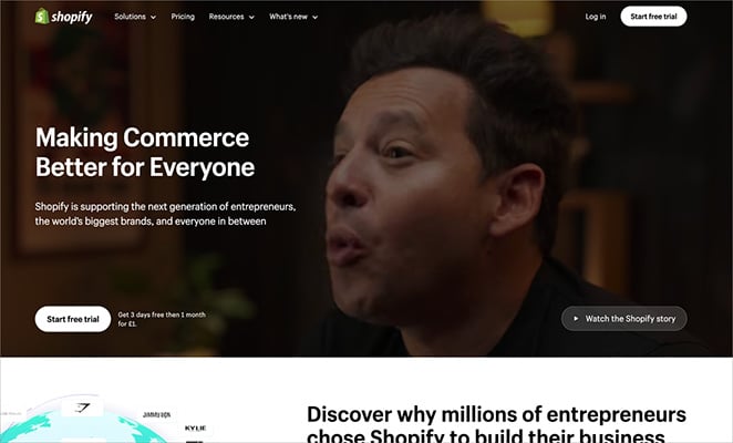
Shopify helps you build online stores. Its homepage uses the Z-pattern to show you what it does and how to get started.
Your eye goes to its logo first at the top left. Following the Z-pattern, you’ll see a button to start a free trial. Shopify explains its platform more at the bottom of the “Z.”
Asymmetrical Website Layouts
Unlike layouts that focus on balance, asymmetrical layouts are about creating visual interest with unevenly distributed elements. You use different sizes, shapes, and placements strategically to draw attention to key areas and create movement and energy on the page.
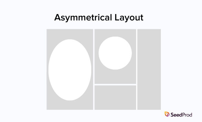
These layouts can be very engaging and eye-catching but require careful design. It’s easy to go overboard and make the layout cluttered or confusing.
The key is to create contrast and visual hierarchy. Guide the eye with purpose without sacrificing readability.
This layout is a great option if you want your website to stand out, especially for creative portfolios, agency websites, and brands looking for a unique look.
I’ve tested this style with portfolio clients who wanted something more creative, and it always gets strong reactions, both positive and curious.
Here are some creative examples of asymmetrical site layouts in action:
Home Societe
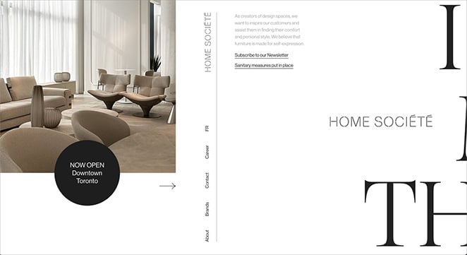
This furniture company uses an asymmetrical layout to create a modern and stylish feel.
Notice how they don’t center everything on the page. They put some elements on the left side and others on the right, making the website more enjoyable.
Plus, as you scroll down, the website moves horizontally instead of vertically, creating a unique browsing experience.
GQ Japan 15th Anniversary Edition
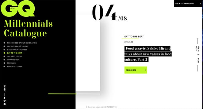
GQ Japan is all about fashion, and its website is just as stylish as the clothes it features.
They use an asymmetrical layout to create a bold, eye-catching look. It’s like they’ve taken elements from a magazine page and thrown them on the website in a cool, random way.
It stands out from typical layouts and shows off the brand’s creative side.
Studio Forum
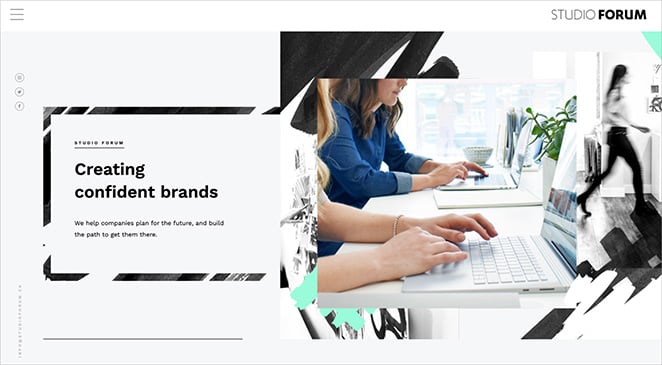
Studio Forum is a company that helps build brands. Their website uses an asymmetrical layout, so it doesn’t look like a typical website. They mix photos and text, almost like they’re creating a piece of art rather than just a website.
Single-Page Website Layouts
As the name suggests, a single-page website puts all its content on one long page. Instead of clicking through multiple pages, visitors scroll to different sections of the website.
IA single-page site guides visitors through your content step by step, without making them click around.. It takes you on a journey from beginning to end, with each section revealing something new and exciting.
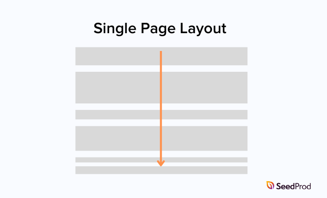
Single-page websites are easy to navigate and work well for telling a story or presenting information clearly and linearly. However, they can get too long and overwhelming if you try to cram in too much information.
This layout style is a good choice for portfolios, one-product websites, and event websites.
If you need some inspiration, here are my favorite single-page website layout examples:
Jamie Windell
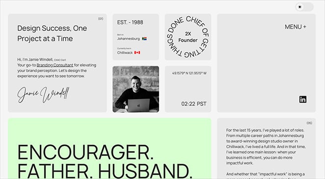
Jamie is a branding expert, and his single-page website is like a digital business card. All of the important information about him and his work is right there on the front page – no need to click around to different sections.
It’s simple, stylish, and easy to get through, just like a good business card should be!
Melvin van der Ven
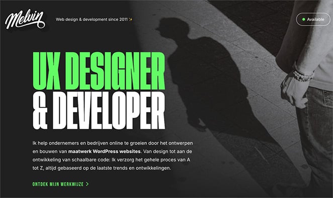
Melvin is a web designer who showcases his work and skills on a single-page layout. You can learn everything about him by scrolling down the page.
It’s a confident design choice that helps Melvin show his personality and skills and encourage people to get in touch.
HPQ Frankfurt
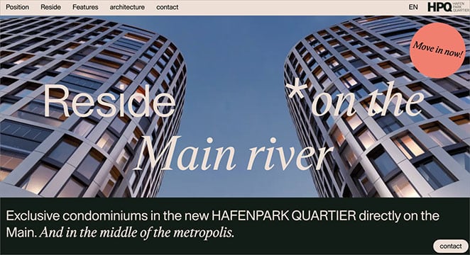
HPQ Frankfurt is selling apartments in a new building. Its real-estate website features a single-page description of the building and explains its unique features.
You can scroll through the entire website and get all the information without clicking any buttons to go to other pages. It’s easy and stylish, just like the apartments they’re selling.
Split-Screen Website Layouts
A split-screen website layout divides the screen into two parts. To make the website stand out, different colors and pictures are often used on each side.
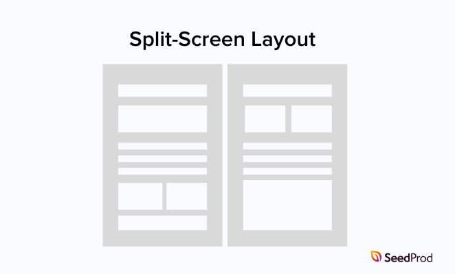
You can use a split-screen layout to make important information stand out or show two different products. While it can look cool and modern, this layout is harder to use on mobile phones because the screens are so small.
Here are a few examples to show how this layout works in practice.
Educated Guess
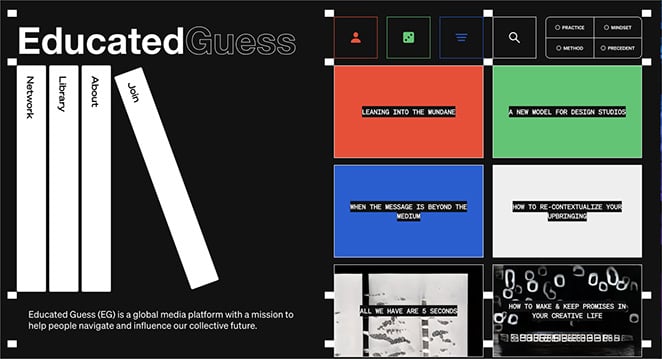
Educated Guess’s website uses a split-screen layout to show you lots of different content at once, like articles and videos. It’s a bold and modern way to design a website.
Biospring

Biospring is a biotech company. Its website uses a split screen, showing a picture on one side and text on the other. This helps it quickly grab your attention with the visual while providing information about what it does.
Pinpoint CGI
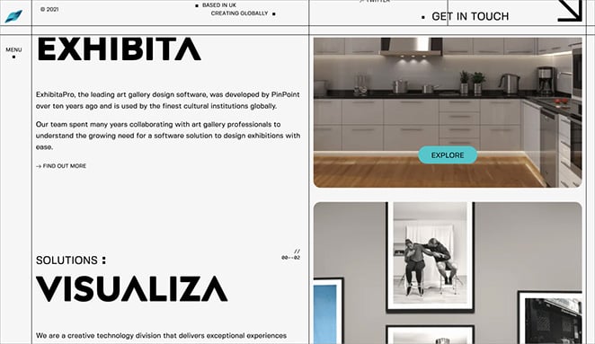
Like Biospring, Pinpoint CGI uses a split-screen layout to present a clean and organized look. They put text on one side, like information about their company and products, and images on the other. This helps to separate the information while keeping things engaging visually.
Mobile-First Design and Responsive Website Layouts
According to Statista, mobile users now make up more than half of all website traffic. If your layout doesn’t work on phones, you’re losing visitors.
This is why responsive design matters so much.. A responsive website layout automatically adjusts to fit any screen size, whether a large desktop computer, tablet, or smartphone.
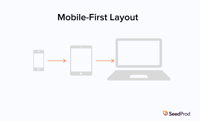
Web designers use CSS media queries to make websites responsive. Don’t worry; you don’t need to know how to code to understand the basic idea. These queries tell a website to change its layout depending on the screen size it’s being viewed on.
The best way to ensure your website looks great on mobile devices is to use a “mobile-first” design approach. This means you start by designing your website for mobile phones, and then you add more features and content for larger screens later.
Here are a few examples of websites that look fantastic on any device:
Relative Design
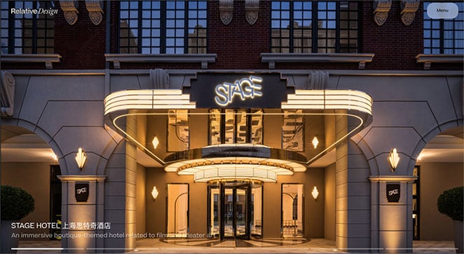
Relative Design is a creative agency whose website looks great on all devices.
If you’re on a big computer screen, you’ll see a large, eye-catching photo next to the text. The photo and text rearrange on smaller screens, like a phone, so they’re easy to read.
This helps make sure everyone has a good experience on their website, no matter what device they’re using.
Durasov Tea & The Rest
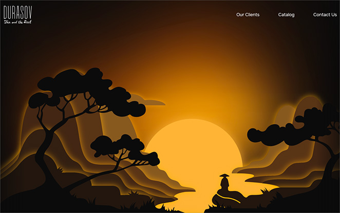
This company sells tea and coffee to businesses, and its website is really creative. It looks like a rural skyline, and you scroll through it like you’re moving through the countryside.
What’s just as good is how well it works on mobile. You can tell they designed it with phones in mind because the scrolling feels so smooth, and the experience is just as immersive on a smaller screen.
Smart Playrooms
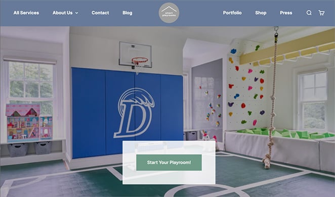
Smart Playrooms designs amazing play spaces for kids. Their website does a great job of adjusting to different screen sizes.
On a computer, you see a big, colorful photo of one of their playrooms. But if you look at their website on your phone, the layout changes so that the photos and text are easier to see. This shows they were thinking about mobile users when they designed their site.
Website Layout Best Practices
Making your website look good is important, but it’s not enough. You also want to ensure your website is easy to use and understand.
Here are some tips to help you create a website layout that looks great and works well:
Give Your Content Some Breathing Room
Have you ever tried to read something with no spaces between the words? It’s really hard. It’s the same with websites.
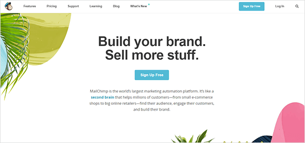
Make sure you have enough space between your text, images, and other elements. This is called “whitespace,” and it makes a big difference in how easy your website is to read.
Learn how to add and remove white space in this guide.
Guide Your Visitors
Think about how you want people to move through your website. What do you want them to see first? What do you want them to do next?

Use headings, images, and other design elements to logically guide visitors through your website.
Choose Your Colors Carefully
Colors can make you feel different emotions. For example, blue is often associated with calmness and trust, while red can be associated with excitement or danger.
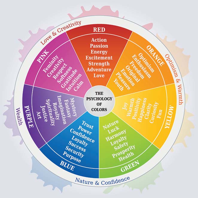
When you choose colors for your website, think about the message you want to communicate and how you want your visitors to feel. Make sure your colors also match your logo and brand.
Make Your Text Easy to Read
Not all fonts are created equal. Some fonts are easier to read on a screen than others. Make sure you choose a font that’s clear and easy to read, even on small screens.
The size of your text is also important. If your text is too small, people won’t be able to read it. If it’s too big, it might feel overwhelming.
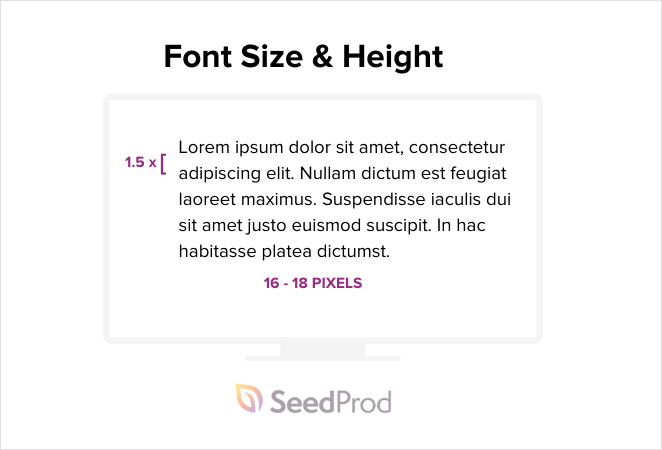
For more details, see our guide on typography in web design.
Use High-Quality Images
Pictures and videos can make your website more interesting and engaging. Oversized images can slow your site down, especially on mobile.
Use high-quality images that are also optimized for the web, meaning they’re small enough to load quickly.
Tell People What to Do
What do you want people to do on your website? Buy a product? Sign up for a newsletter? Donate to a cause? Make sure you have clear “calls to action” on every page of your website.
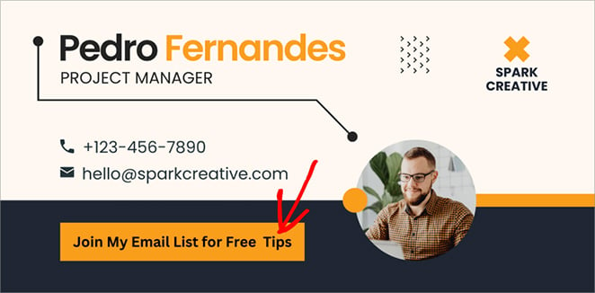
A call to action tells people what to do next. Use strong verbs to encourage action, like “Get Started,” “Learn More,” or “Shop Now.” Also, use plenty of whitespace to make your calls to action stand out.
Website Layout Examples – FAQs
Create Your Website Layout Today
As you’ve seen, your website layout plays a huge role in how people experience your site. A well-designed layout will help you keep visitors engaged, build a strong brand, and encourage people to take action.
Need an easier way to build a great-looking layout without hiring a developer?
That’s where SeedProd comes in. With its visual drag-and-drop builder and stunning templates, SeedProd makes it easy for anyone to build a beautiful, high-converting WordPress website.
Thanks for reading! We’d love to hear your thoughts, so please feel free to join the conversation on YouTube, X and Facebook for more helpful advice and content to grow your business.


