Landing pages are critical for converting online visitors into customers. Even a small increase in a page’s conversion rate can lead to big revenue gains. For example, if a page gets 100,000 monthly visits and the conversion rate rises from 2% to 2.5%, that creates 500 more customers per month.
Boosting conversion rates takes work, but it generates huge returns. In this guide, you’ll learn more about what landing page conversion rates are and how to boost them to grow your business.
Table of Contents
- What Is a Landing Page Conversion Rate?
- How to Calculate Landing Page Conversion Rates
- What's The Average Landing Page Conversion Rate?
- What's a Good Landing Page Conversion Rate?
- Why Are Conversion Rates Different for Every Industry?
- Tips to Increase Landing Page Conversion Rates
- Conversion Rate Optimization for Landing Pages FAQs
What Is a Landing Page Conversion Rate?
A landing page conversion rate tells you how good a landing page is at getting visitors to do what you want them to do. It’s like a score – the higher the score, the better the landing page.
Here’s how it works:
- You have a landing page on a website.
- You want people who visit that page to DO something specific, like sign up for your email list or buy a product.
- The conversion rate tells you what percentage of visitors actually do that thing.
So, if 100 people visit your landing page and 10 of them sign up for your email list, your conversion rate is 10%.
How to Calculate Landing Page Conversion Rates
You can use this landing page conversion rate formula to calculate the rates for your page:
- Divide the number of people who took the desired action by the total number of people who visited the page
- Multiply the result by 100 to get a percentage
For example, if 50 people signed up for a newsletter out of 1,000 visitors to your landing page, the conversion rate would be 5%: 50÷1,000×100=5%
But how do you know if that’s actually a good landing page conversion rate? We’ll tackle that next.
What’s The Average Landing Page Conversion Rate?
The average conversion rate for landing pages varies depending on your industry, target audience, and conversion goal.
According to HubSpot, the average conversion rate across all industries is 5.89%. However, the data varies wildly when you break it down.
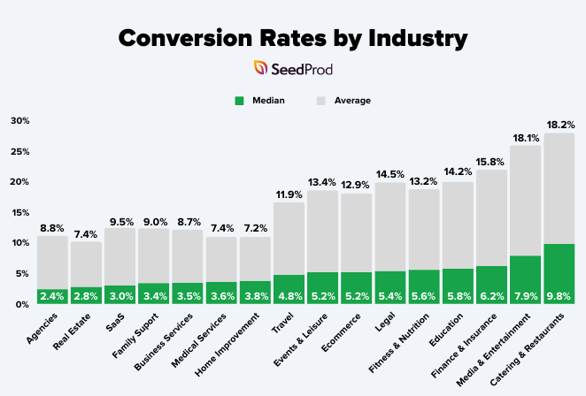
Data source: Unbounce – landing page conversion rates by industry
Here are some average conversion rate by industry:
- Ecommerce Conversion Rate: 2.5-3.5%
- SaaS: 3-5%
- Financial Services: 2-3%
- Healthcare: 2-5%
- Education: 3-5%
The key here is to remember that the average conversion rate for your landing page depends on your industry, audience, and goal.
What’s a Good Landing Page Conversion Rate?
As we mentioned above, there isn’t a single “good” landing page conversion rate overall. However, conversion rate benchmarks of around 10% are considered good across all industries.
But just aiming for a good conversion rate isn’t enough. You want a great conversion rate, which means outperforming your competitors.
If your conversion rate isn’t where you want it to be, don’t worry. There are plenty of ways to optimize your landing page for better results.
Conversion Rate Benchmarks by Landing Page Type
While 10% is considered a good overall conversion rate, it’s helpful to have more specific benchmarks based on the type of landing page you’re using. Here are some average conversion rates for different landing page types:
| Landing Page Type | Average Conversion Rate | Top Performer Conversion Rate |
|---|---|---|
| Lead Generation Pages | 9-12% | 20-30% |
| Ecommerce Product Pages | 2-5% | 10-15% |
| Webinar Registration Pages | 20-40% | 50-60% |
| SaaS Free Trial Sign-Up Pages | 5-15% | 25-30% |
| Newsletter Subscription Pages | 10-20% | 30-40% |
Remember, these are general benchmarks and your actual results may vary depending on factors like your industry, target audience, and offer. Always aim to continually improve your conversion rates, regardless of where you start.
Why Are Conversion Rates Different for Every Industry?
Conversion rates differ across industries because a “good” rate is not one-size-fits-all. Complex products like financial services see lower conversion rates as customers need more time to research, unlike simpler eCommerce products.
A customer booking a last-minute hotel is also much closer to converting than someone just researching enterprise software. Additionally, high competition generally means lower conversion rates, as consumers have more choices.
Finally, strong brands with larger marketing budgets often see higher conversions due to established trust. Understanding these industry nuances is key to setting realistic conversion goals for your landing pages.
Tips to Increase Landing Page Conversion Rates
To help you get the most out of your landing page optimization efforts, here are some of the most effective tips to help you improve your landing page conversions.
1. Offer Value Immediately on Your Landing Page
When visitors land on your page, they need to immediately see the benefit of staying to learn more. If the value of your offer isn’t clear enough, visitors will focus on the cost of staying around rather than what they’ll gain.
You can offer instant value by:
- Creating headlines that include your unique selling proposition
- Highlighting benefits instead of features
- Using an actionable call to action button (CTA button) copy
- Explaining complicated concepts using video
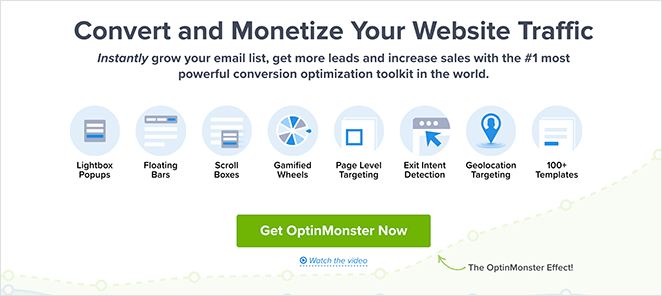
Take a look at this landing page design from OptinMonster. They make it easy to see what they do and how their software can improve conversions for small businesses.
2. Make Your Call to Action Stand Out
Your CTA is the heart of your landing page. Here’s how to ensure it gets the attention it deserves:
- Use Action-Oriented Verbs: Start your CTA with powerful verbs like “Get,” “Download,” “Start,” “Claim,” or “Reserve.”
- Highlight the Benefits: Use phrases like “Start Your Free Trial,” “Claim Your Discount,” or “Download Your Free Guide.”
- Choose a Contrasting Color: Make your CTA button visually distinct.
- Give it Space: Don’t crowd your CTA button with other elements.
- Consider Placement: Place your CTA above the fold and after explaining your offer.
Let’s say you offer a free trial of your project management software. Here’s a powerful CTA you could use: “Start Your Free Trial Today!”
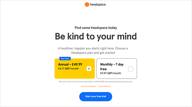
This CTA is short, action-oriented, and clearly highlights the benefit of taking action.
3. Remove Distractions to Boost Page Conversions
Keep visitors focused on what your landing page offers by managing their attention with your layout, color, imagery, and copy.
- Ask for Minimal Information: Minimize form fields to increase the likelihood of conversions.
- Focus Attention: Ensure users can easily access and focus on the key action you want them to take.
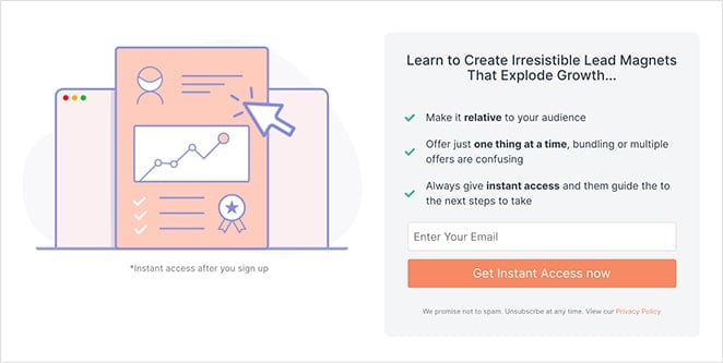
Check our guide on the anatomy of a landing page for the best layout ideas.
4. Reduce Risk with Social Proof
Testimonials and social proof make your landing page more trustworthy. Nudgify’s guide to social proof explains that people are influenced by what others do. When visitors see good reviews, they’re more likely to trust you and buy your product.
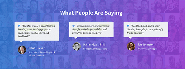
There are several ways you can reduce risk with social proof, such as:
- Displaying testimonials from happy clients
- Showing reviews and star ratings from previous and existing customers
- Adding FAQ to anticipate customer questions
- Showing user-generated content from social media
- Displaying rewards and accolades that boost trust
5. Remove Friction to Increase Conversion Rates
Friction can hinder conversions. Common culprits include slow loading speeds, long sign-up forms, and difficulty finding the next step.
To combat these issues, you can:
- Simplify Forms: Remove unnecessary fields to make sign-ups easier.
- Optimize Page Speed: Use tools like IsItWP’s free website speed test tool to improve performance.
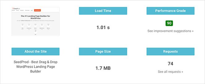
After entering your landing page URL, it offers suggestions on how to improve your page speed. You can then use those suggestions to work on optimizing your page’s performance and provide a better experience for visitors.
If you’re still planning your landing page, choosing the best landing page plugin can have a massive impact.
Many landing page builder plugins are bloated, which can slow down your site. So pick a lightweight solution like SeedProd, with minimal code that’s optimized to achieve the best page speeds.
6. Leverage Urgency and Scarcity
Scarcity is the feeling that a product will run out in a limited amount of time. It’s that feeling that induces the fear of missing out (FOMO).
When potential customers experience FOMO, their desire for the product quickly increases and triggers higher demand. And when that happens, users are more likely to convert.
Add countdown timers and highlight limited-time offers to create a sense of urgency.
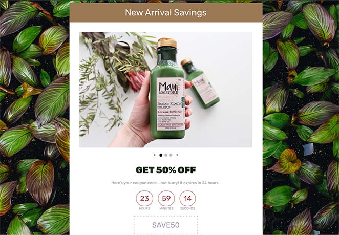
If you follow this guide on creating a coupon code landing page, we’ll show you how to add a countdown timer easily with SeedProd.
7. Optimize Your Landing for Mobile
More and more people browse the internet on their smartphones. That’s why your landing page must look great and function perfectly on smaller screens.
Here’s how to start optimizing landing pages for mobile:
- Choose a Responsive Design: A responsive design automatically adjusts the layout of your landing page to fit different screen sizes. This ensures a seamless experience for all visitors, whether they’re on a desktop or a phone.
- Prioritize Readability: Keep your fonts large enough to read on a small screen. Use short paragraphs and plenty of white space to make your content easy to digest.
- Optimize Images: Make sure images load quickly on mobile devices by compressing them for the web. Avoid using too many images, as they can slow down your page load times.
- Test on Mobile Devices: Don’t just assume your landing page looks good on mobile. Test it yourself on different smartphones and tablets to ensure everything displays correctly and performs smoothly.
8. A/B Split Test Your Landing Page
Regular A/B testing, analyzing user behavior, and making data-driven improvements can help you achieve higher conversion rates.
VWO emphasizes the importance of a targeted approach:
“A/B testing is not about randomly trying different versions of your landing page. It’s about testing a hypothesis you’ve made about changes on your landing page that will lead to an improvement in conversions.” (Source)
This means starting with a clear hypothesis and creating variations specifically designed to test that hypothesis, leading to more focused data analysis and clearer insights.
Make each variation completely unique, with different:
- Copy
- Offer types
- Call to action buttons
- Social proof
- Images
- Design
- Layout
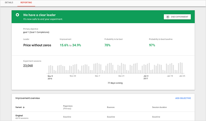
After testing those 10 pages, you can take the top performer and focus your efforts on optimizing the more minor elements and making improvements that lead to better conversions. For instance, you can try making your phone number clickable so users can contact you more easily.
9. Personalize Your Landing Page
Don’t treat all your visitors the same. Instead, tailor the content and offers on your landing page based on demographics, interests, or behavior.
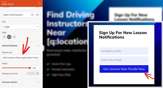
Here are some ideas to make your landing page feel more personal:
- Greet them by name: If you know their name, use it. “Welcome, [Visitor Name]!”
- Match the call to action to their interests: Show them a CTA for what they’re actually interested in.
- Offer targeted discounts: First-time customer? Give them a discount. Loyal customer? Offer a reward.
- Use location information: Show relevant delivery options or shipping info based on their location.
For all the steps, please see our guide on how to create personalized landing pages.
10. Use Dynamic Content on Your Landing Page
Dynamic content changes what visitors see on your landing page based on who they are and what they do. It’s like personalization, but even smarter.
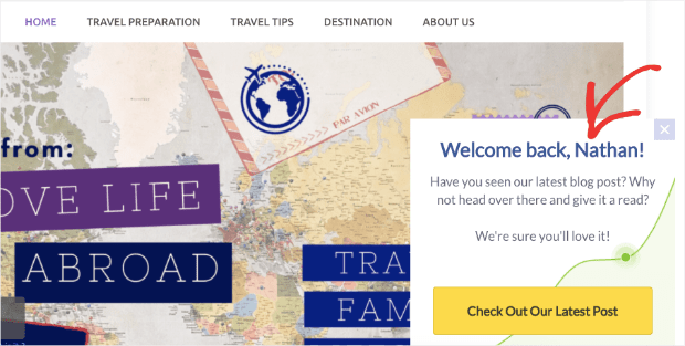
Show different content blocks based on how far they scroll, or display testimonials from people in their industry to make your message hit home.
Here’s how dynamic content is different from regular (static) content:
| Feature | Static Content | Dynamic Content |
|---|---|---|
| What it is | Same for everyone. | Changes based on who the visitor is and what they do. |
| User Experience | Generic. | Personalized. |
| Example | One headline for all visitors. | Different headlines based on the ad they clicked. |
| Another Example | Same product list for everyone. | Different products recommended based on what they’ve viewed before. |
You can learn more in our guide on what is a dynamic landing page?
11. Use and Analyze Heatmaps
Ever wish you could see through your visitors’ eyes? Heatmap tools give you that superpower.
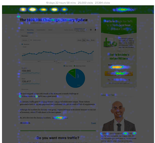
Heatmap tools create visual representations of where users click, scroll, and linger, allowing you to optimize element placement.
12. Perform Conversion Funnel Optimization
Think of your landing page as just one step in a journey. Analyze your entire conversion funnel, from the initial click to the final conversion.
AIDA is a simple way to understand how customers decide to buy. It stands for Attention, Interest, Desire, and Action.
First, grab attention with a great headline or image. Then, get them interested by showing the benefits. Next, make them want it by showing its value. Finally, tell them exactly what to do (call to action).
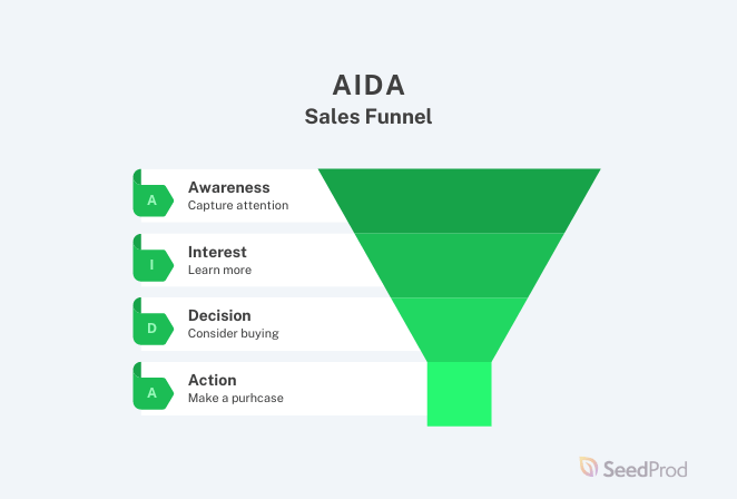
By identifying and fixing any bottlenecks or drop-off points, you can create a smooth and seamless path for your visitors to follow.
Conversion Rate Optimization for Landing Pages FAQs
What is the ideal conversion rate for a landing page?
A good benchmark is a conversion rate of 2-5%, but this can vary depending on the industry, type of offer, and targeted audience. Top-performing landing pages can achieve conversion rates of 10-15% or higher.
How can I increase the average time spent on my landing page?
Create engaging content, improve readability, use visually appealing images or videos, and make your page mobile-friendly to improve page load speed. Encourage user interaction with polls, quizzes, or comments.
How do I know if my landing page is mobile-friendly?
Test your landing page’s mobile-friendliness using Google’s Mobile-Friendly Test tool. Ensure a responsive design, fast loading times, and easy navigation on mobile devices.
Next, More Landing Page Tips
We hope this article helped you discover the best landing page conversion rates for your industry.
For even more ways to improve your landing page performance, check out the following guides:
- How to Create a Quick Landing Page
- Landing Page Headline Formulas
- Landing Page Navigation Is Dead: Here’s Why
- Landing Page Not Converting? How to Fix It Fast
- Landing Page Best Practices
Thanks for reading! We’d love to hear your thoughts, so please feel free to leave a comment with any questions and feedback.
You can also follow us on YouTube, X (formerly Twitter), and Facebook for more helpful content to grow your business.

